86

Update: A Release Candidate has been announced

It's been another month for the new navigation team, and today we are releasing a new iteration.

With this iteration we've accomplished most of what we set out to do initially: we've provided an easier way of navigating the site, exposing a few hidden features and making it possible to use what was already there more effectively.

In short, after moving the cheese, we're making sure all cheese is neatly ...stacked.
Clear evidence that we stack the cheese, without overflow.

Here is what is new:

  • AJAX all the things! Navigation is now javascript-powered and we don't do postbacks if possible.

    all hail the balphadots

  • Tab pinning! What tab you see on the home page is now an explicit choice instead of being autosaved.
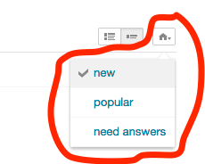
    up up

  • Tag engine performance! We are hitting a performance bottleneck with tag engine. This is why you sometimes see empty results (but see a list upon refresh) and why bounty numbers are inconsistent. We've started optimizing the engine and you should see 10%-20% better perf now, which means you should hit empty results less often. That said -- we are working hard to get your question lists much faster in the future.

  • New URL structure and easier permalinks! Question lists now use a folder-based URL structure instead of a param based one. Permalinks are now injected in the address bar for enhanced copy-pasta performance.

    down down

  • UI cheese shuffle! Tabs moved on the right, similar to the user page. This makes the left title unnecessary and gives us more space overall.

    left right left right

  • Simplified "need answers" tab sorts! We reduced the sorts by one, and we're left with "all" (questions that need answers for any reason), "no answers" (questions with zero answers), "bounties" (questions with a bounty)
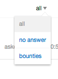
    B A start

How do you get it?

the new "New Navigation" panel

Go to your user preferences page, look at the bottom. Check the checkbox, or un-check it to go back to normal. Checking the box puts you in a waiting list. We'll be adding tons of users this round!

What's next?

Next we'll be focusing on

  • Polishing the current UI
  • Extending the new navigation to the mobile site
  • Extending the new navigation to anonymous users

and we'd appreciate your thoughts on the matter!

How to Feedback

Please file bug reports as separate questions (like any other bug!) so they end up in our bug tracker, and can be . Any other form of feedback is fine in here. Hopefully this is not as complicated as it sounds...

38
  • I love new new tab pinning. It's so much better to be able to do some weird searches using the other tools and quickly be able to revert to my default preferences.
    – ryanyuyu
    Commented Jul 24, 2015 at 14:00
  • 29
    <goes to the mainpage, selects "newest" sorting, clicks the site logo, ends up being still in "newest" sorting, curls up on the floor and utters curses while crying> - Sorry, but mission failed. It's fine that I can configure the default tab now, but what about the sorting and about the good old logo frontpage that we have trained years of users to? Commented Jul 24, 2015 at 14:21
  • @ryanyuyu You still aren't able to do that, since it only remembers half the truth. There is still no easy way to return to your default sorting, only the tab. Commented Jul 24, 2015 at 14:28
  • @ChristianRau you're right, but it's still a lot closer than it was before though. I guess my use behavior only changes sorting on other non-home tabs so I never noticed.
    – ryanyuyu
    Commented Jul 24, 2015 at 14:31
  • Where do you post a suggestion? in the answer or create a new post? Commented Jul 24, 2015 at 15:11
  • 1
    @HackerKarma either: a question allows discussion, an answer much less.
    – Sklivvz Mod
    Commented Jul 24, 2015 at 15:13
  • 13
    Flagged as not a question. just kidding Commented Jul 24, 2015 at 16:57
  • 1
    I fail to see a difference between need answersall and need answersno answer. What happened to the overview of all questions without an accepted answer? For me need answersall shows only questions with zero answers. Commented Jul 24, 2015 at 22:47
  • 1
    So if I use 7 tags for my favorites I can't see the notifications for new questions? This seems to be a serious drawback.
    – Steve
    Commented Jul 25, 2015 at 10:16
  • 1
    @Steve no, notifications had an unrelated bug which I fixed - this will be out in the next deployment
    – Sklivvz Mod
    Commented Jul 25, 2015 at 10:17
  • 1
    @Steve the bug is now fixed.
    – Sklivvz Mod
    Commented Jul 25, 2015 at 14:45
  • 3
    "copy-pasta" sounds tasty, but I think you meant "copy-paste" :D
    – David G
    Commented Jul 25, 2015 at 15:43
  • 1
    @David given my Italian origins, I'd say that copy-pasta was quite intended as-is :-D
    – Sklivvz Mod
    Commented Jul 25, 2015 at 15:58
  • 1
    @ChristianRau I think it's a separate bug -- it's a shared cache bug (both tabs share the same cache but use different algorithms to fill it)
    – Sklivvz Mod
    Commented Jul 25, 2015 at 16:00
  • 2
    What does all hail the balphadots mean?
    – gerrit
    Commented Jul 27, 2015 at 16:55

9 Answers 9

57

I like the "hide excerpts" feature, it lets me fit more questions on the screen.

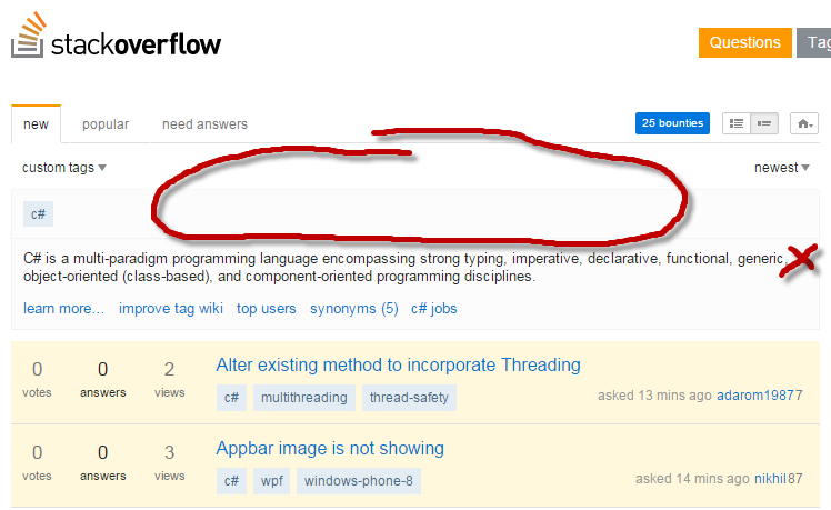
But when I pick a single tag from my favorites (my usual navigation pattern), the interface takes more screen estate than before, thus pushing the first question down the screen.

So here's my : please let me hide tag excerpts. I know what is by now, no need to remind me every day that it's a multi-paradigm programming language... :-)
Another option would be to hide tag excerpts from tags which are in the favorite list.

To be fair, it's not the tag excerpt box per se which takes more space than before, but now there are additional UI elements that push the whole thing downwards, and there's too much empty space on the top of the page:

empty space

Also, the excerpt is on a light gray background, which emphasizes it. Overall, it feels much more prominent than before. I'd prefer the first question be higher up on the page - this is the important part after all.

EDIT: OldCurmudgeon's suggestion:

My 2p'worth


Just noticed the following (new vs old):

tab titles

How to reproduce:

  • Click on a tag
  • Title says "New 'tag' questions - Stack Overflow"
  • Click on the "new" tab
  • Title now says "Stack Overflow"
8
  • 10
    I absolutely agree with your point about the screen estate - I was thinking the exact same thing: "I know what python is, I probably read this tag description a thousand times". That's a whole lot of screen estate (in a valuable spot) for a piece of information that barely ever changes and is of little use to me as a regular of this tag.
    – Lukas Graf
    Commented Jul 24, 2015 at 20:59
  • 8
    How much longer until the 'white space' fad passes?
    – Mazura
    Commented Jul 25, 2015 at 1:23
  • 18
    You should listen to this guy. Look at the drop shadow on that red oval. This guy knows UI.
    – sonicblis
    Commented Jul 25, 2015 at 16:12
  • I completely agree. I posted this feature request a couple iterations ago
    – Andy
    Commented Jul 26, 2015 at 0:43
  • 44
    maybe we should automatically hide tag summaries for anyone with more than (x) rep in that tag? Commented Jul 26, 2015 at 9:10
  • @JeffAtwood - Or make them more visible but in a different location (sidebar)? There is a lot of useful information inside of tag summaries that many users never or rarely reach. It would be nice if there was some way to make them more integrated.
    – Travis J
    Commented Jul 27, 2015 at 23:55
  • 2
    @TravisJ the point here is to hide them entirely for regulars of the tag. I'd rather see my favorites in the sidebar instead of a tag summary I'm really familiar with. Commented Jul 28, 2015 at 7:32
  • 4
    @Mazura It's not a 'fad', it's just web design catching up to every other design medium. Sorry, but it's not going anywhere while it promotes better usability. Besides, this isn't an excel table, so fitting as much content on screen as humanly possible isn't the primary goal - sometimes you want people to actually understand the information as well. Not that this is even really an example of whitespace… Commented Jul 28, 2015 at 15:08
27

Overall nice and an improvement over the old question lists, but one small feature request:

Please let us also save the tag choice (all, favorites, custom tags) in the same manner like the tab choice.

After each return to the list I have to choose my tag choice again.

4
  • 4
    And of course also the sorting choice. Commented Jul 24, 2015 at 15:06
  • @ChristianRau Sorting is different per tab unlike tag choice but sure, why not.
    – Raidri
    Commented Jul 24, 2015 at 15:12
  • 1
    +1 Waiting for that since day one
    – inf
    Commented Jul 24, 2015 at 22:02
  • 5
    We are considering saving custom sets for the next iteration.
    – Sklivvz Mod
    Commented Jul 25, 2015 at 10:29
21

I appreciate your attempt to improve navigation, but this interface is super confusing. I've been playing around with it for 10 minutes and I don't understand how it works.

The primary navigation element appears to be "new / popular / need answers" — effectively three "tabs" — on the left. Why is the Home icon with "new / popular / need answers" all the way on the right? Is the Home drop-down related to the tabs or not?

At the right, I see "recently active ▾". If I click on that, will it toggle the sort direction to "recently active ▴"? Hmm… that arrow isn't a sorting direction indicator after all.

If I click on the blue n bounties button, it switches me to the "need answers" tab, and the "recently active ▾" filter switches to "newest ▾". Despite being in the Need Answers tab, I see that some of the listed posts have answers, and some don't. There is, however, a "no answer" choice under the "bounties ▾" drop-down. Does "need answers" mean something unrelated to "no answer"?

The "Show/hide excerpts" widget acts more like two buttons than one toggle. As @HackerKarma has pointed out, clicking on the already-activated mode, instead of toggling the mode, refreshes the Hot Network Questions list, which enhances the mystery of what the widget is for.


What can be done to fix this mess?

My first suggestion is to simplify the drop-down menu with the Home icon. Just change it into a "bookmark the current view as my home page" button.

The other navigation elements should be reworked as one choice of mode, optionally filtered by other orthogonal criteria. Many clothes-shopping websites have this problem figured out, and people know how those sites work. Instead of shopping for clothes, we're just shopping for questions!

The n bounties button affects so many unrelated settings at once, which is disconcerting. It should probably be made into a top-level mode.

3
  • 1
    I think you had a wrong URL to my post. I just edited it. Commented Jul 24, 2015 at 19:10
  • 2
    Whoa, that "bookmark this as default" button is a great idea! It would easily capture all the current settings, from tab over filter to sorting without the need for messing with millions of adjustable settings. Someone should propose that as an actual feature-request. Commented Jul 24, 2015 at 19:30
  • 1
    It's little confusing but I got used to it. You do have good suggestions. "Home" icon acts like a "Bookmark". Removed the rest of the comment and converted into a post. Commented Jul 24, 2015 at 20:29
20

Can't say I'm overjoyed for these reasons:

  1. Cramming question titles into even less horizontal space.

  2. Loss of question first sentence preview which I found useful.

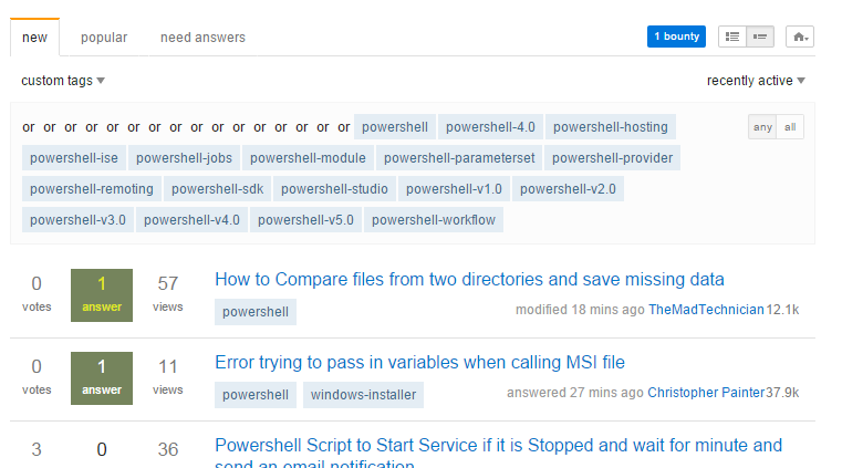
  3. When I hit up my favourite tag wildcard (powershell*) I see the following which is quite broken in more ways than one:

enter image description here

Please don't ruin what was a perfectly good UI just for the sake of change.

5
  • 6
    There is a toggle for question summaries on the right next to "home" icon.
    – user259867
    Commented Jul 27, 2015 at 16:41
  • "Please don't ruin what was a perfectly good UI just for the sake of change." That's one cross for your redesign bingo card! :) I have a feeling, and stay with me here, that they're probably changing it for… a reason! Either that or they're very bored and extremely time rich. Commented Jul 28, 2015 at 15:14
  • @NathanHornby, at least existing URLs should not be broken, right? A lot of users rely on certain URLs, have them bookmarked etc, and now all these are not working as expected. Examples: meta.stackoverflow.com/q/300270/728795, meta.stackoverflow.com/q/300282/728795
    – Andrei
    Commented Jul 28, 2015 at 17:46
  • Ideally, no, a site should never break existing links (but we all know it needs to happen from time to time, improvement invariably involves changing things), but that's more an information design issue - and the two questions you posted appear to be bugs. Commented Jul 29, 2015 at 9:01
  • We are trying not to break any URLs, however we will be changing some features. There are some huge tag queries, such as yours, that we are not sure to be able to support in the long term with the current infrastructure.
    – Sklivvz Mod
    Commented Jul 30, 2015 at 10:21
9

On the whole, I think the new navigation makes it easier to find questions to answer. But it's made searching such a nightmare that I'm giving up on being a beta tester. Please don't make it the default until search is fixed!

The killer bug for me is that searching by tag is broken. Searching by tags is the main reason to use SE's built-in search — for plain text searches, search engines such as Google do a better job. So today I was looking for questions about on MSE.

  1. Click on the tag or type its name.
  2. The post I'm looking for is likely to be a feature request. Let's restrict the search to that. Hey, where did the related tags go? Turns out they're hidden behind a completely unrelated feature.
  3. Having found the related tags sidebar, I click on [feature-request]. Ha! I get redirected to a page which shows questions tagged [exact-duplicates] or [feature-request]. Sigh. Disjunction search on tags is something I use, what, once a month? It shouldn't be the default, and it especially makes no sense for a related tags click. At least this time the UI isn't so confusing, there are two buttons “any | all”, so I click on “all”.
  4. The question I'm looking for might be in the [user-interface] tag. So I'll restrict to that by adding it to the search box. NOOOOOOOOO! It's brought me back to an “any” search. How many times do I need to tell you I want an “all” search? (Hint: once is already too much, more is aggravating.)
  5. In the search results, switching to “newest” is a hassle. I want to switch the sorting order in search results about half the time, increasing the workload for that is not good.

Search by tags is broken is other ways, such as the variable brokenness of excluded tags.

I'm giving up on beta testing this. Sorry. I might give it another go when search by tags is fixed.

7
  • Taking a look. Point 2 and 4 seem like bugs. The rest seems not to be as black and white as you make it.
    – Sklivvz Mod
    Commented Jul 26, 2015 at 14:57
  • 1
    I fixed point 2 and 4, give it a spin
    – Sklivvz Mod
    Commented Jul 26, 2015 at 15:34
  • 2
    @Sklivvz In meta.stackexchange.com/a/261437 you say you don't want to fix 4. Commented Jul 26, 2015 at 20:19
  • In both places I mention fixing a bug. I fixed the saving, but I am not going to change the default. That's your point 3, I guess.
    – Sklivvz Mod
    Commented Jul 26, 2015 at 21:08
  • 2
    I used to search for [dart-polymer] -[dart]. In the search box this is automatically changed to -[dart] [dart-polymer] which is invalid AFAIR because a search must not start with -. The bar containing the all and any buttons shows on the left not [dart] [dart-polymer] (I get no search results). When I switch to all it shows [dart] [polymer-dart] (where the search results have the [dart] and [dart-polymer] tag) which is not at all what I wanted.
    – zoechi
    Commented Jul 27, 2015 at 7:17
  • @zoechi, You should probably post that as a bug report instead of just a comment. It'll get lost as a comment
    – Andy
    Commented Jul 27, 2015 at 13:03
  • @Andy Thanks, done meta.stackexchange.com/questions/261497
    – zoechi
    Commented Jul 27, 2015 at 13:09
7

A nice improvement of the navigation and I want to use this thread to request personal saveable filters so I can store search conditions like [php] answers:0 newbie. That would help to navigate to things I'm intereset much more - and no the tag-shortcuts on the right side is not fully helping for such things. Even if a single tag-shortcuts can't combine multiple tags at once

3
  • 3
    note that those are searches, which are not currently supported in the navigation
    – Sklivvz Mod
    Commented Jul 24, 2015 at 18:28
  • 3
    @Sklivvz Well there's your problem right there, searching is how I navigate.
    – Mazura
    Commented Jul 25, 2015 at 1:25
  • 1
    @Mazura we are considering merging search in the navigation, but not until we release this.
    – Sklivvz Mod
    Commented Jul 25, 2015 at 8:41
3

This new navigation has quite a few great improvements and may confuse users until they get used to it. I see some good suggestions have already pointed out by members here in the answers.

I'm still learning and I will add more to this post as and when I learn something new. Here, I would like post few of my findings that I have noticed while I was going through my learning curve on this new navigation. Hope my findings will help some way:

1) need answers:

The "need answers" is new name for our old unanswered tab. The "need answers" now gives us two filter options on the right: (all the names are obtained by doing inspect element - don't know what are they officially called.)

  • show-filter: a drop-down menu for selecting type of posts with options such as "all, no answer, bounties"
  • sort-filter: a drop-down menu for sorting criteria with select options such as "newest, votes, ending, recently active, bounty size"

So, for example; If I want to display all the questions that need answers sorted by the "votes" then to achieve this, I will select the need answers tab and choose "all" option from the show-filter drop-down menu along with selecting "votes" from the sort-filter drop-down menu.

2) recently active:

This is a new name for our old "active" tab. But, there is one significant change here. Under the old active tab, all the posts were displayed as "modified" whereas in the new navigation all the posts show one of three statuses i.e. "answered", "asked" or "modified" (which is a broad term and covers many changes made to a post). This is a great improvement.

3) Navigation [new / popular / need answers]:

These primary navigation tabs on the left acts like a "you are here". Also corresponds to your "Home tab settings" you selected/set. (on the right, home icon).

Hope this helps to understand better.

3

Two things of note:

  1. Posts I edited don't seem to be shown as "active" even a whole hour after (Observed when revising this MSO answer, other posts others edited were properly reactivated).

  2. The new search seems strictly less powerful than the old one.

    While one can look at all questions which have or using the old nav, the new one makes a hash of it: https://stackoverflow.com/search?q=%5Bc%5D+%5Bc%2B%2B%5D+%5Bmacros%5D

    That was a very useful feature, especially for handling retag-requests, burnination-requests and cleanup-requests.
    Or for finding that one elusive post you know you have seen.

5
  • 1. May be your post went to "review" queue. Did you get a banner saying "Your edit will be reviewed..." Commented Jul 30, 2015 at 12:59
  • @HackerKarma: There's only suggested edits for tag-wikis/excerpts on normal meta-sites. So cannot be the cause. Commented Jul 30, 2015 at 13:04
  • Ohh ok... so tag-wikis edit do not require "review"? Commented Jul 30, 2015 at 13:09
  • On normal sites (and on MSE), you can suggest edits for posts, tag-wikis and tag-excerpts iff you don't have the rep to make them on your own, gaining rep after acceptance in review. On normal metas that's disabled for normal posts, but not for tag-wikis and tag-excerpts. Anyway, normal posts are re-activated so people have a chance to notice things changed (for better or worse), can re-evaluate and maybe correct/flag if things went wrong. Commented Jul 30, 2015 at 13:15
  • Thanks. It would be good to know the answer for this delay. Commented Jul 30, 2015 at 13:18
2

Feedback. Favorite tags editor needs some work. I would remove it. Instead put a checkbox in the tag itself, not to delete de tag but to filter out tagged questions.

This is how it work right now.

enter image description here

Becomes

enter image description here

1
  • 5
    You suggestion is bad, but the issue is legit. It sounds like a bug to me. Commented Jul 25, 2015 at 21:46

You must log in to answer this question.

Not the answer you're looking for? Browse other questions tagged .