77

Those interested can now opt-in to beta testing new themes across the network. More details in Opt in to beta testing new themes

In the post entitled Ch-ch-ch-changes: Left nav, responsive design, & themes, I described a number of changes that are coming with the introduction of the left navigation bar. In addition to the navigation changes, we will be introducing responsive design and new theming across the Stack Exchange network of sites. See that post for the full details. This post will focus on updating the schedule for the release of these features and responding to some of the feedback from the previous post.

When will the changes be coming?

Current state - Left navigation is on for anyone who is in a Stack Overflow team.

Late April - Finish core implementation, addressing early feedback, enable responsive design for Stack Overflow for Teams beta users.

May - Address bugs and critical feedback

Early-June - Sneak peak on MSE. Deploy to Stack Overflow and MSO.

Late June - Address bugs and critical feedback. Gather feedback on preliminary site designs for 5-10 existing communities with custom designs.

Begin deployment for all users on sites with custom themes. Plan is to do this roughly by site age, though we reserve the right to vary the order due to implementation concerns. Outline process and timeline for sites without custom themes to get one.

July and beyond - Design, community review and deploy site themes to additional sites.

Response to feedback

We received a lot of great feedback in the last post. Below I've summarized the major themes/issues raised, will provide a short response, and will tag each one (, , , , etc.) to indicate how we will be proceeding. There is still research and design work to come up with a full solution for the issues we are going to address.

Left navigation bar

We are committed to the left nav, but based on your feedback we'll be addressing some key concerns.

Hide/collapse left nav

One of the biggest concerns was the amount of space that is taken up by the left nav. We're currently working on making the left nav collapsable. If you collapse it, then the left nav stays collapsed. When you click on the hamburger to access it the left nav comes up as an overlay and will dismiss when you make a choice or click away. Plan is that this will be remembered per site. For example you can keep it open on SO.com, but keep it collapsed on other sites.

Add more value in left nav

Implicit in much of the feedback was the idea that the left nav real estate is not delivering enough value per pixel. Based on the images we showed it was clear that for people who are not on SO.com or aren't in a team, the left nav is pretty empty. We have some great ideas for adding value here and have already started work on one. More specifics in an upcoming post.

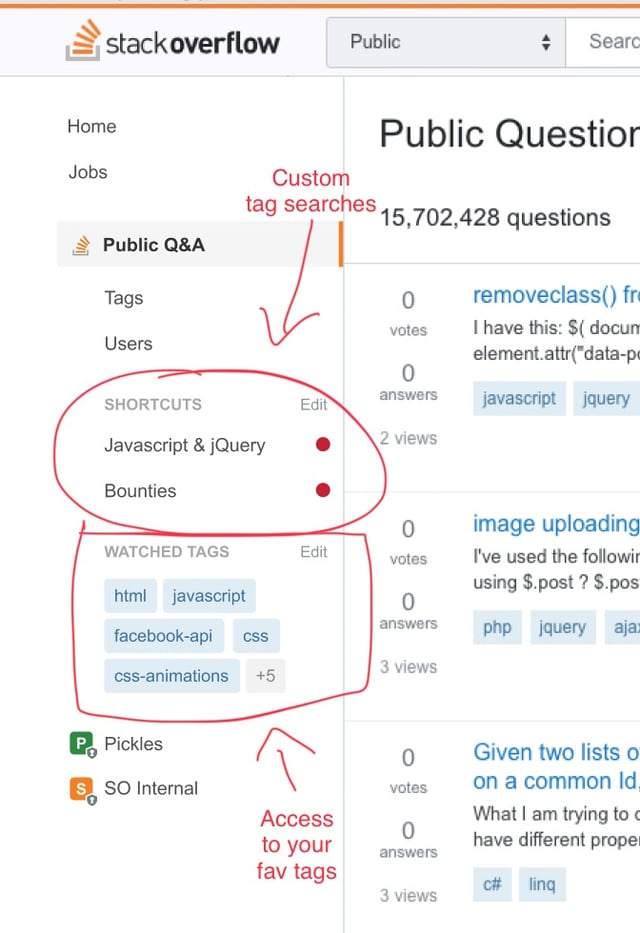
A design exploration showing examples of features we could add/move to left nav.

Image of the left nav with shortcuts and favorite tags

Resize the left nav

Another idea mentioned was resizing the left nav to reduce the amount of space it takes. We looked at several models for this and didn't love any of them. Some of the best options require coming up with good iconography for each item and we know how much fun that is (review queue anyone?). Also, this is a lot more work than hide/collapse. So, we will start with hide/collapse first and evaluate how it works for everyone.

Left nav vs. site selector

Monica raised a great issue about the relationship of left nav and the site selector. We agree that there is room for improvement here. We looked at some models that attempted to merge the two, but we couldn't get it right. Also, it felt like a radical change. So, we are keeping this one on the back burner for now, but will likely come back to review it.

Network site theming

Who gets a new theme?

Simple answer here is the Community team is working out the criteria for who (beyond graduated sites) will get themes. It's kinda silly that sites that have been around for years are still using the basic theme. One of the reasons for simplifying the theming is to enable more sites to get customized themes. Theming will still require support from TeamDAG for the forseeable future (no self service theming) and it will take time for us to work through the full list of sites, but the goal is to get themes to all sites that have proved themselves viable.

Fonts

Check out the resolution to this issue here: Fonts and the new Q&A theming

Specialized (e.g. MathJax) content

There are no plans to remove features to support specialized content. However, there may be special work to make it work well in a responsive design. That said, the goal is no change to the experience if your viewport is the same as today's min width and the left nav is hidden. On smaller viewports we will need to introduce a horizontal scrollbar if the custom elements can't be scaled down.

Badges

People love their badges. This was the top voted feedback. We will support the current custom badges and will do our best to create new badges for new themes.

Keep theming as it is today

Unsurprisingly, people also love their current themes and don't want to lose them. Given that highly themed sites are the minority and that the current theming level is unsustainable, we're going to have to disappoint here. In addition, things like voting and favorite buttons are a core part of the Q&A experience that should be shared across the network. It was a mistake that we ever allowed for those to be themed. So, while we will keep a more limited support for header graphics and colors, we won't be supporting the previous level of theming. The benefit is that most sites will have a theme, and theming for all sites will extend to the mobile experience. Of course, that is still strong medicine for the communities who have extensive themes under the old system.

Responsive design

Much of the feedback around responsive design comes from our reliance on a video that shows a WIP and doesn't capture real world usage. You really need to use it. That said, there is no doubt we will get some stuff wrong when it goes live. We will work through issues as we identify them.

Prioritize right column over left nav

The real answer on this one is "kinda". If you collapse the left nav, then we effectively prioritize things in the way Monica suggests. However, if the left nav is pinned, then we will continue prioritizing it over the right sidebar. We are also going to look at how we integrate sidebar content into the main content area. Some of it does need to be prioritized appropriately instead of just being dropped to the bottom of the page. Professional-advice disclaimer (see Health, Law, and Mi Yodeya) is a great example of this type of an issue.

Don't squish the search bar into oblivion

Well, actually we completely squish it. Search bar drops to a search icon at narrow viewports. This lets us keep a full set of menus in place while supporting search.

Other issues

What about Area 51 and chat?

Poor Area 51 and chat (and SE.com to be honest). They never get the love. For now, they will stay as is. We simply don't have resources to address them. That said, there is so much the team would love to do here.

Again, thanks everyone for the feedback. I'll update the schedule above as we make progress or if any changes come up.

34
  • 63
    As a compromise - and since this is a community ostensibly of developers - would releasing site assets like voting buttons and other depreciated content be an option? That way if someone really wants their oldschool voting buttons and such, they could presumably throw together their own personal stylesheet. Commented Apr 24, 2018 at 9:31
  • 11
    Could we get an example of what one of the “Cadillac” sites would look like under the redesign? The examples so far have been mostly SO, with the one example of a “Honda” site (Magento), but it’s not clear what from that example was supposed to be specific to that site and what would apply to all sites. For example, the orange bar more-or-less matches what Magento currently has; what does that mean for sites with fancier nameplate bars?
    – KRyan
    Commented Apr 24, 2018 at 12:45
  • 4
    @KRyan If you click through this slideshow you can see an example of how a cadillac theme will be treated. The example in the deck is for Worldbuilding.
    – Joe Friend StaffMod
    Commented Apr 24, 2018 at 15:42
  • 8
    Also, more generally, bravo on the feedback response. There are still things I’m not thrilled with, but they now seem like much more measured losses for specific gains, where I can appreciate the trade-off being made even if I disagree. This is looking much more like something I’ll actually appreciate, where before I was imagining a need to user-style much of it back the way it was.
    – KRyan
    Commented Apr 24, 2018 at 16:10
  • 74
    Things like voting and favorite buttons are a core part of the Q&A experience that should be shared across the network. It was a mistake that we ever allowed for those to be themed. So, while we will keep a more limited support for header graphics and colors, we won't be supporting the previous level of theming. -1, I could not disagree more. It's one thing to say that that is unsustainable and can't be repeated going forward, but it's another thing to say you're going to take away these wonderful designs from the communities that appreciate them just because you can't do it again.
    – DJMcMayhem
    Commented Apr 24, 2018 at 17:01
  • 62
    "In addition, things like voting and favorite buttons are a core part of the Q&A experience that should be shared across the network" -- I disagree. Having the functionality of SO but a different, theme-specific feel is a core feature of SE sites. If you take that away, a generic Q&A site remains.
    – Raphael
    Commented Apr 24, 2018 at 18:50
  • 12
    @JoeFriend Could you please elaborate on how you intend to address the need for a plethora of different fonts in combination with some standardised voting buttons right next to the text? My 2c, but the current SO/MSE buttons will look... less than perfect next to the serif fonts that are needed in some environments. Also, stating "[Buttons are] a core part of the network, [theming them] was a mistake" without further details is somehow not immediately convincing as a motivation.
    – Lord_Farin
    Commented Apr 24, 2018 at 22:14
  • 46
    "voting and favorite buttons are a core part of the Q&A experience that should be shared across the network. It was a mistake that we ever allowed for those to be themed" why on earth would that be a mistake?! I love the fountain pen tip on tex.stackexchange.com! What is wrong with the beautiful fountain pen tip? What is wrong with it?
    – thymaro
    Commented Apr 25, 2018 at 10:53
  • 33
    In addition, things like voting and favorite buttons are a core part of the Q&A experience that should be shared across the network. It was a mistake that we ever allowed for those to be themed. Could you elaborate more on this? I'm becoming concerned that the SE team has a specific idea in their head and is just ploughing ahead with that idea regardless of what the community actually thinks, and is now being forced to make up excuses for not listening to the community. I can't see how themed voting/favourite buttons do anything other than improve user experience.
    – Clonkex
    Commented Apr 26, 2018 at 0:30
  • 7
    @DJMcMayhem I completely agree with you, but please, don’t misuse code formatting for quotation. Code formatting is for code, quotations should just use quotation marks. The issue is that code formatting isn’t just formatting, it’s also semantic, telling the computer the text is code—and alternative browsing technologies, like screen readers for the blind, have to treat it like code, do something to make it understood in that context, which can make it difficult to understand as text (reading letter-by-letter is not unheard of). So please, for the network’s overall accessibility, don’t.
    – KRyan
    Commented Apr 26, 2018 at 16:47
  • 8
    One thing I'm heavily concerned about is that people might follow links to other sites, not realize they've been directed to a different site, and then ask their (off-topic) question there. This happens quite a bit on Meta Stack Exchange. While I do appreciate the new theming happening, I don't want this to be a problem across the network. Commented Apr 26, 2018 at 17:13
  • 15
    @JoeFriend I've spent a little while thinking about why it felt like you were making excuses. It's possible there's some misunderstanding. When I say "we want themed voting buttons", I'm not saying we want themed voting buttons. I'm saying we believe theming is a good thing and should apply across all easily-themed areas of the site (and as a web dev, voting buttons seem exceedingly easy to theme). I would go so far as to say most of the community disagrees that voting buttons should not be themed. And that's where it starts to feel (a bit, not super strongly) like you're ignoring us.
    – Clonkex
    Commented Apr 27, 2018 at 1:02
  • 6
    @JoeFriend You also had thought through most of the other changes you decided to make, but many of them have had to be altered, because the community working together makes better decisions than you do on your own. Right now, the community hates your decision, suggesting it is bad one. And you can't even offer a good reason. You just beg the question, saying different buttons are bad because they're different, or that they shouldn't be allowed because they shouldn't have been allowed. Not being able to share the real reasons only suggests that the reason is a bad one.
    – trlkly
    Commented Apr 28, 2018 at 10:24
  • 4
    @trlkly I shared the real reasons. I guess you don't agree with them or don't believe them. Not much I can do about either. I would appreciate if you would not imply that I'm hiding information or being disengenuous. Neither is true. TeamDAG carefully considers all the constructive feedback we receive. This post proves that. But just because the community makes a suggestion doesn't mean we're going to implement it. We have to use our judgement on what is best for the community and the company. That's what we get paid for.
    – Joe Friend StaffMod
    Commented Apr 28, 2018 at 16:25
  • 6
    You're acting like the majority of users will not be negatively affected by the loss of themes, but I don't think this is entirely true. Highly themed sites may technically be the minority, but they also tend to be the sites with more users.
    – 12Me21
    Commented May 2, 2018 at 16:23

11 Answers 11

77

Thanks for considering the above changes; those are definitely an improvement.

However, I request one thing:

Keep error pages customizable per site

In other words, allow sites to choose the image that appears on the left side of the page for the different error pages (404 not found, 500 server error, and the captcha message). In my opinion, the 404 error page in particular adds a certain level of charm to the sites, and I don't want it to go away.

A quick note: this is not a request to restore the 404 polyglot on Stack Overflow. I understand that that request was declined, and I understand that the reason it was declined was that it was difficult to manage because different sites had different styles for the 404 page, and because the same 404 page was to be used on both public Stack Overflow and the several private versions.

However, I believe that at least the image on the left side of the page (if not the note, e.g. "we did, however, find this program" with the old 404 page) can be customized per site. For instance, Stack Overflow can keep its current UFO page, while Super User can swap it out for the person trying to peel open a computer, etc.

Is this possible?

7
  • 10
    I agree with Sonic (I know, right?) but yeah, the 404 images are charming and I hope they stay.
    – Robotnik
    Commented Apr 24, 2018 at 5:17
  • 4
    What @Robot said, adding my voice and support for what it's worth. Commented Apr 24, 2018 at 6:34
  • 3
    And remember, this applies to /404, /error and /captcha. Commented Apr 24, 2018 at 9:12
  • 12
    I can't remember the last time I've seen the 404 page, since I'm not in the habit of entering invalid URLs. I expect this is typical, and don't think it's worth spending more than a few seconds polishing this edge case.
    – Jeremy
    Commented Apr 24, 2018 at 13:43
  • 6
    To understand this request better (or for nostalgia if the custom 404 pages go away), could someone make a list (screenshots) of all the existing 404 pages? For example, Stack Overflow, math, english, superuser, ... Commented Apr 24, 2018 at 16:06
  • 13
    @JeremyBanks: One pretty common case where the 404 page shows up is when following a link to a deleted question without enough rep to actually see it. From your comment, I assume you have 10k+ rep on all sites where you actively participate in review, meta, etc.? That said, I agree that it's a low priority issue; if I had to choose between custom voting icons and custom 404 pages, I'd take the former in a heartbeat. Still, replacing the quirky individualized 404s with a generic "nothing to see here" page will lose one more piece of the former SE spirit, and I'll be kinda sad to see them go. Commented Apr 25, 2018 at 13:01
  • 2
    @ShreevatsaR I didn't check every site for a custom image, but here you go: jsfiddle.net/pcht6z6k/7
    – mbomb007
    Commented Apr 25, 2018 at 18:04
56

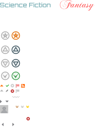
On Science Fiction & Fantasy, we're wondering Exactly which features of SFF.SE's magnificent theme will we be losing?

And if there's go to be a timeline for the changes and if we'll get a preview beforehand or just have it turned on one day.

And what are the technical limitations behind the decision on the custom voting buttons when we're being allowed to keep the badges, considering they're all stored in the same sprite sheet already?

enter image description here

11
  • 18
    Worldbuilding would like to know what we'll be losing, too. Some of the mockups in the earlier post used our site, but there are outstanding questions. Commented Apr 26, 2018 at 14:57
  • For reference I created a similar question to yours on WorldBuilding.Meta. Thanks for making me aware!
    – Secespitus
    Commented Apr 26, 2018 at 16:57
  • 3
    We will post proposed redesigns for each site in that sites meta for feedback. The feedback we will be looking for are related to the specifics of that design (color, font choices, etc). It won't be helpful to get a bunch of feedback on the level of theming supported since we won't be making changes related to that on a site-by-site basis. The images and deck in the original post will be helpful in understanding the detatils (this image in particular)
    – Joe Friend StaffMod
    Commented Apr 26, 2018 at 17:11
  • @JoeFriend: Thanks, I posted a bit of kremlinology on the SFF.SE meta. If you think I badly misinterpreted something, please let me know and I'll fix it.
    – Kevin
    Commented Apr 27, 2018 at 3:54
  • 19
    @JoeFriend Not sure if you're misinterpreting the main point of this answer. The way I interpret it, this isn't primarily a site-specific request, but a general feature-request to keep custom vote buttons as well as custom badges, since they're all stored in the same file. (CreationEdge, correct me if I'm wrong.) Commented Apr 27, 2018 at 14:21
  • 4
    @Randal'Thor I do understand the ask. My last comment was in reference to the other comments above. Unfortunately for custom button lovers the answer is still the same. We're going to keep the core UX elements consistent across the sites.
    – Joe Friend StaffMod
    Commented Apr 27, 2018 at 14:43
  • 10
    @JoeFriend Is the purpose behind that decision specifically to unify the network appearance (and if so, has any analysis been done that indicates that will achieve the desired effect?), or because developing new themes for new stacks takes too much time, or simply some other technical reason? Considering that existing images are already there, I'm still trying to understand the thought process behind not grandfathering them in for existing, themed stacks and just using the default for all new graduated sites.
    – user287266
    Commented Apr 27, 2018 at 16:43
  • 4
    @CreationEdge The existing themes are based on the old design and need to be adapted to support the left nav. In addition to that the old designs have created problems for us in terms of releasing new features in the past. Thus, SO gets somethings, but none of the other sites do. In addition, building a similar level of theming for each additional site that currently is using the "vanilla" theme is not possible due to the amount of work/level of theming that is supported. So, the decision was a combo of the things you mentioned.
    – Joe Friend StaffMod
    Commented Apr 27, 2018 at 17:01
  • 2
    @JoeFriend Thank you for the follow-up. I think those things were probably mentioned or hinted at in the other posts, but there's a lot out there and your concise reply is what I was hoping to find.
    – user287266
    Commented Apr 27, 2018 at 17:19
  • 1
    @CreationEdge In fact this was pretty much what they were already doing anyway. Even when they still did actual designs the later designs were quite toned down with regards to the custom vote/favourite/accept buttons. (Of course they still didn't snatch them from the sites that already had them, though.) Commented Apr 28, 2018 at 13:07
  • 2
    In case they're really hesitant to this, here's an attempt at somewhat of a compromise: meta.stackexchange.com/a/309608/162011. Commented Apr 29, 2018 at 18:45
38

So, to try to state the obvious, and the less so...

For most part I think most sites won't look all that different (and cough I know you guys will keep the worldbuilding robot, right?).

I do think at this point the main point of unhappiness is the voting arrows.

. It was a mistake that we ever allowed for those to be themed.

It seemed a good idea at the time? Its also a design element people see all the time, and least seems like something that means a lot to people. While maybe less practical from a technical viewpoint, it might be worth seeing if a compromise is possible from a community happiness viewpoint.

As someone who uses a 4k monitor all the time, I'd also suggest that as suggested in another answer - using more of the screen on high res monitors would be a mistake. When I read on a 4k/27 inch monitor - I tend to turn text sizes waaaay up. Too much text per page is unreadable. But shrug there's actual UX people to tell you that ;). The current options seem ok.

3
  • 11
    "most sites won't look all that different" - From their current version or from each other? ;-) Commented Apr 26, 2018 at 9:39
  • 2
    Bit of both. Most sites don't currently have super customized themes and will suffer less. I will probably quietly morn some of the very unique designs we lose for the greater good Commented Apr 26, 2018 at 9:43
  • Wow, I'm just noticing that quote again. It really feels like some in the SE team resent us for enjoying our little buttons. That could've been phrased so much better. Commented Aug 14, 2018 at 3:39
36

Resizing doesn't need to mean new icons.

Thank you for making the left nav collapsible! As I noted in an answer there, that meets the real-estate need (albeit in large strokes). I personally don't expect to use the left nav much, so getting it out of my way probably works 98% of the time. That's pretty good!

But I think you might be over-thinking resizing. You noted that making the left nav resizable would require more design work on things like icons and how that never goes as smoothly as you intended. That would be true if you were automagically shrinking the nav. But the request was for user resizing, like on other sites that have a resizable TOC pane. The behavior I've seen pretty much everywhere is that users are responsible for self-inflicted reductions of legibility.

As a user, I don't need you to replace "tags" and "users" with icons if I make the pane too narrow; it's on me to deal with the fact that I can only see "T" and "U". If I dragged the divider between the two panes to change the relative size away from what you recommended, that doesn't have to be your problem.

Resizing might still not be important enough given collapse, but please don't reject it only because of the extra design hit.

22

What will change on Ask Ubuntu?

Currently we have an extra top bar with the same style as the Ubuntu website:

Will this be staying? How will responsiveness be handled here?

9
  • 2
    For all network sites including Ask Ubuntu the navigation will move from the secondary top bar to the left nav. Compare Magento now with our Magento mockup and I think you'll get the idea.
    – Joe Friend StaffMod
    Commented Apr 24, 2018 at 22:10
  • @JoeFriend I've edited to show the bar I mean.
    – Tim
    Commented Apr 24, 2018 at 22:17
  • 5
    It looks like the AU bar outlived its usefulness. It's not even possible to match other *.ubuntu.com domains because developer.ubuntu.com has the bar left-aligned, while community.ubuntu.com and buy.ubuntu.com don't have it at all (or have a completely different top bar). If even Canonical's *.ubuntu.com sites drop it, there's no reason for SE to work hard to keep it.
    – user315433
    Commented Apr 24, 2018 at 22:46
  • 1
    @tim Wow, my eyes just skipped right over it, even when you showed it to me. It's possible we could keep it, however it would be one off work and could break in the future. My preference would be to get rid of it. That said, I need to dig into our agreement related to that site. It is one of our few "special" sites that I need to consider. Would love to hear your thoughts on bro's comment.
    – Joe Friend StaffMod
    Commented Apr 24, 2018 at 23:04
  • 7
    @JoeFriend I've personally used that top bar maybe 3 times in my years on Ask Ubuntu. If it breaks / looks different on Ubuntu.com, that's jarring. Is it worse than it not being there though? There could be a number of power users use it, between launchpad, forums, discourse and ask. I'm a big fan of getting rid of old, unnecessary code, but I'm a also a big fan of not breaking power users' flow. It's the same tradeoff as always!
    – Tim
    Commented Apr 24, 2018 at 23:08
  • 2
    @Tim power users can script it in if needed :P
    – muru
    Commented Apr 27, 2018 at 6:39
  • @muru Not everyone has userscript tools. And even if you want to mess with that, knowing which browser extension to install can be difficult. Also, not all browsers even support this.
    – SilverWolf
    Commented Jun 18, 2018 at 20:53
  • 1
    @seaturtle and those wouldn't be power users.
    – muru
    Commented Jun 19, 2018 at 1:34
  • @muru I'd consider myself a power user, though, and I would love a userscript tool, but I don't know which add-on I would need, or which to trust.
    – SilverWolf
    Commented Jun 19, 2018 at 1:46
18

Integrated site selector and left nav

Left nav vs. site selector

Monica raised a great issue about the relationship of left nav and the site selector. We agree that there is room for improvement here. We looked at some models that attempted to merge the two, but we couldn't get it right. Also, it felt like a radical change. So, we are keeping this one on the back burner for now, but will likely come back to review it.

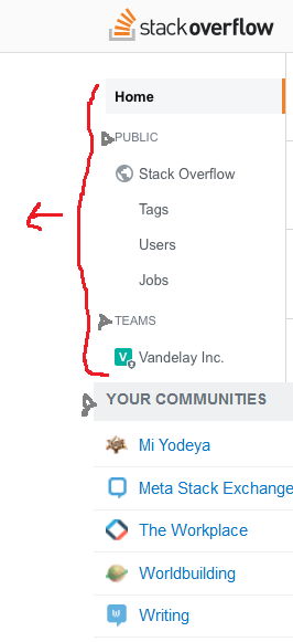
I was imagining something like this (but with unified styling and fonts, of course):

mockup

Make each of "public", "teams", and "communities" collapsible, and add access to all communities like we have now (link and search box), and you get an integrated "layered" approach of site, teams tied to that site, and site as part of a larger group. Everything you need to understand where you are with respect to all of these pieces is collected in one place. Because it's collapsible, it doesn't need to get in the way if a user doesn't care -- maybe you only ever participate on SO and don't care about that other stuff, or maybe your primary interest is your team and you don't care about SO users and tags, or maybe your primary interest is SO but you're also part of a small team -- or maybe you aren't an SO user at all but you participate on a bunch of other sites every day. This last group is ill-served by left nav today but could be well-served by it with this change.

Combined with the left nav being collapsible (thanks!), this would make the left nav a souped-up site selector and so much more -- that gets out of the way when you don't need it, just like the hamburger menu today.

16
  • 3
    That is very close to some of the images we had. There are quite a few complexities there that we would need to figure out. This is definitely something we want to continue to explore, but we have some other critical issues to address first. We might be able to pick this back up later in the year.
    – Joe Friend StaffMod
    Commented Apr 24, 2018 at 16:51
  • 1
    On short screens this would make getting to these links cumbersome, particularly if the sidebar isn't designed to scroll. I prefer the current implementation.
    – Catija
    Commented Apr 24, 2018 at 16:52
  • 2
    @Catija I was assuming it would have to scroll anyway, if they're going to add things like favorite tags and (potentially) multiple teams. Consider landscape on a phone or smaller tablet. Commented Apr 24, 2018 at 17:01
  • @JoeFriend makes sense. You're obviously not going to do everything in version 1; if you're continuing to explore it, that's good enough for me. (So long as I can collapse it out of the way in the meantime, which you've said I'll be able to. :-) ) Commented Apr 24, 2018 at 17:02
  • Maybe. I still think this makes it harder to find. Particularly if they make the top bar behave the same way on the network as it does on SO. Potentially every site would have a different placement for these links... and I don't see how this allows searching for specific sites... I want this menu in a predictable place everywhere and this doesn't fit that as far as I can see.
    – Catija
    Commented Apr 24, 2018 at 17:07
  • 1
    @Catija the search box would be below your list of favorites, like it is today. I accidentally clipped that out of my mockup and didn't go back to try to put it back in. Commented Apr 24, 2018 at 17:11
  • But everything in the sidebar is static and the search bar/results is not. And everything in the sidebar is site-specific but none of this is. It's a huge mismatch.
    – Catija
    Commented Apr 24, 2018 at 17:14
  • 3
    Teams are not static. Favorite tags (shown in a mockup in the question) are not static. Custom searches (ditto) are not static. I don't understand the point you're trying to make. Commented Apr 24, 2018 at 17:16
  • Teams for the user and tags are both static - they don't change after the page is loaded. Actually searching the list requires the sidebar to react after it's loaded.
    – Catija
    Commented Apr 24, 2018 at 17:35
  • @Catija And the list of other communities is also static, so I don’t get your argument either
    – poke
    Commented Apr 24, 2018 at 22:25
  • @poke it's not static. When you search, the list changes.
    – Catija
    Commented Apr 24, 2018 at 22:28
  • @Catija … and that affects the page without reloading how exactly?
    – poke
    Commented Apr 24, 2018 at 22:31
  • Have you tried it @poke ? The page doesn't reload, it's filtered in place.
    – Catija
    Commented Apr 24, 2018 at 22:32
  • @Catija I have not tried it because I don’t have access to that. So thanks for that insight.
    – poke
    Commented Apr 24, 2018 at 22:36
  • 1
    @poke everyone has access... the hamburger dropdown has the site search for every user... unless you're on mobile...
    – Catija
    Commented Apr 24, 2018 at 22:42
16

I would like to contribute to the voting/favourite/accept button discussion with a little alternative that might be some kind of middle-ground. I too would prefer to simply let the sites keep their customized buttons, but if there's really no way to unite this with the goal of having a more standardized Q&A experience, you might at least want to consider giving them some room with regards to the colours of these buttons.

We all know stars are yellow and checkmarks are green. But even within those limits there's a already a broad spectrum of colours used for these buttons all across SE. Keeping those (and maybe even coming up with new ones for new designs) might be a comprise to still have a bit of customization there. And I'd even go as far as saying that the colours of those buttons matching to the rest of the site's colour palette might even be visually more important than some highly elaborate vector graphic.

This would also be much less of a design hassle, since you can (and actually should) often just pick from the site design's already existing individual colour palette (within a broad standard, of course, like "green" ticks and "yellow" stars, ...) without too much effort involved. At the same time you would have them still geometrically support whatever standardized Q&A experience you want to propagate.

13

How will the theme changes affect something like the Hot Network Questions list?

I've often found that while browsing the network through this sidebar, the theme inconsistencies grow more apparent. While I don't have a problem with different icons for upvoting and downvoting, my major issue is with the colours chosen for the links in the Hot Network Questions list. Since the colour of visited/non-visited links changes per site, it can be difficult to figure out which links have been visited already.

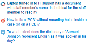
An example of this: Here is what the Hot Network Questions look like on Stack Overflow. Visited links are darker blue and non visited links are lighter blue. This is fairly standard and easy to parse.

Snapshot of the Hot Network Questions on Stack Overflow

Conversely, on Music Stack Exchange, visited links are lighter (the top link in the below image) and non visited links are darker. This means that every time I try to use the Hot Network Questions list through Music.SE, I have to think extra hard about which links I've already visited. In addition, the smaller amount of contrast in the links means it's harder to scan than on other sites.

Snapshot of the Hot Network Questions on Music Stack Exchange

I've used Music.SE as an example here as it's the worst I've come across in my opinion, but there are issues with other sites as well. With the colours of the links changing so often from site to site, it does induce some additional cognitive load to parse these.

So, can we keep this sidebar consistent?

9

Sticky Left Sidebar

At the moment the menu bar across the top is sticky, which is great if you get to the end of a long page and want to get back to home or something.

The left nav at the moment (in it's SO Teams iteration) scrolls with the page, which is ok at the moment, because there's not a lot in it. But as you go "adding value" to it I can see it becoming annoying to have to keep scrolling back up. So having it sticky would be great.

If it becomes longer than the page (especially if the SE sites selector gets added to it - I have a user on all the sites I think, so the "My CommunitiesW bit would be quite large), then it should independently scroll - as in have it's own scrollbar.

1

Can we turn off responsive design?

I use a 900px-wide browser window on the desktop. This used to work quite well, with the Hot Network Questions and such partially offscreen. When I wanted to access them, I would just scroll over to the right.

However, now the main content is squished to make room for the right rail, which I usually don't need. To fix this, can we have a (ideally per-browser cookie-based) setting to turn off the responsive design?

Update: There is apparently a "Disable Responsiveness" link in the footer. However, even with it disabled, the question search results are still in a smaller font than the normal list. This does not happen on other sites without responsiveness, e.g. Worldbuilding. This seems to have been fixed, but it would still be nice to make this setting apply network-wide, not individually on every site.

7
  • That already exists and is mentioned in the post. Look in the footer.
    – Joe Friend StaffMod
    Commented Jun 18, 2018 at 21:00
  • Ah, wonderful, thank you. Do you know if this will be staying?
    – SilverWolf
    Commented Jun 18, 2018 at 21:02
  • @JoeFriend I see it's not shared per-site. Is there a way to copy this setting to all sites at once?
    – SilverWolf
    Commented Jun 18, 2018 at 21:04
  • 1
    There is already an option in the footer and I proposed the same request to the new navigation post. It will get status completed in a few days.
    – Nog Shine
    Commented Jun 19, 2018 at 2:15
  • 1
    FYI regarding your update: that behavior was considered a bug and has been fixed. Commented Jul 5, 2018 at 5:34
  • Why the downvote? Would whoever did it please explain what I can do to improve my answer?
    – SilverWolf
    Commented Oct 21, 2018 at 21:53
  • (Never mind, apparently my edit fixed it.)
    – SilverWolf
    Commented Oct 21, 2018 at 22:21
0

Most of discussion was dedicated to responsive design. As I understand responsiveness is discussed here only for mobile (and maybe tablet) devices, but this is not complete responsiveness, because we have laptops and monitors (sometimes with 1440p or 4k resolution).

As described in answer for question "Can SO have a fluid vs. fixed-width layout?" 50% of space for Full HD resolution is wasted. Situation is even worse for 1440p or 4k displays. Can we have fluid layout for everything bigger than tablet?

7
  • 42
    The thing is, making textual data really, really wide is not helpful for reading it. The longer you have to go left-to-right before you can jump to the next line, the more tired you get reading it. So while I appreciate the need for responsive design, the width having a fixed upper limit is just good UX. For high-resolution displays, you should use that extra space for some other application. Commented Apr 24, 2018 at 13:49
  • 1
    @NicolBolas I think it would be better if content would fit window regardless of browser width. So it would be up to user. Also if you are tired reading text from left-to-right of your display maybe your display is too big or you're sitting too close. But so much space not used (i.e. wasted) even on Full HD, the most popular resolution at the moment. Commented Apr 24, 2018 at 20:23
  • 7
    “maybe your display is too big” – My (ultra-wide) screen is definitely too big, but does that mean that I am at fault now if sites make their content unreadable by not following common UX guidelines? — If you don’t want to waste space on your monitor, then don’t make your browser full screen and use the remaining space for something else. Making content harder to consume is not a solution for this.
    – poke
    Commented Apr 24, 2018 at 22:30
  • @poke Space is wasted even on Full HD. Even if content width would remain fixed but slightly bigger it would be much better than now. Commented Apr 24, 2018 at 22:37
  • 3
    @VadimOvchinnikov: "Space is wasted even on Full HD" Then use that space. Put another window over there. If space is being wasted, that's your choice, not SO's. Commented Apr 24, 2018 at 22:43
  • 22
    @VadimOvchinnikov I'll be honest, i don't really understand your logic. Reasonable line lengths are critical for humans to be able to to read paragraphs. So, a Q&A site doesn't really work when in a maximized window on an HD screen with no upper limit. I have a 4k monitor and use two side by side windows most of the time. Video is really the only case where I maximize. Of course, I'm not a dev or a designer. I'm trying to keep an open mind, but I don't see the case for an ever expanding content area.
    – Joe Friend StaffMod
    Commented Apr 24, 2018 at 23:08
  • 2
    If people want to have the content take up a smaller amount of space, they can resize the window. But, if they don't, your solution leaves them with a bad solution--a bunch of empty space. It also ignores that a large portion of computers users always maximize their programs. Having more than one is distracting. Maybe 10% of the people I know have multiple windows on screen at once. Programmers are probably overrepresented in that group, but SE isn't just for programmers.
    – trlkly
    Commented Apr 28, 2018 at 8:23

You must log in to answer this question.

Not the answer you're looking for? Browse other questions tagged .