38
votes

For further issues, bugs and feedback that have not been covered by existing answers here please feel free to ask a new question.


A few minutes ago, new Post Notices were launched across the Stack Exchange network. This includes all public sites, all meta sites, and all Basic and Business tier Teams (Enterprise tier will get it in a future release).

For our purposes, a 'post notice' includes any status banner shown on questions or answers: deleted, merged, migrated, closed, locked, protected, bountied, as well as any information notices that can be applied to posts by moderators.

As the blog post summarized:

We have some guiding principles that we’re applying as we improve any feedback loops in the Q&A system, including post notices, going forward. Wherever possible we will work to provide better, actionable guidance for all users that helps everyone use the platform successfully while reducing room for public shaming.

I would like to thank the hundreds of users who posted comments and answers to the MSE and MSO meta posts announcing the initial test run. In the 5 weeks since the test rollout on SO commenced:

  • Approximately 71 million notices (of the new style) were shown to users (posts were 50/50 on SO through Monday of this week, at which point we had a silent soft launch to all users on SO)
  • 58% of notices shown are close notices. This is followed by Protected (28%), HasLocalizedVersion (6%), Locked (4%), Migrated (2%), and everything else (Mod, Deleted, Bounty, Merged (2%)
  • 97 answers made on the two meta posts resulted in dozens of changes and improvements. I count 44 cards in my trello board for the project (each card representing a different issue that originated on meta that we addressed or responded to in some way)

Here is an example of how the new notices appear:

closed post owner Closed notice – Post owner

closed high rep users Closed notice – Users with 3,000+ reputation

closed public view Closed notice – Public view

In addition to the visible changes in positioning, look and feel and language, the new system allowed us to consolidate much of the background architecture that is related to post notices, and will enable us to maintain and improve the new notices in a significantly more efficient way than the ecosystem that grew around the old notices allowed us to do. So while this release is a major milestone for us, we do not view this as the end of the product line. As the blog post stated:

This new set of features and improvements is the first of a series of related projects aimed at improving the user experience when a question gets closed. Here are some of the kinds of things you can look forward to:

  • Better guidance for improving closed questions (e.g., in the question editor and via emails) to empower question askers/editors and lower the burden on users who review content quality issues
  • Mechanisms for “hiding” closed questions so they can be worked on out-of-view
  • Easier paths towards re-opening improved questions

We will also continue to iterate on post notices. With a holistic system now in place, this is easier for us to do.

General feedback is welcome on this post, as are and reports. We promise to read everything, and will do our best to engage with the community to address concerns that are raised.

Anticipated Questions

For off-topic close notices that have different versions for public, post author and high-rep users: can we customize those on a per-site basis?

There are plans for releasing additional functions on the Close as Off Topic Reasons editor (currently available to site moderators) that will allow moderators to set these different messages for each Off-Topic reason. Until then, all sites other than SO (and international SO sites) will have the same off-topic language showing up for each of the above viewing scenarios.

Where did the "On Hold" label go?

"On Hold" had been used to label recently closed questions. The idea was that this language would imply less permanence to the current state than "Closed". However, user research showed that this distinction was generally found to be confusing to users at all levels, and did not seem to have an effect on reopen rates. So we have removed this label. All Closed posts are now labeled as Closed but only the label has changed. Edits within the first five days will still put the question in the reopen queue.

Has the help center been updated to reflect these changes?

Yes, we have updated the following help center articles:

Has anything changed about what notices are shown?

No. We are changing what is being shown, and how it is being shown. But not when it is being shown. The same criteria as before apply now as to when specific notices are shown on a question or answer.

I feel like the old notices did X better, can I get that back please?

The old notices are gone for good. And the main structure of the new notices is not going to be changing for the time being (so no, we aren't going to move some of them back down to the bottom of the question) That said, we are open to hearing all suggestions. Make a case for how we can fit your needs into the new notices (taking into account that any changes that we make need to also work in the context of notices that are seen by millions of people every month).

1
  • 2
    There's about 2 pages of answers and a month and a bit. I've had a word with Yaakov, or vice versa, and well- at this point new posts to report new bugs are probably going to be neater. If its here - no need to repost. Else, feel free to handle it as per any other issue on the network :). Despite what the post notice says - its not off topic. It is however of historical significance. I'd also suggest folks not close things as duplicates of this Commented Jan 5, 2020 at 14:01

39 Answers 39

72
votes

The Highly Active Question banner is now only shown to users who either do not have enough rep to answer (10 earned rep), or who have enough rep to unprotect (15K earned rep).

Users who are in between these two privilege levels (and thus are able to answer, but can't do anything about the protected status) are no longer shown this banner.

Highly active question


The "highly active question" banner is still very annoying when reading a Question.

I now see it on most good Questions I find via Google.

It's the most prominent element on the page. It drowns out both the title and the question body.

Please consider tweaking that message, as suggested in the Meta question above.


*I would argue that the message is wrong, too. The question is not "highly active". It is perhaps "highly viewed", or "highly active at some time in the past", but I doubt that the 10 year old programming questions I'm finding via Google are currently "highly active".

This makes the entire banner feel broken. Every time I see it, I do the mental math of "...this question? ...highly active? why?"

16
  • 11
    A lot of these questions should probably be unprotected... We've updated the relevant privilege page to make explicit note of the ability to unprotect and provide guidance for its use.
    – Shog9
    Commented Dec 5, 2019 at 20:06
  • 8
    I was looking at the recently protected posts on SO earlier, @Shog9 ... I couldn’t understand why some of them were protected at all - one had had no activity in months other than votes. We need to do better to help people understand how/when not to use the feature but also to understand what they think protecting the question will do. If (for example) they think it’s going to stop new votes because they’re tired of notifications about 5-year-old questions, that’d help us see how to improve notifications rather than protecting posts.
    – Catija
    Commented Dec 5, 2019 at 21:18
  • 20
    +1 it's so jarring to land on some question from 5-10 years ago and then the very first thing you see is something declaring it's "highly active". Commented Dec 5, 2019 at 21:39
  • 2
    Agree, @cat - I think there's a lot of room for more guidance here, both in the UI and in the privilege documents. Let's not lose track of this...
    – Shog9
    Commented Dec 5, 2019 at 22:45
  • 8
    "Highly active" also doesn't really communicate clearly why some questions should be protected, and would look inaccurate if you can't see all the deleted answers. Commented Dec 5, 2019 at 22:54
  • 4
    I expect people using the feature at least understand what it does, @Catija; I'd be very surprised if anyone using it expects it to prevent votes. The docs explain it straightfowardly in the first paragraph. People using protection seemingly purposelessly may well be preempting bad answers they predict will appear, before any actually do. This practice has been defended on MSO in the past, and at least one such prediction was proved right after unprotection, so it's not crazy.
    – Mark Amery
    Commented Dec 6, 2019 at 0:50
  • 11
    I have seen questions that are a year and half old, be “highly active”, which means “highly active” is a completely useless designation. These questions have seen no recent activity, other than being clicked on
    – Ramhound
    Commented Dec 6, 2019 at 4:18
  • 5
    @Shog9 I think unprotecting these is usually a bad idea. Late answers by people not meeting the rep requirement to answer a protected question on previously very active questions are rarely good. The only real reason I see to unprotect them is because the new wording is very confusing and the notice is prominent.
    – Erik A
    Commented Dec 6, 2019 at 14:56
  • 3
    The issue is protection is meant as a temporary shield against spam/LQ answers to active questions, but it is effectively used as a way to soft-lock a question from receiving new answers from most people once the question has received probably all the different possibly solutions to a problem. Unfortunately it's imperfect at accomplishing that second ask (probably because that's not what it's intended for), as I still find myself seeing useless/bad new answers from users with 100 rep or 50 rep that protection doesn't stop. But without protection, there may be even more bad answers.
    – TylerH
    Commented Dec 6, 2019 at 16:07
  • 6
    It's also a little ironic that, under an announcement that focuses a bit on removing "On Hold" because, despite its intention, it was not being interpreted by users that way, and thus SO made a change to the system to more accurately reflect users' interpretations, SO is defending another tool by its intended use rather than by the (different) overwhelming way it is used in practice. :-)
    – TylerH
    Commented Dec 6, 2019 at 16:09
  • 6
    The thing that strikes me as the most unusual about protected questions is that the banner on the question labels the question as a "highly active question" but then links to a page talking about "protected questions." I've been around long enough to know about protected questions but the difference in name between the banner and the page has thrown me off.
    – dwizum
    Commented Dec 6, 2019 at 20:14
  • 3
    This varies considerably, @Erik. It's true enough sometimes - but IME very few questions should be protected forever. We stole this feature from Wikipedia - we should've also borrowed their notion of a timeout for it.
    – Shog9
    Commented Dec 6, 2019 at 21:17
  • Permanent protection is basically essential on a site like Christianity where it often takes new users a long time to learn the site rules on acceptable answers and standards of research etc. Commented Dec 7, 2019 at 9:10
  • 6
    @Shog9 you can still answer a protected question if you have 10 rep. Some questions on EL&U should remain protected, otherwise you'll get the same asinine "answer" that was posted a year ago and was swiftly deleted by the community, but because that answer is deleted, the new user thinks their contribution is groundbreaking or valuable (read: pedantic), when it is neither. Commented Dec 7, 2019 at 10:59
  • 2
    I just asked a question about how in the world that a question that last saw activity SIX YEARS ago could be highly active. Protected I could understand, but highly active? Split it by age, after a month or more of no activity by someone with a high enough rep make it protected, until then it's highly active. At least it would be less confusing maybe.
    – GB - AE7OO
    Commented Dec 18, 2019 at 13:16
58
votes
+100

The old close notices had their own share of issues that made it desirable to redo them. But publicly displaying the close reason on a question provides an additional benefit of explaining to others why a question is unsuitable in its current form.

Custom close reasons used to show their full text to everyone, which is helpful since they’re all (sometimes rather inaptly) sub-reasons under “off-topic”. They are, obviously, custom close reasons—specific to the site they’re on, and often tailored to address local problems that would not be problematic on most other sites. This makes being able to see those full close reasons important, as without them other people less familiar with that site’s customs will see question closures happening without cause, reason, or explanation.

Unfortunately, with the new post notices, questions closed with custom close reasons now simply say they were closed as off-topic. There’s no explanation of why they're off-topic, and in many cases the questions are about subjects that are entirely topical for the site.

I know there’s still more work being done with question closure mechanics. If (for example) custom close reasons might soon stop being buried under the “off-topic” top level category, and/or if the publicly visible message includes a link to a site's custom close reasons, then letting us know this is a temporary situation to be addressed Real Soon Now™ is probably good enough.
But if we’re going to be stuck with people seeing just “off-topic” for custom closures, that seems like an unfortunate regression. The custom closure reasons no longer speak for themselves.

Could something more informative and accurate be displayed to others when a custom close reason is used?

If the very basic message was an intentional decision, I feel like it’s worth asking: (how) should we publicly clarify these closures so they don’t seem random or unwarranted?

9
  • 26
    Yes, please! This may be more important for some of the smaller sites that rely on custom banners (e.g., on Physics, we routinely close questions as off topic for homework reasons & recently edited the banner message itself to reflect site policy & is now rendered useless by SE changes).
    – Kyle Kanos
    Commented Dec 6, 2019 at 12:46
  • 1
    I don't think there's anything as important as this on this thread. Communicating closure reasons clearly is a vital part of having a clear site scope. While we can probably do better in this regard, that's achieved by going forward, not (as in the current iteration) by gutting the system. It la be nice to see @ Shog9, @ Catija or @ Yaakov give this answer at least a nod of acknowledgement. Or what is this thread for?
    – E.P.
    Commented Dec 7, 2019 at 14:05
  • On SO it seems rather uncommon for a question to be closed with a custom reason.
    – Raedwald
    Commented Dec 7, 2019 at 16:59
  • 14
    @Raedwald It seems worth reminding everyone that there are more sites on the network than SO. Treating things that don't affect SO as if they aren't important is sending the same kind of "a dozen ̵p̵e̵o̵p̵l̵e̵ SE actions pointing out your e̶r̶r̶o̶r̶s̶ site's insignificance feels terrible" death-by-a-thousand-cuts message that a lot of the current round of changes is intended to fix. Please don't tell the smaller sites, by implication or by inaction, that they don't matter.
    – Rubio
    Commented Dec 7, 2019 at 17:18
  • @Rubio Ignoring all the non-SO sites does seem to be a running theme lately.
    – E.P.
    Commented Dec 8, 2019 at 13:58
  • 1
    @E.P. We’re definitely talking about it. These close reasons are really helpful so it’s important that they’re visible. Just for clarity, this is about site-specific close reasons, not “other” custom reasons. I always have to be careful about how I describe them.
    – Catija
    Commented Dec 8, 2019 at 20:35
  • An example just showed up in chat of the confusion caused by this issue. The "off-topic" notice was (and is) displayed on a post which is entirely on-topic, but which was closed for having been cross-posted on multiple sites at once. Very misleading to tell people it's off-topic!
    – Wildcard
    Commented Dec 23, 2019 at 23:39
  • 1
    This is planned for an upcoming project Commented Jan 16, 2020 at 12:23
  • 1
    For a full explanation of the actions taken here, please see this answer
    – Catija
    Commented May 25, 2022 at 22:13
32
votes

Custom bounty notice markdown fails

screenshot

*Edit: this has now been fixed:

new screenshot

1
  • Yeah, was on my list of things to update. Got this pushed live end of last week. Cheers! Commented Dec 15, 2019 at 8:00
27
votes

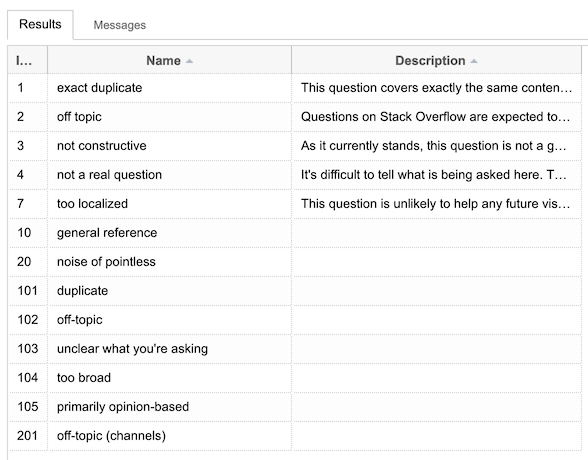
Please update the close reason types in the Data Explorer. Yes, the SEDE wizards probably know 'needs more focus' is the new 'too broad', but future aspiring SEDE users might have a hard time making the connection.

Oh, while you're at it, maybe the Description column can be filled as well :)

enter image description here

1
26
votes

The bounty message appears to blend in the background. Could inverted commas/quotation marks or a new paragraph be added, so the benefactor's announcement is clearer to the TL;DR crowd?

enter image description here

Compare that with the older version, which appeared at the bottom of the page. Note the benefactor's name is highlighted better and the previous font appears to be less squished (IMO).

enter image description here

P.S On a positive note, I like the addition of the clock icon on the bounty notice that's quite effective.

1
  • 2
    We have added quotes around the custom message. I did a quick analysis of the lengths of custom bounty messages, and the vast majority are 1-2 average-length sentences long. So for this length, we are not going to add a new paragraph for the message, as it will push down the notice too far. Quotes should be enough to make it clear that the message is coming from the poster and not from the system. Commented Dec 15, 2019 at 8:07
24
votes

What, exactly, am I 'Submit'ting here?

enter image description here

I recognize it as the 'Yes, that solved my problem' button (you see it as question author when there are pending votes to close as a duplicate). So what I'm submitting is a 'Yes' - but that's shown nowhere in the banner. I expect a statement somewhere that I can submit, or alternatively bring the wording from the old button back.

(Also, I'm not really sure if it's recommended to have a button in the same color as the banner here. Perhaps somebody skilled in UX can comment on that, or post their own answer here.)

7
  • @YaakovEllis this one but it had already been closed in the meantime.
    – Glorfindel Mod
    Commented Dec 8, 2019 at 17:56
  • @YaakovEllis Sure, will do!
    – Glorfindel Mod
    Commented Dec 8, 2019 at 18:36
  • What does it actually do when I press submit. I had an option to mark either yes or no and press submit, but I was afraid of what was going to happen. There should be only an option to accept the duplicate without submitting anything.
    – Dharman
    Commented Dec 19, 2019 at 14:28
  • @Dharman it seems I encountered a bug and the actual banner should be a bit clearer in this case.
    – Glorfindel Mod
    Commented Dec 19, 2019 at 14:30
  • @YaakovEllis this bug report seems related
    – Glorfindel Mod
    Commented Dec 23, 2019 at 9:31
  • @Glorfindel yes, it is the exact same issue Commented Dec 23, 2019 at 9:48
  • This issue has been resolved. There had been one part of the code that was getting the duplicate selections, and another where it was only showing the duplicate selections if they had an answer. So if there was only one suggestion and it didn't have an answer, you would see the notice but would not be given anything to choose from. Has been fixed to show all duplicate suggestions even if they don't have an answer. Commented Jan 9, 2020 at 8:45
19
votes

; see Shog9's comment on another feature request

The dupe posts really seem to de-emphasize the idea of editing one's post to improve it. Instead, the posts seem to emphasize just askign a new question altogether.

Example:

Your post has been associated with similar questions. If these questions don’t resolve your question, ask a new one.

enter image description here

Why is there no mention of editing the post as a suggested option??

As written, this seems to promote leaving behind a mess of closed questions instead of improving upon or clarifying them (a learning moment for some users as well!).

3
  • 5
    thanks for making me privy to this, Glorifindel. glad to see you had similar thoughts. regardless of Shog9's stats, I still disagree with the approach because it's ignoring the psychological impact this has on new users. I like the old phrase If those answers do not fully address your question, please edit this question to explain how it is different or ask a new question because it left open the possibility that a user could self-improve. Commented Dec 6, 2019 at 7:11
  • 7
    The current ask-a-new-question only approach also fails to recognize that once a user tries to do that, many mods will quickly pounce on them as simply duping their own previous question (even if it is different). I have seen too many hundreds of examples of questions being closed as dupe when they really are not. I feel like some users will just get stuck in a loop of never getting their question answered. :/ Commented Dec 6, 2019 at 7:11
  • Have you read a comment regarding shog9 message? : @YaakovEllis Shog's comment doesn't say it's not useful, just that the problem is elsewhere: in the guidance for people which questions are already closed. Once that is fixed, the desired effect would be achieved. – Braiam Nov 15 at 11:53 Commented Dec 8, 2019 at 21:27
19
votes

In the old notices, on questions that were deleted by the Roomba, the notice used to indicate the specific criterion under which the post was deleted (e.g. RemoveAbandonedQuestions, RemoveDeadQuestions, etc.)

However, the new notice no longer indicates this; it's now back to the previous behavior of merely stating matter-of-factly that it was just deleted by Community.

Can this please be re-added?

3
  • 1
    What is the use case for needing to see this data on screen? Commented Dec 10, 2019 at 8:15
  • 3
    @YaakovEllis It would be very nice to know which specific criterion my post was deleted under, not only for the sake of transparency, but also so I know how exactly to fix a given question so that the same criteria no longer apply (or else, the question will be re-deleted again if it gets undeleted). Commented Dec 10, 2019 at 10:06
  • 2
    This info will not be shown on-screen. It is scheduled to be made more accessible in upcoming UI/UX improvements for post timelines. Commented Dec 15, 2019 at 21:40
18
votes

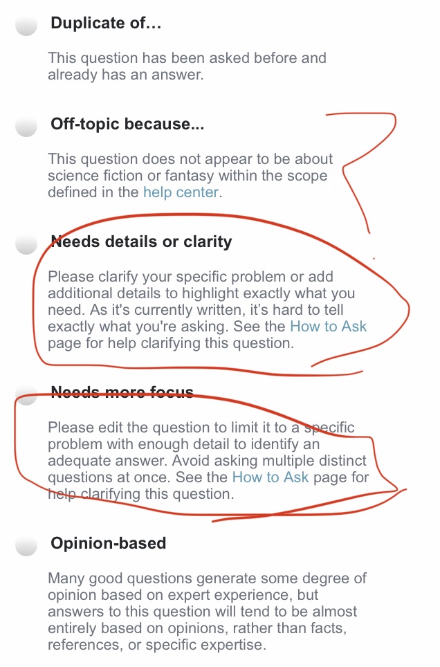
Update the API to use the new close options. (This will also update the texts shown in the mobile apps, even without having to release a new version!)

Example:

enter image description here

Close reason values have been updated as follows

  • duplicate (Id 101) >> Duplicate of...
  • off topic (Id 102) >> Off-topic
  • unclear (Id 103) >> Needs details or clarity
  • too broad (Id 104) >> Needs more focus
  • unclear (Id 105) >> Opinion-based
10
  • 1
    Please, don't. This will break software relying on these values.
    – Dharman
    Commented Dec 9, 2019 at 21:05
  • 3
    For an API, in general, fields which are intended to be machine readable shouldn't change. If the field is intended to be used as something human readable, then it's usually OK to change it. Unfortunately, for close reasons, the SE API doesn't do a good job of keeping this separation. For example, closed_details.description is formatted as clearly intended to be human readable (it's HTML text), but it's also the only place where some information exists in the entire response provided by the API for a question (actual off-topic reason). Thus, it must be parsed to find that information.
    – Makyen
    Commented Dec 10, 2019 at 23:04
  • 2
    The closed_reason and closed_details.reason have the appearance of being intended for machine consumption, but this answer implies they are directly used as human readable information. Note that both of these fields were recently changed (i.e. in the last day, or so), such that the new values have broken a few/several scripts which relied on the values to determine the reason for closure.
    – Makyen
    Commented Dec 10, 2019 at 23:05
  • 5
    I have updated the close reasons accessed by the API. I appreciate that this might break things that rely on these values. Really sorry about that. However, the choice is either to never update them (and then have confusing close reasons that are out of sync with what is shown on the site) or to update them (as infrequently as possible) and have short-time pain for long-term clarity. I chose the second. To help, I put the exact close reason value changes into the answer above. Commented Dec 19, 2019 at 12:23
  • @YaakovEllis Could you confirm that the list you edited into the question is the exact list as it appears in the DB and in the API? We need to update our apps and scripts so that these values match. I would like to make double sure that there are no typos here.
    – Dharman
    Commented Dec 19, 2019 at 17:44
  • @dharman yes, I copied them directly out of my db change script. They will be live on sede on Sunday when it refreshes, if you want to double check there Commented Dec 19, 2019 at 18:53
  • @YaakovEllis I disagree. The duplicate reason is actually called Duplicate of… You used ... instead of Which is the correct one? Also the 105 reason was not unclear before.
    – Dharman
    Commented Dec 19, 2019 at 18:55
  • @Dharman you can see the current reasons here as well. I couldn't use the ellipsis character in the db, so it has three periods (and the API pulls from the Db). The Ids are accurate, sorry if I messed up one of the old values. Commented Dec 22, 2019 at 12:27
  • @YaakovEllis I am 100% sure I am getting elipsis via API. This is the exact value: Duplicate of…
    – Dharman
    Commented Dec 22, 2019 at 12:29
  • I believe you. Feel free to update the answer. Commented Dec 22, 2019 at 12:31
16
votes

Update to functionality: MigratedFrom notices are now hidden after 60 days from migration (you can still see the migration history in the post timeline). This does not apply to the MiratedTo and MigrationRejection notices, which will continue to be shown as normal.

Can we hide the "migration" banner if the question was migrated a long time ago?

If a question was migrated just recently, the notice is completely relevant. However, if the question was migrated several years ago, the fact that it was migrated originally isn't necessarily something that needs to be highlighted on the very top of the post.

Back when the migration notice was below the question's content, this didn't really matter, but as it's now at the very top (displacing other notices such as the one about protected questions), it just gets in the way.

This is especially a problem when reading a large portion of posts on this site: many of them were originally posted on Stack Overflow back in 2008-09 back when it was typical to post them there (under the tag, anyone remember that?), and were later migrated when this Meta site was established. The new notice just gets in the way of reading.

Can we please make it so that if the question was migrated some [x] time ago (e.g. one month, six months, one year), the post notice regarding the migration is hidden, and only visible in the post history?

Another, potentially more preferred alternative is to make the notice disappear once the migration stub on the original site has been deleted (which usually happens automatically 30 days after migration). Many community members do believe that that's the time that the destination site has decided that the question shouldn't be sent back to the origin site (i.e. rejected) and that it has basically "settled" into the new site, and this has meaning in the system's operationalization too: questions that are closed after the migration stub has been deleted aren't marked "rejected".

I'm aware of Hide notice for migrated questions after 30 days, but I didn't particularly care about it at the time since the notice was in a fairly non-intrusive spot. However, it matters a lot today, so I'm answering this with a similar request.

5
16
votes

Does this answer your question?


The new auto-comment when you cast a close-as-duplicate vote is:

Does this answer your question? New Post Notices are live network-wide

it formerly said:

Possible duplicate of New Post Notices are live network-wide


The common thought in the above posts is that the new question phrasing of "Does this answer your question?" encourages a conversational reply.

A conversation is not necessarily what the flagger wants (or what Stack Exchange should encourage) when marking a question as a duplicate.

The ask here is to change the auto-comment back to a phrasing that does not encourage a follow-up conversation or a "thanks!" comment reply.


From the comments on the above posts:

  • I completely agree that this is often not the message I want to give when flagging as a duplicate. I'm really not so much asking as telling. And this is especially the case when a user posts the same (or very very nearly the same) question multiple times. Even if the prior one wasn't answer, the newer one is still a duplicate. It also implies that the linked duplicate should answer OP's question exactly, but duplicates are often not simple copy/paste answers.

  • The change I have observed with this is in the reply I receive when flagging the duplicates, they used to be universally negative, but since this small change I have been getting "Yes, that is what I needed!" / "That really helps thanks!" / Just what I was looking for!".

    This indicates that the change in wording has changed the perception of these comments and it is nice to receive some thanks for the effort of finding these duplicates for a change.

  • This wording is too passive. I'm not asking the OP if their question is a duplicate, I'm telling them that it is.


Answer

Confusing comment “Does this answer your question?”

Yaakov has marked your request as "deferred" to indicate that, while we believe your concerns likely have merit, we can't address them right now; we'll revisit this in the future once we have a better idea of how best to do so.

https://meta.stackexchange.com/a/340573/281934

4
  • 4
    New users (from 1st-person experience) don’t understand the site, and we’ll get a ton of annoying replies every we start to close a duplicate now...these notices sacrifice clarity and accuracy for...something? I don’t think they’re any more useful for new users, just worse for normal users. Commented Dec 7, 2019 at 23:56
  • 1
    I am not sure what the actual ask is here, but the new language is status-bydesign. One of the posts that you linked to has some good anecdotal evidence related to this change. Commented Dec 8, 2019 at 18:49
  • 1
    @YaakovEllis, can you confirm that it is "status-bydesign" to have thanks-comments and comment discussions on posts flagged as duplicate? Commented Dec 9, 2019 at 16:09
  • The new auto-comment is much more welcoming, and I don't have a problem engaging in dialog with the OP if they aren't happy with the dupe target. Sure, sometimes it's a blatant dupe, and there's no point in having a discussion about it. Also, I'm concerned that the new auto-comment will discourage some people from dupe flagging or closing because they don't want to have a discussion about it. But in those situations you can just edit the auto-comment.
    – PM 2Ring
    Commented Dec 14, 2019 at 13:48
15
votes

Not sure if this is a bug because there's probably a good reason it is what it is, so I'll make it a support tag.

On the closed notice, “want to improve this question?“ there is an icon showing a glowing black light bulb. Why black? Furthermore, it's not immediately apparent what the image represents until you enlarge it.

Could it not be an outline, which would make the bulb appear transparent/tinted blue, and change the dots into rays or simply add a bold exclamation mark?

cropped image of post notice, asking "Want to improve this question?” showing a glowing black light bulb

4
  • Yes, there are different ways of drawing light bulbs. We feel that current iteration is sufficient for now. Commented Dec 17, 2019 at 8:17
  • 3
    That black lightbulb looks a lot like a bomb: 💣
    – PM 2Ring
    Commented Dec 17, 2019 at 8:30
  • 1
    @PM2Ring Yes, it does now you mentioned it. If someone can confirm that black light bulbs are also used to represent "eureka" moments that too would be enlightening. Commented Dec 17, 2019 at 10:37
  • 1
    @YaakovEllis nope, I hoped that after a few weeks the image would grow on me but it hasn't really. I now see a super shiny black snooker ball It doesn't look like a light bulb because people don't think of them as being made of black glass. Commented Dec 22, 2019 at 18:02
14
votes

Thank you very much for updating the help center articles in a timely manner.

However, it would be very nice if the SE team could also update the relevant posts here on this site to reflect the changes as well. Specifically:

While I could thoroughly study the system's new patterns and rewrite them all myself, that will take me quite a bit of time (during which time the posts - official documentation, mind you - will show incorrect information), and as you (the SE team) have full knowledge of the new system, you can do it a lot faster.

1
  • 4
    Thanks for the suggestion, these posts will be evaluated for changes that we can make Commented Dec 5, 2019 at 19:25
12
votes

General feedback is welcome on this post, ...
"On Hold" had been used to label recently closed questions. The idea was that this language would imply less permanence to the current state than "Closed". However, user research showed that this distinction was generally found to be confusing to users at all levels, and did not seem to have an effect on reopen rates. So we have removed this label.

I never heard of anyone being confused except people with 1 rep, but other people kindly explained in the comments what the shortcomings were and what was necessary to get it reopened.

Now it's clear it's closed.

"We've closed your question because we didn't like it, have a nice day ...".

That's not welcoming or helpful.

Where it's clear that the question is unwanted, such as spam or a "programming question" on a non-programming site, closing is fine.

When it's an unclear question, missing necessary details to reproduce the problem and confirm, lacks focus, or seems opinion based, then a hold is better than an outright closing.

In that case it would be better to say something like: "There were some problems [insert canned problem description] with your question and it's been placed on hold. You can re-edit it or wait to see if some advice is offered in the comments. Please read the help or "How to ask ..." FAQ if you need immediate assistance.".

0
11
votes

On all my sites other than this site, I don't have enough reputation to vote to close posts. However, on some of them, I do indirectly participate in the closing process by flagging posts. As such, I'd really like to see the version of the notice shown to those users, even though I may not have enough reputation to vote to close.

Can we please have a setting in the profile to allow users to see those notices if they want?

If that is not possible, can the reputation requirement to see the full notice please be dropped to, say, the established user privilege (1,000+ rep on designed sites)?

7
  • 3
    I would rather there be an association bonus than lower the rep threshold; e.g. if you have 3k rep on one site, then all sites you have an account on should see the expanded banner.
    – TylerH
    Commented Dec 6, 2019 at 16:12
  • 1
    @TylerH For many years, I didn't have an account here, but I still participated in the closure process through flagging (and having 1,000+ rep). If this were implemented your way at the time, it would have definitely gotten in my way. Commented Dec 7, 2019 at 1:34
  • 3
    We are intentionally only showing the details to users who have the ability to take action (vote to close/reopen). Not going to change this right now. As to changing the rep requirements, that is tangentially related to this release. If you feel strongly about it, please make your case of a separate post. Commented Dec 8, 2019 at 13:34
  • @YaakovEllis Is there any other way for <3k users to see specific reasons, or are they stuck with asking a 3k+ user every time? Commented Dec 8, 2019 at 21:24
  • @SonictheReinstateMonica-hog The data is available from the SE API, or at least it used to be. I've been considering writing a userscript which added those back in. I expect there will be some changes in the details of what the SE API provides, but I don't think that's happened yet.
    – Makyen
    Commented Dec 9, 2019 at 7:00
  • @SonictheReinstateMonica-hog Not sure how such a feature can "get in the way" of anyone regardless of rep. Being able to see who closed your question is a privilege in the normal sense of the word. If you want to effectively participate in moderation of a site, I think joining the site is a perfectly acceptable barrier to impose.
    – TylerH
    Commented Dec 9, 2019 at 14:18
  • @TylerH Ah, sorry, I noticed my comment was unclear. I meant, I didn't have an account on this site (the sole site where I have 3k+ rep) until much later after I joined the SE network; back then, on other sites where I had accounts, I participated in the closing process by flagging posts. Commented Dec 9, 2019 at 15:38
11
votes

Please remove the meta messages like:

Viewable by the post author and users with the close/reopen votes privilege

... because they're redundant. If I'm seeing the message, I'm the OP or someone with the pertinent privilege. I think these "meta" texts are more appropriately placed here in Meta to describe when the various messages are shown & to whom.

4
  • 1
    There is a related request on the "New Post Notices rollout on Stack Overflow" question, which was marked status-deferred.
    – Makyen
    Commented Dec 6, 2019 at 19:18
  • 1
    Ahhh, thank you, Makyen! I searched only this page for the text, but I still would have missed it in an image. Yaakov's comment "This text will be removed as part of the upcoming project" is in the right direction for me, as long as it applies to all of the notices' "meta" text. Commented Dec 6, 2019 at 19:23
  • This is redundant also because /revisions anyway tell me where to look for voters.
    – anki
    Commented Dec 7, 2019 at 9:56
  • 2
    This is not happening right now. Will potentially be part of upcoming projects addressing related sections of this UX Commented Dec 8, 2019 at 13:39
9
votes

/

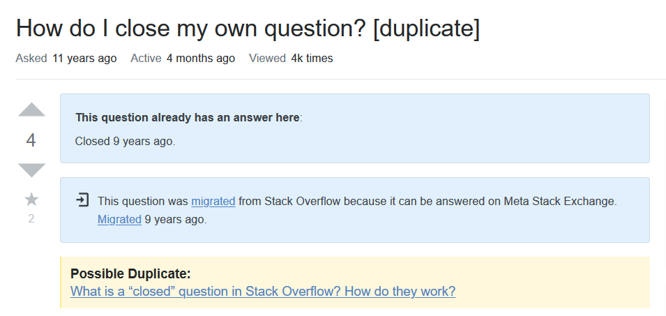
In the past Community user used to insert the links for duplicate. But the new post notices on those questions looks somewhat weird. For example:

enter image description here

13
  • 2
    This is a known issue; the team's already marked it for review on a prior question reporting this. Commented Dec 5, 2019 at 19:16
  • 9
    WontFix/ByDesign: The original way that questions were marked as duplicate inlined the duplicate notice in the question body. When we eventually moved (~5 years ago) to recording the duplicate question relationships to a proper data structure, an effort was made to extract the previously inlined duplicate question links. For a variety of reasons we were not able to extract all of these, so they are staying inline. For these questions (like what you have linked), the post notice at the top is for a duplicate, but it doesn't include a link, as the link is included inline with the post. Commented Dec 5, 2019 at 19:20
  • @YaakovEllis are you saying that you do have a reference to the duplicate-target, but you hide it because it's already contained in the Question text? Or that you do not have a reference to the question? If the latter, is there a way we can fix it? Here's another one that I just organically found.
    – pkamb
    Commented Dec 5, 2019 at 22:36
  • 1
    @pkamb for the majority of them we were able to extract a reference source and we are hiding it (this happened years ago). The problem is that we could not extract 100% of the sources and remove 100% of the inlined text in an automated fashion without running into issues. So the decision was made to continue to use these inlined links. In theory we could build a tool that would allow authorized users to remove the inline link and add it to the post. Unfortunately, we have so many other projects in the pipeline right now that this has a pretty low chance of happening. Commented Dec 5, 2019 at 22:43
  • @YaakovEllis IMO just display both the "real" duplicate and leave the inline. Then let people edit out the duplicates as they find them. (If I edit out the in-question-dupe, will the real dupe suddenly appear?)
    – pkamb
    Commented Dec 5, 2019 at 22:45
  • 1
    @pkamb we considered that. But it then shows the same link twice and looked even weirder. Of course, folks might edit it out. Or they might not - while hundreds of people see the redundant link. Thus, we have the current solution called out here. And if you edit out the question, the real dupe will not appear - it is based on the date when the change was made to the duplicate system. Anything before that date is assumed to be inlined. Commented Dec 5, 2019 at 22:48
  • 6
    @YaakovEllis In the alternative, please consider making the notice “... already has an answer below.” instead of “... already has an answer here.” in the case where you are suppressing the redundant link.
    – Rubio
    Commented Dec 6, 2019 at 4:15
  • 3
    @YaakovEllis If the dup link is shown in the post notice, then users with edit privileges can just edit out the notice in the question Markdown and the question is good to go. With the duplicate hidden, only gold badge holders in a tag the question has and moderators can fix it. There are a lot more people who have full edit privileges than who have gold badges and moderators. You're basically saying "this wasn't fixed because we didn't have the human-power to go through these", but SE chooses not to use the large number of people who have full edit privileges, who could fix these.
    – Makyen
    Commented Dec 6, 2019 at 19:02
  • 4
    I see this as an area where SE could involve the community in helping to maintain the site. It's an opportunity to develop better relations with the users who participate in meta by engaging them in a mutual activity. It would be relatively easy and cost only a moderate amount of time from an SE employee to post a question on the affected Metas asking for help from people willing to take the time to do the needed editing (and reporting those questions where the correct dup-target wasn't automatically selected).
    – Makyen
    Commented Dec 6, 2019 at 19:02
  • @YaakovEllis I'm also missing the [Edit] button on the new post notice that would allow me to update the list of duplicates.
    – Bergi
    Commented Dec 30, 2019 at 14:06
  • Ah, editing the list manually (by reconstructing the edit url) "works", but still doesn't show up in the new post notice. See stackoverflow.com/posts/8433459/revisions for example
    – Bergi
    Commented Dec 30, 2019 at 14:13
  • @Bergi if you want to report a new issue, please make a new post. It is hard enough to track issues in answers here. No good way to do it in comments. Commented Dec 30, 2019 at 14:16
  • @YaakovEllis I guess I was just confused about the workflow for editing inline duplicate links, but I see now that it is WontFix/ByDesign as well, for the reasons you gave above.
    – Bergi
    Commented Dec 30, 2019 at 14:20
9
votes

How exactly are older (pre-2013) close reasons handled by the system?

In particular, how does the new post notice system handle the following deprecated close reasons?

  • not constructive
  • not a real question
  • too localized
  • general reference
  • off topic (old, notice the lack of a hyphen)
  • noise or pointless

From what I can tell, the first two have been remapped to newer close reasons ("Opinion-based" and "Needs detail or clarity"), and all of the remaining except "off topic" simply show the old text, without the "Closed" or the "It is not currently accepting new answers". What was the reasoning behind the implementation details of these, and what happened to older "off topic" closures (which I couldn't test)?

1
  • 6
    Your analysis is correct. The first two were remapped, and the remaining use the old language. Due to the age of these questions, the lack of exact parallels between the old and new reasons which would dictate obvious remapping paths, and time constraints, we decided to leave the old questions with their old text.The old close reasons live in database tables for reference, and are marked as inactive. Commented Dec 5, 2019 at 19:36
9
votes

: add a statement about re-opening.

In the spirit of being nice/welcome, these close-notices often feel blunt and final for new users.

it is currently not accepting answers

They might not know that some extra effort might result in the post getting reopened!

It would be really great to just add that extra bit of assurance that with further effort and improvement that the post could be voted reopened.

Sure, the user should take the tour and visit the help pages to learn this, but honestly many new users or those passing-through don't. Here's another chance to capture these users and quickly teach them how to use the site while (hopefully) simultaneously improving their question and SE overall.

Example suggestion (using the existing language):

Add details and clarify the problem you're solving. This will help others answer your question (and trigger a community vote to reopen your post so that it can receive answers again). You can edit the question or post a new one.

  • Not perfect, but it demonstrates my point.
6
  • by the way, I always thought this was a shortcoming with post notices, even with the original posts. But if you're updating them, now seems like a good time to add this feature-request. Commented Dec 6, 2019 at 5:50
  • 2
    See Yaakov's comment underneath an earlier answer: meta.stackexchange.com/questions/339700/…
    – Tinkeringbell Mod
    Commented Dec 6, 2019 at 8:27
  • 4
    @Tinkeringbell The problem with things like that is it's routinely "we're not doing this really easy, quick change, because we're planning on doing this super great thing down the road", but A) it doesn't help reduce the problem between now and whenever the super great thing actually happens, and B) SE has a long history of not actually releasing the supper great thing. Even if we assume the super great thing actually does happen, and happen moderately soon, it doesn't justify not making an easy change now that helps people in the meantime. It's not like this takes a lot of dev time.
    – Makyen
    Commented Dec 6, 2019 at 19:10
  • 1
    @Makyen hey, I'm just trying to help out by linking a relevant comment from underneath a previous answer :) I think asking Yaakov (who wrote said comment) for more information on a probable timeline for 'super great thing' might increase your chances of getting an answer and perhaps a bit of hope too... I do agree that if these changes never happen, we're probably stuck with things being more obscure than they were to start with and that that might cause trouble. But I'm willing to wait and see for 6-8 months before I start pushing people about that ;)
    – Tinkeringbell Mod
    Commented Dec 6, 2019 at 19:29
  • 2
    @Tinkeringbell Sorry about that. I should have gone to the source. I'm definitely willing to wait for 6–8 for whatever the super great thing is. I'm just frustrated with some super great thing that's (currently) planned for sometime in the future being a justification for not taking quick, easy steps in the present which can significantly reduce the negative impact of not having the super great thing. Of course, SE isn't the only ones which do that, as it's a fairly common theme in tech, but SE does do it quite a bit.
    – Makyen
    Commented Dec 6, 2019 at 19:47
  • 2
    I hear what you are saying. The thing is, we previously had language up there recommending that users edit to reopen. And what it led to is...almost no edit, and from those edit, almost no reopens. So we are (intentionally) removing the dangling carrot of the reopen from the language here. Not because adding it is a good temporary band-aid fix. But because we don't think that it accomplished anything positive (and can even be negative). We are aiming for UX changes that will hopefully improve close/reopen. Adding this language back here is not part of our intended solution. Commented Dec 8, 2019 at 18:41
9
votes

operationally/technically, semantically;

If I'm the author viewing one of my deleted posts, I find it rather impersonal for the notice to say:

This post is hidden. It was deleted [x time ago] by the post author.

If I'm viewing my own deleted post, can the notice please be changed to say "you" instead? Example:

This post is hidden. You deleted this post [x time ago].

1
  • 1
    I have updated the notice to use your suggested text for self-deletions. Thanks! Commented Dec 9, 2019 at 20:15
8
votes

It was clearly indicated in a prior post that all of the feedback from this other post had been considered internally for implementation.

However, as far as I can see, neither of my two suggested ideas have been implemented:

Why were neither of these implemented? Can I please find out what pros and cons were brought up internally on these, and the steps toward the internal decision to not implement either of these?

11
  • 2
    Under the "What's Next" section of the blog post: "Easier paths towards re-opening improved questions." It sounds like the process to re-open closed questions is under review, which likely addresses your first point.
    – LShaver
    Commented Dec 5, 2019 at 19:13
  • 11
    Team members read everything on that post. It did affect our decision-making and planning. Sorry if we were unable to communicate all of the thought-processes back to you. We are not changing the language in this release to be more clear about reopening paths (as had been in the previous language) simply because practically no closed posts ever actually get reopened. Instead, we are going to be focusing on alternate UX work that will encourage reopening. This should be included in an upcoming project. Commented Dec 5, 2019 at 19:31
  • 5
    As far as locating the notice next to the answer box: we are going for a consistent location (top of the post) for all notices. We realize that in some situations this has the potential to add confusion (or not). We will be taking this into account moving forward as we explore additional avenues for improving the usability on the site for all users. Commented Dec 5, 2019 at 19:33
  • 4
    @YaakovEllis: "simply because practically no closed posts ever actually get reopened" - this might be true on SO, but we have lots of questions on RPG.SE that get closed and then fixed and reopened. Dunno what percentage of closed questions that is, or where I'd see such stats, but it doesn't feel like SO's experience matches ours.
    – V2Blast
    Commented Dec 5, 2019 at 22:32
  • 1
    Here you go, @V2Blast rpg.stackexchange.com/tools/…
    – Shog9
    Commented Dec 5, 2019 at 22:47
  • 3
    One other note on the "5 days to reopen" thing - that threshold is totally arbitrary, and will almost certainly change in the future; realistically we could make that unlimited without appreciably affecting anything right now. Tying it to a UI change made sense in 2013 when we had very little data on this stuff, but it's somewhere between confusing and actively misleading today... Getting rid of it frees us up to investigate more useful guidance.
    – Shog9
    Commented Dec 5, 2019 at 22:59
  • @Shog9: Thanks! That is interesting, if a little hard to parse some of it :)
    – V2Blast
    Commented Dec 5, 2019 at 23:01
  • @yaakov Are there stats on reopening questions through editing for every site? I guess I can find a SEDE query, but I don't know how to run it for every site and keep sanity...
    – Athari
    Commented Dec 6, 2019 at 0:53
  • 1
    @YaakovEllis Over on Puzzling it's actually rather common for closed questions to be reopened. We have a custom close-reason for "looks like this is a puzzle you didn't make up yourself; that's fine but you need to give it proper attribution" -- we want this both to avoid plagiarism and because some other local rules need that information -- and usually after we put a question on hold for that reason the poster provides the information we asked for and the question is reopened. Commented Dec 6, 2019 at 12:12
  • 2
    Of course Puzzling is a bit of a weird case in lots of ways, but I wouldn't be surprised to find that a number of other sites have more reopening than you think. Commented Dec 6, 2019 at 12:13
  • 4
    V2Blast & @Shog9 - It's over 55% (25+33) on Space.SE, and I suspect QC.SE and Photo.SE (where I can not see), because people on those sites often help people to repair potentially good questions. --- What encouraged a repairing edit was the "on hold" and supportive comments. Some sites are not so supportive.
    – Rob
    Commented Dec 6, 2019 at 15:35
8
votes

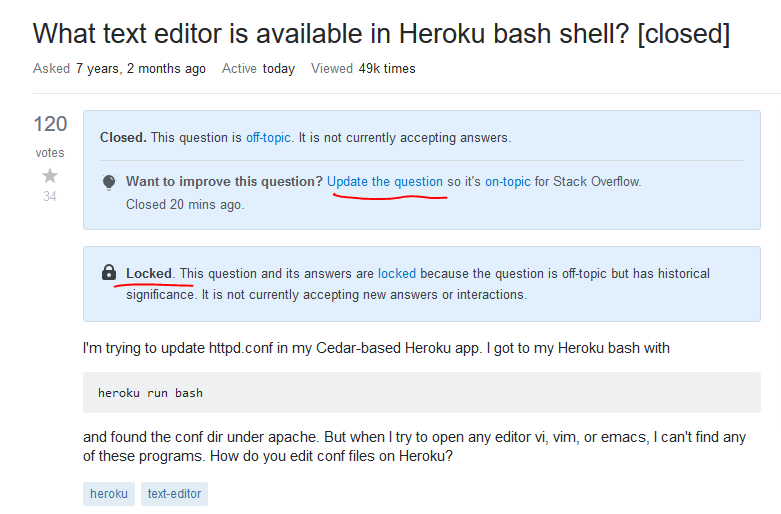
The combination of an "off-topic" banner and a "locked" banner results in the off-topic banner showing incorrect (or misleading) guidance:

Update the question

You can't edit locked questions, and in many cases they shouldn't be edited at all.

enter image description here

1
  • 2
    status-completed: The instructions to "update the question" has been removed from almost all instances of closed notices where the post is locked in such a way that the user cannot edit the question. Commented Dec 19, 2019 at 14:44
7
votes

The new "too broad" and "unclear what you’re asking" notices are too similar. If I'm quickly trying to vote to close a question as one, they are really similar looking when quickly scanning the page to find the right button:

they’re very similar

The first words of the descriptions and titles are the same, unlike the old ones, which had totally different words. They also use similar vocabulary more than that, both asking for a "specific problem".

For people who were used to really quickly knowing what a question was closed as, which thing to click to close it, etc. this isn't great.

7
  • If I'm quickly trying to vote to close a question as one… Why the rush? before casting a vote to close, one should spend at least a minute reflecting. Commented Dec 7, 2019 at 20:57
  • @Mari-LouA it’s just that it feels like a really unnecessary obstacle to close voters to have such similarly worded close reasons. Commented Dec 7, 2019 at 21:24
  • @Yaakov wouldn’t declined be better here? I’m asking for something that is just more distinct between the two different reasons. Commented Dec 8, 2019 at 18:55
  • 1
    Ok. If it makes you happy. It is declined because the current wording is by design. Commented Dec 8, 2019 at 18:57
  • 1
    The "needs more focus" one is very confusing to me. Why is it calling for "enough detail"? Why is it suggesting "clarifying"? Those two have their own close reason. Usually these questions need "less" not "more". They need to be pared down. They need extra questions removed. They need a narrower scope. It shouldn't take an entire book to answer the question. People closing questions are going to have a hard time distinguishing it from the previous close reason. This text isn't going to help anybody get their question re-opened. This message isn't helpful at all. Commented Dec 17, 2019 at 18:58
  • I'd go with "Needs to be pared down -- Please edit your post to limit it to a single question that could be answered in a few paragraphs. See the How to Ask page for help narrowing the focus." Commented Dec 17, 2019 at 19:03
  • 2
    At the very least, it should change "more focus" to "narrower focus" and differentiate the "See the How to Ask" line from the previous reason. Commented Dec 17, 2019 at 19:08
7
votes

Is this a bug or a status-by-design that a moderator's handle is no longer visible on a lock notice? Earlier, it used to show "Locked by ABC(diamond)...lock notice)". Now, it just shows "Locked...lock notice". I noticed this change in this post on front page of meta.

Can we please get the handle/name of the moderator back into the notice? It is important for both transparency and accountability purpose. I know that I can see the handle by checking the edit history, but a new user whose post gets locked is sure going to be a bit confused without knowing who locked their post.

1
  • 2
    This is by design. There is no need for a new user to know exactly which mod locked the post. If there is an issue, any mod should be able to respond to it (and we want to encourage this, as opposed to implying that only the mod who locked the post can handle it). For accountability purposes, the info on who locked it is still available for those who need to know. Commented Dec 12, 2019 at 9:17
7
votes

Update: This has been implemented. It looks like this:

new screenshot


When you suggest an edit and you don't have enough reputation to have it live immediately, it needs to be peer reviewed. When this happens, you see this post notice in the post you want to edit:

enter image description here

Wouldn't it be good, for consistency sake, to have these banners also follow the new post notices format?

6
votes

/

Clicking the 'edit the question' link in the closed banner (e.g. here) opens a non-responsive edit page, unlike clicking the edit link under the question itself. (To clarify: the page is working, it's just not resizing correctly and it's hard to use on a smartphone.)

4
  • 1
    Huh, it seems to work for me. Commented Dec 5, 2019 at 18:44
  • 1
    Yes, the page is working, it's just not resizing correctly and it's hard to use on a smartphone.
    – Glorfindel Mod
    Commented Dec 5, 2019 at 18:46
  • ohhhh that kind of non-responsive. Gotcha. Commented Dec 5, 2019 at 18:47
  • 6
    This is the same edit page as ever. It is one of a whole bunch of screens that we still need to move to our new design system. Not part of this project however. Commented Dec 5, 2019 at 19:38
6
votes

"On Hold" had been used to label recently closed questions. [...] we have removed this label. All Closed posts are now labeled as Closed but only the label has changed. Edits within the first five days will still put the question in the reopen queue.

In the past, editors knew to never edit someone else's post if it was "On hold", see Should I edit on-hold questions?.

The feature that 3rd-party edits would put an "on hold" post to the reopen queue was heavily criticized:

So now that the specific label is gone, I'd like the emphasise that the community (as shown by above posts) does not want 3rd-party edits to push a question into the reopen queue. Only post-owners edits should automatically put the question in the reopen queue, not 3rd-party edits.

(also note that normalizing the labels to a unique one goes against what the community asked)

13
  • Related comment on a related answer on this same question. "We are not changing the language in this release to be more clear about reopening paths (as had been in the previous language) simply because practically no closed posts ever actually get reopened. Instead, we are going to be focusing on alternate UX work that will encourage reopening. This should be included in an upcoming project." Commented Dec 6, 2019 at 16:59
  • 6
    I'd argue that you're overestimating who knows that rule. There may be a subset of people who do but it's not one that I'm familiar with personally, so I think it may be a site-specific or limited to a subset of users.
    – Catija
    Commented Dec 6, 2019 at 23:42
  • 1
    Marking as deferred as this is not the place to fix it. We have not changed the reopen workflow through here, only the "on hold" label. If you feel strongly about changing the rules around reopen, please open a new post for it. Commented Dec 8, 2019 at 18:43
  • Usually (sometimes?), yes. "... does not want 3rd-party edits to push a question into the reopen queue ...". On some sites a moderator or an expert (sometimes a teacher at a university, with a Doctorate) will edit a question needing a fix when there's a language barrier, or the person is a new user immediately changing a wobbly/wonky question into a work of art/pile of gold. --- My point: 3rd party edits should cause the post to hit the reopen queue, thus make certain you ought to make the edit (an "expert" would know).
    – Rob
    Commented Dec 8, 2019 at 21:38
  • I totally disagree with this. I absolutely want questions edited into shape by a third party put into the reopen queue on the sites I frequent.
    – mattdm
    Commented Dec 14, 2019 at 15:03
  • It is often the case that a question which can be salvaged is closed before it is, yes. This is particularly true on Role-playing Games, which seems especially trigger-happy with closing questions which don't fit the site's established rules for questions.
    – mattdm
    Commented Dec 14, 2019 at 15:10
  • Then maybe just for Stack Overflow (and sites that request the same feature). Note that we have reopen votes and flags to push a question in the reopen queue.
    – Cœur
    Commented Dec 15, 2019 at 1:05
  • @mattdm: The issue is that, currently, any edit (within the first five days after a question has been closed) pushes it into the Reopen Votes queue.  Somebody helpfully does some copy editing (fixing spelling, grammar, punctuation, capitalization, formatting, removing “Thanks”, or even changing tags), and, Poof!, it’s in the Reopen queue.  And, Poof!, three votes to “Leave Closed” later, it’s out of the queue and in the trash bin.  See also Cœur’s comment (above) and my response (below). Commented Jan 3, 2020 at 4:47
  • @Cœur: The problem is, when a user with <3000 rep clicks on “flag” in an open question, one of the options is this question ‘‘should be closed’’, but there’s no corresponding “reopen” option on closed questions (only ‘‘in need of moderator intervention’’).  It’s too hard for a low-rep user (even in the 2000-2999 range) to start the ball rolling on reopening a closed question. Commented Jan 3, 2020 at 4:47
  • @Catija: FYI, it has been discussed on a few meta sites: Computer Science, Unix & Linux, and Super User. Of course, many users don’t look at meta. Commented Jan 3, 2020 at 4:47
  • @Scott Does that mean that any later edits don't put it in the queue? If that's the case, that seems like the problem.
    – mattdm
    Commented Jan 3, 2020 at 4:50
  • @mattdm:  That’s my understanding: it’s a one-shot deal.  See the posts I linked to in my comment to Catija.  But what do you propose?  That a closed question should go into the Review queue every time it gets edited?  Speaking as a reviewer, I would get really tired of seeing the same question in the queue many times because it got many small edits. Commented Jan 3, 2020 at 5:02
  • I think that's the real problem, then. It's often the case that the original poster makes some small edit that does not address the issues. I don't see any difference between that and a spelling correction from someone else.
    – mattdm
    Commented Jan 3, 2020 at 5:07
6
votes

One of my questions, Don't show canned off-topic reason in close banner if a moderator or a majority of users override it with a custom reason, was just bumped by the Community user. There used to be banner indicating this, but it's missing on this question.

1
  • 5
    We deliberately removed the bump notice. The data is still there in the message history for those who are in the know and want to look for it. But for almost all users it is not relevant. (In our opinion) it is not a best practice to give a small technical detail related to post sorting such a visible placement in relation to content. So it is no longer being shown. Commented Dec 8, 2019 at 19:13
6
votes

The wording on the migration banner is kind of awkward when a question is migrated to a Meta site. Example:

enter image description here

This question was migrated to Meta Stack Overflow because it can be answered by professional and enthusiast programmers.

But it was asked on the site for 'professional and enthusiast programmers'. An idea for a better wording:

This question was migrated to Meta Stack Overflow because it's a question about the site for professional and enthusiast programmers.

1
  • 2
    The language of the migration notice from main sites to meta sites has been updated to This question was migrated to [$toSiteName$]($destinationUrl$), our site for discussion, support, and feature requests for this site. Commented Dec 23, 2019 at 8:52
6
votes

The new deleted post notice for deleted posts (non spam) reads (emphasis mine)

This post is hidden. It was deleted 2 months ago by....

I don't understand what is the reason to say "This post is hidden".

This text is seen in the notice applied for questions and answers irrespective of the reason.

The purpose of the notice is to let viewers which is not something explicit. But it has been made clear in many ways it is hidden.

  1. Deleted posts are visible only to users with a reputation level or to the author of the post. This is clear in the privileges page for Access to moderator tools

    You can...

    View deleted posts
    Cast delete and undelete votes on questions Access moderator tools
    Edit tags inline

    A notification in reputation icon is also sent when this privilege is gained.

  2. The colour of the post makes the distinction. A deleted post is in red colour and a post which is not deleted is white. So the distinction is very clear.

  3. It is expected that users who have reached 10k reputation earn some sort of experience to know that it is deleted post. Even help center article for moderator tools privilege considers it them to be one of the most experienced users of the site.

The post is also not hidden. For questions and answers which are not deleted through red flags are visible to everyone with access to moderator tools just under the notice.

So I think it's incorrect, repetitive and to add "This post is hidden." It looks like meta commentary. I propose it should be removed

The posts which are hidden are actually deleted through red flags. We have to click on revision history to see what was the post.

For spam Flag deletion notice:

For posts deleted as spam and rude flags, notice is as follows:

This post is hidden. It was flagged as spam or offensive content and deleted 5 months ago by Community♦.

Almost the same content is written just under the notice.

This answer was marked as spam or rude or abusive and is therefore not shown - you can see the [revision history](link to revision history) for details.

Previously red flag deletions only said deleted by Community ♦ because it was clear in the post it is deleted as spam or rude or abusive.

Only change is the notice doesn't contain link to revision history.

Adding the post is spam or rude or abusive looks like redundancy in the notice. What is the reason to add it twice?

We can reword the spam flag deletion notice to remove repetitive statements.

1
  • 1
    For the first case, "The post is hidden" is to make it clear that normal users will not be able to see the post. Yes, the user may understand that anyway. Just trying to be clear. For the second case, this is by design. The general post notice is not going to contain the link to revision history as this is very specialized for the general audience. The second notice (in the body, giving the link to revision history) is shown only to high rep users, who may be interested in this (only place it is appropriate to give this link). Commented Dec 23, 2019 at 9:00

You must log in to answer this question.

Not the answer you're looking for? Browse other questions tagged .