312

Just checking how many people feel similar. At least for me, the increased space between lines makes it a nightmare to read. My eyes lack guidance and just feel somehow lost with so much white space.

This change also breaks posts that use Unicode box-drawing characters, as pointed out in this answer.

Details and reason given for the change:

Our line spacing is ~1.6.

W3C writes the following: "Many people with cognitive disabilities have trouble tracking lines of text when a block of text is single spaced. Providing spacing between 1.5 to 2 allows them to start a new line more easily once they have finished the previous one."

We prefer more spacing between our lines for better readability. I think there are possible refinements between block level elements though, and plan on further refinement to header spacing now that this is in production. via comment

20
  • 12
    Also reported here: New post formatting. Unfortunately marked as status-bydesign. Commented Aug 27, 2020 at 15:15
  • 4
    Here's my take on it: Request for a possibility to adjust the spacing between lines for those with poor eyesight. It may be closed as a duplicate, but it's not just that I don't like the new format. I can hardly read code anymore ...
    – Ted Lyngmo
    Commented Aug 27, 2020 at 15:56
  • I retract my comment on it being Stylus, @ChristianRau . There really is a bigger gap in the code blocks! Had to use my phone to get an old cached version, but you can see it in old vs new.
    – Larnu
    Commented Aug 27, 2020 at 16:26
  • 1
    @Larnu Another comparison on desktop: meta.stackexchange.com/q/353536/289905#comment1181514_353536 Commented Aug 27, 2020 at 16:49
  • 7
    The change to larger linespace intervals literally slows me down on reading about two times. Unbelievable design choice. Commented Aug 27, 2020 at 17:07
  • 8
    It's not just line height. Something else has changed as well. I always format my code to avoid horizontal scrollbars in blocks of code. I have noticed they now appear if the number of characters on a line is near the right edge but is still completely visible. Commented Aug 27, 2020 at 20:32
  • 1
    @user289905 status-bydesign or not, there's a first time for everything. This could be the first time it's subject to change (revert). Correct me if I'm wrong :D
    – Ollie
    Commented Sep 7, 2020 at 20:54
  • 3
    @Ollie They obviously don't care about community opinion, so I doubt it will change anything. Might also get closed as a duplicate if you don't add any new aspects. But if you still go for it, I'll definitely upvote ;)
    – MaxD
    Commented Sep 17, 2020 at 19:47
  • 1
    @Ollie I get that they need to take some decisions that doesn't fit everyone but this particular change seems to have upset a lot of people. They did set the line-height in code boxes back to almost what it was, so at least they did listen for awhile. Perhaps a feature request to be able to select between a few pre-set modes would survive the dupe votes. It's not a request for a total reversal and it wouldn't have the kind of freedom I requested in my feature request so it'd be somewhere in between.
    – Ted Lyngmo
    Commented Sep 17, 2020 at 21:02
  • 3
    This was asked over a month ago, still hasn't been fixed...What now?
    – Ollie
    Commented Oct 10, 2020 at 18:35
  • 4
    @Ollie Install the script/addon, accept that SE designers suck and move on with your life, I guess.
    – MaxD
    Commented Oct 10, 2020 at 19:24
  • 2
    @MaxD Yeah...I don't think that SE's designers suck, it's just the decisions do...but they're their decisions.
    – Ollie
    Commented Oct 10, 2020 at 20:39
  • 1
    @Ollie It's not who we are underneath, but what we do that defines us... :)
    – MaxD
    Commented Oct 10, 2020 at 20:59
  • 4
    I thought we had firmly established there was no reason in any relevant guidelines to increase the line spacing. Why is this not reverted yet?
    – einpoklum
    Commented Oct 18, 2020 at 18:57
  • 2
    @KodosJohnson I still prefer the 1.3 line-height. I've had the userscript on for a while, so I can still compare the two, and I still like the old one better
    – Ollie
    Commented Dec 23, 2020 at 2:42

10 Answers 10

69

The new line-height makes it hard to mentally separate paragraphs. It's difficult to tell from a glance which lines belong to which paragraph, while the old line-height made this very easy to distinguish.

Anyways, let's do what we do best as programmers ;)

Revert Stack Exchange Formatting

PLEASE UPDATE SCRIPTS!: updated to fix new changes to code blocks (Sep 24, 2020)

Mobile:

Contribute:

GitHub repo -- help me revert it faithfully!

12
  • 7
    Gonna switch the accept mark to this one to give it more visibility. I personally don't use Chrome, but for the majority of people it's probably the more accessible solution, and it also offers many additional features.
    – MaxD
    Commented Aug 29, 2020 at 0:19
  • 1
    personally I don't trust extensions as I can't easily review their source code, like I can look at the javascript code of a userscript, so thanks for including both the userscript and the stylus userstyle for non-Chrome users Commented Aug 29, 2020 at 8:20
  • 1
    Is there an alternative for mobile (specifically Chrome in iOS)? I can't find any
    – hkotsubo
    Commented Aug 29, 2020 at 12:48
  • 3
    the old community members were massively leaving the platform, even with the previous formatting. this new crappy one, might apparently happen to be the last nail into SO's casket
    – mangusta
    Commented Aug 30, 2020 at 3:08
  • 6
    @mangusta Where could you leave to though? The only other site I can think of is quora, and I don't like it at all.
    – MaxD
    Commented Aug 30, 2020 at 12:14
  • 1
    @hkotsubo: after researching extensively, the closest alternative in iOS is to use one-click Javascript Bookmarklets that run on a per-page basis -- you'll have to activate it manually per page load, unfortunately. I've included full mobile instructions in the post :) For lazy people: github.com/Prid13/Revert-StackExchange-Formatting/blob/master/…
    – Prid
    Commented Aug 31, 2020 at 4:18
  • 3
    Okay. It's good that there's at least a possibility of reverting it back. What would be even better, though, is to not break it in the first place. Commented Aug 31, 2020 at 7:38
  • @Prid BTW, in my phone I've added one more rule to add yellow background to blockquotes: .s-prose blockquote { background: var(--yellow-050) !important }
    – hkotsubo
    Commented Aug 31, 2020 at 10:42
  • 2
    Can you fix the misspellings, here and on GitHub? It is "Stack Exchange" (the last section - scroll down to "Proper Use of the Stack Exchange Name"), Stack Overflow, Greasemonkey, JavaScript, and GitHub (not StackExchange, StackOverflow, GreaseMonkey, Javascript, and Github). Commented Aug 31, 2020 at 15:52
  • 1
    @hkotsubo: awesome! I thought about adding yellow blockquotes as one of the scripts for mobile, but decided against it. Glad to know you solved it yourself :)
    – Prid
    Commented Aug 31, 2020 at 20:57
  • 2
    @P.Mort.-forgotClayShirky_q: with all due respect, StackExchange is less mentally straining than Stack Exchange, and better denotes a single idea. That unneeded "horizontal line height" in between is exactly the problem this post is trying to solve, ironically. StackExchange should be an expected misnomer as what most visitors frequently see is the logo and the URL, which do a poor job at conveying the space. I'll accept the guidelines of this site, but I'm not changing it on Github.
    – Prid
    Commented Sep 1, 2020 at 1:18
  • 1
    @Prid: I don't think the spacing/capitalization "errors" matter too much either way, to be honest. Neither version of each name is particularly easier or harder to parse for me than the other. It's just that the official names of each site/plugin/entity use a certain styling, so as long as one gets reasonably close to that, it's fine.
    – V2Blast
    Commented Sep 11, 2020 at 0:38
60

This probably shouldn't be an answer, but I can't think of where else it should go.

Aaron has commented on the linked question that the line-height is ~1.6.

I maintain that the line-height needs to be tailored to the font in use and the size of that font in normal text. A blanket ratio is not enough; more finesse is required.

Most users will, I guess, use Arial. Arial is a good workhorse with a fairly-large x-height but generally narrow letters. It's the narrow, fairly large letters which make the line-spacing too wide. For posterity, here's a screenshot of the current arrangement:

Line-height ratio 1.6

A line-height ratio of 1.6 does work with other fonts and other source material. Here's a blog I maintain which uses Calluna Sans. That's a wider font. The font size is set as "1em", so it's decided by the browser, and you can see that the letter-height (and the x-height) are quite similar to Arial here with the default browser settings. But it's quite a bit wider, and the stroke weight is heavier. The source material is different, too; this is a text from a Catholic homily. A slightly more densely-argued text may well benefit from a greater line-spacing; and it's reasonable for such a site to look pretty too. However I would argue that for the vast majority of posts in SE, it's not needed.

Line-height ratio 1.6 with Calluna Sans

(The line length in the blog is longer than that, but SE does odd things to wide images)

Stack Exchange posts are, for the most part, not works of art. They are factual posts where the content needs to be read easily, without worrying about how each line relates to the next. It's perfectly possible to see where paragraph breaks happen in this post, but the spacing — when combined with the font choice and possibly the line length — makes it difficult to relate lines together when reading, and that must be the prime objective.

The line-spacing doesn't even need to be whatever it was. I can't actually find that now, but I suspect it was the 1.30769231 which still appears in the stylesheet. That could be widened (although it's such a low priority when there are far more important things for SE to be working on); I would suggest 1.45 is sufficient for Arial. Other fonts like Georgia on English and Palatino on Christianity will probably need different values.

Line-height ratio 1.45

6
  • 18
    Ironic that even the webpage where they got the 1.6 from is perfectly readable, just our dear SE obviously has to be different... w3.org/TR/WCAG20-TECHS/C21.html
    – MaxD
    Commented Aug 27, 2020 at 16:36
  • 20
    @MaxD Yes, that page is set for line-height: 1.5; which is within their own guidelines. I think I'd like to see how the W3C came up with those figures though. It's quite likely that the range they suggest is down to font considerations such as I give here. Commented Aug 27, 2020 at 16:39
  • 6
    Also interesting to see how they themselves are at the very bottom of their own range instead of somewhere in the middle like you'd expect. Maaaaybe because line-heights that big aren't actually that good.
    – MaxD
    Commented Aug 27, 2020 at 16:49
  • 2
    The line-height was originally exactly 1.3, if I’m interpreting the CSS rules correctly. Commented Aug 27, 2020 at 16:54
  • 2
    w3.org/WAI/WCAG21/Understanding/text-spacing.html > There's something there under 'related resources' that links to an entire, whole, study? Maybe that's where they got the figures from?
    – Tinkeringbell Mod
    Commented Aug 27, 2020 at 16:54
  • 12
    @AndrewLeach On that page he line-height for body is 1.5, but for p and td it's 1.4.
    – ChrisW
    Commented Aug 27, 2020 at 18:43
55

I hope this gets reverted, but in the meantime, we can browse with the old line height of 1.3 with this mini userscript I wrote. Screenshot:

enter image description here

You'll need a userscript manager like Tampermonkey.

12
  • 3
    @MaxD Once you install Tampermonkey (or another userscript manager), click the link to the userscript, then click the "raw" button on GitHub (above the code on the right side). Tampermonkey should then prompt you to install the script.
    – NobodyNada
    Commented Aug 27, 2020 at 17:13
  • 1
    Greasemonkey for Firefox. Commented Aug 27, 2020 at 17:21
  • 3
    Alternatively, if you have a user styles extension like Stylus, this is equivalent to .s-prose { line-height: 1.3; } (with or without linebreaks, of course). I ended up reducing both the line height and the margin-bottom of paragraphs. Commented Aug 27, 2020 at 17:39
  • 4
    For those without userscipt but who are using uBlock-Origin you can style elements with element:style(details) syntax. So all you need is add custom filter like stackoverflow.com##.s-prose:style(line-height: 1.3 !important;). This can be done by picking at stackoverflow.com eye-dropper icon (selector tool in uBlock), select anything and replace selection text with ##.s-prose:style(line-height: 1.3 !important;).
    – Pshemo
    Commented Aug 27, 2020 at 20:35
  • You should add the style directly into the post as a code block for Stylus users - no need for extra userscript boilerplate if you have a dedicated extension for styles. (also I realize a userstyle is a convenient way to add all the SE/SO/SU, etc sites as matching rules but still) Commented Aug 27, 2020 at 23:45
  • @CertainPerformance You don't happen to know what the old background-color was? The new color hurts my eyes...
    – Ted Lyngmo
    Commented Aug 28, 2020 at 7:29
  • 2
    @TedLyngmo Old: #EFF0F1 New: #F6F6F6 see meta.stackexchange.com/a/353550 Commented Aug 28, 2020 at 7:32
  • 2
    @CertainPerformance Now that they also changed paragraph spacing, could you, please, revert it as well? It looks horrible with old "normal" line height. Commented Aug 28, 2020 at 11:51
  • 2
    @valsaysReinstateMonica seems he already updated it 20 minutes ago without mentioning.
    – MaxD
    Commented Aug 28, 2020 at 14:31
  • 2
    I made a Chrome extension for even more simplicity: chrome.google.com/webstore/detail/revert-stackexchange-form/…
    – Prid
    Commented Aug 28, 2020 at 23:33
  • 1
    @user289905 Tampermonkey works fine on Firefox, too. This is my current setting. Commented Aug 29, 2020 at 13:42
  • Could you tweak the numbers a bit to account for yesterday's font change? At least to me, the old line height feels a bit too tight now compared to before, but the SE standard is still too wide.
    – MaxD
    Commented May 11, 2021 at 7:35
48

Edit 2020-09-09:

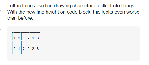
It is quite common to use things like line drawing characters in illustrations. With the new line height on code blocks, this looks even worse than before.

Real-life examples

From here

┌───┬───┬───┐
│1 1│1 2│1 3│
├───┼───┼───┤
│2 1│2 2│2 3│
├───┼───┼───┤
│3 1│3 2│3 3│
└───┴───┴───┘

From here:

┌→────────────────────────────────────────┐
│ ┌→┐ ┌→┐ ┌→┐ ┌→┐ ┌→┐ ┌→┐ ┌→┐ ┌→┐ ┌→┐ ┌→┐ │
│ │0│ │1│ │2│ │3│ │4│ │5│ │6│ │7│ │8│ │9│ │
│ └─┘ └─┘ └─┘ └─┘ └─┘ └─┘ └─┘ └─┘ └─┘ └─┘ │
└∊────────────────────────────────────────┘

From here:

 ┌─┴─┐          
×/ ┌─┼───┐      
   ⊢ ÷ ┌─┼──┐  
      +/ - +⍨

From here:

    ┌──────┴──────┐
 ┌──┼────┐     ┌──┼──┐
┌┴┐┌┴┐┌──┴──┐ ┌┴┐┌┴┐┌┴┐
│⊢││~││∘.× ⍨│ │≢││↓││⍳│
└─┘└─┘└─────┘ └─┘└─┘└─┘
7
  • 3
    I do believe that real tables are actually on the roadmap though? (Your point still stands, large amounts of old posts that already use semigraphical tables notwithstanding) Commented Aug 27, 2020 at 16:50
  • 3
    @JohnDvorak - Even if so, how many hundreds of thousands of answers already do the above? Commented Aug 28, 2020 at 9:09
  • 1
    @ThomasMarkov you can't use mathjax in most of sites.
    – Braiam
    Commented Aug 28, 2020 at 13:58
  • 1
    This doesn't look completed to me....
    – Luuklag
    Commented Sep 9, 2020 at 16:57
  • @Luuklag How so? I'd prefer 1.15 but with the new value it is at least readable.
    – Adám
    Commented Sep 9, 2020 at 16:58
  • Horizontal allignment is faaaaaaar off.
    – Luuklag
    Commented Sep 9, 2020 at 16:59
  • @Luuklag That's due to the font stack. SE doesn't care.
    – Adám
    Commented Sep 13, 2020 at 14:33
27

There was probably no problem with the previous UI. Forgive me if there was. But if there was, keep it as an option that one can choose. Even better, keep two tabs, one for the previous, and one experimental. People might want to give feedbacks on experimental UIs. By the experimental tab, I mean a Theme tab. Users may choose one already made or customise one on their own.

By default, I would prefer the previous UI. It's looking just odd today!

Edit: The text here as it appears now in mobile devices resembles the one in desktop devices. I mean the colour was sort of yellowish earlier in mobile devices. I hated this change most.

4
  • 8
    While this would be nice, it's an astronomical amount of work. Better would be to not make stylistic changes to underlying infrastructure on a whim in the first place.
    – TylerH
    Commented Aug 27, 2020 at 17:50
  • I think that if there had to be more than one version for every UI change, things would be a horrible mess now.
    – hat
    Commented Aug 28, 2020 at 11:40
  • 4
    Well, the idea was about themes. Some of us would prefer the previous one. Whoever doesn't like it may go to the proposed experimental tab, choose one that he/she likes most. Nothing else. It would just change the appearance. Commented Aug 28, 2020 at 11:49
  • 3
    This is what Wikipedia did, for example. You can still use the original themes if you want.
    – OrangeDog
    Commented Aug 31, 2020 at 16:43
25
+50

To quote @hkotsubo:

Lots of people are saying it's harder to read. You should at least take this into consideration before saying you're done talking about it.

I totally agree. It's not only on my laptop, it's worse on mobile too. Although I don't use my mobile very often, I use it enough to make it a problem. From this comment:

That's not even just for people with cognitive disabilities, who struggle more than usual. It is true of everyone. Stop attacking the research angle while presenting nothing of your own. We're done talking about this.

It's not true for everyone, not for me anyway.

The feedback you're getting about this seems pretty negative. Please, revert to 1.3, and don't fix it if it isn't broken. If these two posts are anything to tell by, the old way was better.

I won't deny there are exceptions, but the vast majority of us are saying it is not a good change. If reverting it is not possible, or just isn't going to happen, then adding options in user preferences still seems like a good idea, hard work or not.


UPDATE:

Sixteen days have now passed since Aaron Shekey posted this answer with the update saying the proposed line-height of 1.6 had been adjusted to 1.5, and we haven't received a reply to our many questions since. Is Stack Exchange going to even consider reverting the changes, or adding options in user preferences? Or is the change just going to endure, like the one about the blockquotes? Resourceful @Prid made another extension to revert the changes on that, too.

Extensions, userscripts, and various other "Band-aids" are all very well, but making tons of people use multiple third-party resources to revert the various poor design choices made by Stack Exchange is...not great.

I would also like to know why the larger line-height was deemed favorable, and why no user testing was performed (and if there was, we haven't heard about it)? A line-height of 1.5 might be good for some, but it is not for all. To quote @ResistanceIsFutile, "catering for accessibility means catering for everyone, not just some."

I don't think giving us control over something as simple as line-spacing, or quote-background color, is a big deal to ask for.

3
  • Not responding or acting on said feedback isn't the same as not listening. Would them making a post stating that they hear our feedback but believe they're decision better serves the community change anything? They've already stated their reasoning for making the change, I don't see how them responding while not making further changes would be fruitful for anyone.
    – Kevin B
    Commented Sep 22, 2020 at 19:26
  • I mean, you're again assuming they don't know that a percentage of their community don't like the change. Offering this up as a choice has it's own problems, such as effectively multiplying the amount of testing needed to make sure a change doesn't break things.
    – Kevin B
    Commented Sep 23, 2020 at 14:42
  • Starting from a position of "They don't know", "They're not listening", or "They're ignoring us" pretty much precludes receiving no response. You're not coming from a position of willingness to listen, so why should they respond? They've clearly presented their reasoning, they budged on the original change to bring it to something at least better than what they started with, why not address their reasoning directly rather than just claiming they're failing their community?
    – Kevin B
    Commented Sep 23, 2020 at 14:46
22

Yes, I agree. Please revert the line height back to 1.3! The adjustment to 1.5 is not enough.

The lines are still harder to read IMHO.

21

Prid said

The new line-height makes it hard to mentally separate paragraphs.

I'd like to add that for me, the new spacing makes it very hard to tie even the same sentence together as I try to go from one line to the next.

It's so disconcerting and something I've never experienced before, but it makes me give up halfway down a paragraph because I've lost the thread of what was being said. I go back a couple of times to try to re-read, but it seems to make it considerably more effort.
As someone who's never had any reading difficulty since infant school 55 years ago, I find this particularly odd.
If this is some kind of medical condition It's not one I've ever noticed before.

This is a link to a BBC News site page which has similar wide spacing, but using a larger, slightly more solid font. I don't have the same difficulty with this. I have no real idea what technically differentiates one from the other - nor any clue how to look up what line spacing or font it uses.
[You have to bear in mind that, though Stack Overflow might be populated by people well-versed in or at least familiar with this type of work, the rest of us across Stack Exchange are just 'users'.]

There seems to be some knockback from mods/developers here who are insisting 'research shows bigger lines are better'.
Empirically, this doesn't appear to apply to everyone.
It seems someone read a research paper and the rest of us must suffer the consequences.

One additional factor that just ocurred to me is that Windows & Mac users are seeing rather different things. Ask Different used to use a Mac-specific font which was lovely to read - unfortunately that was removed a couple of years ago, leaving us with the poor alternative that SE now uses globally.

Screenshots of my earlier paragraph, first on Mac Safari

enter image description here

then on Windows Microsoft Edge

enter image description here

Click through to get these at 'life size' for better comparison.

So, by my own personal opinion, it doesn't look quite so bad on Windows as it does on Mac. There is a slightly better balance between font size & spacing.
This makes me think it was only ever checked on one platform.

0
20

I want to draw readers' attention the fact that the W3C does not actually recommend setting the line height to 1.5 or higher.

The relevant recommendations seem to be WCAG criteria 1.4.12 (Text Spacing) and 1.4.8 (Visual Presentation).

Criterion 1.4.12 regarding text spacing reads (emphasis mine):

In content implemented using markup languages that support the following text style properties, no loss of content or functionality occurs by setting all of the following and by changing no other style property:

  • Line height (line spacing) to at least 1.5 times the font size;
  • (etc.)

So this isn't a requirement, or a recommendation, for the line height setting - it's a requirement that if the lines are set to be more spaced-out, the site/webpage not become unusable or dysfunctional, and no content becomes invisible/inaccessible.

The W3C document entitled "Understanding Success Criterion 1.4.12: Text Spacing" reiterates this (emphasis mine):

The intent of this Success Criterion (SC) is to ensure that people can override author specified text spacing to improve their reading experience.

The recommendation is to support overriding of settings to cater to the needs of some readers - not to change the default settings.

WCAG criterion 1.4.8 regarding Visual presentation reads:

For the visual presentation of blocks of text, a mechanism is available to achieve the following: (Level AAA)

... snip ...

Line spacing (leading) is at least space-and-a-half within paragraphs, and paragraph spacing is at least 1.5 times larger than the line spacing.

So, not the default, but achieveability through some mechanism.

@MaxD linked to a "techniques" document regarding criterion 1.4.8 which mentions the importance of providing line spacing between 1.5 and 2, but:

  • That document is not the official WCAG.
  • "Providing" doesn't mean "having that be the default". The actual WCAG clarifies that the intent is providing the mechanism for making that setting. For example, a site-level per-user setting to that effect.
  • Criterion 1.4.8 regards AAA-level conformance. That level is not intended (according to the WCAG document itself) for general use, but for more accessibility-specialized sites.

Due disclosure: I have posted this as a reply on this related discussion as well.

6
  • 1
    Here, on the other hand: "Many people with cognitive disabilities have trouble tracking lines of text when a block of text is single spaced. Providing spacing between 1.5 to 2 allows them to start a new line more easily once they have finished the previous one."
    – MaxD
    Commented Sep 4, 2020 at 21:01
  • @MaxD: See edit.
    – einpoklum
    Commented Sep 4, 2020 at 21:28
  • I'm having some trouble interpreting all these convoluted wordings. Maybe because I'm neither a native speaker nor have much of a webdesign background. So you're saying the 1.5-2 recommendation is ONLY aimed at sites that explicitly focus on special needs users? And that SE staff just copied the number without properly understanding its intended meaning?
    – MaxD
    Commented Sep 5, 2020 at 0:41
  • 3
    @MaxD: It is actually slightly confusing, because 1.4.8 is level AAA while 1.4.12, with about the same recommendation, is AA level. But none of them say a site should have 1.5-2x spacing by default for everyone. The assumption is that there is a _mechanism for enabling more spacing.
    – einpoklum
    Commented Sep 5, 2020 at 16:34
  • 1
    Huh. If W3C's recommendation is based on the research(?) and came out to less than 1.5, then I'm curious as to why we went to 1.6, then back to 1.5.
    – Ollie
    Commented Sep 7, 2020 at 20:59
  • 1
    @Ollie: But what happened on SE is not the W3C's recommendation anyway, so, in particular, it is not the recommendation of the underlying research.
    – einpoklum
    Commented Sep 7, 2020 at 21:27
14

I’ve split the difference between the original 1.3 line-height and the proposed 1.6 line-height. We’re now at 1.5, with additional refinements to spacing between elements. I’ve also reduced line height within code blocks back to near the original value.

Update

It took me longer than I wanted, but I’ve got some updates for you on our s-prose component. You can see the pull request with my thinking over at our design system’s repo. It does the following:

  1. Spreads s-prose headers out from paragraphs for better grouping.
  2. Tightens up s-prose spacing between paragraphs a bit, and made sure spacing under headings are more consistent.
  3. Replaces all s-prose margins internal to the component with a CSS variable var(--s-prose-spacing) so our users can more easily tinker with it in their browsers and user scripts.
  4. Kills trailing margins in s-prose

You can see some examples of content at our Stacks documentation.

27
  • 25
    Why not simply rollback to the original everywhere (or put this as an option in user preferences, so each one chooses whatever they want)? I think 1.5 it's still too much, specially - but not only - in mobile
    – hkotsubo
    Commented Aug 27, 2020 at 21:03
  • 12
    @Aaron, it would be better if you could now change it back to 1.3 or even 1.2. Commented Aug 27, 2020 at 21:11
  • 20
    Psychologists have been studying the effects of text presentation methods on comprehension and speed for decades, and the information presented by W3C is based on that research. Tons of research has repeatedly concluded that information from surrounding lines of text can interfere with reading speed and efficiency, suggesting additional spacing between lines of text is valuable. That's not even just for people with cognitive disabilities, who struggle more than usual. It is true of everyone. Stop attacking the research angle while presenting nothing of your own. We're done talking about this.
    – animuson StaffMod
    Commented Aug 27, 2020 at 21:42
  • 48
    Lots of people are saying it's harder to read. You should at least take this into consideration before saying you're done talking about it...
    – hkotsubo
    Commented Aug 27, 2020 at 22:39
  • 12
    @hkotsubo We're listening to the feedback we're getting about it. We are not listening to people who are simply stating "the research is nonsense" because that is not constructive to any discussion here. (The comments doing so have been deleted here, but my comment remains to deter people continuing to bash research instead of offering constructive opinions.)
    – animuson StaffMod
    Commented Aug 27, 2020 at 22:56
  • 22
    @animuson can you link to the supporting studies? I'd like to read up on what kinds of reading material, at what font sizes, paragraph dimension ranges, reading duration and intermediately inserted content like code, quotes, illustrations they based their recommendations on. If w3.org/TR/WCAG20-TECHS/C21.html this is the source then I find it interesting that on the page it says 1.5 when the initially used value was greater, but maybe it's a different "w3c". Commented Aug 27, 2020 at 23:53
  • 46
    Whatever any research says or doesn't say, at the end of the day it's the users who are reading this site. And if 150+ users say a certain change makes it harder to read, while 0 say it makes it easier to read, then they probably might have a point? And the change probably might not be a good one? And should probably be reverted?
    – MaxD
    Commented Aug 28, 2020 at 1:20
  • 11
    @MaxD Just so you know I've seen multiple people say they like the change better (even though the people who don't like the change definitely seem to be in the majority here) so 0 is definitely an exaggeration. Commented Aug 28, 2020 at 3:31
  • 20
    @animuson I don't want to argue against research. But if vast number of people is telling you that this change is bad for them, then it certainly carries some weight. I didn't have trouble reading old settings, but I do have trouble reading new one. It is especially bad for code. While small sections of text are equally readable with old and new settings, I have real trouble fast reading larger posts. This is detrimental for going through review queues and also for quickly browsing answers and finding solutions for problems. All that will now require more time than before. Commented Aug 28, 2020 at 8:22
  • 15
    @MaxD people who are unhappy are more likely to voice there opinion (loudly), then people who are content with something. So I think that is to some extent a flawed argument. Personally I think the comment section is easier to read, then the post body, and guess what line height the comments section has set ;). Also, old habits die hard.
    – Luuklag
    Commented Aug 28, 2020 at 10:15
  • 7
    I'm surprised no one has yet pointed out that "splitting the difference" would be 1.45, not 1.5. Commented Aug 29, 2020 at 10:39
  • 15
    @animuson Look, this change was clearly based on a W3C recommendation, not on decades of research. The W3C is attempting to provide a one-size-fits-all recommendation, which may not be the right solution for Stack Exchange. Research is more nuanced than that. I'd be interested to see what the research says about readability in the context of technical writing, specifically. Speaking of research, has any user testing been performed before deploying this change site-wide? Commented Aug 30, 2020 at 3:29
  • 13
    @animuson right now the argument by SE is simply “because the W3C said so”. As long as as SE doesn’t actually cite the specific research, I don’t think it is unsurprising that people aren’t convinced by the “research”. You cannot make constructive arguments against research you’ve never seen. Commented Aug 30, 2020 at 7:50
  • 7
    This answer would probably be received better if it would explain more about why a larger line height was deemed favorable. It seems that a substantial amount of people like a smaller value better, so a good explanation why a larger value would actually be better might go a long way towards acceptance. Commented Sep 1, 2020 at 10:50
  • 17
    @user1306322 I find it interesting to note that even the W3C page you linked to, which advocates for 1.5 to 2.0 line spacing, uses 1.4 line spacing.
    – Jeff
    Commented Sep 1, 2020 at 16:16

You must log in to answer this question.

Not the answer you're looking for? Browse other questions tagged .