41

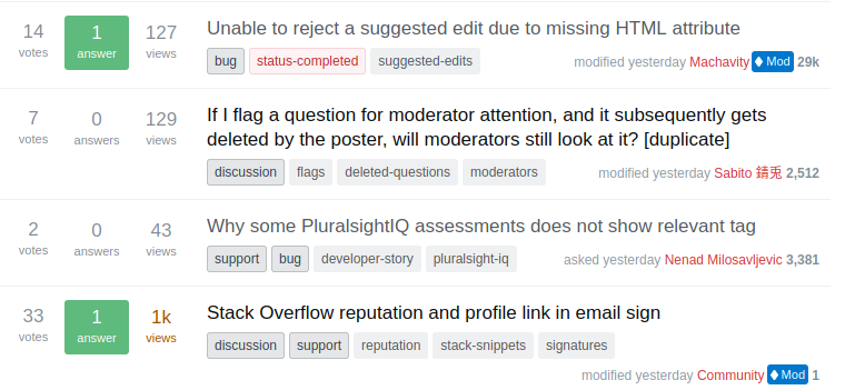
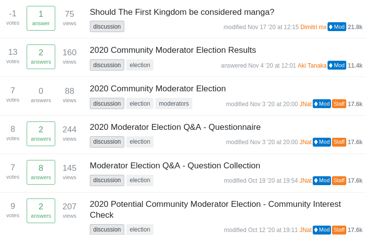
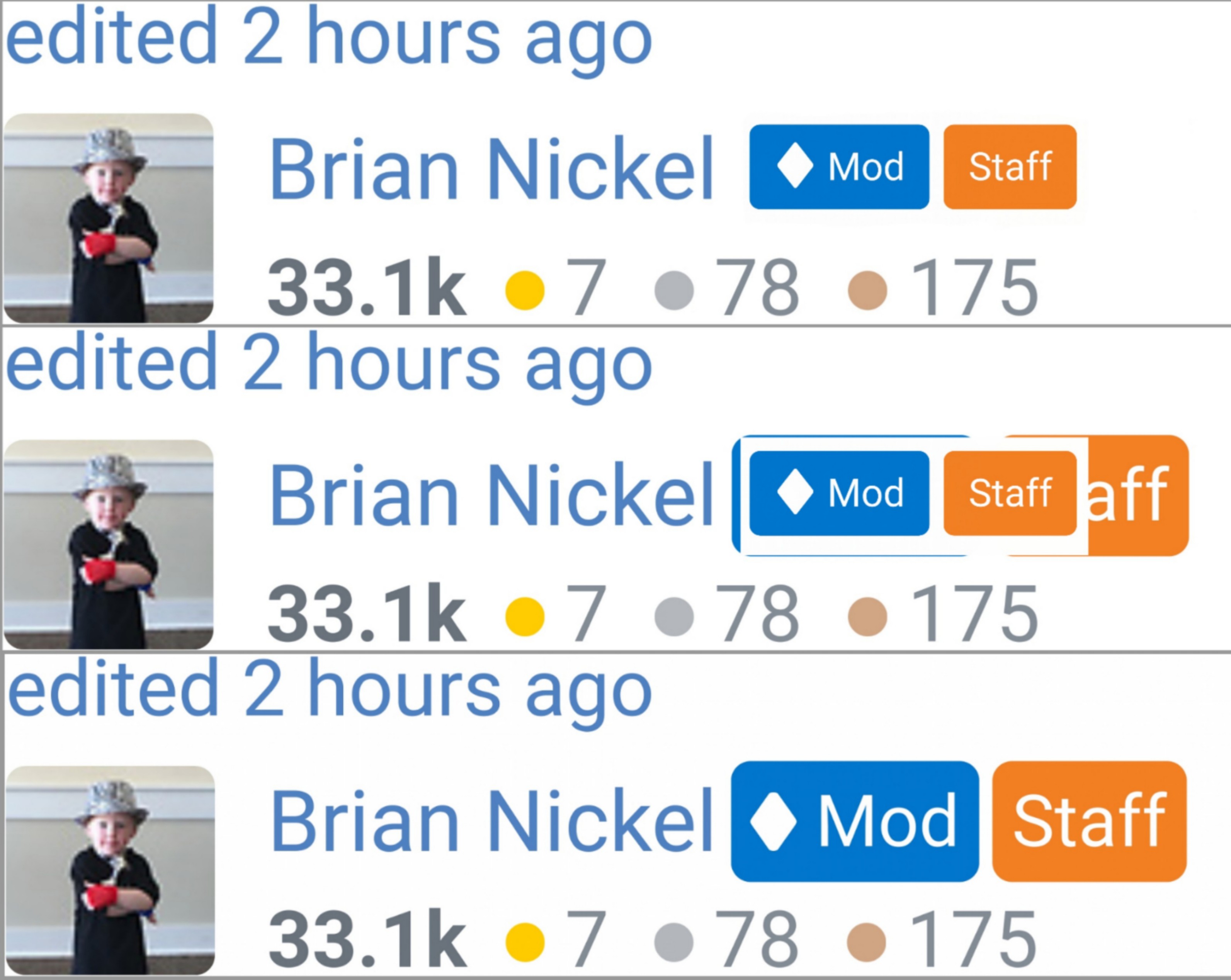
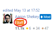
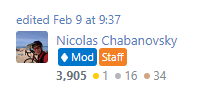
Update: As can be seen on this post and elsewhere on the site, the styling for the mod/ staff labels has been modified, and hopefully will not pop out and be as overwhelming as the original colors:

New new label designs visible next to an avatar, with colors more subdued than the original

Big thanks to Aaron Shekey and Ben Kelly for finding a great solution here.

Original announcement below.


In response to the request to Add an immediately visible indication that a user is a staff member or an employee of SE, we recently announced a new feature on per-site metas and Meta Stack Exchange (which is live as of now):

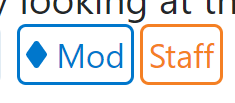
  1. Mod diamonds are replaced by the new Mod label (which includes a diamond). These labels will all start out in blue (as shown in the screenshots here), but could change color in the future to match color themes on sites if/when these are modified.
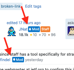
  2. Staff labels now follow the user's display name anywhere on the site where the name is shown. This includes question listings, user profile, author/modified boxes on questions and answers, comments, timeline/user history, post notices, (and many more places). The label will be Stack Overflow Orange on all sites.

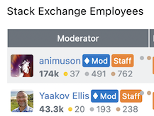
Here is how it will look in the Users listing:

Screenshot of new mod/staff labels in the Users listing

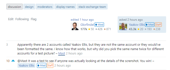
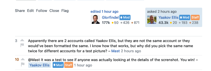
And here is a sample from some comments:

Screenshot of comments with mod/staff labels

The new mod labels will not yet be included on Main sites (or anywhere on Chat or the main StackExchange.com site) where for the time being, the good old unaddorned mod diamond will live on. And there are no plans to show staff labels on Main sites aside from the profile page.

I am reposting this announcement here to serve as a collection point for feedback on this in general, as well as reports of positioning issues.

As the labels are being laid out with a new component (that is more complicated than the Unicode ♦), and as we are right now in the process of making all of our pages fully responsive, it has been difficult to get the positioning of the labels (in terms of margin between the display name, vertical positioning, padding, etc) to look "just right" in every instance across the site.

Please post any related issues as answers below. Some things may be addressable now, and some may have to wait for the related page to have its full responsive conversion completed.

24
  • 5
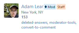
    Apparently there are 2 accounts called Yaakov Ellis, but they are not the same account or they would've been formatted the same. I know how that works, but why did you pick the same name twice for different accounts for a test picture?
    – Mast
    Commented Jul 28, 2021 at 18:59
  • 22
    @Mast It was a test to see if anyone was actually looking at the details of the screnshot. You win!
    – Yaakov Ellis StaffMod
    Commented Jul 28, 2021 at 19:00
  • 4
    Thank you. I'll get myself a cookie now.
    – Mast
    Commented Jul 28, 2021 at 19:01
  • 1
    Is it just me or does putting Staff and Mod feels a bit redundant? I mean, personally seeing a Mod badge correlates more with elected mods. I think Staff already gives the required information. Is it really necessary to clutter with Mod as well?
    – Tomerikoo
    Commented Jul 28, 2021 at 20:37
  • 13
    There's a very important distinction, @Tomerikoo - Staff that are also moderators have additional abilities that other staff do not have. For example, they have all of the privileges of any site and access to all of the mod tools. Regular staff accounts do not. For the most part, they are limited in the same way that any user is (though there are some exceptions). Both distinctions are important for viewers, even if they aren't necessarily aware of what they are.
    – Catija StaffMod
    Commented Jul 28, 2021 at 21:34
  • 8
    @YaakovEllis Where's the "Alumni Staff" label? ;)
    – Joe Friend
    Commented Jul 28, 2021 at 22:20
  • 2
    Couldn't we just have blue and orange diamonds, or another jewel? (Mock-up coming later, possibly in the Tavern)
    – Ollie
    Commented Jul 29, 2021 at 0:00
  • 5
    @V2Blast the new mod badge might be making its way to the main sites sometime in the future (no idea if/when). And you surmised correctly - the staff badge will not be shown everywhere on main sites like it is on meta.
    – Yaakov Ellis StaffMod
    Commented Jul 29, 2021 at 8:23
  • 2
    @YaakovEllis No! We do not want the new mod badge to be making its way to main sites anytime in the future. No one ever asked for it in the first place. You said this was all "In response to the request..." but that was a request to add a STAFF badge not a MOD badge too. The community did not ask for this. Furthermore, while this post has some upvotes (and downvotes too), keep in mind that all of Meta.SE has a "bias" because the vast majority of the participation is from network mods. What network mods want here, is not necessarily the same as what the 15 million users want. Commented Jul 29, 2021 at 19:20
  • 5
    @user1271772 the staff badge is from this request. The mod badge is part of planned theming changes in the system (though there are no definite plans at the moment to include them on main sites). They make sense to put into place together. And I do not agree that the best majority of participation here is from network mods.
    – Yaakov Ellis StaffMod
    Commented Jul 29, 2021 at 20:09
  • 5
    @user1271772 I did some number crunching; using SEDE and a trick to pull a list of all moderators on SE, I get a tally of 171,508 users that have accessed Meta.SE in the last 6 months, 469 of which are site moderators (Query). I... don't think that supports your claim about participation very well.
    – zcoop98
    Commented Jul 29, 2021 at 22:40
  • 2
    The muted colors are better… are they rolled out everywhere? If I see old bright style ones, is it a caching issue?
    – ColleenV
    Commented Aug 12, 2021 at 20:22
  • 4
    @ColleenV yes, rolled out everywhere and if you still see it, do a hard refresh.
    – Yaakov Ellis StaffMod
    Commented Aug 12, 2021 at 20:24
  • 16
    Big thanks to Aaron Shekey and Ben Kelly on the quick turnaround and great solution for the label colors that was just included in their latest Stacks release!
    – Yaakov Ellis StaffMod
    Commented Aug 12, 2021 at 20:34
  • 7
    @YaakovEllis Thank you to everyone responsible (I guess Aaron Shekey and Ben Kelly based on your question update and comment above) for the changes to the mod/staff labels appearance. For me at least, It's definitely a significant improvement compared to the original version. Commented Aug 13, 2021 at 6:14

40 Answers 40

70

The words "Mod" and "Staff" are fine on the user card. However, the badges are too much of a distraction in the comments, especially when there are many comments from mods or employees.

I suggest reducing it to just symbols (as before) next to usernames in the comments similar to what's demonstrated in this answer:

Small stack overflow logo next to username in comments to indicate staff status

...or any other alternatives. My personal preference is either the Stack Overflow logo shown above or the Stack Exchange logo as in the SOX userscript, but I don't mind any other symbols or icons suggested by the community, like in this answer, for example.

Additionally, if the symbol is added next to "Staff" in the user card (as is the case with "Mod"), it will be immediately clear to someone looking at the comments what the symbol represents.

14
  • 2
    I pulled in a cropped down version of the image from the post you referenced for added clarity, feel free to roll back if you'd prefer to go without.
    – zcoop98
    Commented Jul 28, 2021 at 19:51
  • 1
    I've added in an alternative option so that staff don't decline this on the basis of the specific markup proposal alone, and make it more clear that you're requesting a marker in general, not necessarily that specific one. Commented Jul 28, 2021 at 20:49
  • 4
    Do you think a white diamond suit with the staff color be a better option to seperate the blue-colored black diamond suit used for mods?
    – Krazer
    Commented Jul 28, 2021 at 21:41
  • 1
    (Without staking a position on the question:) What's that experience like for a new user who doesn't know what the symbols mean?
    – Philippe StaffMod
    Commented Jul 29, 2021 at 12:30
  • @Philippe Sorry, I'm not sure what you mean by "Without staking a position on the question". Note that although my personal preference is using symbols everywhere, I'm only proposing using symbols in the comments section specifically to accommodate new users who might not be familiar with the symbols.
    – 41686d6564
    Commented Jul 29, 2021 at 12:45
  • 1
    Right.... I'm saying that I haven't jmade up my mind about this, but I do think that it could potentially cause confusion - the new users wouldn't know where to look to see what the symbols mean.
    – Philippe StaffMod
    Commented Jul 29, 2021 at 12:55
  • 4
    @Philippe Assuming the symbol is added to the Staff badge on the user card, it's quite difficult for someone to miss it. Users will learn to correlate that symbol with "this person is an employee" very quickly. I'm not saying that it's impossible for someone to see the symbol in the comments before in posts but I imagine that would be quite rare (seeing that we're talking about meta's, after all).
    – 41686d6564
    Commented Jul 29, 2021 at 13:00
  • @Philippe they can open the user's profile and see the "Moderator"/"Staff" badge, or mouse over the symbol, or just use Google. Commented Jul 29, 2021 at 13:30
  • 2
    [Status-completed] by a certain friendly neighborhood squirrel over on Stack Apps. If SE does wants new labels let them, we can make them ourselves :)
    – 0Valt
    Commented Aug 9, 2021 at 18:08
  • 1
    @OlegValter ironically it was just now declined. Commented Aug 9, 2021 at 18:10
  • 3
    @ShadowWizardWearingMaskV2 - I know, that's precisely the reason why I decided to link to this script :)
    – 0Valt
    Commented Aug 9, 2021 at 18:13
  • 1
    Thanks for all of the feedback. We are trying to go in the direction of avoiding (or at least minimizing) the use of standalone symbols that require more context/knowledge to understand their full meaning.
    – Yaakov Ellis StaffMod
    Commented Aug 9, 2021 at 18:47
  • 2
    @YaakovEllis I thought that's what tooltips are for. Commented Aug 10, 2021 at 9:53
  • 1
    @YaakovEllis Curious that <> Mod includes "Moderator" as tooltip. It seems that it could be leveraged to do the same for staff.
    – Braiam
    Commented Aug 12, 2021 at 15:18
56

Some things to call out:

  • This is jarring to look at. Suddenly now my attention is taken up by the fact that a mod or staff member (or mysteriously both) has provided an interaction with this post.

    Just look at this. Nothing quite gets my attention like suddenly blue/orange boxes.

    enter image description here enter image description here

    Historically, this hasn't even really mattered to the degree that we have to highlight it to draw out that much attention.

  • Here - right here was some perfectly suitable and conventional feedback on such markers. Making them icons or something easy to identify that wasn't obtrusive or wasn't so doggone in-your-face would have been preferable. Would've been nice to see that followed. Better yet, it could've been applied everywhere as opposed to just the Meta sites.

  • Would've been nice to have a period of bake-in before this was implemented, y'know, something we the community could've gathered together and discussed and really talked about what we wanted, and what the goals of this were...

18
  • 4
    I agree. A simple Unicode symbol is my personal preference (at the very least in the comments section as I said in my answer).
    – 41686d6564
    Commented Jul 28, 2021 at 20:15
  • 6
    Maybe just making them coloured outlines with coloured text, but otherwise no fill, would do? Something like this?
    – Adám
    Commented Jul 28, 2021 at 20:16
  • 4
    @Adám: Or symbols. Symbols take up less space.
    – Makoto
    Commented Jul 28, 2021 at 20:17
  • 1
    @Adám That indeed looks much better (if they won't go with just symbols).
    – 41686d6564
    Commented Jul 28, 2021 at 20:27
  • 1
    One of the primary reasons for the text is that symbols are only transparent to people who are already "in the know" of what those symbols mean. A diamond isn't a universal symbol for a moderator. Using the words "Staff" and "Mod" are ubiquitous around the web, though and clear even to first-time viewers.
    – Catija StaffMod
    Commented Jul 28, 2021 at 20:56
  • 13
    Perhaps it could explain on mouseover, to clarify. But at the very least they are really loud right now. It looks, visually, like whatever information those elements are conveying should be my top priority when reading that section of the page, and in almost every case, that's not accurate.
    – Ryan M
    Commented Jul 29, 2021 at 0:05
  • 2
    @RyanM mouseovers aren't accessible on mobile and they assume people actually use them. Many people don't realize they exist.
    – Catija StaffMod
    Commented Jul 29, 2021 at 0:20
  • 15
    These labels are the most visible objects I've ever seen on any SE website. Why do I need to see them on every other page just to save a few seconds of first-time viewers' time? (the last sentence wasn't even an exaggeration, it takes only a few seconds of research to find out what ♦ means, and then the "Mod" text is effectively useless for the rest of your life) Commented Jul 29, 2021 at 6:12
  • 1
    We agree, it is jarring. We are planning on doing something to address this, potentially inverting the colors. But as I commented above, we are not going to be going the way of symbols-only here.
    – Yaakov Ellis StaffMod
    Commented Aug 9, 2021 at 18:49
  • 1
    @YaakovEllis: I'm surprised that this wasn't seen as jarring to begin with when this was being validated internally. But okay then. In this, the sentiment that "this is what you're going to get and this is as far as we're going to work with you on this" is in full effect, and it actively demotivates me from providing more constructive feedback on features like this. We don't get to talk about the goals of this feature, nor do we get to discuss why something like SVGs could or couldn't work while also serving the same purpose. Thanks a lot.
    – Makoto
    Commented Aug 9, 2021 at 19:16
  • 2
    @Makoto (1/2) This is not the first time that the idea of symbols only was raised. It was in fact the top answer on the previous meta post talking about this. So we already considered that before moving in this direction. And we reconsidered again after reading your feedback, which we do appreciate.
    – Yaakov Ellis StaffMod
    Commented Aug 9, 2021 at 19:29
  • 2
    @Makoto (2/2) That said, and taking into account the feedback, we made the decision to decline this, and are deliberately moving away from using only a symbol. We found that a standalone sumbol is not something that new users understand right away, and we think that including the text label in this case is necessary. I appreciate your feedback, and sorry if this decline demotivates you from providing feedback in the future, as this is not our intention.
    – Yaakov Ellis StaffMod
    Commented Aug 9, 2021 at 19:30
  • 7
    @YaakovEllis: This is kind of my point. For the sake of new users, the power users' polite and patient requests don't feel like they're taken into account. This rollout you're doing? It's only on the Meta sites. It's only in the places where the power users roam. And you're pushing the change on the power users because the new users don't read the FAQ. Instead of pushing them to read more FAQ you're making it stand out. See, that's the feedback I want to give, but the decision feels like it's been made, so I'm just wasting my energy here.
    – Makoto
    Commented Aug 9, 2021 at 19:39
  • 3
    @Makoto the feedback was heard, considered, and the decision was made. We went through every single piece of feedback here, and talked about every single request. Sometimes the answer is no. But that doesn't mean that the feedback isn't doing anything. And FWIW, we are planning on some other changes that should significantly reduce the amount that these stand out, while still including the (what we see as) benefit of the labels.
    – Yaakov Ellis StaffMod
    Commented Aug 9, 2021 at 19:42
  • 11
    @YaakovEllis: I'll leave it at this: I don't have a problem with the answer being "no". I have a problem with changes like this that are radically intrusive to the way that power users have become accustomed to using the site without a whole lot of discussion amongst the power users or consensus for the sake of new users. That trend has happened so often on UX changes like this just for the sake of new users that the veterans in the room can't help but feel like they're being left in the cold. You may have considered the options, but I can only live with what is implemented.
    – Makoto
    Commented Aug 9, 2021 at 19:45
42

Feedback

The icons pop out too much, with the style they have now.

The colours are much too rich. They only associate with "answered question" icons as shown with the red outline in the following screenshot:

Screenshot highlighting answered question and tags

Given they contain text and are used in text areas, they should blend with other text elements such as tags as shown with the blue outline.

That means making the colours lighter.

7
  • 7
    Maybe something like this?
    – Adám
    Commented Jul 28, 2021 at 20:16
  • @Adám Nice! However a little too much contrast between the outline and the inside colour. Commented Jul 28, 2021 at 20:22
  • It was just a quick CSS hack. The inside could be transparent.
    – Adám
    Commented Jul 28, 2021 at 20:23
  • I picked some colours from the stacks design system, to make it easier for SE to change if they want to. See this answer: meta.stackexchange.com/a/367934/361484
    – Luuklag
    Commented Jul 28, 2021 at 21:03
  • 6
    Here's a transparent version (same blue and orange, just inverted): i.sstatic.net/7AGZP.png IMO, it's way less distracting, yet still distinct.
    – zcoop98
    Commented Jul 28, 2021 at 21:13
  • 1
    I meant the outside border colour could be a bit lighter as well. But yes each of your examples are much more pleasing (softer) to look at! Commented Jul 28, 2021 at 22:26
  • 1
    @YaakovEllis The new less-emphasized badges are looking much better! Thanks very much. :) Commented Aug 13, 2021 at 11:17
38
Update 2021-08-12

The badges have since been updated to be much less distracting in the meantime, so this script doesn't serve much of a purpose anymore. If you're still a fan, I've made sure the script still works, but know that the Stack Exchange official style is now much improved over the initial release.


Original Post

In true Stack Exchange community fashion, here's a (very quick) userscript to tweak the appearance of the new badges. Note that this doesn't revert the change, but just tweaks it to be a bit less distracting.

Based on a comment by @Adám above, I played with inverting the badge color and making the background transparent:

Zoomed in mod and staff badge. The mod badges has a blue border & text and is on a transparent background, staff badges has an orange border & text and are also on a transparent background

I find this design to be still distinctive yet less loud than the filled-in version, which makes them less distracting overall.

Bottom of a post with the tweaked mod and staff badges visible

Here's the script. It runs on all Stack Exchange Q&A sites, but note that the badges are only currently live on per-site metas. Feel free to edit/ improve it locally to suit your own needs, without limitation.

// ==UserScript==
// @name         Invert Staff & Mod Label Colors
// @description  Inverts the color scheme of the Staff & Moderator labels on Stack Exchange
// @homepage     https://meta.stackexchange.com/a/367942
// @author       zcoop98
// @version      0.2
// @grant        GM_addStyle
// @run-at       document-start
//
// @include      https://*stackoverflow.com/*
// @include      https://*serverfault.com/*
// @include      https://*superuser.com/*
// @include      https://*askubuntu.com/*
// @include      https://*mathoverflow.net/*
// @include      https://stackapps.com/*
// @include      https://*.stackexchange.com/*
//
// @exclude      https://data.stackexchange.com/*
// @exclude      https://contests.stackoverflow.com/*
// ==/UserScript==

GM_addStyle(`
  .s-badge__staff {
    border-color: var(--orange-400) !important;
    background-color: transparent !important;
    color: var(--orange-400) !important;
  }
  .s-badge__moderator {
    border-color: var(--theme-secondary-color) !important;
    background-color: transparent !important;
    color: var(--theme-secondary-color) !important;
  }
`);

I know that this doesn't fix any other issues brought up here (eg. contrast, placement, size, etc.), but I presume that Stack Exchange itself will address those, and hope that someone else may find this useful in the meantime anyway.

As a final note, I want to mention that no disrespect whatsoever is intended to the Stack designers who engineered this change, I know this change took effort and careful consideration to create; Meta folk are just fickle about design changes.


If you'd instead prefer the old pointy (but smaller) diamond character instead of the new SVG, add the following stanza to the end of the script (this requires a little more work than simply changing the SVG color):

.s-badge__moderator:before,
.s-badge__moderator.s-badge__sm:before,
.s-badge__moderator.s-badge__xs:before {
  background-image: none !important;
  background-color: transparent !important;
  mask-size: unset !important;
  -webkit-mask-size: unset !important;
  mask: none !important;
  -webkit-mask: none !important;
  content: "♦" !important;
  width: unset !important;
  height: unset !important;
  margin: 0 2px 0 0 !important;
}

This will yield the following:

Comments/ Posts Profile Page

In the meantime, I've uploaded the diamond character (♦) version of this script to GitHub.

3
  • If this isn't the place for this, or this just otherwise isn't welcome on this announcement, I'll gladly remove it. I just put it together for myself and thought it might be useful to someone else.
    – zcoop98
    Commented Jul 28, 2021 at 22:12
  • I'm not disagreeing with this suggestion because it's a bad one. I'm disagreeing with this because it feels like capitulation. To compromise, we ignore the established precedence we've had with symbols to represent significance since forever with literally no discussion at all on the matter, and "meet them halfway". Sure, it's less jarring than before. But I still feel like this loses something.
    – Makoto
    Commented Jul 28, 2021 at 22:14
  • 8
    @Makoto That's a very fair response. It does feel a bit jarring to abandon the standalone diamond symbol as "not clear enough" when it's been standard since... forever. Obviously the text Mod is "clearer" (because it literally spells out the meaning), but it's weird for staff to suddenly say that the diamond isn't clear enough without any apparent prior public discussion.
    – zcoop98
    Commented Jul 28, 2021 at 22:18
26

Yaakov: There is a new help center page for staff. However, since the redesign of the user profile page has moved the clickable label for leagues to a different position on the page, we will not be linking the staff label to the help page (as this would now be the only label in that section, and the moderator label is not linked anywhere).

Users will try to click on the labels, especially since the other label in a profile is clickable and leads to the reputation leagues:

enter image description here

The moderator label could link to the Help Center article Who are the site moderators, and what is their role here?; I'm not sure about the staff label (this post does not cover every staff member) but suggestions are welcome in the comments :)

0
26

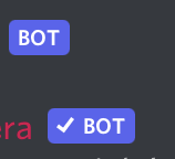
The diamond next to Community’s name has always been confusing, but now it seems a little more so than before: why should it have the same “mod” label as the people who moderate our sites? It would make sense if it was labeled as the bot that it is, perhaps similar to how Discord is:

bot icon, one verified one not

In short: Community should keep the diamond but be labeled “bot” instead.

2
25

Is it intentional that the new icon cuts/rounds off the top and bottom tips of the diamond? Personally, I liked the sharply defined points. The degree of cutting off varies from place to place.

Old:

old diamond with sharp tips

New Communities list:

new diamonds with rounded tips

Username on the profile page (much sharper points!):

new diamond with sharper tips

In a comment:

rounded tips, bottom cut off

(All pictures are of Tink, for consistency)

7
  • Is this in the Communities list? For me (on Chrome), it's not exactly cut but with "softened" edges: i.sstatic.net/iY8n6.png
    – 41686d6564
    Commented Jul 28, 2021 at 19:14
  • @41686d6564 this was the Communities list, yes. (If it matters, I stole pictures from Tink's profile page). I'm also on Chrome, latest version to my knowledge.
    – bobble
    Commented Jul 28, 2021 at 19:15
  • 1
    I still see the same thing on Tinkeringbell's profile. Not sure why it looks different for you. Perhaps it has to do with screen resolution, DPI settings, etc.
    – 41686d6564
    Commented Jul 28, 2021 at 19:18
  • I see the same rounded edges as 416: i.sstatic.net/bwOFv.png . I agree with you though that the pointed points look better!
    – zcoop98
    Commented Jul 28, 2021 at 19:41
  • 1
    @zcoop98 Maybe some users complained that mods' diamonds were "too sharp" :-P
    – 41686d6564
    Commented Jul 28, 2021 at 19:50
  • @41686d6564 I've added some more images of different places; the cutting off/rounding varies.
    – bobble
    Commented Jul 28, 2021 at 20:18
  • 1
    This has been fixed upstream as part of our Stacks design system. The icon should now look a bit sharper.
    – Ben Kelly StaffMod
    Commented Aug 31, 2021 at 20:07
21

Related to this request, I suggest to "unite" the Staff and Mod labels when a user is both a staff member and a moderator.

Before:

Mod and Staff labels as it is now

After:

Mockup of a label showing staff member who is also moderator

This is easily seen as "Staff member who is also a moderator", and can be applied anywhere. To achieve that all I did was adding the s-badge__moderator class to the Staff span element.

7
  • Yes! Much cleaner! I'm not a fan of these badges being so prevalent anyway. Especially on small sites where maybe 20% of the comments are from mods, meaning that the screen is full of these blue badges all over the place. Commented Jul 29, 2021 at 19:26
  • 2
    Interested in potentially following up on this later, but going to wait and see the impact of other soon-to-be-launched changes to styling to tone down the impact, before we proceed with this.
    – Yaakov Ellis StaffMod
    Commented Aug 11, 2021 at 19:37
  • Absolutely not good - the proposed solution says they are Staff and nothing about being a moderator. I can tell if it is a Moderator by seeing the text Mod on a background- the new set up is much better than relying on an obscure mark and colours are not a good thing to give information - they can highlight information but the information has to be there.
    – mmmmmm
    Commented Aug 11, 2021 at 19:44
  • @mmmmmm staff who don't get a diamond will just have the orange "staff" label". Staff member who also has a diamond will have the diamond next to the "Staff" label, it is really clear in my opinion. Commented Aug 12, 2021 at 6:08
  • Ah I am somewhat icon blind - the text is what matters icons just make it look pretty and colours emphasise it - either icons or text or both but not a mixture
    – mmmmmm
    Commented Aug 12, 2021 at 8:49
  • @YaakovEllis Oh no :( Can you please explain why this feature request is declined? Commented Feb 20, 2022 at 9:02
  • 1
    While we hear the argument that in some ways, it can make the role of staff-mod clearer, we want to avoid confusion in creating a new tag that is a composite of two. So status-declined for now, could be revisited in the future.
    – Yaakov Ellis StaffMod
    Commented Feb 20, 2022 at 9:13
19

Quick feedback: not a big fan. I feel like these are inconsistent with the overall style of comments/badges/tags. The new labels are overtly styled and simply jump out of the screen.

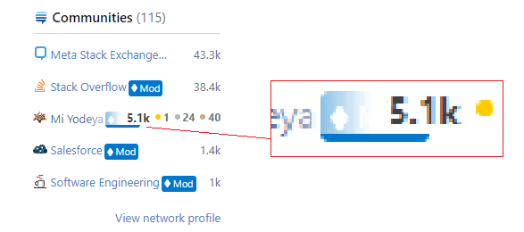
In any case, here's what looks like a styling in profile pages (link) when hovering the mouse over the communities listed in the "Communities" sidebar:

screenshot

6
  • 1
    Can you be more specific about what the bug is in the profile styling? Do you mean the part of the badge that sticks out under the reputation display on hover?
    – zcoop98
    Commented Jul 28, 2021 at 19:43
  • 3
    This is not specific to the new badges, BTW. See: i.sstatic.net/tCsAF.png
    – 41686d6564
    Commented Jul 28, 2021 at 19:46
  • 1
    @zcoop98 yep, doesn't look right. Edited the screenshot to be clearer. Commented Jul 28, 2021 at 19:46
  • 2
    @41686d6564 well damn, now that I've noticed that my day is ruined. Commented Jul 28, 2021 at 19:49
  • 1
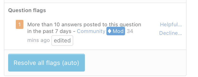
    The listing now uses the old mod diamond
    – Yaakov Ellis StaffMod
    Commented Aug 16, 2021 at 19:01
  • @YaakovEllis thanks, also I like this new design much more, feels in line with the rest of the comments' style. Commented Aug 17, 2021 at 16:36
14

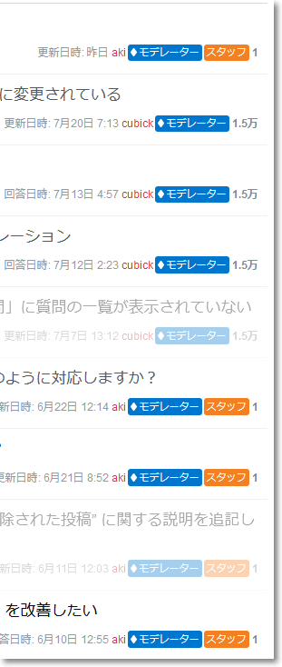
The "Mod" icon has the classic "Moderator" tooltip/hover text, which was also visible when hovering over the ordinary diamonds before this change (or as they appear now on main sites). The new "Staff" icon doesn't have a tooltip. Could you add a tooltip to this icon with some fitting text? For example, "Stack Overflow Employee" would do nicely.

If you were feeling fancy, you could put the employee's job title (if available) there instead. "(Position) at Stack Overflow" or something similar.
2
  • 3
    I don't think the system actually knows what people's position are, so I think that part would require a big change. A tooltip seems doable, though. :D
    – Catija StaffMod
    Commented Jul 28, 2021 at 20:54
  • 2
    The staff label now has a tooltip: "Stack Overflow staff"
    – Yaakov Ellis StaffMod
    Commented Aug 16, 2021 at 18:37
14

This is what the moderator tab on a certain user's profile says right now:

enter image description here

Perhaps it's time to drop the '(moderator)'?

2
  • 3
    Question is: What did Rosie do that you had to open the mod dashboard?
    – rene Mod
    Commented Jul 28, 2021 at 20:18
  • 1
    @rene this was the top question on the MSE homepage when I was doing science ...
    – Glorfindel Mod
    Commented Jul 28, 2021 at 20:21
14

On the moderator history page, the labels underflow the Talkative / Outspoken badge indicators:

enter image description here

Perhaps the easiest solution is not to show those indicators at all; it's not like they are really significant...

1
  • 3
    This has been fixed and is live. We tweaked the layout on this column to remove the position: absolute and better position those badge indicators (along with any other info that sometimes shows in that area).
    – Ben Kelly StaffMod
    Commented Aug 31, 2021 at 19:58
13

The new muted blue of the Mod marker makes it difficult to see in the user card for questions and self-answers:

mod marker with blue box

I'd suggest maybe adding a darker blue border to the marker box, or something similar to demarcate them from the user box

4
  • 5
    it's hard to distinguish the background, but it's not harder to read.
    – Kevin B
    Commented Aug 12, 2021 at 20:51
  • 2
    Same for when a mod closed a question: i.sstatic.net/lrnJa.png
    – Tinkeringbell Mod
    Commented Aug 13, 2021 at 11:05
  • 2
    This seems to have been fixed now with the new border on the Mod label.
    – Glorfindel Mod
    Commented Aug 30, 2021 at 19:41
  • 2
    This has been fixed upstream in our Stacks design system. We've added a darkened border around both of the Mod and Staff badges to help them better stand out against any background.
    – Ben Kelly StaffMod
    Commented Aug 31, 2021 at 20:09
12

Can we change the blue and orange colour used on the mod and staff button to use stacks colour: theme-secondary-300 and orange-300?

This makes it a little less bright and in your face, and more in line with the more neutral background of the rest of the sites.

It would then look like this:

enter image description here

3
  • 1
    Also when writing this answer, I see that the results from the variables I use contradict the colours that are given on stackoverflow.design/product/base/colors
    – Luuklag
    Commented Jul 28, 2021 at 21:09
  • 1
    We already have contrast issues with the current colors. These issues will only get worse if we make the badges lighter. So gonna have to decline this one.
    – Yaakov Ellis StaffMod
    Commented Aug 9, 2021 at 18:53
  • Would contrast improve if you were to use black/dark blue letters on a lighter background @YaakovEllis?
    – Luuklag
    Commented Aug 9, 2021 at 21:44
12

The new Staff badge text colors fall short of accessibility standards and are difficult to read

The background color for the Staff badges only has a contrast ratio of 2.63:1 with the text "Staff". This falls short of the WCAG AAA accessibility standard for normal text, which requires a contrast ratio of 7:1. Also, the small badges that appear on comments and home pages are very difficult for me to read without zooming in.

While the AA standard only requires a ratio of 4.5:1, I'd highly suggest that they conform to the AAA standard, because the badges that show in some places (e.g. comments, home pages, etc.) are smaller than normal text.

7
  • 3
    I've done a lot of thinking about WCAG contrast ratios, and take them seriously. We can do better at systems level. However, the metric WCAG uses for contrast ratio is not perfect, and there are lots of subjective issues with orange, a color we can't avoid, giving our branding. Some threads: twitter.com/DanHollick/status/1417895151003865090 twitter.com/edwardsanchez/status/1234002776377544704
    – Aaron Shekey StaffMod
    Commented Jul 28, 2021 at 20:59
  • @AaronShekey If you use the markup I proposed previously, you'll be able to use orange, and won't have to worry about contrast ratios since there's no text. Commented Jul 28, 2021 at 21:05
  • 5
    I appreciate your mockup, but we're not going to ship a rounded rectangle with no content to indicate staff members. It looks like a rendering error, and the word staff is way more understandable. ✌️
    – Aaron Shekey StaffMod
    Commented Jul 28, 2021 at 21:09
  • @AaronShekey That makes sense. By the way, there's also another accessibility report I filed that doesn't involve the orange branding color; can you please escalate that to the right people (IIRC it's in Lisa's territory)? Commented Jul 28, 2021 at 21:11
  • What's the rationale for recommending the AAA criteria? Most organisations don't try to meet level AAA at all, and level AA is sufficient. Commented Aug 13, 2021 at 11:19
  • Coincidentally: the mod badge now meets level AAA text contrast anyway! Mod badge is at 9.77, staff badge is at 5.88. Commented Aug 13, 2021 at 11:25
  • 1
    @AaronShekey You could always use ⚕ or ⚚, or even 💈 — but probably not 𝄁𝄚𝄚𝄞 . :)
    – tchrist
    Commented Aug 28, 2021 at 3:18
12

If a marker appears as the top line in a comment, the top side of the marker is cut off

If a moderator or staff marker appears in a comment, it only appears correctly if it's the second line in the comment or later:

Not cut off

But if it's the first line in a comment, the top sides are cut off slightly:

enter image description here

Can this please be fixed?

6
  • Can you include a link to the comment you're seeing this issue on? I'm unable to reproduce the issue locally on Windows 10 in Chrome or Firefox. Any additional details as to what platform you're running on would be useful as well.
    – Ben Kelly StaffMod
    Commented Aug 23, 2021 at 19:24
  • @BenKelly It can be reproduced on this comment from a non-staff moderator: the "Mod" badge's top is cut off. Zoom the page in with a touch screen to see clearly. Commented Aug 23, 2021 at 19:40
  • Thanks for the link. I still can't seem to reproduce the issue on Windows 10 Chrome 92/FF 92, Android Chrome 92/FF 91, or mobile Safari on iOS 14.7.1. Since you're still able to reproduce the issue, can you give me some additional details about your browser / OS?
    – Ben Kelly StaffMod
    Commented Aug 23, 2021 at 20:53
  • @BenKelly It was in the dev version of Edge, on another machine. I tried on a stable browser and it seems to be gone. It would be nice if you investigated it still despite the policy of not supporting beta browsers, in case the bug remains in the corresponding future stable version. Commented Aug 23, 2021 at 22:46
  • Thanks for the info. I just tried in Win 10 / Edge 93 beta and couldn't reproduce still. I'm going to mark as status-norepro for now, but I'll be keeping an eye on it.
    – Ben Kelly StaffMod
    Commented Aug 24, 2021 at 17:59
  • @BenKelly You sure that your screen width is high enough that the comment is only visible on one line, and that the sign doesn't wrap to the next line? Commented Aug 24, 2021 at 18:00
10

The staff label isn't applied to all revision entry types

Weird little thing I noticed, but there's something of an inconsistency to where the staff label appears on non-revision post history entries. As far as I can tell, it happens both on the /revisions page and the \timeline.

Examples:

Unprotection
enter image description here

Bounties
enter image description here

Closing
enter image description here

Locking, deletion and undeletion enter image description here

I don't know whether there are other actions which also don't get the staff label, outside of bounties these aren't trivially tracked down.

(And I'll leave it link only as it's only a gratuitous dupe of the second example, but this makes certain timelines look silly.)

1
  • 1
    This is fixed. Staff labels should show up for all this stuff now.
    – Yaakov Ellis StaffMod
    Commented Aug 16, 2021 at 18:38
9

The spacing between the indicators and the user names is different in user cards and in the comment sections:

image highlighting the different spacing in user cards and the comment section

Makes it look like the user card is slightly broken when seen in proximity like that.

9

In comments, the Mod/Staff labels are not aligned with the box indicating that Yaakov is the OP of this question.

See how the red line in the following image is perfectly on top of the box surrounding his name, but intersects with the mod badge:

Screenshot of Yaakov Ellis's comment on his own question, with red line indicating that Mod/Staff badge height is taller than question OP indicator

This is because they are not equal in height. The post.owner item is 20.2 pixels, while the mod label is 20.5 pixels according to Firefox's inspector tools.

3
  • The text looks mis-aligned everywhere to me, it’s just more obvious when the name is in a box itself.
    – ColleenV
    Commented Aug 24, 2021 at 18:15
  • This is now fixed - more or less. There's still some work that needs to be done to better unify the post owner and mod/staff badge design, but it looks better now than it did.
    – Ben Kelly StaffMod
    Commented Aug 31, 2021 at 20:00
  • @BenKelly you aligned the top I guess, but their still not the same heighth, so now their bottoms are off.
    – Luuklag
    Commented Sep 1, 2021 at 4:58
8

I understand why you are hesitant to ship a simple orange box, as suggested by https://meta.stackexchange.com/a/367900/1044379.

But this is unacceptably gaudy. Those big blue and orange boxes are literally all that I can see. On some site metas, the huge blue Mod boxes clash very weirdly with the color scheme. We do not need to draw attention to certain questions just because they have recent changes by moderators. Particularly when that moderator is Community, who, for all we know, is just bumping an old question.

Here is a reasonable middle ground: Use a blue hollow box (like mentioned in this answer with an "M" for moderators and an orange one with "S" for staff. While these boxes are not self-explanatory, they do not look like weird symbols that failed to load, and they will attract enough attemtnion for people to click the link to the profile and see a significantly larger indicator that a user is staff or a moderator, thereby resolving concerns mentioned by Catija in this conversation.

On a related note, having both the diamond and the "Mod" marker is a redundancy. This shows up in places where screen real estate is tight, so it is important to shorten things as much as possible. The bigger the new blue box, the more attention it draws. Either the diamond or the "mod" (or abbreviated m) must be dropped.

6
  • 3
    @Catija I agree, they are not self-explanatory. But they do not look like accidents and they will encourage users to click user profiles (or at least hover with a mouse). The profiles can have more clear explanations. Showing these large banners to frequent users simply for the benefit of new users is impractical, particularly since the proportion of new users who find themselves on meta but do not know that diamond users are moderators must be relatively small. Commented Jul 29, 2021 at 5:05
  • A single diamond is enough. Commented Jul 29, 2021 at 5:07
  • 3
    I disagree. Completely. There's a lot to this situation that your answer clearly shows you don't quite understand. Asserting that it's "unacceptably gaudy" and demanding that we choose between either the diamond or the "Mod" - the first is an opinion and the second actually has an explanation - the diamond is a tradition and it's how we actually refer to mods - "Diamond moderators" removing that part makes it very difficult to separate the generic use of "Moderator" from the specific one. Additionally, main sites use the diamond only, so it would make little sense to exclude it on meta.
    – Catija StaffMod
    Commented Jul 29, 2021 at 5:08
  • 1
    @user1271772 for people familiar with the network, yes. But I will concede that new users could use some more indicators. I remember being somewhat confused myself when I first saw the diamonds. Commented Jul 29, 2021 at 5:08
  • @user1044379 It doesn't take long to figure out. The problem now is that the mod label is way too big and loud. Is the purpose to draw users' attention to only the comments made by mods, and to ignore all comments by other users? It certainly does look that way. Commented Jul 29, 2021 at 5:12
  • 2
    @Catija fair enough. As staff, you are required to solicit feedback from the community, but we do not expect you to agree to use every suggestion. As long as the SE team reads and reasonably considers every answer posted here in good faith, I'm happy. Commented Jul 29, 2021 at 5:12
8

If the Mod and Staff badges were reduced to 2/3 of their current size that might resolve half of the complaints here. It's a quick tweak, before working on the "saturation" and resulting WCAG AAA accessibility contrast. Note: The top grid image uses pointy diamond.

Example appearance:

Grid of three user badges, to compare resized moderator and staff badges

7
  • I suspect you're right about the placement/ size problems, but I also think that at that size, the badge text would be very, very small, likely too small to still be useful.
    – zcoop98
    Commented Jul 28, 2021 at 22:56
  • The idea of slightly reducing the icon size seems elegant, the problem would be the font size inside the icon would become smaller than the smallest fonts currently used (in comments). But good post, it's nice seeing the possibility explored.
    – bad_coder
    Commented Jul 28, 2021 at 23:01
  • @zcoop98 & bad_coder: As bad_coder already asked, and recieved the Developer's reply - There are upcoming tweaks to accomodate Dark Mode; and the reduction in white brightness (via font size) is correct over using a greyer white instead, as Adobe explains (and that webpage demonstrates, using the controls at the top). - It could be 3/4 size, but I think that would still exceed the boundaries in some locations.
    – Rob
    Commented Jul 28, 2021 at 23:21
  • @bad_coder & zcoop98, You can see how that font size would appear in light and dark mode by looking at the user profiles on Stack Overflow.
    – Rob
    Commented Jul 29, 2021 at 0:07
  • Let's make it 1/10th of the original size! Commented Jul 29, 2021 at 19:30
  • Declined: Reducing them to 2/3 of the current size would make the text be just too small
    – Yaakov Ellis StaffMod
    Commented Aug 9, 2021 at 18:55
  • Yaakov, thanks for considering this request.
    – Rob
    Commented Aug 9, 2021 at 21:51
8

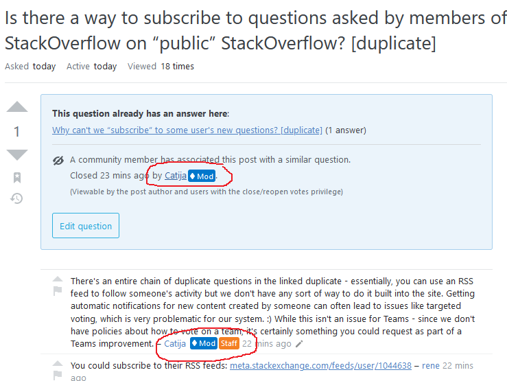
The "Staff" badge is missing in the "Closed" section of the post notice.
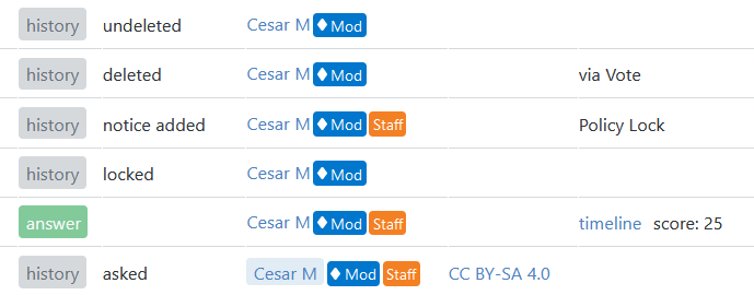
For example: in the below screenshot, in a post's notice Catija has Mod badge only, but in the same post's comment section Catija has Mod and Staff badges. Seems this is not consistent on the same page.

Bug

8

In mod's profile (who is also a staff), double staff appears. (Mobile view)

enter image description here

0
8

The labels need more margin in the ♦ moderator flag dashboard; it covers/touches letters with descenders on the previous line, like the q in this example:

enter image description here

(screenshot from Safari, iOS 14.6 an iPhone 11. In case you're wondering: yes, it's a flag on this very question)

3
  • 4
    This is sometimes also the case in regular comments.
    – Luuklag
    Commented Jul 28, 2021 at 21:43
  • Looks like it could turn a bug into a buq. Commented Aug 3, 2021 at 4:11
  • 1
    This has been fixed and is live. We've unified the text here with the same styles we use for comment text. This includes a very slight bump to line height, which fixes the issue in a roundabout way. There's still some work we'd like to do in this area to further improve things, but this is at a satisfactory level for now.
    – Ben Kelly StaffMod
    Commented Aug 31, 2021 at 20:02
7

Nicolas was kind enough to fix a typo in one of my posts, but on /revisions the new badges don't align properly and cover part of his name:

enter image description here

6

Consider the fact that the label string needs to be translated at the international site.
Because there is no suitable Japanese that represents the abbreviated "mod", more character widths are required.

Mod
モデレーター

enter image description here

4
  • 2
    Or just use mod and staff.
    – Luuklag
    Commented Jul 29, 2021 at 4:26
  • 1
    what would you recommend?
    – Yaakov Ellis StaffMod
    Commented Jul 29, 2021 at 8:48
  • 1
    On international sites, maybe omit the word "Mod" and just leave the diamond as a card you can mouseover and see the full word. The card at least hints that you can do this from a UX perspective.
    – Machavity
    Commented Jul 29, 2021 at 13:45
  • 1
    I dont see a specific ask here. The international sites have control over how they translate these terms, so there is not much more that we can think to do here (but we did consider what you brought up).
    – Yaakov Ellis StaffMod
    Commented Aug 9, 2021 at 18:56
6

The Staff badge is pushed to the next line when the username is a bit long

Actually, when the username is even longer, both badges are pushed to the next line:

Is this a bug or intentional behavior?

5
  • 6
    Clearly Aaron needs a shorter name
    – Machavity
    Commented Jul 28, 2021 at 20:21
  • @Machavity See the edit :P
    – 41686d6564
    Commented Jul 28, 2021 at 20:24
  • 1
    There's only so much space in the box, so I'm assuming this is by design.
    – Catija StaffMod
    Commented Jul 28, 2021 at 20:53
  • 2
    @Catija I assume what 41686d6564 means is that only one badge is wrapped instead of both (which, I agree, would be more logical). If both badges were a part of a single flex item, I am pretty sure that would be possible :)
    – 0Valt
    Commented Jul 28, 2021 at 21:05
  • 1
    Wrapping cannot be avoided in all cases. However, we do plan on removing the mod badge and adding the diamond to the staff badge for staff mods, which can hopefully help for some of these scenarios.
    – Yaakov Ellis StaffMod
    Commented Aug 9, 2021 at 18:57
6

Remove the mod card on MSE and leave them as diamonds.

There are similar requests elsewhere, but I'm limiting this to just MSE. My reasoning is that MSE is different from other Metas. On any other Meta, the Metas work for/with the mods. It's useful to see mod interactions highlighted in that regard.

On MSE... not so much. Mods here aren't the reason to post. I mean, the MSE mods say useful things and all, but the Staff interaction is what people are after here. I'm not as concerned with what, say, Glorfindel posts, because as far as SE policy is concerned, we're all in the same boat.

7
  • 1
    Even on MSE, Mods are the ones who are normally responding to flags, and dealing with situations that arise. Although Staff Mods do have the power to do things here, and sometimes do, it is not accurate to say that Mods and non-Mod users on MSE are all in the same boat.
    – Yaakov Ellis StaffMod
    Commented Jul 29, 2021 at 8:50
  • 2
    @YaakovEllis I probably didn't explain it as well as I should have. MSE mods can and do moderate (and they do an excellent job at it). But few people (if any) come to MSE to talk about how MSE mods (specifically) moderate. People generally come here for staff replies. Highlighting MSE moderators on MSE, in that context, doesn't really help the folks trying to use MSE. It's not a big deal, just a minor quality-of-life change.
    – Machavity
    Commented Jul 29, 2021 at 13:14
  • For the same reason why you, a non-mod on MSE, wants it left as diamonds on MSE, the non-mods on SO will also want it removed from SO and the rest of SE. Consider it please! Commented Jul 29, 2021 at 19:33
  • @user1271772 Huh? I am a moderator on SO and I rather like the change for MSO. I'm just saying it doesn't work for how people use MSE is all
    – Machavity
    Commented Jul 29, 2021 at 19:38
  • @Machavity That is precisely my point. You're a moderator on SO and you like it on MSO. You're not a moderator on MSE and you don't like it on MSE. Non-mods on SO will probably have the same opinion about these loud labels all over the place, just like you don't like them on MSE. If you were not a mod on SO, you would probably not want other people's comments to be getting 20x more attention than yours. Commented Jul 29, 2021 at 19:48
  • @user1271772 You seem to be missing my point. In many cases, people come to MSO to ask questions of both moderators and staff. I consider the Meta cards in those cases to be part of the job. How many folks come to MSE to ask questions of MSE mods?
    – Machavity
    Commented Jul 29, 2021 at 19:54
  • @Machavity You seem to be missing mine. You're right that people don't ask questions to MSE mods much here, but that's not my point, and you will probably never see it. I wonder what proportion of the 15 million non-mods on the network, are in favor of these loud boxes all over the place, like you (a mod on SO) are. Commented Jul 29, 2021 at 20:25
6

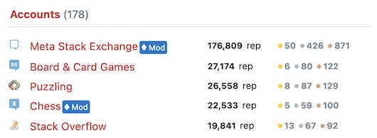
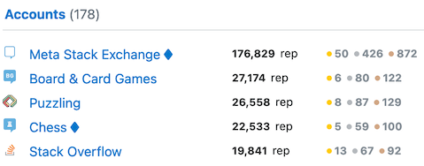
Don't show mod labels in network account lists

Mod labels are shown in a user's (network) account list on Meta sites:

enter image description here

(and as @41686d6564 mentions, the Communities list)

but not on main site profiles, where the diamond nicely 'blends' and almost looks like it's part of the site name:

enter image description here

The new mod label indicates (to me) some degree of importance; 'pay attention to this, it's written by somebody who knows things'. Since I'm just a regular on Meta Stack Overflow, I have no additional powers or authority there; it feels a bit out of place.

9
  • I'm not sure I understand this one. What does being a regular user on (Meta) Stack Overflow have to do with deciding whether to display the label or the diamond symbol?
    – 41686d6564
    Commented Jul 28, 2021 at 21:13
  • @41686d6564 I think Glorfindel intends to say he prefers to have just diamonds, as it used to be, in this place.
    – Luuklag
    Commented Jul 28, 2021 at 21:14
  • @41686d6564 exactly my point. My user status on site X doesn't matter on site Y or on site meta.Y. Yet it is shown differently.
    – Glorfindel Mod
    Commented Jul 28, 2021 at 21:15
  • Um, maybe I'm missing something obvious... but what does a user's status on a given site have to do with whether to display the badge or just the diamond when they both indicate the same thing? (note: I'm not challenging your preference; I just don't understand the relevance between those two things). CC: @Luuklag
    – 41686d6564
    Commented Jul 28, 2021 at 21:18
  • 2
    @41686d6564 the label is there to convey some degree of importance; 'pay attention to this, it's written by somebody who knows things'. More than just a diamond symbol, which (to a casual visitor) almost looks to be part of the username.
    – Glorfindel Mod
    Commented Jul 28, 2021 at 21:21
  • 1
    That's fair. I assume you're proposing the same for the Communities list on the Profile tab as well, right? If so, you might want to add that to the answer.
    – 41686d6564
    Commented Jul 28, 2021 at 21:24
  • @41686d6564 yes, thanks. That happens when you use your own profile as an example - it always opens on the Activity tab :)
    – Glorfindel Mod
    Commented Jul 28, 2021 at 21:30
  • @Glorfindel That's the advantage of not being a mod - you must check another user's profile :P
    – 41686d6564
    Commented Jul 28, 2021 at 21:33
  • This listing now uses the regular old mod-diamond (since it refers to mod status on main sites), which resolves this issue.
    – Yaakov Ellis StaffMod
    Commented Aug 16, 2021 at 19:02
6

When the line above the line containing the staff/mod badge contains a hyperlink, they underscore of the hyperlink (almost) collides with the staff/mod badge:

enter image description here

This could be fixed by making the height of the badge a tad smaller, as to be consistent with the OP indicator on comments.

3
  • 1
    Similar enough to just post in a comment here: The badges are also touching some long letters, like the g in this comment.
    – Tinkeringbell Mod
    Commented Aug 4, 2021 at 11:31
  • Can you include a link to the comment you're seeing this issue on? I'm unable to reproduce the issue locally on Windows 10 in Chrome or Firefox. Any additional details as to what platform you're running on would be useful as well.
    – Ben Kelly StaffMod
    Commented Aug 23, 2021 at 19:24
  • @BenKelly I edited a hyperlink to the image to go to the comment itself directly. It appears that somewhere down the line there came to be a bit more room between the lines, or a border around the badges, as currently there is the tiniest of gaps between the underscoring of the URL and the badges.
    – Luuklag
    Commented Aug 25, 2021 at 5:21

You must log in to answer this question.

Not the answer you're looking for? Browse other questions tagged .