65

Earlier this year, we started work on a design refresh for the moderator flag dashboard, and ran a limited alpha on a few sites. Today, we're opening it up to the rest of the network, with the goal of fully launching by the end of June. (Yes, that is an actual date.)

Brief introduction for curious non-mods

As the name suggests, the moderator flag dashboard is a tool for moderators to review and act on post and comment flags. Each post is peppered with contextual information (e.g. is this a new user? have other mods looked at this?) and provides actions relevant to the post and flag types.

What's changing?

The most obvious change is that it no longer looks like it was designed ad-hoc by a handful of developers over a number of years based on the specific needs of the time.

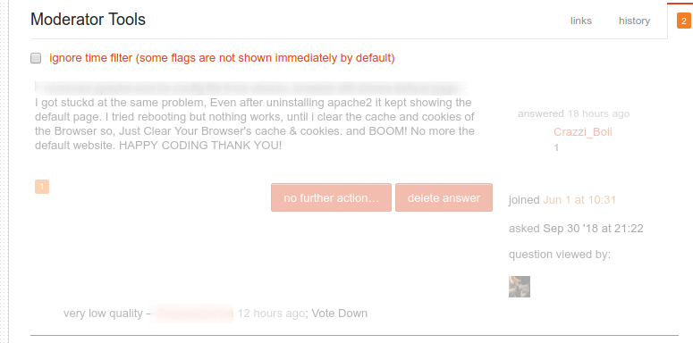
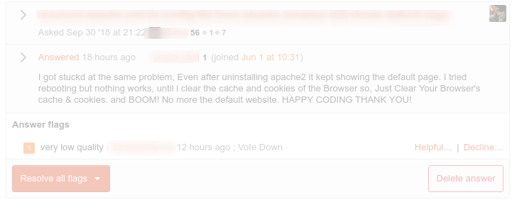
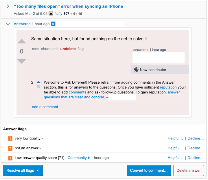
Before:

Screenshot of the existing dashboard

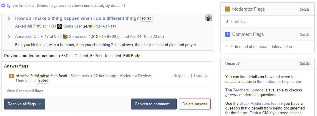
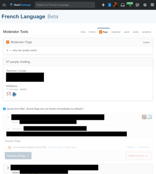
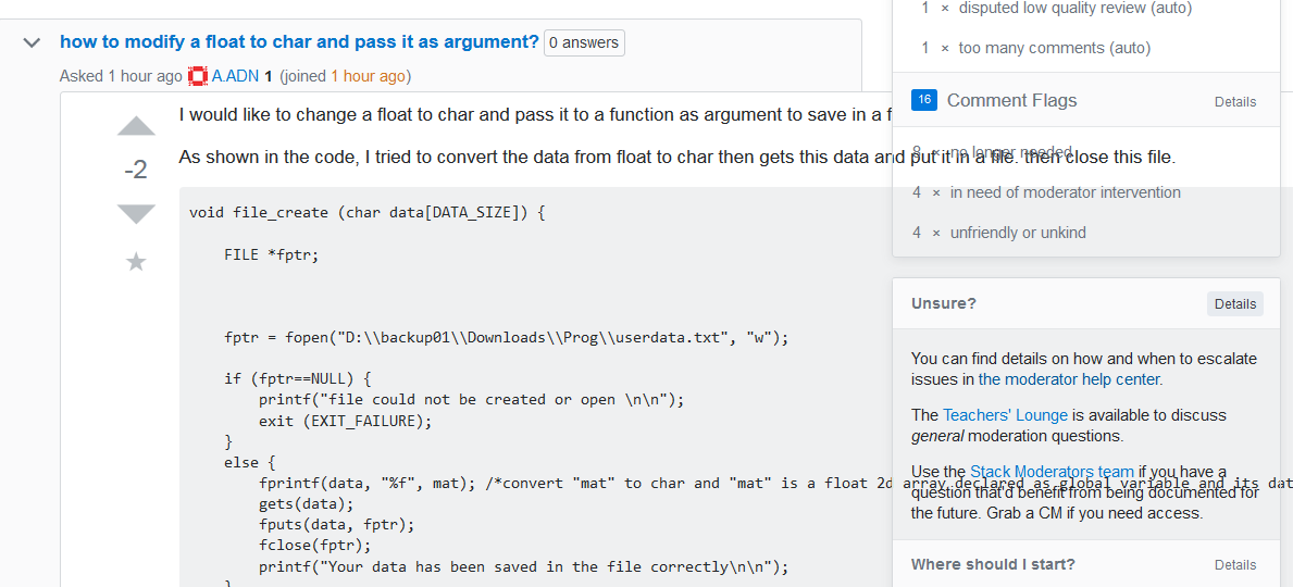
After:

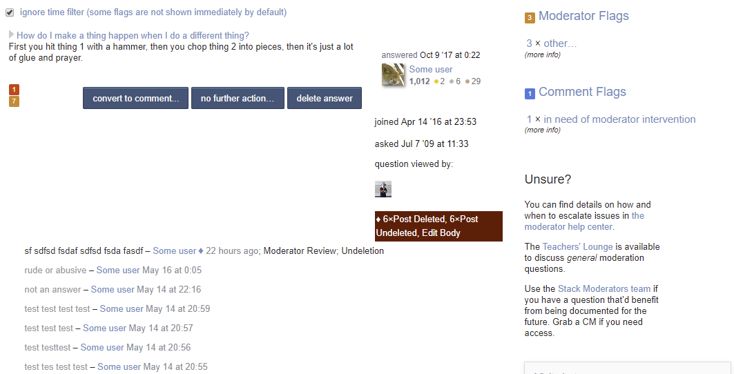
Screenshot of the new dashboard

Beyond appearances, there have been some thoughtful reworks:

  • More / clearer context for flags (e.g., edited-after-flag indicator, post owner indicator).
  • Consistent location and ordering for actions on posts, flags, and comments (making muscle memory matter!)
  • Comment editing, move comments to chat works the same in the dashboard and on the question page.
  • The flag "waffle bar" stays better in sync with changes happening the page and vice versa. Same with actions taken inside embedded posts.
  • Responsive design for phones and tablets.
  • Previously undiscoverable UI components are now actual buttons.
  • "No further action" has been brought inline with the page.
  • Smaller quality-of-life improvements along the way.

Importantly, the code has also been cleaned up, modernized, and is now better understood by the team. This increases the potential for the tool going forward.

Ok, I'm a moderator - how do I enable it?

It's an alpha feature - so you can enable it from your profile settings (/users/preferences/current), just find the section labeled "Admin Dashboard Refresh" and check the "opt me in" box, then go to /admin or any flagged question page and enjoy! Opting in/out is done on a network level, so if you moderate multiple sites you only have to check the box once.

If you run into a show-stopping bug, you can disable it by unchecking the same checkbox - the preference is cached though, so it'll take a few minutes to take effect after you disable it.

I've found a bug or have other feedback - where do I post that?

Here - just post an answer with details. If you post a screenshot, please remember to redact any sensitive data first!

Since we are officially out of alpha, all bugs and feature requests should be done in the form of questions tagged on MSE, not answers on this post. Feel free to post an answer here if you have specific concerns about the release process.

15
  • 10
    I'm not a mod but thank you; this looks like a huge improvement just from the screenshots alone. Hopefully this will reduce the number of "oops, I goofed" answers from mods on Meta due to lack of immediately available context or user-friendly UI.
    – TylerH
    Commented May 29, 2019 at 22:05
  • 9
    end of June ... that is 6 to 8 weeks ...
    – rene Mod
    Commented May 29, 2019 at 22:39
  • 2
    @rene daycalc.appspot.com/06/28/2019 Commented May 29, 2019 at 22:55
  • 1
    Next question - do I need to do this for each site I moderate?
    – Rory Alsop
    Commented May 29, 2019 at 23:08
  • @RoryAlsop Alpha tests are set up on the account level, so it'll work across all your sites. Commented May 29, 2019 at 23:10
  • 4
    Thank you - have just tested, and it's pretty good. One request - I'm still having to open up the post, as there is such a small window I'm only getting a couple of lines, so for a spam/not an answer flag there isn't enough to confirm. Can we get a bigger box?
    – Rory Alsop
    Commented May 29, 2019 at 23:13
  • 1
    @RoryAlsop I'm not sure what you mean. Are you talking about the body summary (a few lines from the start of the post) or the > button next to the title? If I click the > I get the full post embedded in the dashboard and it should be full height. Commented May 29, 2019 at 23:18
  • 1
    Okay, that doesn't happen for me. I'll try and figure out why and get back to you with more info
    – Rory Alsop
    Commented May 29, 2019 at 23:44
  • @RoryAlsop This is what should be happening: i.sstatic.net/IE1g5.png Commented May 30, 2019 at 0:21
  • 4
    I'm not able to reproduce the UI design change.
    – Arulkumar
    Commented May 30, 2019 at 3:23
  • 10
    @Arulkumar You're not a moderator. You can't access the page that this post refers to.
    – Catija
    Commented May 30, 2019 at 4:13
  • 2
    @Arulkumar nice try to get a diamond .. I tried something similar ...
    – rene Mod
    Commented May 30, 2019 at 7:26
  • feature request wrt flags on hot questions - would you prefer it to be duplicated as an answer here?
    – gnat
    Commented May 30, 2019 at 19:04
  • I think this should be discussed privately in a team.
    – Pandya
    Commented May 31, 2019 at 1:10
  • 2
    @Pandya Then it would only be accessible to mods who are (a) members of a programming site and (b) willing to ignore certain privacy issues. Several active mods fail one or both of these conditions. Commented May 31, 2019 at 14:35

34 Answers 34

34

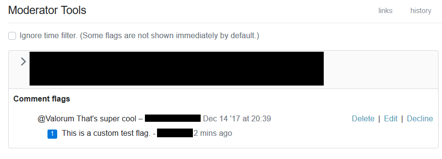
For comment flags, it can be hard to tell the difference between the comment text and the flag text.

For example:

example comment flag in dashboard

Usually one can tell from context which is which, e.g. if the flag is a standard one like "no longer needed". But the formatting of the two lines of text is identical, and especially with custom flags, it can be easy to get confused for a moment thinking the flag text is the comment text or vice versa.

Please could the UI/formatting be improved here to clarify what's flag and what's comment?

22

Don’t show what the flagger of a comment did to the parent post (question or answer). For example:

Example

Here the comment flagger upvoted the post under which the comment was posted. I know that the vote wasn’t on the comment, because that one received no upvotes. Not only is this confusing, but also should I not see this information in the first place since it violates the anonymity of individual votes without need.

7
  • This makes sense to me but I'll run it by our community team. It 100% makes sense not to show votes on comment flags but they may have thoughts on why they do belong on post flags. We also show the number of times flaggers commented on the post, which I feel is still helpful, even on comments, because that's public information that could give you a hint on what direction to explore. Commented May 30, 2019 at 17:21
  • 7
    This has been available on the mod dashboard before this design refresh. The information is very helpful because it tells us something about the context of the flagger. We've seen some wonderful juxtapositions, like Rude or abusive and vote up. I'd be sad to see this go. It certainly is not a bug! Commented May 31, 2019 at 15:45
  • @MartijnPieters: This has been available on the mod dashboard before this design refresh. – not for comment flags (I checked for this very flag).
    – Wrzlprmft
    Commented May 31, 2019 at 16:58
  • Right, it wasn't visible in the comment flag board, but IIRC with Shog's flag handling userscript it could be shown anyway (as well as who flagged, which was hidden too until not too long ago). Commented May 31, 2019 at 17:12
  • 3
    @MartijnPieters: We've seen some wonderful juxtapositions, like Rude or abusive and vote up. I'd be sad to see this go. – Really? Except for a slight amusement factor and potentially pointing to a bad reviewer, I wouldn’t consider this very valuable. I cannot remember ever having made use of that information.
    – Wrzlprmft
    Commented Jun 1, 2019 at 19:33
  • 2
    @Wrzlprmft: yes, I've made use of that information before, where it was helpful in serial voting cases. Commented Jun 2, 2019 at 18:10
  • 1
    This is fixed. We now don't show post level "edited" and post actions on comment flags. Commented Jun 20, 2019 at 22:12
21

My main issue with the interface is that it is very cluttered:

  • There are lots boxes and horizontal lines. In particular the following seem unnecessary:

    • the boxes around edited and owner,
    • the box within a box when expanding a post view.

    Note that just removing these will probably not suffice to address the issue.

  • There is lots and lots of information. This is generally good, because we may want that information on some occasions, but you have to balance between that and overloading the interface. For example:

    • Details about the parent post (question to a flagged answer; question or answer to a flagged comment) such as date, author, etc. can be hidden by default and only shown when the post is expanded.

    • I certainly don’t need to know the number of badges of the flagged post’s author. I also rarely need their reputation and when they joined the networkk. I get that you do not want things to be hidden, but having this information in a pop-up is normal on SE.

  • There is very little space between major items (different posts that have received flags).

1
  • 2
    I've completed some of what you asked. Parent post information is only shown when relevant, e.g. when an answer is flagged and it was posted well after the question, reputation and badges are hidden. Joined information is still there as it was in the old UI, but the logic should be the same. I also increased the space between flagged posts substantially, as well as the space between post and comment flags. Commented Jun 27, 2019 at 17:20
17

I don't know if this falls within the sphere of the improvements you're currently making, but would it be possible to make the comment flag options helpful and decline rather than delete and decline? Sometimes I want to mark a comment flag helpful without deleting the comment, or vice versa.

A few days ago someone on my mod site flagged a comment, not because the comment was problematic, but because the comment raised an issue that warranted mod attention. The flag was helpful, but so was the comment ... so I had to needlessly delete and undelete the comment.

For posts, we can mark a flag helpful without deleting the post. Why not for comments?

8
  • This would necessitate four (five?) options: helpful (doesn't delete), delete (helpful), edit, decline... and, heck, even delete (decline flag). The alternate is to make it a two-step process - helpful/decline and delete/retain/edit. This seems to add a lot of complexity for what I've always assumed is a tiny minority of flags. The intention is to make comment flag handling simple. The cost is having to choose between infrequently confusing a flagger or adding a bit of work to flag handling. If we can do all of this somehow that'd be awesome but I haven't seen a great solution yet.
    – Catija
    Commented May 30, 2019 at 15:33
  • 3
    Not commenting on the request itself, but I think you can just do "Edit", "Save" on the comment and get the same effect. It dismisses the flag as helpful but doesn't mark it as "edited" in the UI. Commented May 30, 2019 at 16:27
  • @BrianNickel Thanks for the tip! I just tested it with a pending comment flag and it works as you describe. Don't think I'd ever thought of that before. Commented May 30, 2019 at 16:36
  • @Catija wouldn't 3 buttons do it? 1) "Delete comment": delete the comment and mark the flag as helpful; 2) "Dismiss flag": leave the comment, mark the flag as unhelpful; 3) "Mark flag as helpful": does what it says on the tin and doesn't delete the comment. The rest are edge cases, I think, that can be dealt with manually. The current "edit" button isn't needed, we could simply get a little pencil icon when hovering over the comment just as we do when visiting the page the comment was posted on. So, instead of the current "Delete | Edit | Decline" options, have "Delete | Decline | Accept".
    – terdon
    Commented May 31, 2019 at 10:23
  • @Catija It can't be that difficult since it's what you already do for posts: I don't have to delete a question in order to mark flags on it as helpful. Commented May 31, 2019 at 11:20
  • @Randal'Thor It's not that it's difficult to implement - I'm guessing it'd be pretty easy - but making it function like post flags will double the handling time because two separate clicks are needed - helpful/decline and delete/keep. When you're dealing with dozens or hundreds of comment flags, that's a lot of extra clicks. If the four options were equally used, that'd make sense to do but most of the time a comment flag is valid, the correct response is to delete it and most of time a comment flag is invalid, the correct response is to keep it.
    – Catija
    Commented Jun 1, 2019 at 4:44
  • This idea has merit but is big/nuanced enough that it should be discussed as a separate topic. Can you create a meta post for this with the feature-request, moderator-tools, and flag-dashboard tags? Commented Jun 20, 2019 at 16:59
  • @BrianNickel done ... er ... four months late. Commented Nov 7, 2019 at 16:44
17

In the "how do I dismiss" box, there's this text:

Note that deleting a post or comment automatically marks the flag as valid.

Everywhere else on the page - and, really, just everywhere else - flags are "helpful", not "valid". To be consistent, shouldn't it be "helpful" here too?

1
  • Fixed, but I realized there's other copy that needs to be reworked. 😒 Commented May 31, 2019 at 23:23
16

The too many comments autoflag now has a special button to move comments to chat (yay!):

Move comments to chat screenshot

Can this button please be made to dismiss the flag?

This has been a minor annoyance for years since we need to first move and then go back and dismiss the flag. The action of moving should automatically dismiss the flag as helpful.

I assume that the reason the button still appears when I revisit the page after having moved the comments is that checking that the comments have been moved requires some sort of lookup and that would slow things down. I get a warning if I try to move them again, so that's fine. But it would be really nice if I could handle this with a single click that both moves the comments and dismisses the flag.

4
  • 8
    On a high-comment-noise site I sometimes move the comments but leave the flag, as a reminder to check back later and purge the 50 new comments from people who ignore the chat room and keep discussing in comments. (I'm not making that up. This most-recently happened yesterday. It was 65 new comments then.) If we could get a new flag when some threshold number of comments appear after a move to chat, that would work for me. Commented May 30, 2019 at 20:02
  • 2
    @MonicaCellio ah, that's a good point. But I guess, as you say, we could get a flag for each 20 comments.
    – terdon
    Commented May 30, 2019 at 20:12
  • Checking since I'm not familiar. Is "Move comments to chat" an action that can be done multiple times? Commented Jun 25, 2019 at 21:41
  • @BrianNickel hi, sorry, I was travelling when I saw this and forgot to answer! No, unfortunately, the "Move comments to chat" can only be done once. Or, at least, only once to the same chat room. Once you've moved the comments to a chat room, you can't move new ones to the same chatroom easily at all.
    – terdon
    Commented Jul 5, 2019 at 8:04
13

Please don't gray out flags because I have visited them. It took me a while to understand what was going on (as you can see in the revision history of this post), the graying doesn't give me any information I don't already have (I can see my avatar) and it makes it much harder to read.

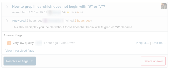
This is what the grayed out flag looks like:

grayed out flag

As soon as I hover over it, it looks normal:

normal flag

Can this please be removed and have all flags appear normal?

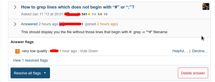
Or, at least have the effect be less strong? This is what it was like in the old UI (ignore the different colors, this image is from a different site where I had a pending flag to use as an example):

old UI gray flag

And this is the new:

new UI gray flag

I know they look pretty similar, but I'd never had any issues with this with the old UI and I thought it was a bug when I first saw it in the new. So it's more different than it might appear at first.

13
  • I think the intent is to declutter stuff a mod may have already looked at, which I think is a good idea... but I think it might be even better if it was explicit on the part of the mod with a "snooze this" button that would either remove or grey out an item for 24-48 hours.
    – Catija
    Commented Jun 7, 2019 at 13:48
  • @Catija part of the problem is the greying out makes the post fainter in the new UI than it was in the old.
    – ChrisF Mod
    Commented Jun 7, 2019 at 13:52
  • 2
    @Catija Could it become a global option to select at the top of the queue, like the "Ignore time filter" checkbox? We could have two of those checkboxes, one for showing/hiding the recentest VLQ/NAA flags and one for showing/hiding already viewed posts. (I'm guessing some mods like this greying-out thing and some don't.) Commented Jun 7, 2019 at 13:52
  • @Catija ooh, that would be great. Also, it has been pointed out to me that we've always had this graying out, but it seems to be more pronounced in the new UI. See the update.
    – terdon
    Commented Jun 7, 2019 at 13:55
  • @ChrisF I think the greying is the same... but now the main text is on a grey background instead of white, which reduces the contrast and makes it seem more greyed.
    – Catija
    Commented Jun 7, 2019 at 13:57
  • @Catija is this feature useful for any site other than SO? I can see how SO mods would like it since they have thousands of flags to keep track of, but most of us don't have the flood of flags those poor souls need to handle, so showing me that I've visited a flag doesn't seem to be giving any useful information to me. I can't remember finding it useful at any time in the past few years anyway.
    – terdon
    Commented Jun 7, 2019 at 14:00
  • @Catija - either way, it's still too faint ;)
    – ChrisF Mod
    Commented Jun 7, 2019 at 14:03
  • Hmm, personally as a new mod who just saw both the old and new version for a couple days now, I found the greying to be quite intuitive. I'd still support the extra checkbox solution to hide visited flags though. Or adding a hide/skip button to each post independently of whether I viewed it or not. Commented Jun 7, 2019 at 15:11
  • @ByteCommander do you find the greying helpful or useful in any way though? I admit I find it particularly hard to read, but I also don't get why we would want it outside SO.
    – terdon
    Commented Jun 7, 2019 at 15:12
  • I find a quick and unmissable indicator of having it seen before useful. Whether it needs to be fully greyed out like this (or a bit less faint), or shown in any other way (more obvious than the avatar in the corner at least) is not something I have a strong opinion on. It should also be clarified how long ago the question was viewed by someone though, in case it might have been before the current flag. A manual "ignore/skip for now" or "save for later" button might be at least as useful though. Commented Jun 7, 2019 at 15:20
  • Yeah, it's often before the flag or not even related to the flag (I have often seen flags on posts that I have visited already by chance).
    – terdon
    Commented Jun 7, 2019 at 15:39
  • 2
    I'm having a lot more trouble with the graying now, too. Why not sort flags I've seen already to the bottom, if we're trying to make it easier to focus on the new stuff? With my avatar right there in the top right corner, though (unlike the old one where it was farther down), it's easy for me to see that I've seen a flag already and I don't think I'd personally need anything else, though SO is different because they have so many mods that you might not be able to spot your avatar. Commented Jun 7, 2019 at 18:18
  • 1
    I increased the opacity of these from 30% to 65%, bringing the body to grey background contrast ratio to 4.68:1. So it should be visibly distinct but still readable. Because different people use this specific functionality different ways, to accomplish different goals, I think we need to flesh out any more complex solution as a separate feature request. Can you create a meta post for this with the feature-request, moderator-tools, and flag-dashboard tags? Commented Jun 20, 2019 at 22:06
12

Here's a screenshot of what I see right now on French.SE, on Chrome on Linux:

screenshot of the French.SE flag dashboard

The main problem with the new UI is that the information I want to reach is way down near the bottom of the page. From the top, there's: the top bar, the site name, the page tab bar, a box with a sort of table of contents, a mostly-empty box about people chatting (why doesn't it use the available width?), a checkbox for ignoring the time filter, and FINALLY the flags. The “Unsure?” box is nowhere to be seen.

To reproduce: use an operating system that lets you split the screen between multiple applications and make your browser narrow enough that the right sidebar on the main site pages moves to the bottom of the screen. This is the way I use Stack Exchange and I'm not going to change that.

I find it harder to see where content switches from one flag to an unrelated page than on the old UI. I've occasionally goofed by clicking the button for a flag while looking at the information for another flag, and the lack of separation can only make this worse. The old page had a horizontal line between flagged posts, and a lot of white space (mostly wasted space, but it did help a bit with the separation. Please add a horizontal line between flags like in the old page, and maybe a little more vertical space.

I never use the time filter. I guess it might be useful on high-activity sites, but on low-traffic sites it kicks off too early to be useful. I guess that most people either have the time filter always on or never on, so please move the checkbox to a less prominent place.

The first flag is grayed out. Maybe because I've already viewed the flagged post? The old UI had this graying out as well, and it just makes things hard to read. Don't gray things out at all. Also, what I did on the new flag dashboard has somehow caused me to be marked as having seen the second flag even though I didn't actually visit the post.

Why does the chat box on this page show rooms that aren't relevant here? I guess it's the same chat widget as elsewhere showing active rooms. It would be a lot more useful to show the Teacher's Lounge (which is showing up here because it's a pretty active room) and the site's mod room if any. I know there's no database entry that says “this room here is the site's mod room”, so please create one.

I only have one major complaint against the current flag dashboard page: it sucks for comments. They aren't shown in context by default — you have to click a button to see the context. Then deleting a comment from the flag dashboard requires confirmation, unlike deleting comments on the main page. I always click through to the post page whenever there's a comment flag. There's no flagged comment for me to handle at the moment so I can't see what it's like in the new UI; I hope these issues are resolved and the dashboard page is now usable for comment flags.

11
  • That's a lot so I'm gonna attack it piecemeal: (1) full sidebar appears above content on narrow browsers: We have a standard practice of moving the sidebar inline with the document contents at the medium width breakpoint (I wanna say 780px). I had it appear above because the table of contents bit seems important and I did the help text because it seemed less important. We actually do something on sites like judaism.stackexchange.com where we move some sidebar content up and the rest down. I'll try that here. Commented May 30, 2019 at 20:14
  • (2/4) The placement of the checkbox isn't something we visited in our first pass, but we can review it. Commented May 30, 2019 at 20:15
  • (3) I'm throwing in some extra whitespace as a stopgap. Moving the flag actions down and darkening the header was intended to create an enclosure around around the content, but it sounds like it's not fully having the desired effect. Commented May 30, 2019 at 20:17
  • (5) It's greyed out because it's a visited post. We didn't really visit how to change this, but another moderator mentioned that knowing it was visited was important, so I'll mark it for review. I'm guessing the post got marked as viewed when you expanded the post. This is existing behavior since it counts that as the moderator viewing the post. Commented May 30, 2019 at 20:31
  • (6) Both those chat rooms are moderator-only and show up the same across all sites. It seems reasonable that the list be Teachers Lounge + site-specific. I'll put that on the list for CoGro's input. Commented May 30, 2019 at 20:35
  • (7) Comment flagging has improved in that it is now consistent with the post UI and consistent with the post page (same editor, no confirmation prompt, comments deleted in the post UI disappear from the flagging UI and vice versa), but there's not yet a one-click way to see all flags in context outside of the embedded post preview. Commented May 30, 2019 at 20:38
  • Issue 1 is fixed. For 3 I've thrown more whitespace between questions. Commented May 31, 2019 at 23:22
  • @BrianNickel Thanks. For (3), it's better, but still not as clear as it used to be, with a horizontal line between flagged posts and no horizontal line inside a given flagged post's space. The new everything-in-a-box design gives a cluttered look and doesn't help to get a view of items on the page in relation to each other. Commented Jun 1, 2019 at 13:41
  • @BrianNickel (7) For comments on an answer, to see the context on the same page, I need to expand the answer, then expand the comments. This was true with the old UI, but it's worse now because the click target for expanding the answer is now a subelement of the question box, with a bigger click target that expands the question. To click through to the page, I now need to click on the word “Answered” to go directly to the answer, whereas before I had the whole question title to click on (now the question title brings me to the top of the page). The new UI is slightly worse for comments. Commented Jun 1, 2019 at 13:58
  • Several parts of your request have been implemented. (1) All sidebar content is available on narrow screens, with the "table of contents" appearing above the flags and everything else below, (2/4) the checkbox is now in the TOC sidebar, this not particularly helpful for you but at least it's a single UI element to skip over. (3) The whitespace has hopefully proven to be enough, it's about the same as the spacing on the old UI. (5) The fading is a lot more subtle and provide distinction without breaking readability. Commented Jun 27, 2019 at 17:42
  • With regards to (6) improving the site relevance of chat rooms and (7) showing all comments in the context of the flagging UI, they both have merit and could/should be implemented, but are too big for the scope of this project. Could you open them as a separate meta question with the flag-dashboard and moderator-tools tags? Things have improved per your comment where the post title will take you to the flagged answer, as will its expander arrow. Commented Jun 27, 2019 at 17:47
12

You're probably sick of me complaining about issues with comment flags by now, but ...

Long usernames get confusingly chopped in half on flagged comments.

demonstratory screenshot

That username is "I N T E R E S T I N G", not "I N T E R E S T I Delete Edit Decline N G".

2
  • 5
    And now imagine, how confusing it would be if a user named themselves "Approve" :P Commented May 31, 2019 at 14:35
  • 1
    I added the .comment-user class to that link, so it shouldn't wrap. I also added more whitespace between the comment and "Delete" so it should never appear that User "Approve |" is an action. Commented May 31, 2019 at 23:27
11

Just show a simple mark as resolved button for most auto-flags by the community user. Specifically this should apply to all flags where it does not make any difference whether you mark them as helpful or decline them, such as too many comments, self-vandalism, closed without comment.

Before, these flags could be resolved with two actions (no action needed → helpful), which was already slightly annoying; now it is three (resolve all flags → helpful → submit).

9
  • Do you see the "Helpful… | Decline…" next to the flag? That gives you the same two-click handling. The "resolve all flags" is designed for multiple flags on the same post which you want to handle the same way.
    – Catija
    Commented May 30, 2019 at 14:40
  • @Catija: Do you see the "Helpful… | Decline…" next to the flag? – Yes, but it’s not very prominent (which may be considered another problem). Still, this may be a good opportunity to improve this.
    – Wrzlprmft
    Commented May 30, 2019 at 14:41
  • There's a UX concern that we have behavior be predictable. Single-click deletion of one "user's" flags (Community) is surprising, particularly to mods who don't see them often. As someone who started declining Community flags with silly reasons because they were annoying me... I know the feeling... finding a way to ... do something with them more quickly would be useful... :)
    – Catija
    Commented May 30, 2019 at 14:49
  • 1
    @Catija I think Stack Exchange isn't doing something with Community's flag data anyway. So you could theoretically replace Helpful/Decline with a simple Okay or Dismiss button. Commented May 30, 2019 at 15:11
  • We already have logic that does this for invalid flags (FlagTypeId = 12) but I'm not really sure what code (if any) creates these flags. I'll add this to the list for a design review. Maybe if the button says "Resolve all flags (auto)" or something, it'll help. Commented May 30, 2019 at 17:01
  • In particular, if I mark a community auto-flag as helpful, it asks for a comment. I don't think anyone is ever going to read that comment, so that step is unnecessary and confusing. I also think that it didn't ask for a comment on auto-flags previously (which I would be able to check if not for caching). @BrianNickel is this covered by this feature request or should I make a new post? Commented Jun 10, 2019 at 9:49
  • After being able to look at the previous behaviour again, it seems this is not new. Still, I do wonder why this field appears for community auto-flags. Commented Jun 10, 2019 at 9:53
  • 2
    I've implemented single-click resolve for auto flags. If all flags on a post are auto flags, the "Resolve all flags" dropdown button becomes a "Resolve all flags (auto)" button. Otherwise, the single flag resolve buttons (Helpful... and Decline...) become "Resolve (auto)". I don't love the naming there, but I'm keeping it consistent with the other button for now. Commented Jun 27, 2019 at 17:24
  • @BrianNickel: It seems like this includes the auto low-quality flag, which does not fall into the category of “flags where it does not make any difference whether you mark them as helpful or decline them”, as marking them as helpful comes with an auto-downvote (and this seems to be what happens if you choose resolve). I would just get rid of this auto-downvote altogether.
    – Wrzlprmft
    Commented Jun 29, 2019 at 14:19
10

It's always difficult to adapt to a new interface, but we still appreciate the effort

What I think has improved:

  • the handling of multiple flags at once for instance
  • the frames that separate the posts better.
  • on flagged comments, it's easier to know which posted the comment and who flagged, since comments appear as they appear in the normal pages.
  • the bottom banner when visiting the question from outside the moderator page has now more options (like "delete")

A few minor annoyances, though:

  • when deleting "no longer needed" comments, not sure if it was intentional, but when clicking on "delete" on a post, the next flagged comment appeared right under the cursor. In the new interface, it doesn't anymore, so I have to move the mouse on each "delete" button instead of just clicking.
  • on a small screen, when you decline a post flag, the reason unrolls under the button, which may already be on the bottom of the screen, so you have to scroll down to select a decline reason. The old interface popped a window in the center of the screen. I miss that.

Another annoying issue: when "unfolding" a question, the moderator menu merges with the unfolded question:

enter image description here

And please, pretty please, provide an option to dismiss a rude/unfriendly flag while deleting it to defuse a situation (sometimes you don't want to add a rude comment flag to someone, but you can understand why the other party took it as rude: better make it a draw, but for that you have to navigate to the page, dismiss the flag, and delete...

2
  • 1
    These issues should be fixed. I've moved the moderation history to the sidebar and improved the consistency of header heights, so moderating comments should take less mouse movement. The reasons position themselves on screen, as does the form. And I fixed a lot of cases where longunbrokentext would stretch out the UI. Commented Jun 27, 2019 at 17:07
  • @BrianNickel BTW I'm not going to edit my post since it's "status completed", but redaction approval still has the "text mixup" bug that the question expansion had (seen 2 days ago) Commented Jul 10, 2019 at 20:37
9

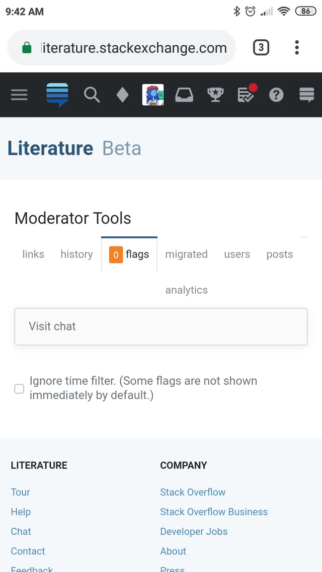
On my phone, at least when there are no flags, the chat widget reduces itself to a single line of "visit chat" (and jumps to above the checkbox to see all flags):

screenshot of issue

It links to the chat.SE homepage, instead of something useful like the TL ;)

It should probably keep the full widget and move down the page.

1
  • 1
    Now it'll move below the content. The lack of contents is just because it failed to load, but it does make sense that "Visit Chat" should link to moderator-only rooms in this context. Commented May 31, 2019 at 23:21
9

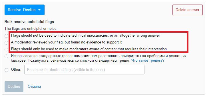
Flag resolution comments are not not translated, and strings are not available for translation at traducir.win. Those comments are visible for end users, to that is a blocker for international sites:

enter image description here

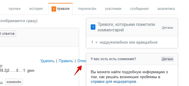
Also, translation is off for the most of the new / updated UI components - and admin dashboard is now a wild mix of Russian and English buttons for me.

6
  • 1
    I'll revert this. I did find the strings at traducir.win/… and traducir.win/… though. Commented Jun 4, 2019 at 16:16
  • 2
    There's a general problem right now where we're in the process of adopting a new design system which favors capitalizing previously lowercase letters and it is taking a particularly high toll on the international sites. We have a project this month that should allow fallback at least in the simple case of "foo" -> "Foo" edits. Commented Jun 4, 2019 at 16:31
  • 1
    I'll coordinate with the international team to make sure this is translated before we go from alpha to a full release. Commented Jun 4, 2019 at 18:02
  • At least in spanish, only this one is important.. Just remeber to make the string localizable.. with traducir and the push, we can have it in a rush...
    – gbianchi
    Commented Jun 5, 2019 at 1:55
  • @gbianchi as Brian said, those strings were indeed in traducir.win. I translated the 3 pointed by Pasha
    – Pikoh
    Commented Jun 5, 2019 at 6:54
  • @BrianNickel thanks for update! Will translate those strings to that to Russian.
    – PashaPash
    Commented Jun 5, 2019 at 12:55
9

If I open preferences page of another user I can see option to opt in a new mod tools.

enter image description here

But this user isn't mod. Probable, on this page the engine checks my account status, but should check this user status, and display this option depending on it.

I've created separate post about this bug: Disable option to opt in new mod tools on other user preference page if this user isn't a mod.

9

When going to the actual question page, the flag info and actions appear in a separate frame at the bottom. If I click the close question button in that frame, the modal appears in that frame, but the frame is too small for the modal:

enter image description here

While the frame resizes and creates a scrollbar initially, moving the modal to the top results in the frame shrinking and top getting lost. I think the best solution would be to let the modal appear in the main frame, instead of the tiny frame at the bottom.

7
  • What browser are you using? I saw someone else report this but I can't reproduce it in Chrome. Any info you can add to help will be appreciated! :D
    – Catija
    Commented Jun 3, 2019 at 15:21
  • @Catija I'm using Firefox 68.0b6, a nightly build, but I would expect that the stable release of Firefox has the same behaviour here. What is different in your case? Does the modal appear in the main frame? Or does the small frame not shrink after dragging the modal up s.t. the top is above the frame? Commented Jun 3, 2019 at 16:03
  • Ah. I just figured it out. If you use the "close" button on the question, it will open just fine... it's just that that "Close question..." button in the Waffle bar is designed for being on the Flags Dashboard, not in the Waffle bar, so it tries to open the modal in context rather than on the page... Hopefully Brian can figure that out but, until then, just click "close" on the question itself! :D
    – Catija
    Commented Jun 3, 2019 at 16:17
  • @Catija Exactly, the modal appears in the wrong part of the page. The easiest workaround for me is avoiding draggin the modal and use the scrollbar in the context menu, instead. Commented Jun 3, 2019 at 16:52
  • That's easier than just clicking "close" on the question itself?
    – Catija
    Commented Jun 3, 2019 at 16:53
  • @Catija Well, perhaps 'easy' is not the right word here. It's just the first thing I thought of. Commented Jun 3, 2019 at 16:55
  • 1
    This is fixed. The modal now appears above everything. Commented Jun 20, 2019 at 22:13
8

Missing things on traducir.win

enter image description here

Not prioritary, but this string should be localizable. This is the report on a flaged post.

1
7

A minor thing, but the "Convert to Comment" button should make it clear that it's converting the answer to a comment on the question. Right now there's no indication at all where the answer will go once it's converted to a comment.

2
  • Not sure where the best place to expand on this would be. It's kind of lengthy for a button or modal title. Right now, the mod menu lets you pick a target post and that input highlights that it's going to be on the question. I feel like I should just add that functionality here as well. Commented May 31, 2019 at 19:26
  • I went ahead and added the field from the mod-menu version of the action. Commented May 31, 2019 at 23:25
7

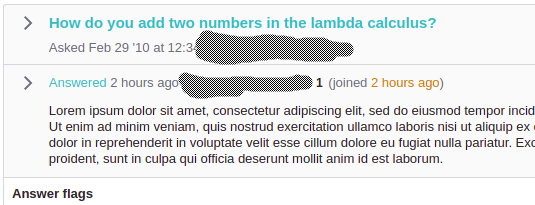
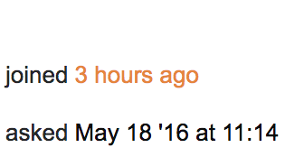
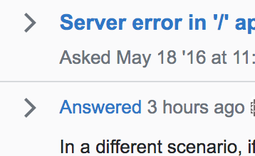
When viewing the question, the 'asked ## mins ago' gets updated to reflect the current time, but the 'joined' date does not:

enter image description here

To be clear, no this user did not ask and flag their question before joining the site, I checked.

It may be possible that I'm mistaken in the 'joined' date not updating while the other dates did (should've saved the html, in hindsight), and that the 'joined' date is simply incorrect for some reason.

If it is not possible to get an accurate joined time to display on this page, then please make the displayed date less fine grained (e.g. 'joined today') to not give a false impression of accuracy.

4
  • 2
    This will be fixed in the next build. That element was getting the class .hot, but we only update the relative time if it has .relativetime, now it'll be .hot.relativetime Commented Jun 18, 2019 at 23:53
  • 1
    @BrianNickel Thanks. I don't know if you already fixed/seen this as well, but I just noticed that the hover menu on the edited badge has a 'relative time' (i.e. edited x mins ago) that is not updated either. Although I'd actually expect to see absolute times in a hover, as that is what happens when I hover over relative times. Commented Jun 19, 2019 at 12:33
  • 1
    Thanks for pointing that out. It'll be fixed in a future build (switching to absolute time) Commented Jun 19, 2019 at 16:19
  • 1
    The tooltips have been fixed. Commented Jun 20, 2019 at 22:07
7

When there are previous moderator actions, the box around the action text crowds/overlaps surrounding text, like so:

screenshot

Notice how the line around "previously dismissed" overlaps the descenders on the line above. I took that screenshot with all userscripts and styles disabled, just in case (didn't make a difference, as it turned out), at 100% zoom, so it's not my accessibility mods acting up.

I don't know what the solution is. Presumably you want to visibly offset this text ("owner", too) and want to avoid using color differences (the site style might not provide something you can rely on with all designs). Presumably you want text and not cryptic iconography. If you increase the line spacing to make room for the box borders, that'd probably make the text look funny. So I don't know what to do with this, but I'd like to not do what we're doing now if possible.

(I have uglier examples, but in an abundance of caution I didn't want to identify other flaggers, so I used myself.)

8
  • 3
    These boxes are cursed. I keep wanting them to be good, but they're not good. Commented May 31, 2019 at 23:03
  • 1
    @BrianNickel yeah, I hear you. Your comment here gave me an idea: what if you used background shading instead of a box? (Like the rendering of your name here because you're the OP, but with better contrast for the flags since we need to actually be able to read that text.) Commented May 31, 2019 at 23:05
  • 1
    That's not a bad idea. I was also thinking about a deeper dive into how tags render and if they are doing a good job why aren't these things? Commented May 31, 2019 at 23:07
  • 1
    If you mean tags in the body of a post, they render by increasing the line spacing to the next line. So the paragraph looks uneven but nothing overlaps. Commented May 31, 2019 at 23:10
  • 1
    Cool. I'll look at both with design and see what option makes the most sense. Commented May 31, 2019 at 23:10
  • 1
    Here's an example that uses tags inline in both paragraphs and lists. Compare the second paragraph to the fifth. Commented May 31, 2019 at 23:13
  • 2
    We're going with the tag approach. They now flow with the paragraph and affect line height. Commented Jun 20, 2019 at 22:08
  • 1
    @BrianNickel thanks! I've now seen the new version -- much better. Commented Jun 21, 2019 at 0:44
6

Design is intended to be responsive, but it feels more like just "fixed max width" for me. I'm mostly using PC with standard 1920 x 1080 resolution. And new alpha design uses less of available space then current UI. Here how inline edit looks in both new and old design, for the same flag:

Old:

enter image description here

New:

enter image description here

(White space on the left and right sides is not the image margin. It is the actual white space on the page.)

New editor width is 530px vs 642px on the old UI. For comparison: public site editor is 706px wide. What is the point of making the editor taller in new UI?

Current max width for container is set to 1100px, that is including paddings and 250px section on the right. Real work area size is limited to 665 px even on large monitors.

Can we make working area a bit wider to compensate excessive box padding for alpha UI?

Here is the effective work area in new UI compared to 22'-24' monitor width:

enter image description here

Same work area with max width removed:

enter image description here

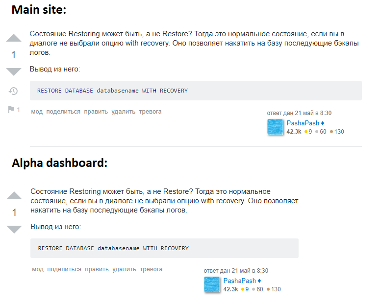
Same for post preview is expanded. Here is the post view sizing, on a main site vs new admin dashboard:

enter image description here

That is the same post, and it should be clean and readable for mods - and right now it fitted in some extra small box with the huge white space areas on both sides.

6

The new interface has a nifty button to dismiss flags. When I click on the button, I get a submenu letting me choose "helpful" or "decline" (which is great!), but as soon as I make my choice, everything changes size and my mouse is no longer over the "resolve" button:

animation of the issue

I keep thinking that choosing either "helpful" or "decline" will actually handle the flag and I'm taken by surprise when I get a new sub-level of choices instead. This may seem like a minor thing, but it's really disconcerting when things suddenly move. I need to re-scan the page to find the submit button.

Ideally, can we have a text box always visible on the right of the "Resolve all flags" button? That way, I can write the message there and then click on the "Resolve" button which will now actually do what it says on the tin and resolve the flag. Something like this:

UI mockup

If that isn't possible, then could you please make it so that the page isn't redrawn and my cursor is no longer where I expect it to be? I've been using the new UI for a few days now and I'm still not sued to this. It always takes me a couple of seconds to refocus and find where the button has moved to.

6

Actions links on flagged comment are out of block.

enter image description here

1
  • 2
    This will be fixed in the next build. It happened because the comment contained a long string of text without breaking points. We now use overflow-wrap: break-word to force wrapping. Commented Jun 20, 2019 at 0:09
6

I like the 'mini post UI' you get when you expand the flagged post, but I hoped that when you delete the post from there, the UI would be smart enough to turn in some kind of completed status. It doesn't:

enter image description here

If you had used the red 'Delete answer' button instead, it does update the entire 'dialog':

enter image description here

1
  • 1
    This is fixed. Now when a post is deleted with this function, the button emits a post:deleted event with the post ID. The flagging interface captures that event and applies the same functions as deleting from the flag UI. Commented Jun 20, 2019 at 22:15
6

Answer flags should not link prominently to the question

I keep clicking on the question and expecting to see whatever is flagged. Part of that is muscle memory because that's how it used to work before, but it's also where the new UI drives me on its own.

Here's what it looks like when an answer is flagged (text changed to protect the innocent and the guilty):

screenshot of an answer flag

The question title links to the question. The word “Answered” links to the answer. Ok, fine.

The long, large-font, bold link at the top goes to the surrounding context. A single word in small type links to the flagged post. No, that's not good.

Please change the way answer flags are displayed so that the most prominent link is to the answer. Yes, it's good to have a link to the answer, and many answer flags require seeing the answer in context. But the most obvious link should go to the answer.

I don't know what the best presentation is. Having “Answered” in a larger font than the title would help, but it wouldn't be enough, because it would still be a far smaller target than the question title. The question title does need to be displayed at the top. Making the whole answer snippet a link target wouldn't work when there are links in the answer. Maybe make a big rectangular button in the left margin?

1
  • 1
    Done. The UI has been simplified, so the link and the arrow beside it go to the flagged post rather than the parent question. Commented Jun 27, 2019 at 17:11
6

enter image description here

I'm confused by the term 'owner' being used when the author of the question casts a flag on the answer. Yes, when I hover over the label I see that the flagger posted the question, not the answer, but I'd expect the term 'owner' to refer to the owner of the post itself. So I flagged one of my own posts 'for science' and it turns out the label is applied, too (see below). That's fine, but can the label in the first case be changed to e.g. [question author]?

enter image description here

Oh, and you might want to adjust the padding - right now it probably overlaps with letters with descenders like 'g', 'p', 'q' and 'y'.

1
  • 1
    We now show [question owner] and [answer owner], and have fixed the collision with descenders. Commented Jun 20, 2019 at 22:10
6

→ asked separately in Could the moderator flag dashboard have an indicator if a post is in the review queue?

Supose an old answer gets flagged as Not an answer or Very low quality. If it did not get any of these flags back when it was posted, now it will enter in the Low quality posts review queue. Otherwise, it will not and the flag will have to get resolved by the mods.

In general, it is preferable if community handles the flags, but the old and new dashboards don't show if there is a review item for a given flagged post. This way, it is easy for a mod to just go ahead and resolve the flag without knowing that some users could/were handling it already.

For this: could we have an indicator on whether a post is in the review queue?

2
5

enter image description here

  1. Typo. Should be An error.
  2. This string isn't in the transifex. Please, use existed string (e.g. 3abb4d84b5da2e231e7f809e0cbd8a9d), or add new one into transifex, so we will be able to translate it.
1
  • 2
    This will be fixed in the next build. Per your suggestions, I'm using that existing string so there's noting new to translate. Commented Jun 18, 2019 at 21:43
5

Make Edited less confusing for comment flags

Currently, a comment flag has the edited mark when the post the flagged comment is made on is edited. (and the flagged comment itself is not edited in the case I encountered, but I'm not sure if that matters) This is not what I'd expected it to mean, I thought the comment was edited (which can be relevant for R/A-flags).

It would be better if, at least for comment flags, it is clear that edited refers to the post. Replacing it by e.g. Post edited would probably work.

2
  • 2
    I just removed it along with some other post-level information. This doesn't apply to comment flags so there's no reason to show it. Commented Jun 20, 2019 at 22:19
  • @BrianNickel Ok, that works as well. Thanks! Commented Jun 21, 2019 at 7:35
5

Make it clear that the answer is on a old question

In the earlier dashboard, whenever a particular answer was flagged, it used to display the time at which the question was asked in the form "asked {timestamp}", based on whether the question was new or old.

This is the right hand side display for a new answer on a new question

enter image description here

This is the right hand side display for a new answer on a old question

enter image description here

As you can see the difference, there is an additional line "asked". In this way the old dashboard made it very clear that the answer was on a old question.

The new one doesn't give any such indication.

enter image description here

The issue with the current way is that the timestamp is always present, and there is no visual difference between a old question and a new question. Can we please have some sort of a similar feature back. Just changing the color of the timestamp of the question should be enough.

3
  • 1
    Okay, I get it now. The presence or lack of an asked date was a signal that the answer was a late answer. Thanks for bearing with me. Commented May 31, 2019 at 22:10
  • That's perfect @Brian. Thanks so much! Commented May 31, 2019 at 22:11
  • 2
    This is implemented. We're just using the same logic here, only showing the Asked details on an answer if it is more than 30 days after the ask date. I toyed with explicitly saying "Late answered" but I felt that sent too strong of a message that could bias moderators in a direction that may be irrelevant to the flag. Commented Jun 27, 2019 at 17:16
4

When clicking 'share', stay on the moderator dashboard page

There are five 'menu' links in the embedded post widget:

mod share edit delete flag

When you click one of those links, you stay on the moderator dashboard page, which is neat. But it doesn't work this way for the 'share' link; that one takes me to the Q&A page itself. It shouldn't be too hard to make it stay on the moderator dashboard too, right?

1
  • 1
    This is fixed. Our code for sharing UIs was fairly old and spread out over many places, so this ended up being quite a handful. Commented Jun 27, 2019 at 17:29

You must log in to answer this question.

Not the answer you're looking for? Browse other questions tagged .