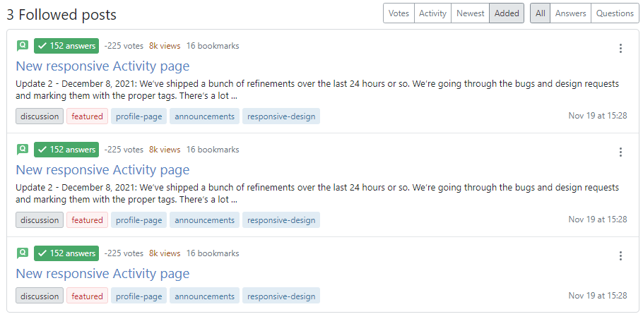
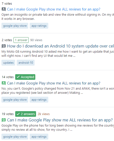
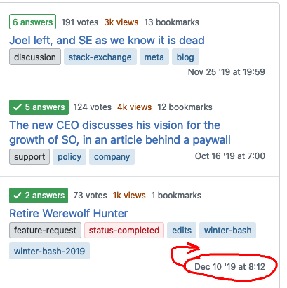
Update 2 - December 8, 2021: We’ve shipped a bunch of refinements over the last 24 hours or so. We’re going through the bugs and design requests and marking them with the proper tags. There’s a lot here, so it’ll take us a minute. We’ve done the following to address your design feedback in the near term:
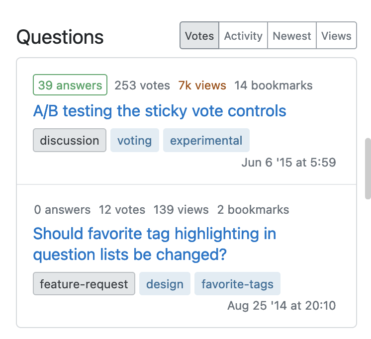
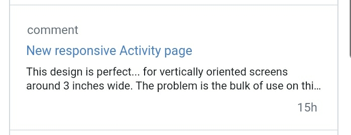
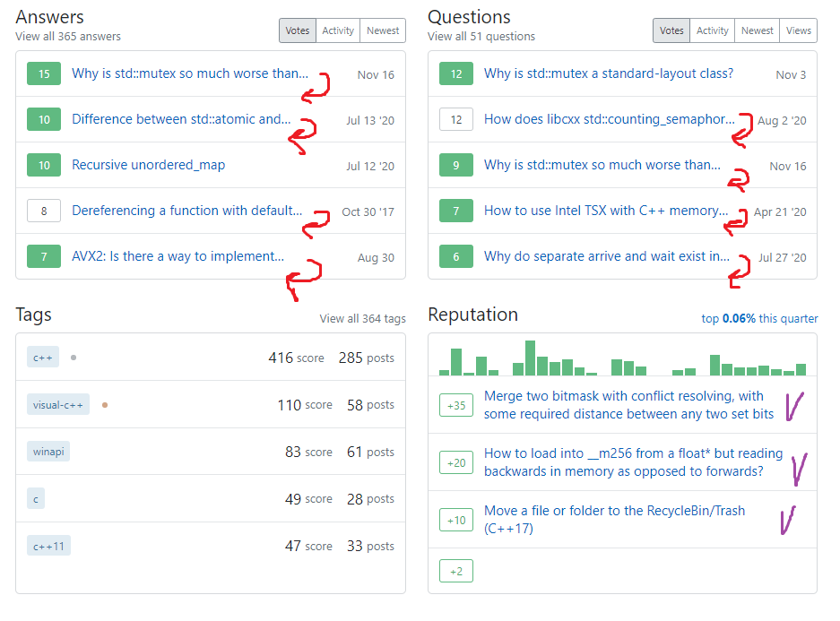
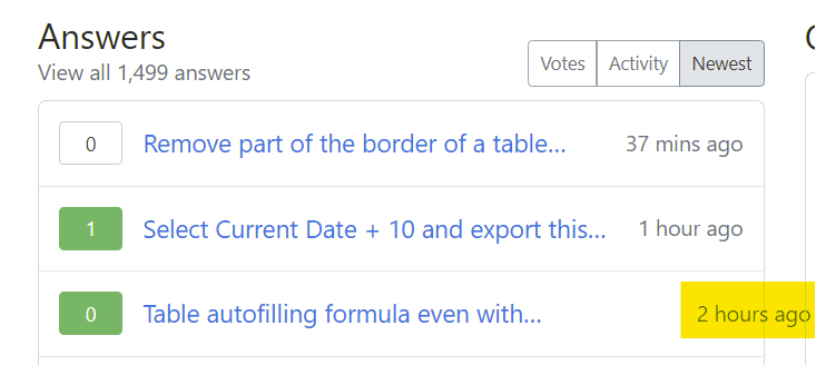
- Switched to the smaller version of questions / answers from the Profile page, thus changing the font size.
- Reduced the padding on individual items while maintaining this newer aesthetic.
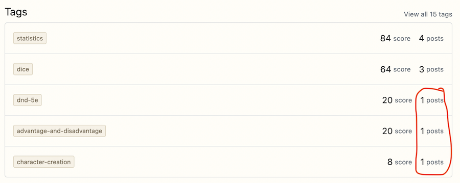
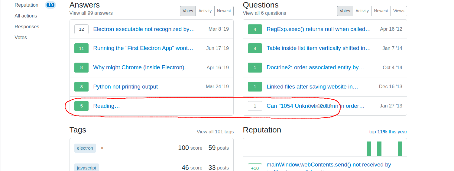
- Grouped questions, answers, tags, and reputation as columns again.
- Upstreamed a smaller font size to our design system’s post summary component.
- Various smaller visual refinements.
Update 1 - December 7, 2021: This was rolled out on Stack Overflow and all Stack Exchange network sites.
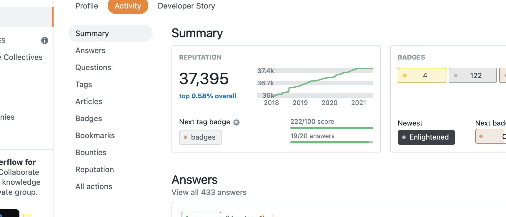
After receiving and incorporating feedback the community (thank you!) we’ve launched the responsive Activity page! The most common feedback we received was that we’re straying too far from a summary for the summary view. This feedback was not only valuable but also correct!
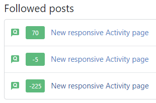
We reconsidered the value of information shown on post summaries and condensed them significantly from our initial redesign. We also made tons of little tweaks and fixes along the way. We’ll be triaging bug reports as they come and we know there’s still room for improvements, so suggestions are welcomed and encouraged! Thank you in advance!
Original post - November 19, 2021:
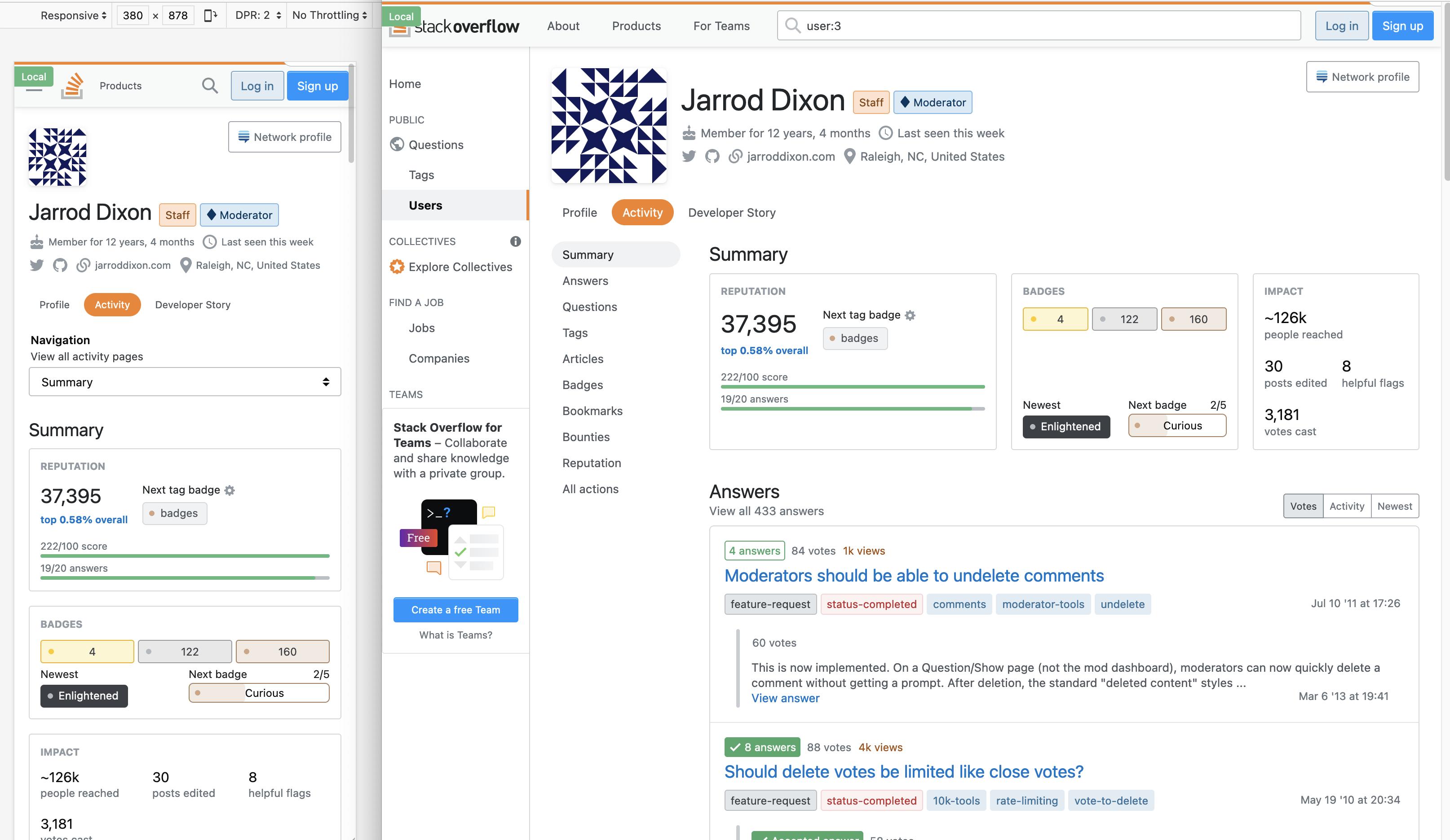
In our continued effort to deprecate our mobile views, we’ve turned our attention to the Activity page. We’re planning on shipping the changes next week sometime soon and wanted to show it off first.
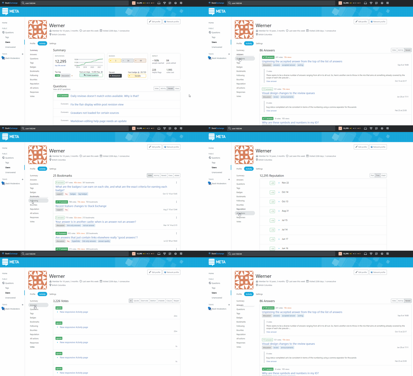
Check out this 5 minute tour of the Activity page and let us know what you think. The feedback we’ve received so far has been invaluable, not only in identifying bugs, but also in helping us reflect and be thoughtful about the changes we’re making.
What’s new?
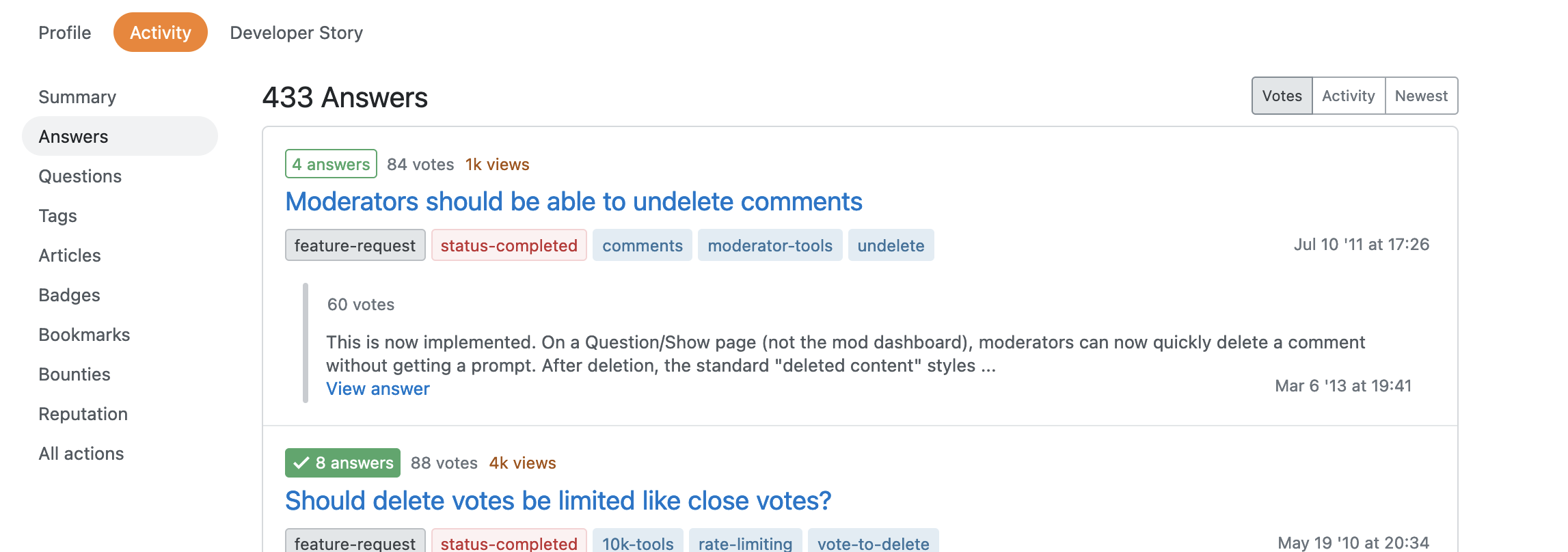
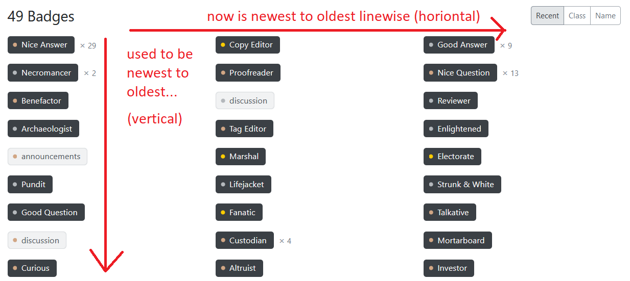
Horizontal navigation turns vertical
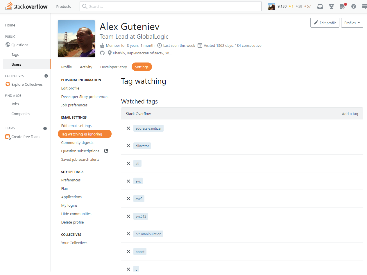
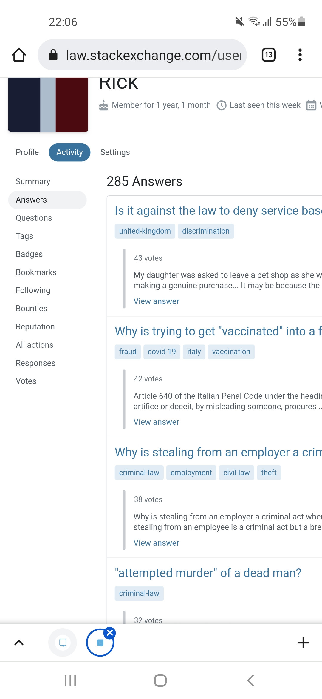
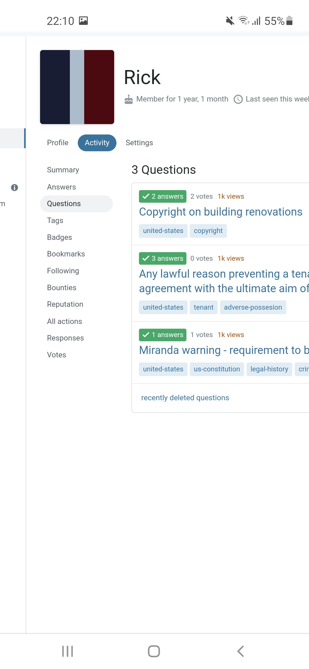
The navigation includes all the same items but is now placed vertically to the left of the column of sections to fix moments like this. It’ll allow us to add more functionality in the future without breaking the layout or introducing any wrapping.
Two columns become one
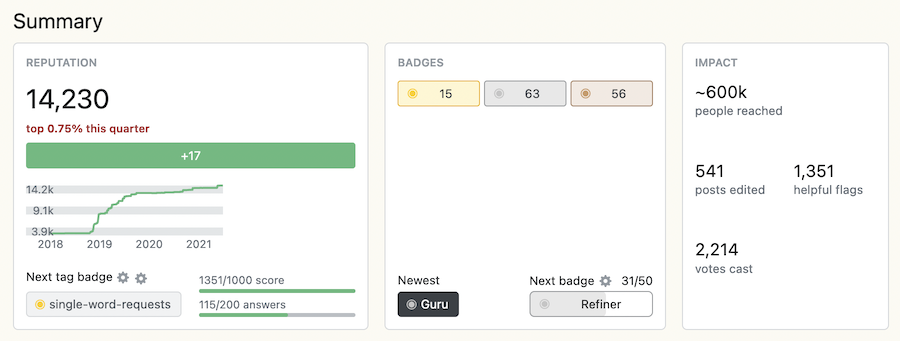
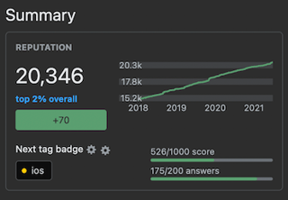
The most obvious change might be the switch to a single column for Activity sections. All of the same (and a little additional) information is here, but now it’s within a single column that squishes comfortably all sorts of browser widths.
Post summaries
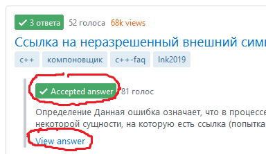
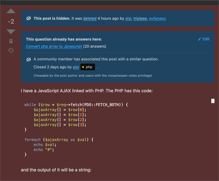
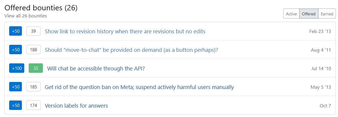
We’ve switched post summaries to use the post summary component in our design system. In the process, we’ve added more details about each post such as views, answer counts, tags, and an answer excerpt on answers. This component has been designed to be responsive and show information in a compact but digestible format.
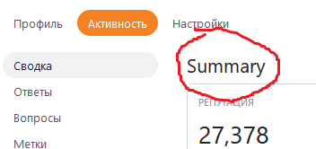
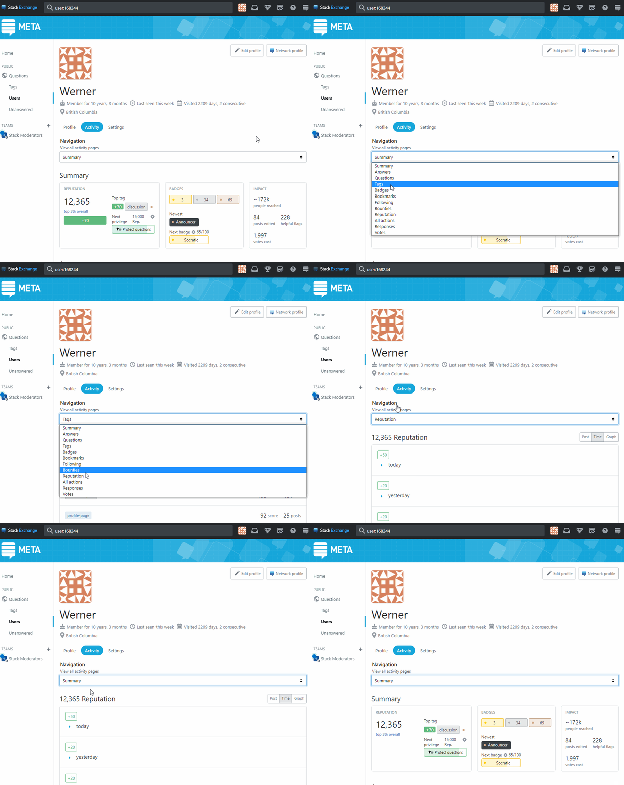
Summary stays on “Summary”
Quick reference information will only be shown on the Summary page (which is the base Activity page). It made sense to show “Summary” on Summary and to not show it elsewhere. Less stuff to scroll past to get to the stuff you want to on other Activity pages.
A handful of other changes
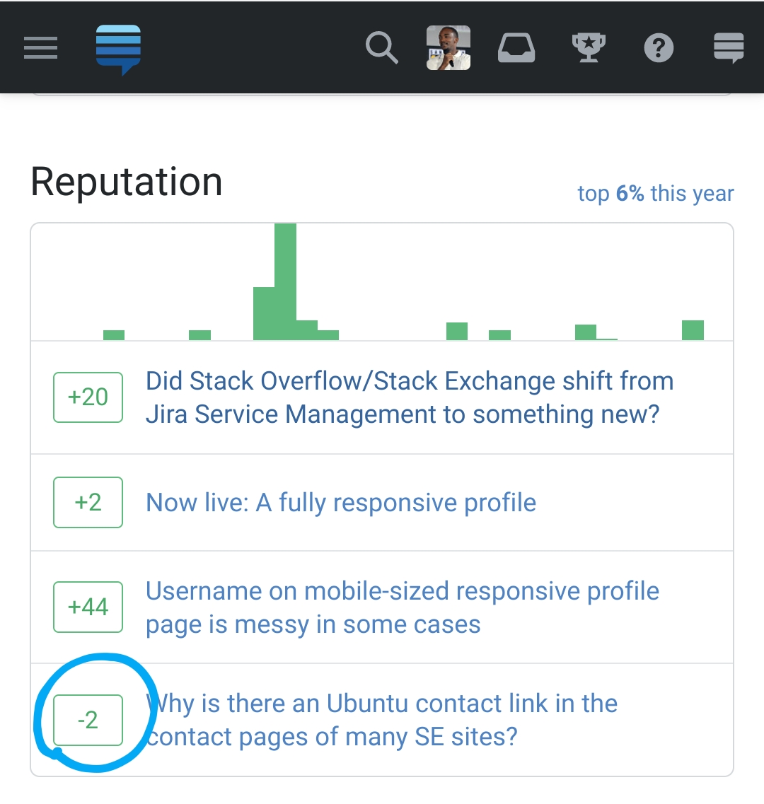
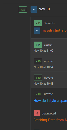
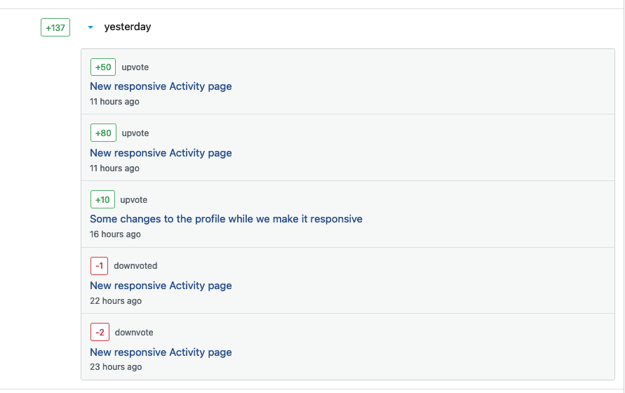
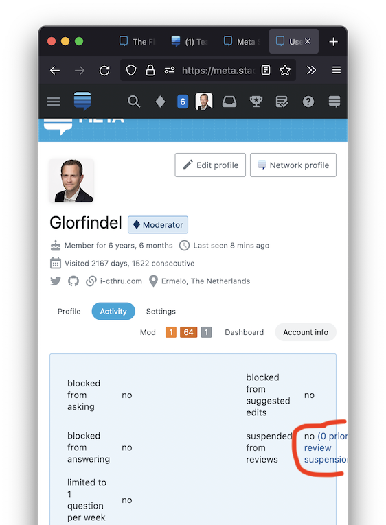
In this process, a lot of little things were tweaked and polished. This includes empty states, improvements to the reputation changes view, accessibility improvements, and much more. No functionality has been lost so if you find anything broken, missing, or out of place, please let us know. We appreciate it!

