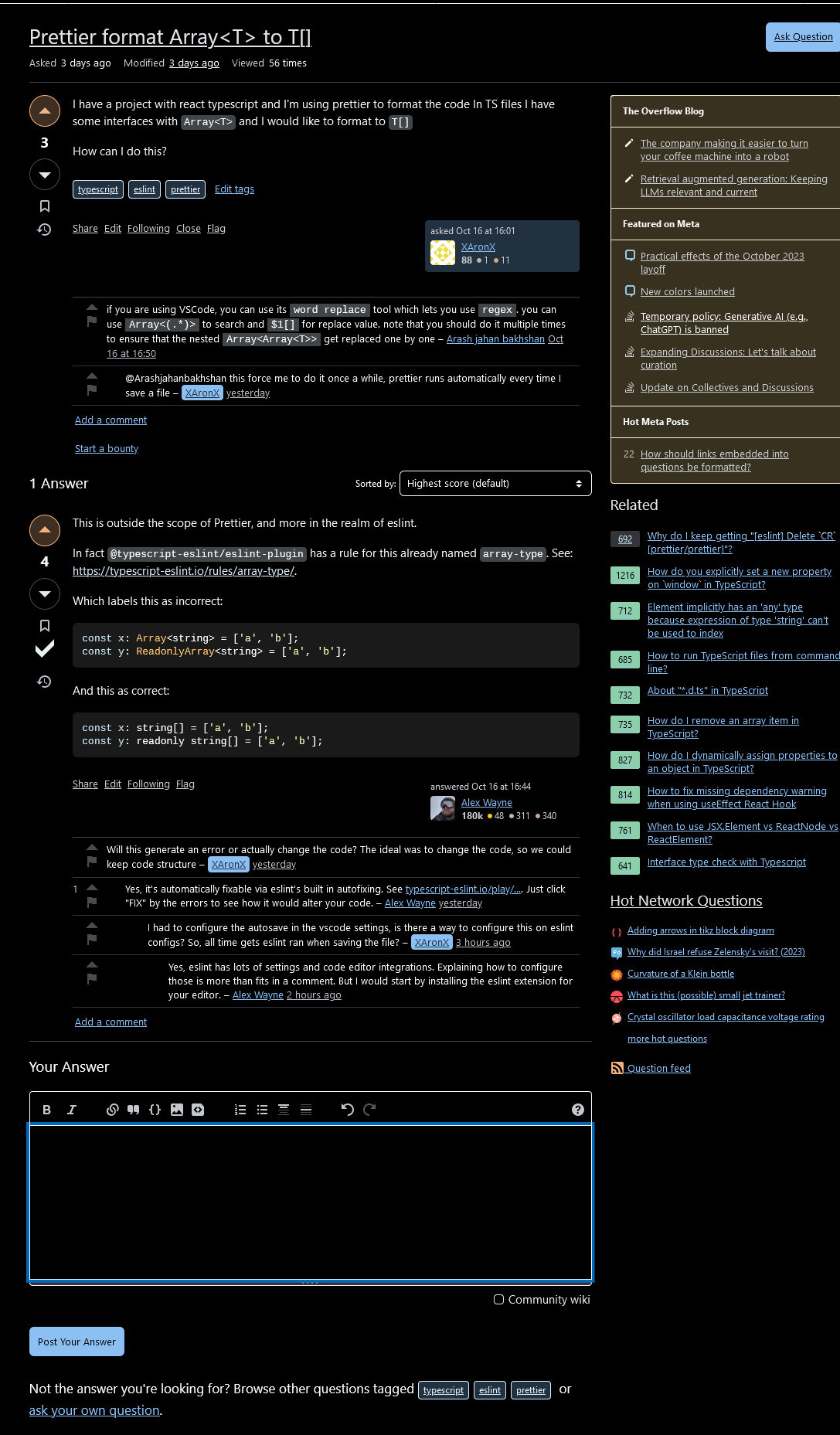
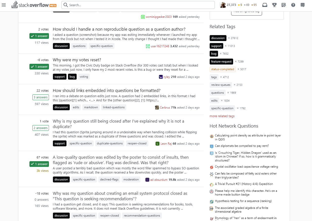
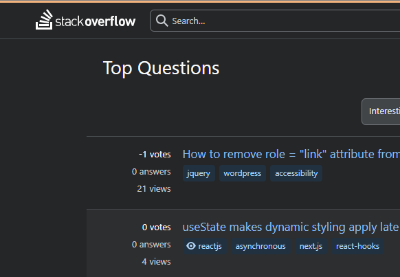
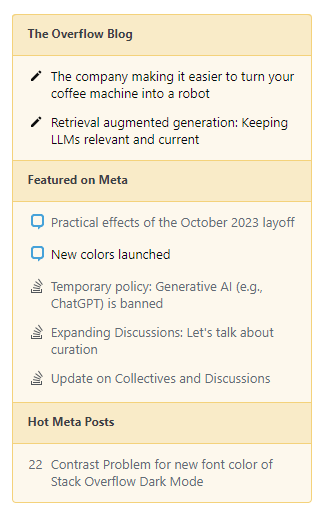
-104

November 21, 2023: To help with internal managing issues, you may see a reference number added next to the status tag on your post. These numbers don't determine the order or priority of issues but will make it easier for internal staff to log and track progress.


October 26th, 2023

Thank you for all the bug reports, feedback, and concerns with this latest update. We have rolled out a handful of fixes based on those and are requesting more feedback on the new post regarding those.


It has been a long journey, but the time has come to finally bring our new colors to production! This post will serve three purposes:

  • The first is to announce the launch of said colors and celebrate with the community who helped us get here.
  • The second is to explain what we changed from our last post.
  • The third is to provide a space to report bugs.

Our new standards

Our goal is still the same: we want to be more accessible without hindering usability and setting standards to ensure we reduce inconsistencies across our sites.

As discussed before, we used APCA to guide our decisions. While we weren’t able to hit lightness contrast (Lc) value of 75 for all text, our large blocks of text do hit this and the rest of our text (with the exception of muted/disabled copy) will have an Lc value of at least 60.

At a high level, our light mode won’t feel that much different, but we believe that our dark mode has come a long way and that is thanks to the advice of a community member. Simply put, WCAG uses a simple contrast calculation that can not adjust for the human nonlinear perception and by using APCA our readability should improve for all users.

We’ve put much more detailed usage guidelines into our design system that discuss color usage, layering, emphasis levels, interaction states, and accessibility standards. We may not be meeting all of our own, new standards yet, but something we are aiming to do over time.

Changes from our last post

From the last meta post, we made the following changes based on your feedback:

  • Desaturated the blues and greens in light mode
  • Changed the hue of green in all modes
  • Darkened and desaturated the yellow in all modes
  • Did an overhaul of the “background” colors in dark mode to more seamlessly blend with their foreground brethren.

Once we got in and started examining the sites we made even more changes. We noticed that there were certain scenarios where our dark mode blue wasn’t passing and had to make adjustments. We also still struggled with our brand color, orange, and had to make the sacrifice to no longer use it in the UI.

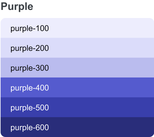
We added in a purple color so designers could have the unique color to use for new features and onboarding

New Purple Palette

UI changes of note

The biggest change you’ll notice is the changes to the moderator and required tags. The moderator tags have changed from red to orange so they look less like an error state.

Then: Red moderator tags with red borders

Now: Orange moderator tags with orange borders

The required tags have changed from grey to a bold emphasis level of the site’s themed color. These tags were almost identical to muted tags, which we found to be a source of confusion.

Then: Grey required tags with grey borders

Now: dark blue required tags

Another change you will notice is that our toggles, radios, and checkboxes selecting component (dot/checkmark) will now switch to black instead of staying white in dark mode.

list of checkbox and radio elements in various states

Lastly, we had to lighten the meta theme a little to account for the new way we will do hover states. This will affect all meta sites themed with the black meta color.

Then: Black button with the word button in white

Now: Dark grey button with the word button in white

Next steps

This was a big effort for just a handful of folks so if you find bugs, please use this post to log them and we’ll add them to our backlog. We hope to iterate on this in the future, thinking of things like font size and ensuring we use more than just color to represent information. We appreciate your patience and help as we’ve worked through this. We hope you feel it’s as successful as we do.

46
  • 58
    Does this bring dark mode closer to being available on other sites than SO as well?
    – Mast
    Commented Oct 19, 2023 at 18:33
  • 11
    Should site-specific bugs be reported here, or on per-site meta? Commented Oct 19, 2023 at 18:42
  • 12
    @Mast From our developer... "Yeah, it gets us closer (particularly when it comes to custom themes having sufficient contrast), but we still got a ways to go to ensure a given site’s overrides play nice"
    – Piper Staff
    Commented Oct 19, 2023 at 19:13
  • 56
    Wow, so many bugs reported (some of them blatant) in less than 2 hours. Was this really tested before launching?
    – hkotsubo
    Commented Oct 19, 2023 at 19:34
  • 45
    @hkotsubo Nearly 10k lines of code added, 10k removed, 113 files effected across SE Network, SO sites, Enterprise sites, and Teams tested by 3 designers, 4 developers. Yes, we tried our best to test every corner, but we clearly missed some.
    – Piper Staff
    Commented Oct 19, 2023 at 20:01
  • 77
    10k of lines added, 10k removed and 113 files affected just to change some colors and css stuff? Holy moly! Commented Oct 19, 2023 at 20:29
  • 47
    It just looks so washed out in SO dark mode, it's lost the vibrant colours that made important parts stand out. Did this really get reviewed or did the designers forget about dark mode again?
    – Phil
    Commented Oct 19, 2023 at 21:33
  • 24
    i genuinely thought that my not-normal monitor i'm on right now was the reason the colors in dark mode looked so strange (and not in a good way). starting fiddling with monitor settings for a minute before I saw the post on this... Commented Oct 19, 2023 at 22:00
  • 45
    @Piper Yeah, that's a lot of work, but seriously, didn't anybody try to simply access the homepage in dark mode? Or check the colors of vote buttons? Looking at the bugs reported, many - if not all - of them seem to be basic stuff of the most accessed parts of the site, not hidden things in some obscure page. I don't mean to be rude and tell you how to do your job, but if the change is so big, perhaps you should've done a more comprehensive and careful test.
    – hkotsubo
    Commented Oct 20, 2023 at 0:55
  • 14
    The issues here and in many other changes the team has made to the colors seem like the sort of thing that would be addressed by automated screenshot testing. A human would need to approve the changes, which they would do after verifying that the change is what they expect. For something like this, that'd be a lot to review, but then, it's a large change, and that time is time that doesn't have to be spent in repeated manual testing. It's unsurprising that with dozens of network sites with different themes, manual testing fails to catch stuff; that's where automation can lend a hand.
    – Ryan M
    Commented Oct 20, 2023 at 1:10
  • 37
    I can't speak to accessibility, but the new colors are unpleasant and look washed out in dark mode. I kept thinking my laptop had gone into outdoor-light overbright washed out mode.
    – Andy Ray
    Commented Oct 20, 2023 at 1:26
  • 25
    If you roll out such changes, you should have made an option to restore the previous state (or you should have done better job at testing!). For me personally StackOverflow is completely unusable now, both in light and dark mode. The high contrast toggle does nothing, everything is high contrast.
    – Chaosfire
    Commented Oct 20, 2023 at 6:56
  • 31
    "tested by 3 designers, 4 developers" and not tested by single dedicated quality assurance team / person.
    – luk2302
    Commented Oct 20, 2023 at 8:59
  • 23
  • 11
    We have heard the feedback on Dark Mode. I posted a separate answer addressing that. meta.stackexchange.com/questions/393939/new-colors-launched/…
    – Rosie StaffMod
    Commented Oct 20, 2023 at 12:32

76 Answers 76

112

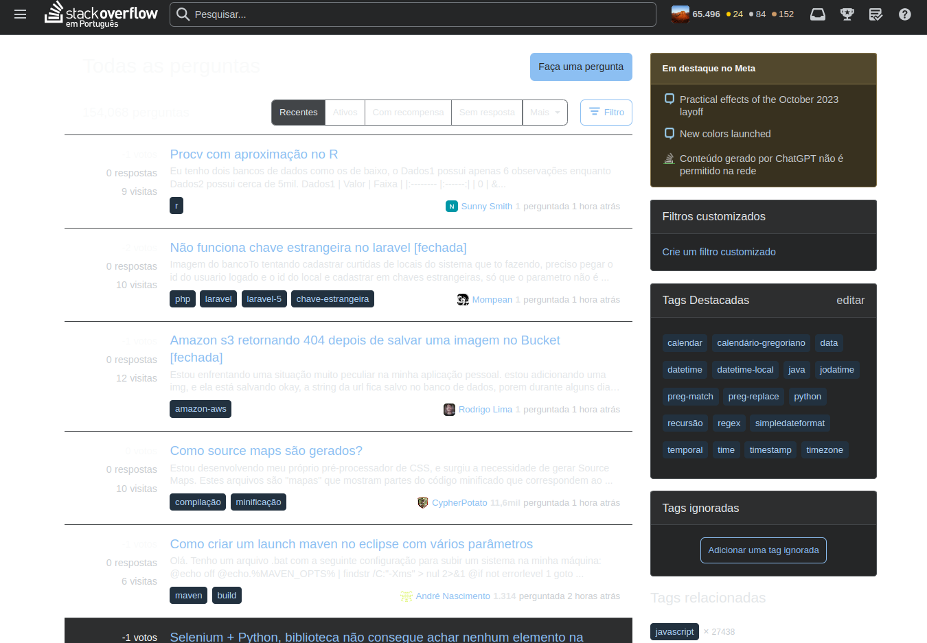
Some international Stack Overflow sites are almost unusable in dark mode

The new standards are causing problems at least on our site, Stack Overflow em Português (SOpt).

When using Dark Mode, many information are unreadable:

Invisible mode


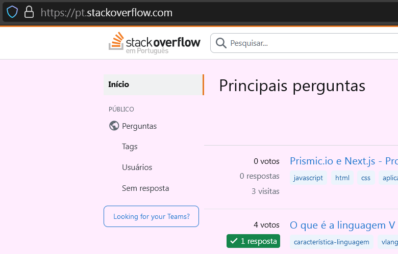
Also, light mode leaks background. Not so obvious if your browser uses white as default, but it's not a guaranteed default.

bg leak

Please, can you revert until you fix and test it properly?

This was also reported in our meta.

5
  • 4
    We've shipped a fix for this one. Dark mode should be usable now. Thank you for the report and I apologize for the issue!
    – Dan Cormier Staff
    Commented Oct 19, 2023 at 21:43
  • 3
    @DanCormier It seems the white background was properly added in the light theme, fixing the default bg leak.
    – Largato
    Commented Oct 19, 2023 at 21:47
  • 6
    @DanCormier: Sorry, no. Scroll bars in code blocks are not visible!
    – Gustav
    Commented Oct 20, 2023 at 7:41
  • 4
    @Gustav We've shipped a fix specifically to make Stack Overflow em Português dark mode function as expected. We're considering the scrollbar issue a separate issue (see meta.stackexchange.com/a/393962/163535) and we'll expect the fix to ship on Monday.
    – Dan Cormier Staff
    Commented Oct 20, 2023 at 20:21
  • [a lot of information, not many information]
    – Lambie
    Commented Oct 24, 2023 at 0:28
103

ref 459

The 'compulsory' meta tags are much too weighty. They distract from everything else. Punchier than even the question title.

e.g.

MSE

enter image description here

Ask Different [& others]

enter image description here

If you shrink a page down so you're only really seeing 'selected highlights' then it's all you see… [well, that & the orange/yellow box, but that's mentioned elsewhere]

enter image description here

4
  • 11
    I don't think the compulsory nature of the compulsory tags is important enough to care about the visibility of the distinction. They're always listed first, so even if you care you don't need to visually distinguish them.
    – wizzwizz4
    Commented Oct 19, 2023 at 19:32
  • 3
    I've put the first part of this (required tags) on the backlog for someone to think about. Won't be one of the first things we fix, but we will get there.
    – Piper Staff
    Commented Oct 19, 2023 at 20:07
  • A new tag style has been released, we've included a less prominent required tag as part of the change. More details here
    – Carrott Staff
    Commented May 21 at 14:24
  • @Carrott - Thanks, yes, I already had an answer/opinion on that… & today a new one on meta.stackexchange.com/questions/400086/… after it went live today. I like the de-emphasis on compulsory tags, but the new all-bold is a bit much.
    – Tetsujin
    Commented May 21 at 15:07
90

Question author's user cards are no longer highlighted on some sites

The OP used to be highlighted (usually in blue), but now they're not, making it harder to see who's talking in the comments:

no highlighting

In fact this is also making it harder for me to tell the difference between the question and its answers, especially when scrolling up.

For some reason, it still works here on meta.

6
  • 13
    On per-site Metas there is no contrast at all: i.sstatic.net/swnx0.png
    – TylerH
    Commented Oct 19, 2023 at 20:19
  • 2
    Yes, now the "new user" also doesn't have any form of conspicuousness. Commented Oct 20, 2023 at 2:28
  • 2
    The CSS class is still there, but it only adds some padding now.
    – Daniel B
    Commented Oct 20, 2023 at 9:57
  • 25
    OP's name is also supposed to be highlighted in comments. Commented Oct 20, 2023 at 13:24
  • 7
    I don't think I've ever been used before as an example like this! Commented Oct 21, 2023 at 19:03
  • This appears to have been fixed as of October 26th.
    – Timothy G.
    Commented Oct 27, 2023 at 14:34
70

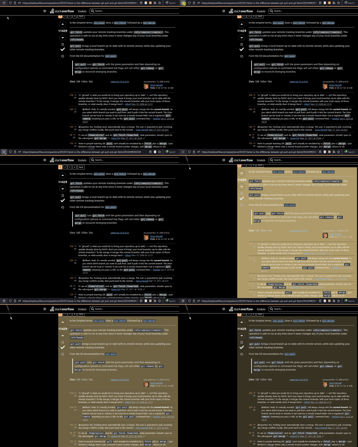
The brief flash when directly visiting an answer (as demonstrated by clicking this link) is EXTREMELY BRIGHT in high-contrast dark mode.

Navigating to an answer leads to AN EXTREMELY BRIGHT AND JARRING FLASH

7
  • FOSC⠀⠀⠀⠀⠀⠀⠀⠀⠀⠀⠀
    – starball
    Commented Oct 19, 2023 at 20:58
  • 8
    @starball flash of searing chartreuse?
    – miken32
    Commented Oct 19, 2023 at 21:40
  • 12
    Yeah, this is a lot. I have a fix staged to bump this animation's starting color from yellow-300 to yellow-200. 100 less yellow! Hopefully that'll ease some retinas.
    – Dan Cormier Staff
    Commented Oct 19, 2023 at 22:06
  • 9
    For me, it's too bright even without high-contrast. I'm just using regular dark mode, and the flash is really straining, especially when going through review queues and seeing the flashes repeatedly.
    – tdy
    Commented Oct 20, 2023 at 1:24
  • 8
    Reminds me of the Pokemon Shock incident... Commented Oct 20, 2023 at 6:32
  • 5
    @DanCormier Perhaps the flashing is an idea to shelve. You know which is selected, thanks to :target: is there another way to highlight it, perhaps with an outline of some kind, without causing the page to reflow? (You're going to need something anyway for the @media (prefers-reduced-motion) people: currently the flash is a workaround for the fact that the page jumps around loads.)
    – wizzwizz4
    Commented Oct 20, 2023 at 18:40
  • The fix for this is live. Hopefully the flash is still noticeable but not too intense.
    – Dan Cormier Staff
    Commented Oct 23, 2023 at 18:14
65

Low contrast on bounties text

Can it not be white on light blue?

enter image description here

2
  • 4
    White on light-blue is terrible on the eyes.
    – Mast
    Commented Oct 19, 2023 at 21:26
  • 9
    This is fixed now. Thanks for reporting!
    – Dan Cormier Staff
    Commented Oct 19, 2023 at 21:45
57

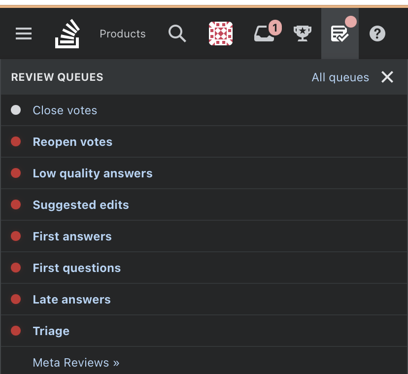
Inconsistent reds for review

In dark mode, the colors in the top bar are pink but the review indicators themselves in the drop down are the old red. This doesn't happen in light mode on sites other than SO, despite the fact that the top bar is now the same color on both. (I prefer the red with white text.)

Pink on icon. Red reviews in drop-down

52

The color of the "voted" state for vote buttons seems to have changed. Now it has an orange border and is not filled in with dark blue.

Orange isn't Meta's theme color so I suspect this is a mistake.

Also, IIRC after the new vote buttons were introduced, people complained that it was hard to see the "voted" state of the button. So it was updated to be filled with a dark blue color to contrast with the normal state.

See image below:

upvote button with changed color for upvoted state

9
  • 7
    Meta sites used the "darker" theme of the button, while the "lighter" theme continued to be used on main sites. It looks like they accidentally copied the theming for main sites onto the meta sites. Also, it's not the first time that they've accidentally used SO orange instead of the site's theme color on sites. Commented Oct 19, 2023 at 18:34
  • It appears to be the exact same color as the one used for the mod tag text.
    – zcoop98
    Commented Oct 19, 2023 at 18:42
  • 1
    We've shipped a fix for this issue. Thanks for reporting!
    – Dan Cormier Staff
    Commented Oct 19, 2023 at 21:31
  • @DanCormier I saw that the orange border was removed. But what about making the button filled with a dark color for meta sites? Meta sites should have the dark-filled vote buttons for the voted state. Commented Oct 19, 2023 at 21:52
  • @DanCormier Here is relevant answer by a staff member showing the vote button filled with a dark color: meta.stackexchange.com/a/389771/299995. Commented Oct 19, 2023 at 21:56
  • 3
    Thank you for the reminder @CaveJohnson. I've asked our designer who is out for the evening on how to proceed here. Expect an update within 24 hours.
    – Dan Cormier Staff
    Commented Oct 19, 2023 at 21:58
  • 3
    @CaveJohnson I've mentioned this issue to our designers and they've confirmed that vote buttons should appear filled on Meta sites. I've implemented the fix which should ship on Monday.
    – Dan Cormier Staff
    Commented Oct 20, 2023 at 20:23
  • @DanCormier I use Dark Reader on sites that don't have a Dark Mode - because I have eyesight issues. I cannot see if I have voted or not.
    – mmmmmm
    Commented Oct 23, 2023 at 8:03
  • @DanCormier in music.stackexchange.com the vote button highlight color is violet, which doesn't seem to match the site theme, which is yellow-black-white. Commented Oct 23, 2023 at 21:22
46

Differing Contrasts In Page Is Hard On Older-Eyes

Eye-strain with new color scheme in dark-mode is significant. After working with the new color scheme browsing questions, it is quite blinding. Either the background or the text foreground colors changed dramatically increasing contrast. The inline code in dark mode makes this worse. This is very hard on the eyes -- especially older eyes.

The eyes fight trying to resolve the green-boxes of answered questions in the "Related Questions" list. There is very little contrast between the value in the green boxes and the box itself. You can't avoid having your eyes being drawn to and trying and resolve text on the screen. The areas of "too much" and "too little" contrast create a lot of work to focus and really make dark-mode on SO a jumbled mess of colors.

To make sure you see that I'm seeing, here is a shot of the last question I browsed:

enter image description here

ref 496 — For older eyes, after attempting to read though numerous questions, it just begins to look like a lot of glare on the screen and it takes much more effort to focus. Especially with the inline code shown in the main paragraphs. At full resolution, the inline code is literally jumping out at you. I hope you can do something to help soften the contrast there. It really is hard to read much with the colors like that.

Nothing ventured, nothing gained, and I know a lot of good effort went into the new colors. This would have been a great project to preview or beta for comments before going live with. One general comment is the "outline" colors seem over-bright in dark mode. Softening the contrast there would also help. Keep up to good work.

Update - Horizontal Scroll Bars Missing in Firefox (Linux)

With the new update, the horizontal scrollbars for code-blocks that extend beyond the div boundaries are missing on SO, e.g.

enter image description here

8
  • 4
    Hot take: inline code shouldn't have a background, or at most a very subtle one. There's virtually no benefit to it, it's disruptive to readability when used frequently (even correctly), and people abuse it for emphasis.
    – Ryan M
    Commented Oct 20, 2023 at 0:10
  • Compare what we got to what we were told we were getting
    – Phil
    Commented Oct 20, 2023 at 0:59
  • 2
    The Question List is close, but it doesn't look like the actual question pages were demoed or a lot of this would have likely been caught. What detracts from the Question List is the pastel (desaturated) reds and greens in the top bar to indicate Review Queue need and Rep Changes that add to the "too much/too little" contrast issues. I think it can be saved, it just needs tweaking. The unseen/visited Question List colors also are not as apparent as it was (white/light-blue). I can't remember what it was before, but I just know it takes more effort to distinguish. Commented Oct 20, 2023 at 1:09
  • 5
    @RyanM I do understand the sentiment - I especially sympathise with the misusing and overusing of inline code markup. Yet, having very little visual indication of what is or isn't code is also inconvenient. That was the case for a long while in high contrast dark mode - inline code markup would have very faint and often imperceptible background. Thus the most noticeable part would be the monospace font. This very easily gets lost in the flow of text, thus making things like "a variable" vs "a variable" harder to read than needed. Inline code does need to stand out. Maybe via other means
    – VLAZ
    Commented Oct 20, 2023 at 6:18
  • 1
    This isn't just "old eyes" and not just dark mode either. When starting up electronics.stackexchange.com this morning I thought the contrast on my monitor was acting up. Didn't notice it on other sites but that one in particular look all blurry and bleak.
    – Lundin
    Commented Oct 20, 2023 at 7:47
  • I completely agree. They seem to have made regular dark mode into a high-contrast mode. I can't even see much difference now between regular dark mode and high-contrast mode except for the background color. This new color scheme is absolutely causing me eye strain and is going to negatively affect how much time I spend on Stackoverflow.
    – mbaird
    Commented Oct 20, 2023 at 13:39
  • 1
    The horizontal scroll bars in code blocks are there in Firefox on Windows. However, my beef is that the code block scroll bars has extremely low contrast now. Black on dark grey just doesn't do it for me. (And, I'm sure others would agree with that assessment.)
    – RobH
    Commented Oct 20, 2023 at 17:04
  • I've updated this post with status tags for each issue/request. There was an issue with the value in the green boxes on "Related questions" that has been resolved and status-completed was added. Our design will discuss/review the background color of inline code (that got status-review). Most of the border (I'm assuming this is what you mean by "outline" colors) didn't change very much with the new colors — we mostly just did a swap to the new system. Re-thinking what has an outline or not would be a larger effort on a per component basis — won't be part of this color work. Scroll bar is fixed!
    – Carrott Staff
    Commented Nov 27, 2023 at 23:00
45

Highlight color in achievement notifications is too dark

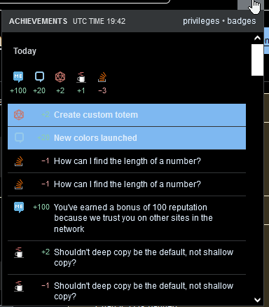
It seems like the highlight color for unread achievement notifications has unintentionally become darker than before:

Too dark highlight color

Can this please be fixed?

2
  • 7
    Eek! This is awful! Of course we can fix it. Thank you for your help
    – Piper Staff
    Commented Oct 19, 2023 at 18:40
  • 5
    We've fixed this by lightening the background a step. The fix is now live. Thanks for the report!
    – Dan Cormier Staff
    Commented Oct 19, 2023 at 21:32
43

Link text looks just about readable on a white background, but it's low-contrast against the blue background of the new contributor indicator. (A convenient bug illustrates both cases in one image!)

Unintelligible is a new contributor. Be nice, and check out our unintelligible.

40

The scroll bars for code blocks are barely visible in dark mode. The old ones were a light gray and now they are black on an almost black background. Here is a comparison from the old version to the new one:

side by side of the old version versus the new version of the dark mode showing the dark scroll bars

6
  • 6
    This is a great catch! We have a fix in the works and it should go out within the next 24 hours. Thanks!
    – Dan Cormier Staff
    Commented Oct 19, 2023 at 21:39
  • 9
    @DanCormier would be nice if the community didn't have to catch this kind of stuff after it goes out the door :|
    – starball
    Commented Oct 20, 2023 at 1:24
  • 1
    I could hardly see the horizontal scrollbar, I merely thought that content had been cut off. Commented Oct 20, 2023 at 5:54
  • 2
    @mickmackusa me too, it was only by accident that I discovered it was still there
    – Nick
    Commented Oct 20, 2023 at 6:15
  • 2
    An update: The fix for this is scheduled to go out on Monday. Sorry for the delay!
    – Dan Cormier Staff
    Commented Oct 20, 2023 at 20:28
  • They're visible again, thank you! Commented Oct 27, 2023 at 4:51
36

There's bad contrast in the sidebar: Grey on light yellow—even I, who barely have reason to criticise my eyesight, have slight trouble reading it on my screen:

bad contrast in sidebar

5
  • 11
    I think they're going for “unfocused / unactivated is light; focused / activated is dark” everywhere. Having consistent semantics is a laudable goal, but I don't see how to make it work here (especially not with the coloured background).
    – wizzwizz4
    Commented Oct 19, 2023 at 19:24
  • 8
    The contrast value of ~73 Lc of that text doesn't appear to be appropriate for text that small; it should be darker, or bigger, or both... but to wizz's point there's also a semantic factor here; it would still be nice for it to be just a little higher.
    – zcoop98
    Commented Oct 19, 2023 at 19:39
  • 3
    There's bad contrast everywhere now.
    – Lundin
    Commented Oct 20, 2023 at 7:48
  • Also reported by Sonic: meta.stackexchange.com/a/393963/946962 Commented Oct 20, 2023 at 15:20
  • 1
    Our goal is to hit a contrast value of Lc60 for text. The lighter grey does meet that standard on the yellow background. However, we've also recently switched visited vs unvisited link logic. So the lighter grey is only used for visited links (the goal being that they have less emphasis). The darker grey/black is now used for unvisited links. Hopefully this switch, helps a bit.
    – Carrott Staff
    Commented Nov 23, 2023 at 20:23
31

ref 426

High contrast dark mode looks closer to monochrome with washed out colours and less contrast than ever. Washed out more muted colours in the page in high contrast dark mode.

Notifications are not drawing any attention now as the contrasting red has been replaced with white. And the grey in the background is now also white.

Notification area with white inbox icon showing white notification for unread messages.

4
  • 8
    That #fce9e9 of the notification badges is about the faintest possible red you can have; it seems likes a strange choice in the mode that by-design should be the most contrast-oriented.
    – zcoop98
    Commented Oct 19, 2023 at 19:46
  • 6
    Regular contrast dark mode looks almost exactly the same as this, just with a different background color.
    – mbaird
    Commented Oct 19, 2023 at 20:06
  • 11
    Feels like it's been left out in the sun too long
    – Phil
    Commented Oct 19, 2023 at 21:50
  • 1
    i even notice this on regular dark mode Commented Oct 19, 2023 at 23:43
25

At a high level, our light mode won’t feel that much different,

But it is different, very, very much different. I can finally read the green reputation badges :)

Overall, it is a good change, but it is not all perfect.

My main complaint is about used black color on light themes. I think it is way too black and it stands out too much.

For instance black top bar on some sites, including here on Meta.

enter image description here

(ref 459) — Also black tags on per-site Meta. It looks like a black hole(s) staring back at me.

If you look at the Stack Overflow Meta screen, black tags dominate the page and attract attention even more than question titles that should be the ones that catch attention. I would prefer something less black that would be gentler to the eyes.

Stack Overflow Meta

3
  • 3
    It feels weird to create a usercript just so your eyes don't hurt from looking at tags, but that's where we're at right now unfortunately.. had to change them back to grey. Commented Oct 20, 2023 at 7:08
  • Agree with the tags on meta taking too much prominence, we're looking into all the tag styles, including the required ones here using a black background. For the top bar, we reduced the amount of variations in our darker blacks/grays, which resulted in the background now being slightly darker. I think the overall amount of "black" should decrease once we resolve the tags issue.
    – Carrott Staff
    Commented Nov 21, 2023 at 20:29
  • @Carog I understand why having single color happened. The point is that the choice is too dark. While Meta bar is less of a problem than black meta tags, it still creates a very high contrast between such black top bar and light theme which causes eye strain for me. Commented Nov 21, 2023 at 22:01
24

ref 459

The coloring for moderator-only tags doesn't have enough contrast, and I'm having trouble reading it

The color contrast ratio between the text and background color is too low, at only 3.88:1. Given the small size of the text, the effect of this low ratio is that I'm not quite as able to read what's in the tag.

Can the text and border color of moderator-only tags please be bumped up to a darker shade, so it's more easily readable?

2
  • 1
    Or even flip them so they start in the current hover state, and on hover, they lighten.
    – Aaron Bertrand Staff
    Commented Oct 19, 2023 at 18:31
  • 4
    On our list. Thank you. Reminder, we are using APCA, not WCAG calculations so sharing Lc numbers would be easier for our brains to take in right now.
    – Piper Staff
    Commented Oct 19, 2023 at 18:35
20

How is it that the blog's dark mode looks more like Stack Overflow than Stack Overflow itself?

Blog

screen snap of the top of the blog

SO Light

screen snap of the top of SO in Light Mode

SO Dark

screen snap of the top of SO in Dark Mode

Dark mode is effectively washing out all the colors other than links resulting in just a sea of blue links. There's no color balance, unlike on the blog where blue is used specifically for drawing attention rather than being the primary color of text on the page. (The sea of blue links issue does improve when you move on to anything that isn't a list of question or answer links)

2
  • An update was made to the dark mode colors (more saturated to have less of a washed out effect). I'm going to mark this as complete, if there's still a specific issue with the new dark mode colors, please add to the newer post.
    – Carrott Staff
    Commented Nov 21, 2023 at 20:16
  • :shrug: doesn't look any less washed out to me.
    – Kevin B
    Commented Nov 21, 2023 at 20:18
19

Some background colors are missing:

  • Asker's user infobox

  • Notice on answer box

Observed at least on Android.SE (+Meta) and Anime.SE (+Meta).

2
19

The text color for unvisited and visited links is reversed to what is expected: the de facto standard is that unvisited links are normal and visited links are lighter.

screenshot of sidebar

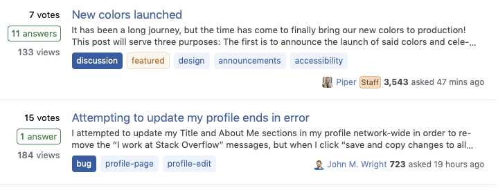
The "New colors launched" link and others that are 'dark' are visited.


Also reported by MegaIng in a comment on Sonic's related answer about the contrast.

3
19

Rather poor distinction between accepted and not accepted checkmark colours for question authors

Not accepted:

Checkmark button which is not pressed. Grey coloured.

Accepted:

Checkmark button which is pressed. Light grey coloured.

For clarity, both side-by-side:

Two checkmark buttons - left is grey, right is light grey.

Brief animation of what toggling between the two looks like:

Toggling between very similar looking colours.

It is possible to think accepting does not work. Maybe already happened.

3
  • might be a reason to have accepted marks green in addition to more highlight?
    – Trish
    Commented Oct 26, 2023 at 9:10
  • 2
    @Trish I'd say it's a good reason to have high contrast dark mode not look as exceptionally desaturated like it does right now.
    – VLAZ
    Commented Oct 26, 2023 at 9:23
  • An update to the dark mode colors was made (more saturated). I'm going to mark this as complete, the checkmark should appear 'more green' when accepted in both Dark and High Contrast Dark mode now.
    – Carrott Staff
    Commented Nov 21, 2023 at 20:11
19

ref 480

The contrast between visited and unvisited links on Meta.SE hasn't been changed, and is still just as poor as it was prior:

Top is visited, bottom is unvisited: Questions page with two questions visible, the top is visited and the bottom is unvisited

The default color is #4e82c2: , and the visited color is #36649d:

Obviously comparing them using an APCA text-on-background contrast tool isn't entirely fair, since these aren't background colors– but I do think it still does a good job of illustrating why these colors are so difficult to tell apart:

Visited Text on Unvisited Link Background Unvisited Text on Visited Link Background
Visited-link-colored text on a background of unvisited-link color
Contrast: 11.26 Lc
enter image description here
Contrast: -12.19 Lc

Can we please, please, pretty please get better contrast between these two colors?

18

  1. Click on the SE icon in the upper right corner.
  2. Click on Link to the Meta site of the current SE site.
  3. The link gets an grey rectangular background

Reproducible: Windows, Ubuntu, Android.

Not reproducible: MacOS, iOS (see comments).

SO

Ask

Movies

Italian

11
  • Can't repro. If I click on the link itself I don't get time to see any change, I just get the new page. i.sstatic.net/aV1tV.png
    – Tetsujin
    Commented Oct 20, 2023 at 8:25
  • 4
    @Tetsujin Well, I have about 1-2 seconds to admire this background before new page loads :)
    – Neumann
    Commented Oct 20, 2023 at 8:29
  • I have to wait a second or so, but the image doesn't change in the meantime. i don't see that grey box at all.
    – Tetsujin
    Commented Oct 20, 2023 at 8:40
  • @Tetsujin I tested on different browsers on 2 PCs. Same behavior. You don't have a custom script which may interfere?
    – Neumann
    Commented Oct 20, 2023 at 8:51
  • Tested 2 browsers, same Mac. Can't repro. No user scripts at all on this machine.
    – Tetsujin
    Commented Oct 20, 2023 at 8:55
  • Repro on Firefox + Windows 10. Happens for all Metas, except MSE
    – markalex
    Commented Oct 20, 2023 at 9:11
  • @Tetsujin Tested on Iphone - no grey rectangular background. But reproducible on Ubuntu. and Android.
    – Neumann
    Commented Oct 20, 2023 at 9:14
  • Hmm, thats a weird one. I was able to reproduce it on Windows only, though.
    – SpencerG StaffMod
    Commented Oct 20, 2023 at 12:55
  • 1
    Actually, I can reproduce it on a Mac too.
    – SpencerG StaffMod
    Commented Oct 20, 2023 at 13:05
  • 2
    @DanCormier, but is it in fact completed? It seems like I still have this issue on both Firefox and Edge (both on Windows).
    – markalex
    Commented Oct 24, 2023 at 19:43
  • 2
    @DanCormier "status-completed" for 4 weeks now, but the issue is still present!
    – Neumann
    Commented Nov 20, 2023 at 20:02
18

ref 462

The icon for the "run" button of Snippets has very poor contrast in dark mode.

enter image description here

It appears to be always using white, instead of the text color.
The class applied to the element to give it the icon is always icon-play-white.

6
  • 6
    The buttons used to be different colours to each other, as I recall. I found that useful: the obvious button was the one you're meant to press, and the other one was the one you always ignore.
    – wizzwizz4
    Commented Oct 19, 2023 at 22:24
  • 3
    @wizzwizz4 Your recollection is correct. I had a tab open with the old colours: here is what it looked like before and after.
    – VLAZ
    Commented Oct 20, 2023 at 5:59
  • 4
    Based on the screenshots from VLAZ, looks like that icon was an issue beforehand (Eek!), added to the backlog (this one is likely to take more time). The second button will also be changed to the outlined version (there shouldn't be two primary buttons next to each other). Thanks for catching @wizzwizz4
    – Carrott Staff
    Commented Oct 20, 2023 at 21:47
  • 1
    @Carog The same thing's happened with the consent-to-tracking buttons in the square in the lower-left corner: I assume it has the same causes.
    – wizzwizz4
    Commented Oct 20, 2023 at 22:17
  • 1
    @wizzwizz4 Correct similar but in a different area. Added to our backlog as well thanks!.
    – Carrott Staff
    Commented Oct 23, 2023 at 20:29
  • 1
    @wizzwizz4 The double primary button resolved for code snippets has been fixed but not the icon so I'll leave the status-review tag on this answer until then. Example can be found here
    – Carrott Staff
    Commented Oct 23, 2023 at 22:24
17

Visited links in the community bulletin have too little contrast

When a link in the site's community bulletin (featured posts, hot meta posts, etc.) has been visited, the contrast between the link and the background is too low:

enter image description here

In the past, links in the community bulletin wouldn't change much between visited and not visited, as it wasn't that important to differentiate them in that block. Can this please be brought back, or an alternate solution to fix this problem implemented?

6
  • 8
    These are actually the unvisted links from what I can tell... Which makes this even worse, since now the intuition is the wrong way around.
    – MegaIng
    Commented Oct 19, 2023 at 21:40
  • 1
    Also reported by shaedrich: meta.stackexchange.com/a/393963/946962 Commented Oct 20, 2023 at 15:21
  • @MegaIng Yeah, that's what confused me even more 😅
    – shaedrich
    Commented Oct 20, 2023 at 21:32
  • It looks like the color may have been darkened a little. At least, it's now hard to tell visited links apart from unvisted links. Commented Nov 16, 2023 at 12:15
  • @MegaIng was correct, this screenshot was showing the unvisited link style. We've since made an update to swap those colors. Visited links will be lighter and the Unvisited link is darker now. There is a bit less contrast between the two states now but all meet our goal of Lc60 on the yellow background. This was a change made to all gray links on the site.
    – Carrott Staff
    Commented Nov 21, 2023 at 17:16
  • @Carog Just when I got used to looking at the lighter colors for new things... (nice change thou, ty)
    – MegaIng
    Commented Nov 21, 2023 at 17:21
16

I cannot see the numbers in the highlighted recent achievements menu in high contrast dark mode:

Green rep adjustment on EXTREMELY LOUD AND BRIGHT blue background.

3
  • It doesn't look like that for me: i.sstatic.net/u1Y0t.png you sure you are not running a userscript for that?
    – M--
    Commented Oct 19, 2023 at 19:51
  • @M-- I disabled all my userstyles and userscripts to make sure. But no, it's exactly what I get.
    – VLAZ
    Commented Oct 19, 2023 at 19:54
  • 1
    Possible duplicate: meta.stackexchange.com/a/393953
    – zcoop98
    Commented Oct 19, 2023 at 19:59
16

ref 479

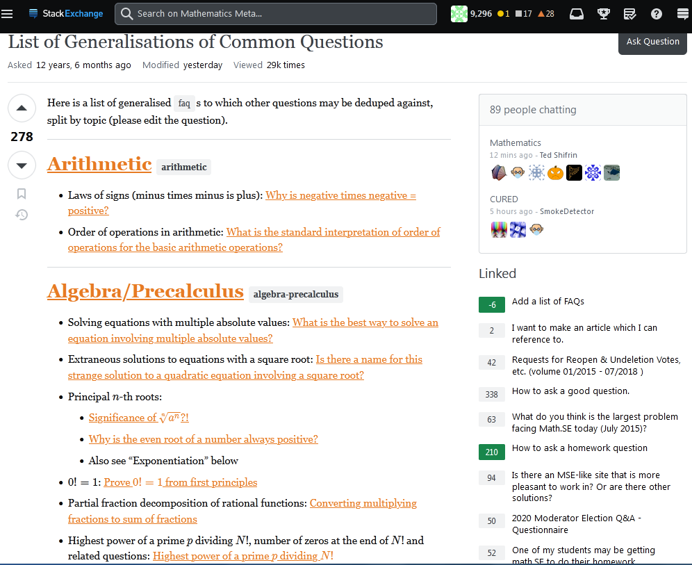
I'm afraid I don't know about all the ins and outs of themes and accessibility, but this

Screenshot of a math.meta.se post with an awful lot of orange

and

Another screenshot with lots of orange.

are very hard on my eyes. (Windows+Firefox). I tend to think of orange as an accent color, and not really suitable for extended amounts of text.

It comes from here.

Is it supposed to look like this? Or is there some way to use different markup that would have a better result?

7
  • 2
    This seems like it'd be better if it were just a teeny bit darker. Here's 45% luminance instead of 52%: example 1, example 2
    – Ryan M
    Commented Oct 20, 2023 at 0:03
  • That's... a lot of links in one post. Maybe it's normal on the site you dwell on, but on SO that kind of link-heavy answer rarely lasts very long... Commented Oct 20, 2023 at 15:55
  • 3
    @HereticMonkey - Yeah, that's not a typical post for math(.meta).se. (Heck, notice that it's on the meta for math.se, not the main site.) We get a lot (seriously, tons and tons) of duplicate questions there. And since there's almost no support for site-specific FAQs, that post is an attempt to put answers to frequently asked questions in one place. So it definitely pushes the link-color question hard....
    – JonathanZ
    Commented Oct 20, 2023 at 16:21
  • That said, a more average question, like this (check out the answer), still makes me think that orange is not a good color choice for links in bodies of text. (And this is only on math.meta, not regular math. But meta questions are often link heavy - you're often pointing people to previously-stated policies.)
    – JonathanZ
    Commented Oct 20, 2023 at 16:23
  • 1
    Oh yeah, don't get me wrong, orange is not a good color for links or any text beyond some accent display text. Duplicates are a bane everywhere with little support forthcoming for SE it appears... Commented Oct 20, 2023 at 18:05
  • 2
    Please correct me if I'm wrong, but this is a theme specific issue and was in fact an issue before colors, correct? No theme-specific colors should have been affected.
    – Piper Staff
    Commented Oct 24, 2023 at 13:51
  • @Piper You appear to be correct. Here is the page before the update; the relevant colors look identical to me.
    – Ryan M
    Commented Oct 25, 2023 at 23:03
16
  • Link brightness / contrast against the background is still reversed for dark mode on SO. Visited links should draw less attention to the eye (in dark mode, visited links should be darker than unvisited links). I brought this up in the previous post and it was claimed to have been addressed, but it hasn't.

    My previous userstyle to fix this has broken due to the new CSS and with the new complexity (seems almost machine-generated) I can't figure out how to fix my workaround. I won't exaggerate and say the site is unusable to me now, but it's real heckin' frustrating and confusing, and even slightly anxiety inducing. Like- imagine if you woke up one day and suddenly the sky was green and grass was blue. Please just fix it.

  • (ref 481) — On SO in dark mode, the current colour of visited links (which is what I assume the colour of non-visited links is intended to be) is so bright that it's hard to differentiate from regular text. The brightness probably needs to go down for the hue to actually be noticeable.

    This actually does make some pages near unusable for me- particularly the New Answers to Old Questions 10k tools, where I rely on being able to easily tell which title links I've visited to know when I've reached the post I last stopped at in my previous pass of the content. After you've switched the brightnesses of the visited and non-visited links, please lower the brightness of non-visited ones so the hue is actually noticeable compared to regular text.

  • It feels weird that the button to change the saves list when saving something in a Q&A page is blue when hovered, while the rest of the toast banner is green.

  • I still think the community bulletin is too attention-drawing in SO dark mode- probably due to a combination of saturation and contrast compared to the primary background.

  • Did inline code in comments always used to have square corners?

  • (ref 482) — Wow. the background colour for unread reputation/achievement notifications is... very different than the colour for read ones.

9
  • 8
    The visited link colour issue happens every time they touch colours and every time they say they'll fix it 😞
    – Phil
    Commented Oct 19, 2023 at 21:39
  • (1/2) Visited/unvisited links: we pushed an update that reversed the logic for gray links to make visited feel less prominent. I've logged a ticket for looking at the blue links on questions in dark mode. Buttons share the same styling for hover and in this case I understand it might be odd to see blue on a green toast but we're trying to create more consistency by having less variations in our buttons. This should have been the case already before the new colors but it might be more noticeable now.
    – Carrott Staff
    Commented Nov 21, 2023 at 17:41
  • (2/2) We're hoping to update the Bulletin design altogether (timeline uncertain) and it was requested to increase saturation overall in dark mode, for that reason won't change the yellow color (used on the bulletin) for now as it might not be used at all in the new version. We would not have changed the corners on inline code with this update so I'm assuming it's always been this way. Achievement inbox: Agree, I've logged a ticket to decrease the contrast or try to match the notifications inbox style if possible.
    – Carrott Staff
    Commented Nov 21, 2023 at 17:45
  • @Carog when is the dark mode visited link reversal supposed to be fixed? I just tested SO rev 2023.11.21.1314 and it's not fixed. and what is your "ref 481" "ref482" supposed to mean?
    – starball
    Commented Nov 21, 2023 at 18:31
  • @starball The reversal fix that went out was only for black/gray links. The community bulletin would show an example of this — black/gray links use our muted style, that's what got fixed: in dark mode, visited links are now darker than unvisited links. If you're looking at the Review queue or New Answers to Old Questions 10k tools, the links use our default style (blue link). That needs to be changed separately. It's logged as it's own issue. The ref# is to make it easier for internal tracking purposes (there just for me and my sanity) — I added an update at the top of this post about it.
    – Carrott Staff
    Commented Nov 21, 2023 at 23:37
  • @Carog my primary concern is everything else other than the community bulletin. so it is not status-completed. It's not just NAtOQ. The default link styling literally applies almost everywhere except the community bulletin. It's way more disruptive than the issue with the community bulletin.
    – starball
    Commented Nov 21, 2023 at 23:44
  • @starball Sorry for the mix up, there were a lot of other posts about the visited/unvisited links for the black/gray version (the community bulletin is the easiest example to find). I thought your first paragraph was referring to the black links and the 3rd refers to the blue links in your post so I split them up as two different requests. The "completed" on the first paragraph was for the black links getting the reversal, I have status-review on the 3rd paragraph which will be for blue links in dark mode. Sounds like it was all for blue links. Apologies for the confusion on my end.
    – Carrott Staff
    Commented Nov 22, 2023 at 21:50
  • @Carog no, they are separate problems both with the blue links. the first is about the brightness reversal between visited and unvisited. the second is that the brighter of the two link colours is too bright for me to easily differentiate between it and regular text.
    – starball
    Commented Nov 22, 2023 at 21:53
  • 1
    @starball I've logged it as an issue with blue links in dark mode overall and mentioned both points (and any other comments from others about blue links) that need to be considered. It's all under "one issue" on our end.
    – Carrott Staff
    Commented Nov 22, 2023 at 21:58
16

ref 459

The contrast between tags and the background colour for "watched tag" questions on the Stack Overflow home page in dark mode is just terrible

tags on watched bg

You can barely distinguish the tags.

It's not much better for unwatched tags

tags on regular bg

or on the question pages themselves

question tags


The May 2024 update to tags does nothing to address the colour contrast. Making the tag text ridiculously bold is not the solution.

Watched tags

updated watched tags styling

Unwatched tags

updated unwatched tags styling

2
  • 1
    A new tag style has been released which has improved this contrast. More details here
    – Carrott Staff
    Commented May 21 at 14:27
  • @Carrott I disagree entirely. The contrast between the tag background colour and the underlying colour is still extremely subtle. Making the text stupidly bold does not address the colour issue at all
    – Phil
    Commented May 22 at 0:53
15

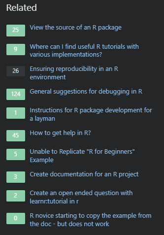
Why does the "Related questions" section for unanswered questions have one font color for the numbers, but the one for the answered section has a different font color (non-contrasting, by the way)?

A "Related questions" section for an unanswered question:

enter image description here

And for answered questions:

enter image description here

The same is true for the 'linked' section

15

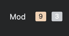
The count of CM escalations on a user's profile when viewed by a moderator is extremely low-contrast in dark mode:

White-on-light-grey "3" in a box

2
15

The new dark mode has all the colors washed out. The orange is really bad...

enter image description here

2

You must log in to answer this question.

Not the answer you're looking for? Browse other questions tagged .