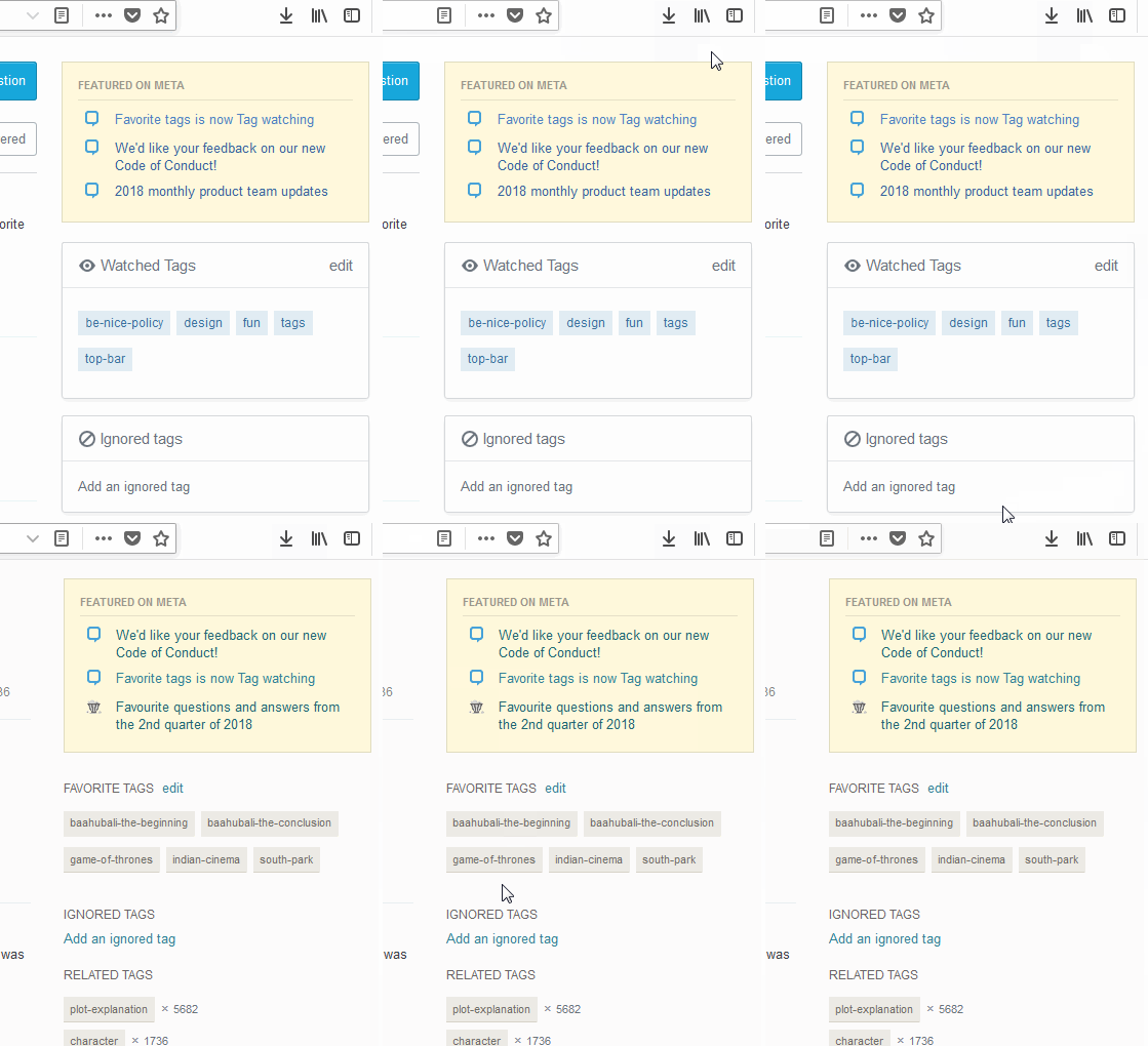
100

tl;dr

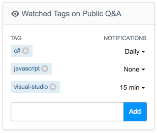
We rolled out some improvements for how you track the topics you are interested in for your favorite Q&A sites. This feature used to be called Favorite Tags. We are renaming it Tag Watching. Naming is hard, but we think this better captures the value of the feature. There were a number of confusing elements to the old feature. We've attempted to clear these up and refocus the user experience on the core functionality.

This feature is live as of today (07/26/2018) on all sites. We turned this on for all sites earlier than expected so that we could do some code cleanup.

Key improvements:

  • Released

    • On boarding: new users are introduced to tag watching and how it can help them
    • Cleaner pop up: new pop up is more focused on the key actions.
  • Coming later

    • Notifications: When watching a tag you're prompted to set up notifications, if desired. Also, changing notification settings will be supported when you edit your watched tags in the right side bar.

On boarding

Many users don't actually favorite any/many tags. Part of this is likely due to fact that we never explained why you should bother. In the old system all you saw was:

Tag Favorites on boarding

Old experience for on boarding

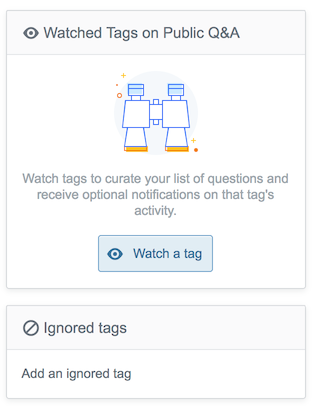
Now you see a description of the value tag watching provides.

New tag watching on boarding

Tag pop up

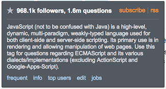
Our old tag pop up was very comprehensive and confusing. So many options. Watching/ignoring a tag was a tristate button (those are never a good option). An every action is essentially presented on equal footing. This makes it really hard for new users to understand what they can/should do.

Old tags pop up

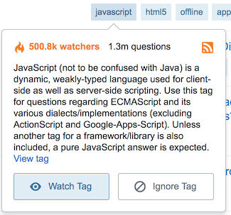
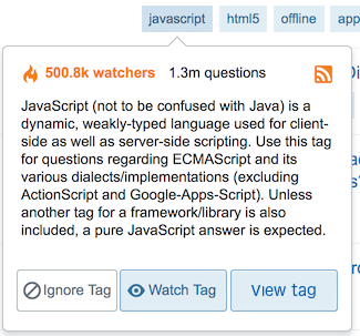
The new pop up is focused on two primary actions (watch or ignore tag) and two minor actions (view tag, access RSS).

New tag watching pop up

Notifications (coming later)

We have some work to make the notifications scale to SO. So, while these improvements are live for Teams users, they will be enabled later (timing TBD) for SO and the rest of the network.

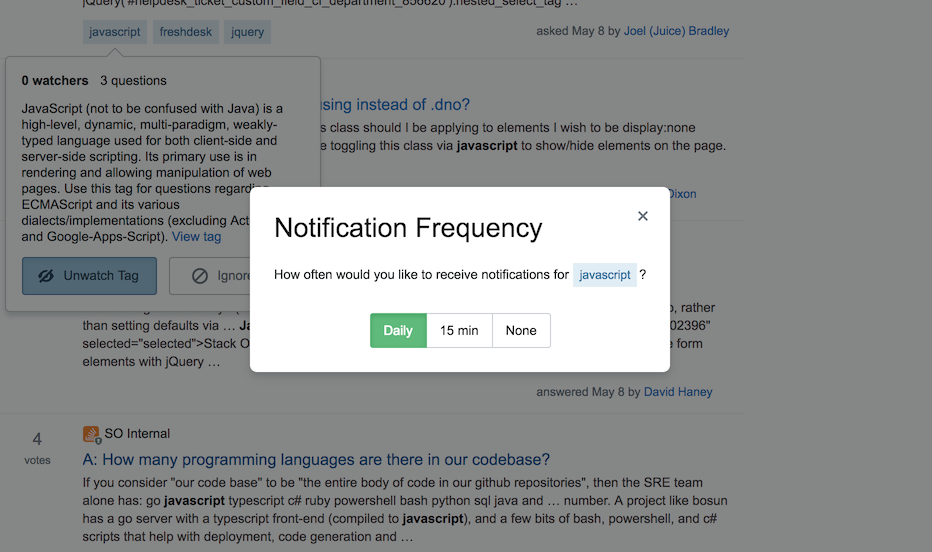
With the old system watching a tag and getting notifications were two separate steps. With the new experience, you will be prompted to set your notifications when you watch a tag.

New tag watching notifications prompt

Also, changing your notifications will be integrated into the experience of editing your watched tags.

Editing tags with notifications

Feedback wanted

As usual, we are happy to hear your constructive feedback. Feel free to post an answer below if you think of an improvement.

23
  • 28
    This looks awesome! ...So, when will we be able to reorder them?
    – BJ Myers
    Commented Jul 5, 2018 at 17:41
  • 2
    @BJMyers Drag&Drop wasn't invented here yet :D
    – Skipper
    Commented Jul 5, 2018 at 17:42
  • 7
    Does this mean that we will temporarily lose notifications, or just that we have to get to them some other way? (The only thing I use tag favorites for right now is to get email about new questions in them. Can I still do that?) Commented Jul 5, 2018 at 17:54
  • 2
    There are so many people watching tags! C++ has almost as many watchers as questions! Half of the top 10 Stack Overflow tags have a watch count greater than half the number of questions with the tag! I'm baffled that these watcher:question ratios are so high. Commented Jul 5, 2018 at 19:00
  • 13
    I like this. I've had a love/hate relationship with Internet Explorer for about 2 decades... I follow the "#InternetExplorer" related tags to see what crazy things appear and to help out lost souls that venture into IE quirkyness... but "favorite" was always a bit weird... IE is not my favorite.
    – scunliffe
    Commented Jul 5, 2018 at 19:29
  • 13
    Why reduce the functionality of the popup? I almost never want to "watch" or "ignore" a tag. It's nice that you want to help make sure that people know they can watch or ignore the tag, but did you look at what people were using the tag popup for, prior to making this change? Personally, I use tag popups to get a brief idea about what the tag is and/or to get access to the links which used to be in this popup. This change makes my use of the site harder, not easier. Why not leave the previously existing links in the popup? They don't need to be glaringly big like the new Watch & Ignore.
    – Makyen
    Commented Jul 6, 2018 at 0:48
  • 10
    I do not want to be a "Negative Nancy", but the new tag->flyouts are hideous. When I scroll down the page with the mousewheel, the tags pop-ups are annoying as heck when you momentarily pause. Next the "Watched Tags" and "Ignored Tags" now take up 5 times the vertical real-estate than the original simple tags widget did. Why do you people think making the page pop-out like neon on the Vegas strip is wanted -- or even a good idea for that matter? We have now lost 2-full questions of space at the top with the latest change there, bigger is not always better. If it's not broken -- don't fix it. Commented Jul 6, 2018 at 5:19
  • 4
    And while we are "Improving Things", can we get a setting to turn off (hide) "Hot Network Topics"? I do not, and will never, care to see "When is a vampire in sunlight?". That's just psycho-babble... Commented Jul 6, 2018 at 5:38
  • 1
    Is this planned as well? : meta.stackoverflow.com/questions/370430/…
    – Luuklag
    Commented Jul 6, 2018 at 7:15
  • 6
    "Notification Frequency: How often […]" "None"… Wait, isn't "Never" more appropriate in this context? Commented Jul 6, 2018 at 7:40
  • 2
    Huge usability improvement! The old UI was really quite bad. People would click the tri-state button without realizing that it was a button or that they'd clicked it, and then they'd get confused later on when they noticed questions were either missing or a different color, with no idea why that was the case. This UI should solve those problems.
    – user215040
    Commented Jul 6, 2018 at 9:25
  • 1
    It's a long, long time since "new navigation", and it's good we're getting some new features soon. Now, about that eye icon... Am I the only one finding it a little creepy, with The Eye staring into my soul? Maybe a kinder, less judgmental eye would look better? A tag icon? By the way, dilated pupils tend to look better than small pupils.
    – Kobi
    Commented Jul 6, 2018 at 9:26
  • 2
    The eye of Providence watches over us benevolently, @Kobi; annuit cœptis!
    – Shog9 Mod
    Commented Jul 6, 2018 at 14:59
  • 3
    Every time one of these opens, I'm struck again by how much less useful these are for me than the old tag popups. How now with the new popups, to get any of the information I actually want (the links that used to be there), I have to go thorough loading an entire additional page (the tag search), just to find those links. This is nowhere less clear than when looking at the Tags page. I'm getting tired of having to write userscripts just to recover functionality that once existed, but was removed because someone thought it was better not to have it. Yeah, I'm a bit frustrated.
    – Makyen
    Commented Jul 8, 2018 at 3:14
  • 1
    Did you collect usage data as to what people did with these popups prior to making this change? If so, what did that usage data show? I assume that the primary thing was that people just close the popup. However, when a user clicked on a link/button, what percentage of time did they click on each button/link?
    – Makyen
    Commented Jul 8, 2018 at 3:17

24 Answers 24

73

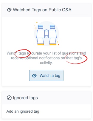
This is super tiny nitpick, but there's a number-mismatch in the tag-text:

enter image description here

The text should either read

Watch a tag to curate your list of questions and receive optional notifications on that tag's activity.

or

Watch tags to curate your list of questions and receive optional notifications on those tags' activity.

or some third construction I'm not smart enough to notice.

Given the mismatch between the box's heading ("Watched Tags...") and the button's text ("Watch a tag") it's not clear which of the two options above would be better. (And perhaps that's a signal that the heading and the button-text also need agreement.)

Absent a strong feeling on whether we're really trying to talk about tags singly or as a group, I'd suggest the first construction: it's slightly simpler English. (Since it avoids the plural possessive tags'.)

0
52

Please make the watched/hidden tag thing hidable/toggle-able, especially on the per-site metas.

The new display takes up a bit more screen real-estate if you have watched tags, or a lot more when you don't, and draws more attention with its glow effect and large image when empty. Why is it glowing, btw? It's static and doesn't need to draw attention, and nothing else is glowing

On the per-site metas, I imagine very few people want to watch/hide specific tags, so it'll likely be empty, and making it pop out like that is distracting and provides very little utility.

Alternatively, you could consider removing the feature altogether on the per-site meta.

2
  • 12
    Please don't remove the feature for ignoring tags on per-site Metas. I don't use Stack Overflow Jobs, so on Meta Stack Overflow, I've ignored [jobs] and a few other tags that have to do with Jobs like [job-recommendations] and [stackoverflow-talent]. I do agree though that it can be less distracting. Commented Jul 5, 2018 at 22:47
  • 2
    @Donald removing it altogether might be too much, but imo removing it from the sidebar, and leaving it in the settings, where it currently already is, will likely harm very few on the per-site metas. Follow starts on MSO are extremely low with less than 100 on most of the most popular tags (dunno how to look at ignored tag stats, though).
    – Erik A
    Commented Jul 6, 2018 at 5:20
45

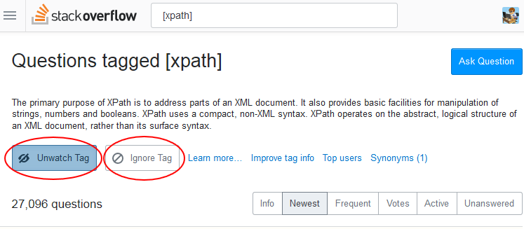
Please de-emphasize the Unwatch button

The unwatch button in really inviting and asks to be pressed as 'main' action in the tag-section. This is OK if you accidentally added the tag, but for a normal workflow this is not what a user wants to do.

See this image:

enter image description here

Maybe just a grey button with blueish text is ok?

1
  • 21
    'Unwatch Tag' looks like the most important thing on the whole page now. It is the least important, imo, however. Bad design!
    – TaW
    Commented Jul 6, 2018 at 22:44
41

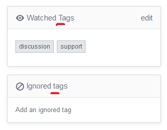
In the new design the two sections having the title as Watched Tags and Ignored tags.
In these for the Ignored tags, the tags can be replaced to Tags for uniformity.

Tags caps

Also I can see Ignored Tags only in the Tag Watching & Ignoring page too.

0
29

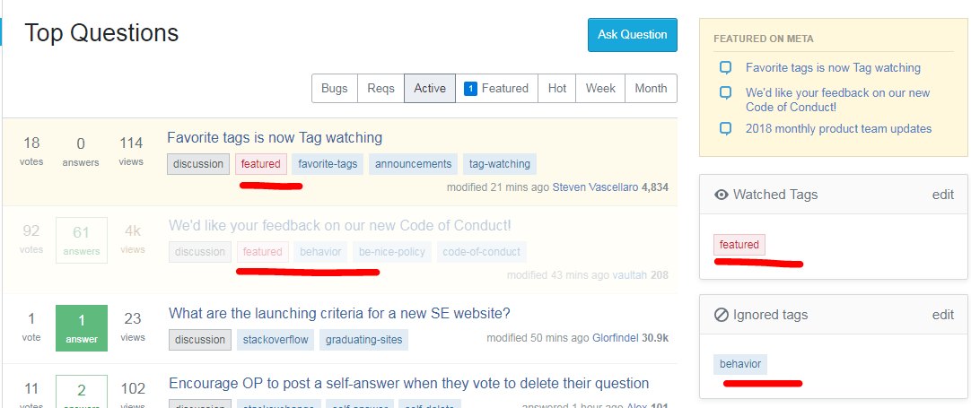
In this system, what options do I have for dealing with tag conflicts, that is, with questions that have both an ignored tag and a watched tag?

Here's what I see on MSE right now:

MSE featured vs. behavior

Apparently, the "ignored" tags have a higher weight than the "watched" tags – in my example, the ignored causes the second line to gray out even though is watched.

Can I have the option to specify that a particular "watched" tag should override any "ignored" tags on the same question, and prevent it from being grayed out or hidden?

4
  • Not sure I see the merit in this; if you want a tag to not be ignored, remove it from your ignored tag list.
    – TylerH
    Commented Jul 5, 2018 at 18:49
  • 15
    @TylerH Sure, but as in the example, tags are used for different things. Maybe I'm not interested in "behavior," unless it's important enough to be "featured." This may be less useful on SO, where many tags are simply identifying the relevant coding language, but on language sites, for example, tags cover a variety of subjects like grammar, history, regional differences, definitions, and more, and it's common to want to ignore 90% of a tag, but not all of it. Commented Jul 5, 2018 at 18:57
  • 1
    Tag interests are plenty complex on Stack Overflow, actually. Anyway, if you are interested in reading "featured" stuff that is tagged with your ignored tags, it will still show up in the "Featured on Meta" announcement box, as indicated in your own screenshot. If it's something else, I would say just wait until the complex tag combination favorites/tabs from the now-defunct new-nav gets added back; that will purportedly let you 'favorite' tag combinations.
    – TylerH
    Commented Jul 5, 2018 at 19:47
  • This isn't new behaviour, and I posted an workaround here: graphicdesign.meta.stackexchange.com/a/3075/52050
    – Cai
    Commented Jul 6, 2018 at 11:38
28

The new sidebar widget stands out (in a bad way) because it does not match the style of the existing widgets. Why not keep the style similar?

enter image description here

21

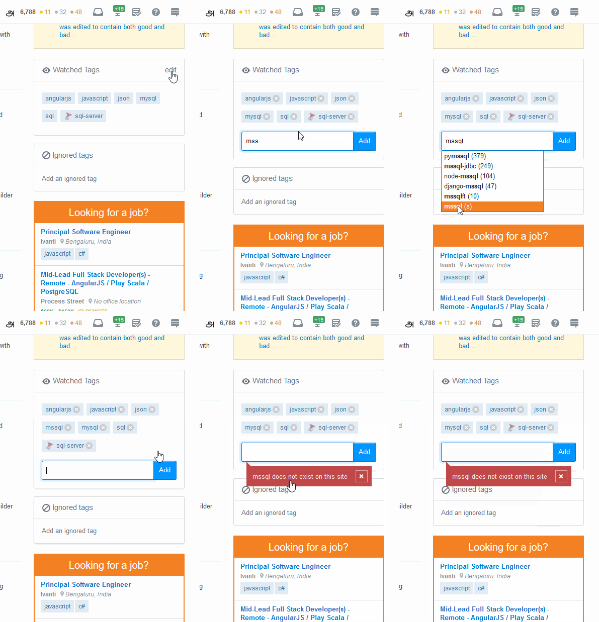
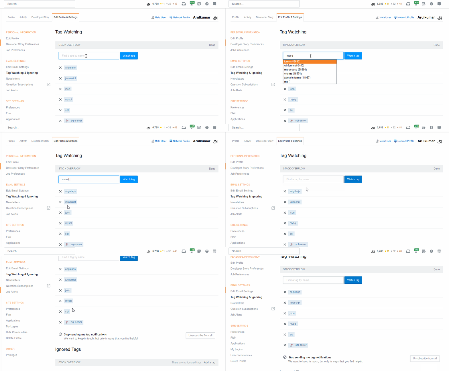
If I'm trying to add a synonym tag to the Watched Tags or Ignored tags section in the Question page's side bar, it throws the error as

{tagname} does not exist on this site

For an example, in SO I'm trying with mssql as on of the synonym of sql-server tag.

GIF for reference:

In questions page

But if I'm trying the same in the Tag Watching & Ignoring under the Edit Profile & Settings, it doesn't throw any error.

GIF for reference:

In edit profile page

The validation in the question's page can be applied in the Edit profile & settings page too?

1
  • Adding a tag synonym that's "not found" actually seems to add the main tag, so in terms of mssql, for me it was adding sql-server instead, not sure if this is always the same, but that's how it appeared Commented Jul 6, 2018 at 12:02
18

I really like this update. The tag description is easier to read and interact with, the layout is lighter, and makes Watched Tags more understandable in general.


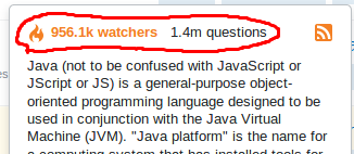
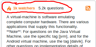
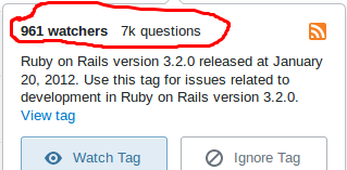
The only suggestion/doubt I got is regarding the "hot" tags being colored, while the others remain with black text. Specifically, the way that coloring is determined:

enter image description here

enter image description here

enter image description here

We can see that both and have the same color tone, even though Java tag has almost 1000x watchers and 200x questions asked. On the other hand, the tag is not colored, but it has almost the same watches as VM, and even more questions asked.

In my mind, I would have expected the color to change (more intense or red) proportionally to the number of watchers and questions asked, similar to the way the vote counter on comment gets more orange/red as the counter increases.

IMHO, this gives a better sense of the "hotness" of the tag, and can perhaps give a "wrong" impression of hotness (i.e.: VM being equally hot to Java when clearly it isn't, and Ruby not being hot when it got almost the same watchers and more questions).

8
  • 2
    It looks like it switches to orange simply whenever there are >= 1k watchers.
    – TylerH
    Commented Jul 5, 2018 at 19:48
  • @TylerH that is what I concluded also. I think it could consider both watchers and questions, plus a gradient to orange/red, to give a better sense of hotness
    – DarkCygnus
    Commented Jul 5, 2018 at 20:03
  • 21
    I doubt a gradient that slight would be good; a lot of people who are color-blind would likely see the same shade. Frankly I think the "hot" analogy is wrong for tag watching metrics, because they aren't like trending hashtags on Twitter; people don't typically follow a tag only for a little while or ask a question and then delete it shortly after. The numbers always trend up. Maybe some indication of overall popularity would be OK but I feel like that's already kind of obvious just by looking at the # of watchers and questions. In other words, I think the 'hotness' feature is redundant.
    – TylerH
    Commented Jul 5, 2018 at 20:11
  • 2
    @TylerH interesting point of view, do you suggest all tags have black text?
    – DarkCygnus
    Commented Jul 5, 2018 at 20:23
  • 2
    I'm not sure; that would be fine with me, or some kind of visual indication like an icon or an underline or something intuitive. I don't think a tag is any more or less particularly interesting or worthy of being followed by me based on how many other people follow it or have asked questions about it. I want to watch tags I can either answer or that I have a real-world use case for reading questions about... 'hotness' (this metric) has no bearing on either of those things... unless I'm rep-hunting, of course, but gamification is a sticky subject to a lot of users :-)
    – TylerH
    Commented Jul 5, 2018 at 20:35
  • 2
    @TylerH I see... perhaps making the tags you are watching different somehow (a star, color, whatever), as those are the ones that are "hot" for you
    – DarkCygnus
    Commented Jul 5, 2018 at 20:37
  • Exactly; before this change it was already a star, IIRC.
    – TylerH
    Commented Jul 5, 2018 at 20:51
  • 6
    I think the number of questions is more important than the number of watchers. That should be the bold and/or colored element. Commented Jul 6, 2018 at 4:20
18

After the change in the name and addition of the icon, we can also watch over things. Are anyone from the designing team following the show? ;)

Jokes apart, I like improvement in popup and removing extra options from it. However, there are some concerns from me.

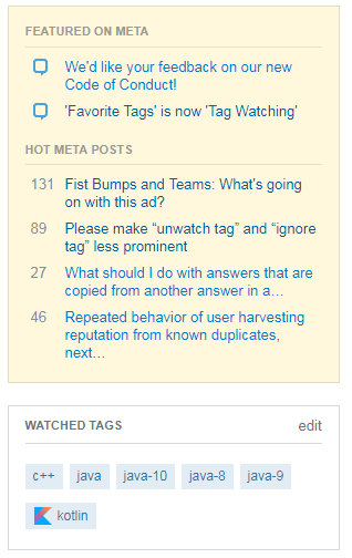
Boxes take more space in the page

I think the dialogue boxes for watched and ignored tags are occupying more space on the page.

Comparison between new and old

I think this can be reduced by some margin. Note that it takes more space even when the tag names are smaller.

Empty white space in the dialogue boxes

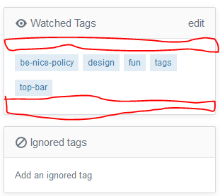
There is white space above and below the tags. This can be removed a bit to reduce redundant space. This space is not present in current design. Some space can be saved by doing.

White Space above and below the tags

Can this be implemented?

3
  • 6
    Actually being able to click the eye and forbidden icons to the left of the headers to hide the body and only show the darker header would be even better IMO.
    – TylerH
    Commented Jul 5, 2018 at 19:49
  • 5
    That's actually what I assumed the eye did in that box--that clicking on it would close the eye and windowshade the box. The whole eye="watched" connection didn't hit me until now.
    – nitsua60
    Commented Jul 6, 2018 at 2:30
  • All the more reason (excuse) to put more stuff in the left nav
    – Kevin B
    Commented Jul 7, 2018 at 15:25
15

The feature is still called 'favorite tags' in some places, like the Help Center:

Add favorite and ignored tags

Another way to filter out questions you're not interested in and focus on the ones you do care about is to add favorite and ignored tags to your account.

Favorite tags are meant to call out questions that are important or interesting to you. Any question tagged with one of your favorite tags will be highlighted on the homepage and questions lists.

(while you're at it, please update the screenshots as well)

Another example is further down the page, which also mentions a non-existing star icon:

You can also toggle a tag between normal, favorite, or ignored by mousing over the tag and clicking the star icon.


Also, the 'Favorite Tags' filter:

enter image description here

4
14

This came up on MSO and I thought it was a good idea so I'm reposting it here.

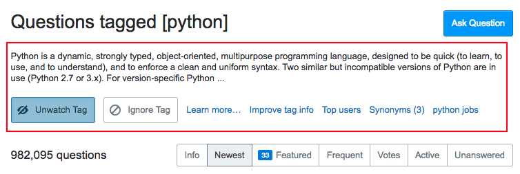
I'd go one step further than the OP's proposal, and remove the entire tag description block. We don't need this on every single page, forever! Who really needs a tag description permanently cluttering the space?

If we made the [Python] clickable or hooverable, that'll amply do.
The watch/unwatch/ignore/nore is already on the right side bar, it is not necessary there. Surely, there must be other, & better ways to induce people's goodwill to edit and improve tag definitions.

enter image description here

1
  • 2
    I wholeheartedly agree - I ve summed 700+ points in python(-3,-2.x) related tags. I do not need the text nor the buttons - I find the "Learn more..." handy as way to point newlings to the link-collections to those topics but thats it. Remove the buttons, shrink the text to [Python is a dynamic, strongly typed, ....](stackoverflow.com/tags/python/info) - link to the info page and I would be more then happy with it. If I ever get sick of python I can unwatch in the right side bar. Commented Jul 7, 2018 at 14:33
12

Notifications regression

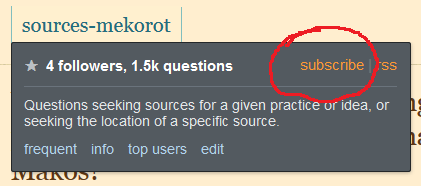
Before this change, I could subscribe to a tag to get email notifications for new questions (after 15 minutes, 3 hours, or 1 day) by clicking this link:

subscribe link

This link has now been removed, to be restored in some way at some time in the future, per the question. This isn't a case of not-yet-met plans for future functionality; this is something that used to be available, isn't now, and is promised again for the future.

The only thing I use tag favorites for right now is to get email about new questions in them. Can I still do that somehow? If not through the UI, then how? That "subscribe" link in my screenshot isn't a direct link; right-clicking on it in my browser doesn't offer me "copy link address" so I can get something to inspect.

4
  • 2
    If you want to subscribe to updates for ALL your fav tags on all sites, then there is a way around this. Go to: stackexchange.com/filters. Click on "Favorite Tags" under "Select Filter" in the right sidebar. Then click "Subscribe" to received email updates (again, right sidebar) and choose your subscription prefs.
    – Joe Friend StaffMod
    Commented Jul 6, 2018 at 19:58
  • 1
    Next step is to click on your profile, click on "subscriptions" and unsubscribe from any one-off favorite tag subscriptions.
    – Joe Friend StaffMod
    Commented Jul 6, 2018 at 19:58
  • I promise we will get the new stuff up and running as soon as we can. Reality is that this code is fairly complex and there is a ton of features on se.com filtered questions to support.
    – Joe Friend StaffMod
    Commented Jul 6, 2018 at 20:02
  • @JoeFriend understood; refactorings are hard. I didn't expect the temporary departure of existing functionality, which is why I posted. Glad it's still there, if less obvious for now! Commented Jul 6, 2018 at 20:07
10

I don't see the link "Add an ignored tag" when I unignored my last tag.

enter image description here

It is back after refreshing a page.

Also, the "edit" button doesn't disappear when there is nothing to edit.

1
  • 1
    This will be fixed in the next build. It was missing a call to updateVisualState() on clear.
    – Brian Nickel StaffMod
    Commented Jul 9, 2018 at 21:22
10

Could we have the "View tag" button more prominent?

Instead of:

We could have an easier to find "View tag" (forgive my poor GIMP):
enter image description here

Style is up to you: I just want "View tag" as big as the other options.

And if the size change isn't approved, could we instead adjust the position of "View tag" and "Watch Tag" to the right of the popup, for accessibility for right handed people?

3
  • 3
    imo that layout of buttons feels cramped.
    – user367580
    Commented Jul 6, 2018 at 15:16
  • 3
    I think that, if the pop-up is showing is because one has the cursor on :hover over the tag. In which case, one just has to click to view the tag, without even having to move the cursor... perhaps making the whole pop-up clickable could be an alternative?
    – DarkCygnus
    Commented Jul 6, 2018 at 15:35
  • 9
    There was a "view tag" link? I had no idea. I completely missed the link next to the massive buttons to watch or ignore the tag
    – Justin
    Commented Jul 6, 2018 at 18:32
10

I'm unable to watch or ignore non-existent tags

This probably explains something I noticed the other day, I'm no longer to watch or ignore tags that do not exist (yet).

Rationale

Why would I want to do that? The answer lies between those parentheses. I want to be able to add tags that don't exist yet, but that I expect or hope to exist in the future.

Example

My home stack is Science Fiction & Fantasy. Let's say a highly anticipated new film is coming out, for instance a new Star Wars film. No questions have been asked about it yet, but the title is already known, so I know what the tag will be. I want to avoid spoilers as much as possible, so I want to ignore the projected tag. But now I can't do that any longer, since I can't ignore tags that do not exist!

Another example would be following a tag of a favourite author about whom no questions have been asked yet, but I expect there aren't as many users having that same issue.

Don't silently alter my existing tags, either!

Additionally, I noticed that older non-existent tags had been silently removed from my list of favourite tags when I edited it to add another tag. I noticed and backed out without saving. Please don't do that.

9

If one box gives me the option to "Watch a tag" and explains what that will let me do, the other one should let me "Ignore a tag" and explain what the consequences might be. (Honestly, I'd like to know.) The wording "Add an ignored tag" is super geeky, at best. Add it to what? Tomorrow's soup?

I don't know what a notification might be, but I'd like to see a little marker beside the watched tag indicating that there is some unseen activity. And ideally, I'd like it to show up immediately, or a reasonable approximation. That's somewhat like the old new-nav tabs, except that the indications on those tabs were too fragile; they vanished on refresh. I'd like it to be like the markers on messages/rep: the marker stays until you act. Other than that, I was pretty fond of the nav tabs so I'm looking forward to getting something like them back.

1
  • 1
    Ignored tag soup is tasty. But I wasn't paying attention. ;)
    – Wildcard
    Commented Aug 6, 2018 at 22:10
7

So... I actually find the new name more confusing.

Favorite tags - by definition, is a list of tags I like. (Which is what it was)

Watched tags - by definition, is an activity. I am actively interested in these tags. So why can't I actively follow multiple tags at once? (Or am I just not seeing this feature? The closest is the "interesting" question tab, but that is clearly ignoring my watch list) Not counting notifications because that's mostly passive. (And not a feature yet)

I don't like the idea of the coming notification feature... I am only interested in new questions for ~1 hour after they are posted (After that, they are either well answered, or require very specific knowledge). I'd have to experience how the notifications work, but if they are normal notifications, I would expect to be flooded by notifications I no longer care about if I take a short break from the site (filthy casual me!)

I would expect to be able to view "watched tags" in a question que (like the "New", "Unanswered", or "Interesting" tabs), because that is the closest behavior to "actively watching". I'm not flooded by pointless notifications if I take a week hiatus, and I can view questions up to however old I want, whenever I want.

(Please correct me if I'm wrong, but isn't the only thing watching a tag does right now is provide you a shortcut to filtering on that tag alone? Where is (if there is) the view all shortcut?)

2
  • +1 for just watched tags timeline
    – user379859
    Commented Jul 6, 2018 at 14:55
  • 1
    I also have lost count how many times I've clicked different parts of the Watched Tags box trying to get to a watch que... but maybe that is just a symptom of my insanity?
    – Tezra
    Commented Jul 6, 2018 at 15:01
6

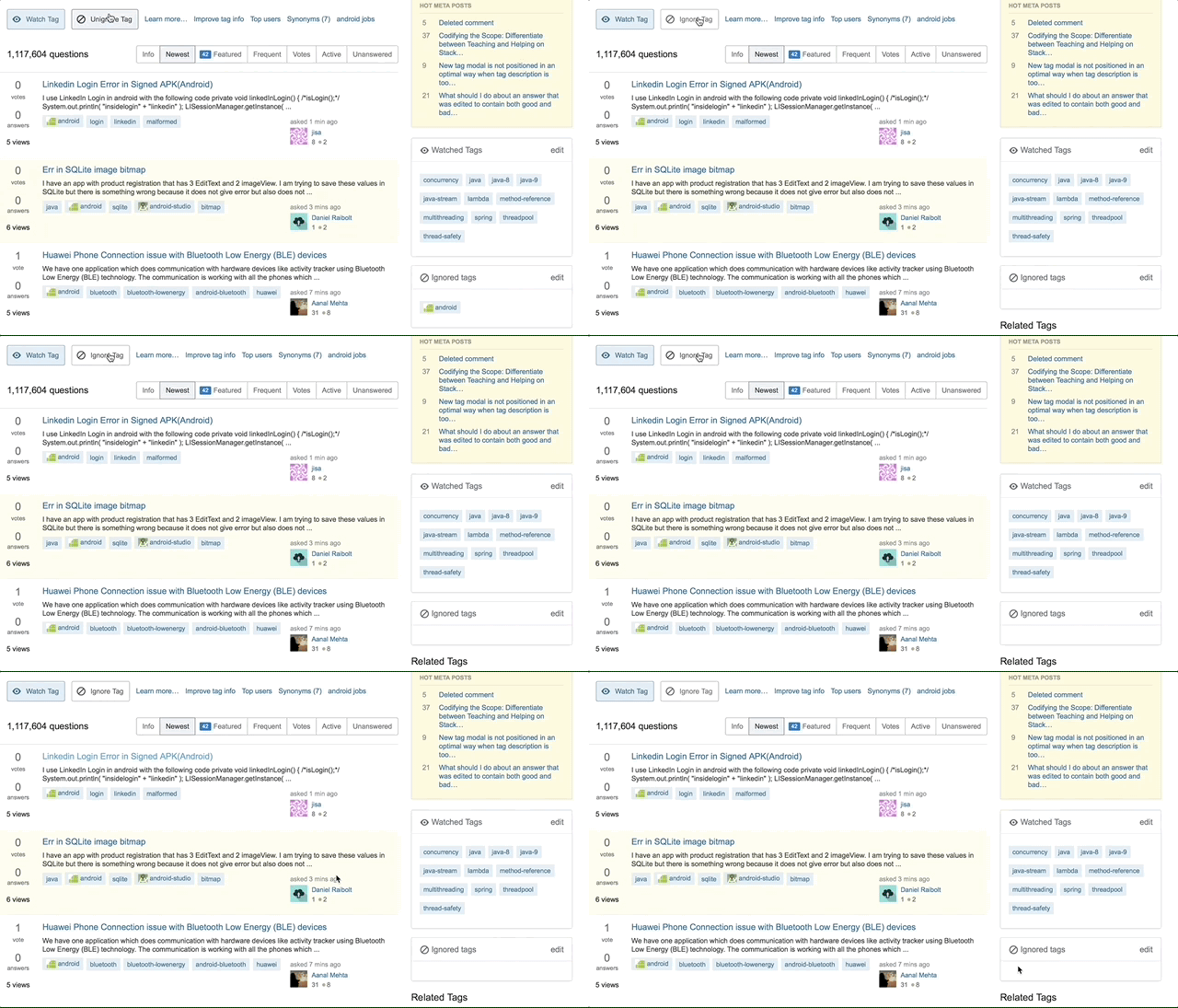
One thing that doesn't quite make sense to me, is:

I click on a Watched Tag to show the newest questions with that tag. The top of the page then looks like this:

search for questions with a specific tag

I get buttons to "Unwatch Tag" and "Ignore Tag". Why would I want to ignore it if I'm watching it? How can I watch it and ignore it at the same time? You mentioned something about a tristate link previously, but maybe that was more sensible/clear? I am unlikely to ignore a tag until after I have unwatched it, after all.

And related: from this page, "Unwatch Tag" shouldn't be as prominent as it is an action I am not all together that likely to take compared to just editing my watched tags list.

1
  • 2
    That is a valid combination: I watch the PHP tag while I ignore it as much as possible to stay sane ....
    – rene Mod
    Commented Jul 9, 2018 at 6:20
5

Two nitpicks:

  1. After pressing 'Edit' in the top right of 'Watched Tags', there is no way to revert back back to the previous state. Perhaps there should be a 'Done' button.

  2. The highlight around the text fields ends abruptly on the right hand side:

Add tag field

In my opinion it should match the style of the top search bar, which gets a faint all-round drop-shadow

enter image description here

1
  • Re #1: you can just click outside the 'Watched Tags' box and it will revert back to normal.
    – user395762
    Commented Aug 1, 2018 at 17:14
4

Watch tags to curate your list of questions and receive optional notifications on that tag's activity.

There is, of course, the tags/tag's issue that nitsua60 has already dealt with admirablely. But the rest of the sentence contains some peculiarities as well.

to curate your list of questions

I have a list of questions that I am, moreover, curating? When I go to stack overflow.com, I am presented by a list of questions called "Top Questions". I can't say I've ever thought of them as "my questions". Right now, the top question deals is one tagged 'xamarin' -- which as far as I know is a kind of fruit. Have I 'curated' this list by setting 'cocoa', 'xml' and 'xcode', among others, as my Watched tags?

As I understand it 'curate' has been gaining in popularity since museums started using it in their marketing, as in: a new exhibition curated by Hatsuko Mpufu von Schtottelheim-Chomborley. Which means that Hattie had a good look around the basements and picked some stuff. However, by watching a tag, I'm not really assembling a collection of great questions, am I? I'm just more likely to see some questions rather than others, regardless of their quality.

optional notifications on that tag's activity

Tags used to be labels, but now they've become actors as well? They're no longer the electronic equivalent of a hanger on a dog's collar, but they themselves go out sniffing for questions? Even metaphors get busy these days.

1
  • 1
    Brilliant points. "Curate" by definition means "select, organize, and look after the items in (a collection or exhibition)" or "select, organize, and present (online content, merchandise, information, etc.), typically using professional or expert knowledge." Indeed, you're definitely not curating anything by watching tags. I think they grabbed the word from its use in describing social media newsfeeds as "personally curated content," but it really doesn't apply here.
    – Wildcard
    Commented Aug 6, 2018 at 22:16
4

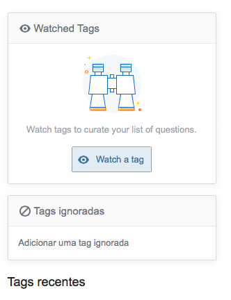
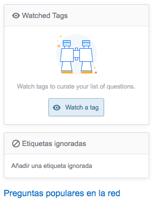
This seems to have been rolled out without proper localizations.

For example, on the Portuguese version of Stack Overflow we read this strange English intrusion:

untranslated pt.so “watched tags” botch

Similarly, on the Spanish version of Stack Overflow we read that same English intrusion:

untranslated es.so “watched tags” botch

Could we please get these translated properly on all the sites that have a native UI?

(The word “curate” there in the middle of it actually means something in those two languages, which threw me off a little. I kept thinking of how ¡Cúrate a ti mismo! is Spanish for the old adage of Physician, heal thyself.)

1
  • 1
    Thank you for for the answer! We crowdsource the translation. You can improve or suggest translations for those boxes on Transifex. Based on what I see on Stack Overflow in Russian I would say that all strings are available for translation already.
    – Nicolas Chabanovsky StaffMod
    Commented Aug 1, 2018 at 6:06
3

This seems to have somehow borked the Favorite Tags section on (some?) sites that haven’t changed to the new system yet.

On ELU, for instance, the section now looks like this:

Favorite Tags section on ELU

Notice how the “edit” link is squished up against the header, which no longer takes up the full width of the section. For comparison, the Hot Network Questions section right underneath it still looks correct:

Hot Network Questions section on ELU

2
  • Not sure it's related to the "brand change", more likely it's result of the responsive design changes, but totally agree it's ugly and better be fixed asap. Commented Jul 9, 2018 at 12:28
  • @ShadowWizard That is possible. I admit I don’t pay much attention to that box normally, so I can’t say for sure it’s a result of this present change, or whether it changed earlier. It definitely wasn’t always like this, though. Commented Jul 9, 2018 at 12:35
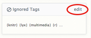
3

Font size of "edit" is too big

enter image description here

The font size of "edit" should not be bigger than the tags below. This would be consistent with the "edit" links for questions and answers which are also set in a smaller font size.

3

The colors are off

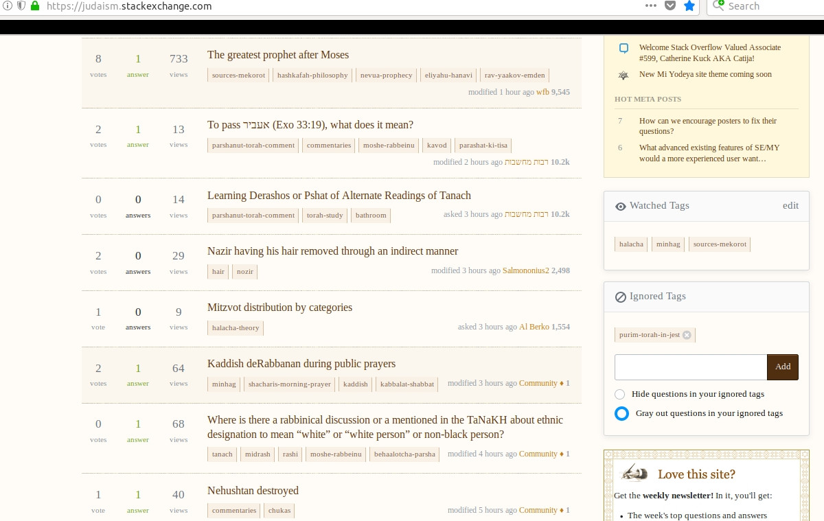
The questions containing a watched tag are highlighted, but that highlighting (at least on Judaism.SE) is very dull and is very hard to distinguish from the other questions.

It should at least be similar to the coloring of the 'Featured' sidebar, as it is on other sites (image taken from above answer):

Another thing, although this may be a little nitpicking, but I think the highlighting (notice the blue highlighting around the radio button 'Gray out questions in your ignored tags' in the first image) should also be consistent with the site coloring.

You must log in to answer this question.

Not the answer you're looking for? Browse other questions tagged .