-664

Update 3 - 2022-02-01

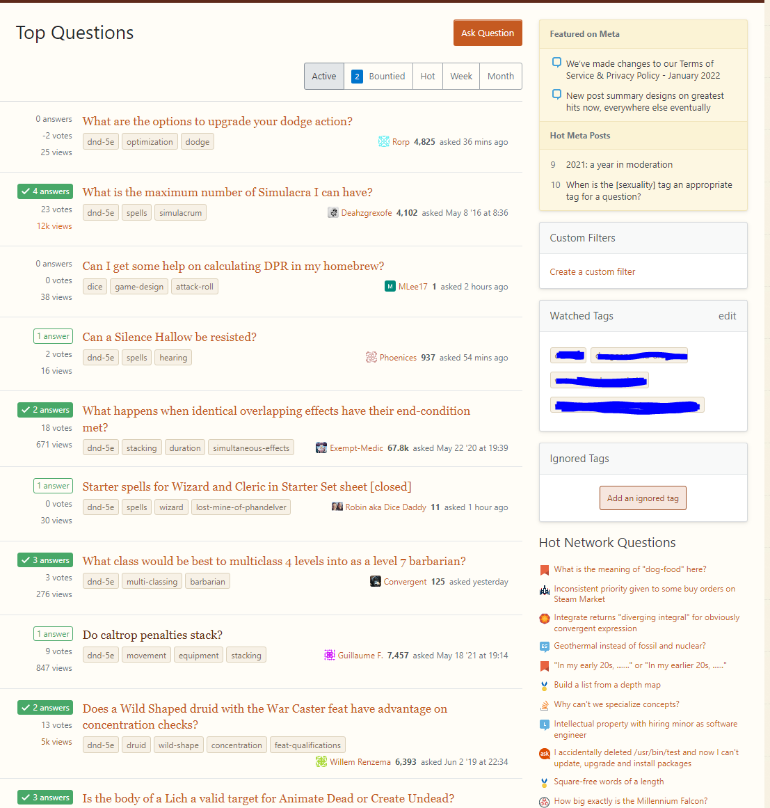
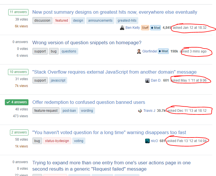
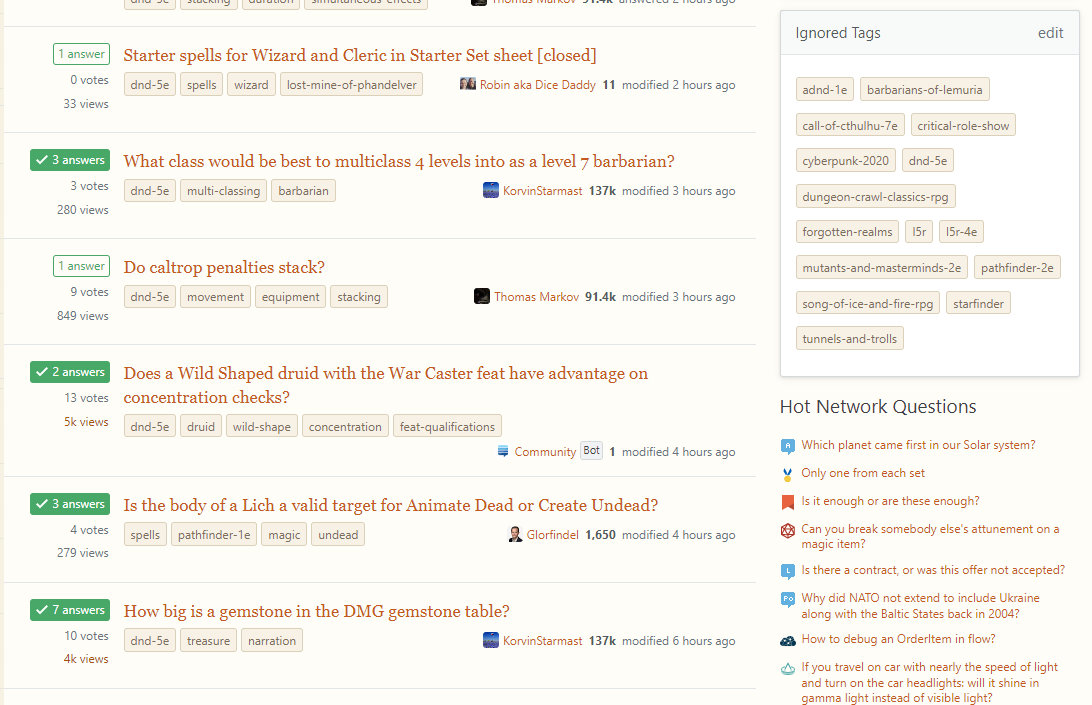
We've rolled out another small set of changes + bugfixes. The largest change was that we removed the yellow from watched tags entirely, leaving just the new "watched" icon.

We've also added this answer where we lay out our next steps.

enter image description here

Update 2 - 2022-01-27

We've pushed some layout changes live. When reviewing the given feedback as a whole, we've identified a few major themes:

  • Stats are too hard to pick apart, "votes" in particular
  • New watched/ignored states are not bright enough/too bright (respectively) and cause too much trailing whitespace

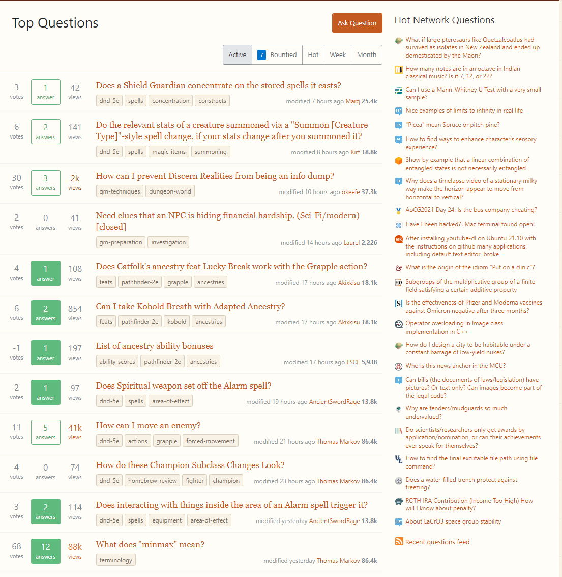
We've made the following changes to alleviate these issues:

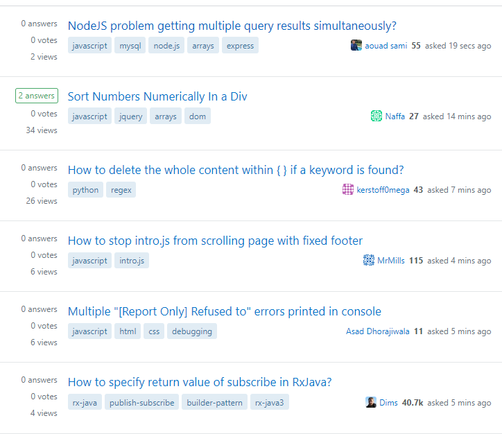
  • Bumped up the size of stats
  • Gave more visible weight to "votes"
  • Gave less visible weight to "supernova" view counts by removing the :fire: icon
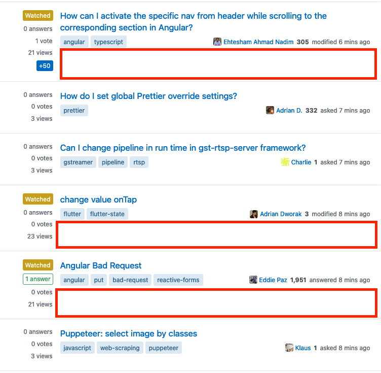
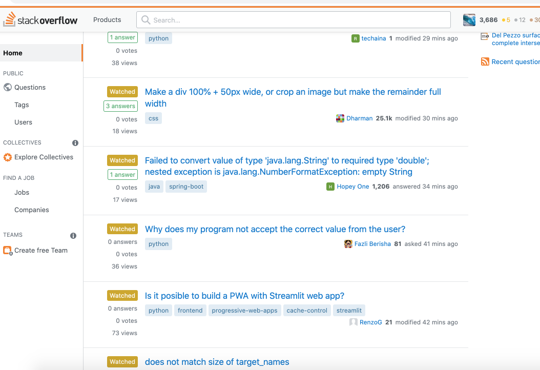
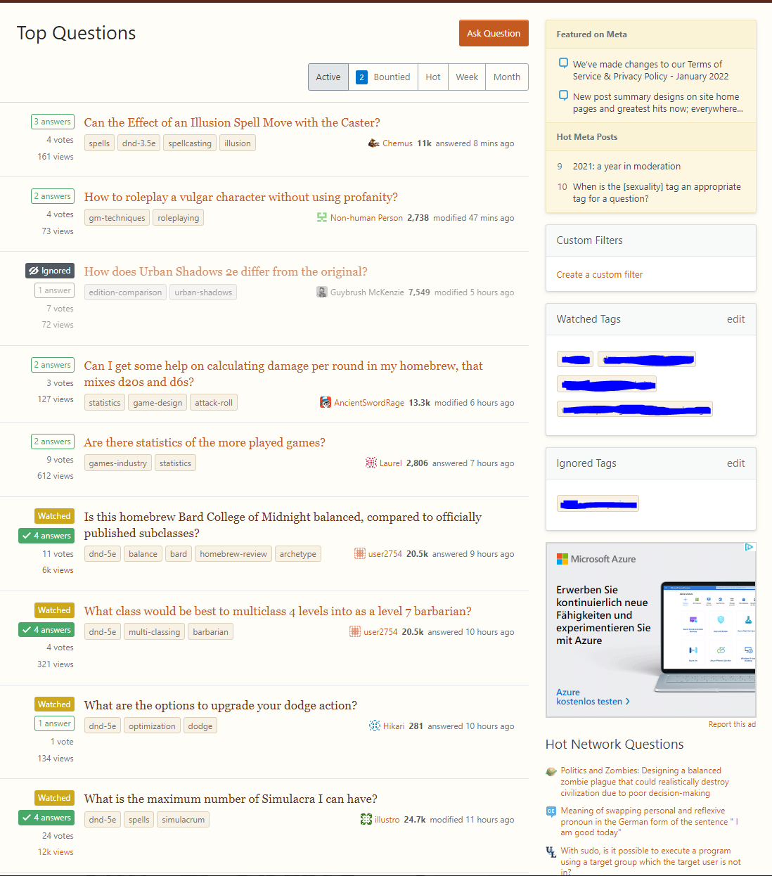
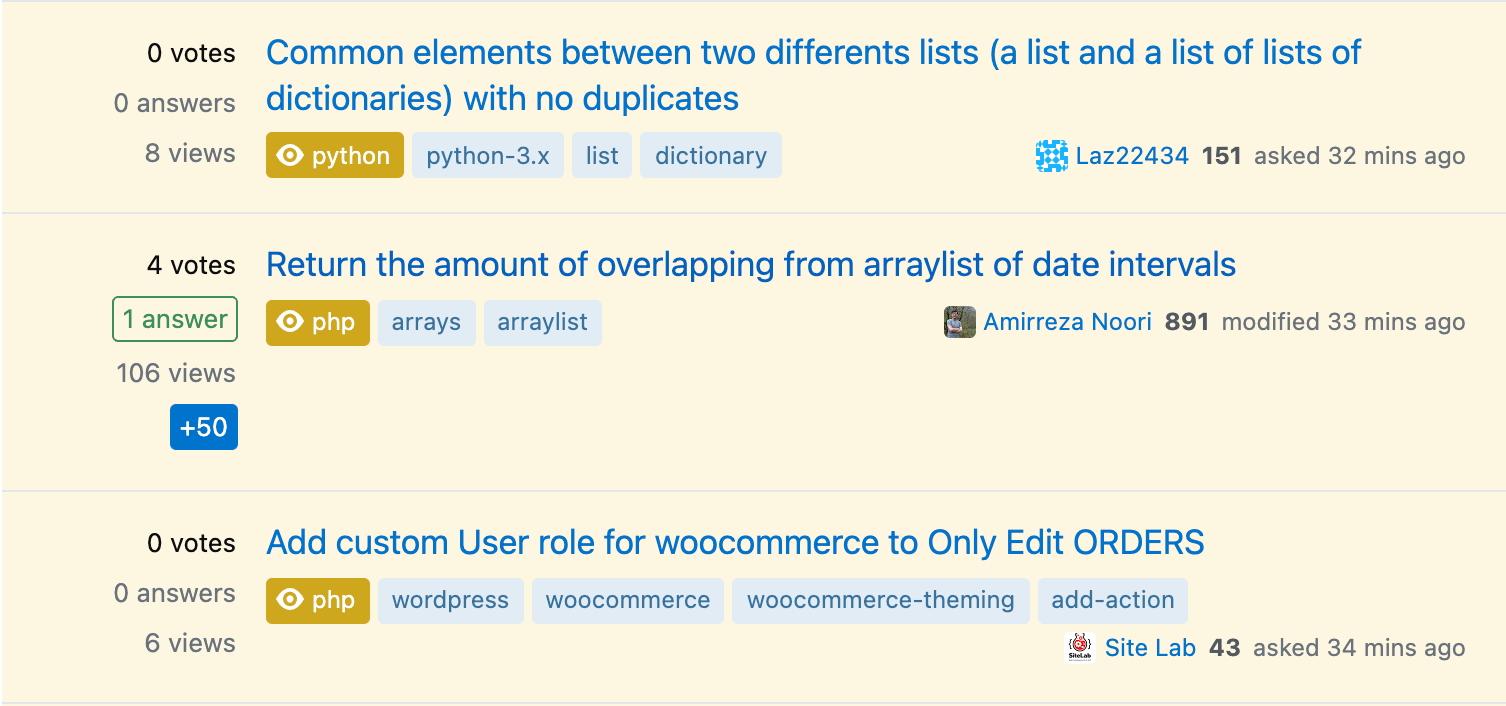
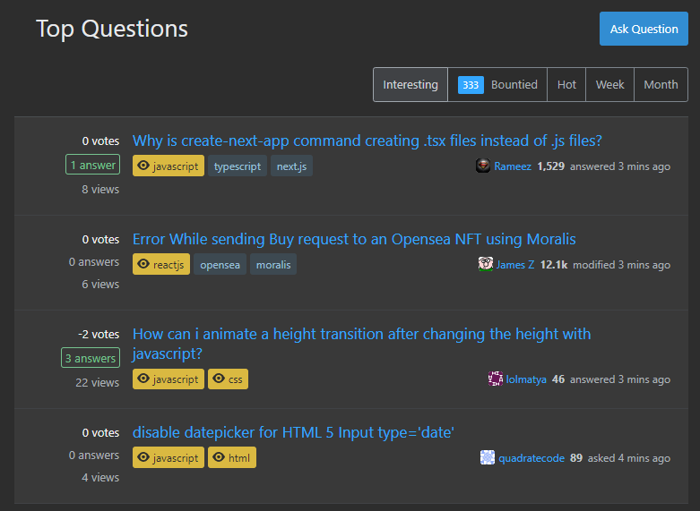
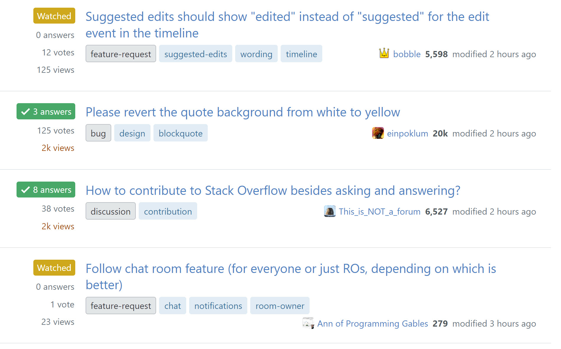
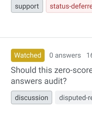
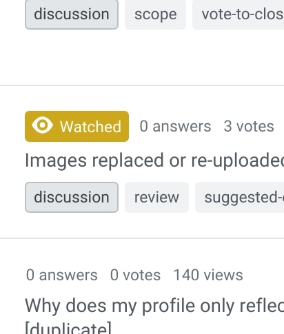
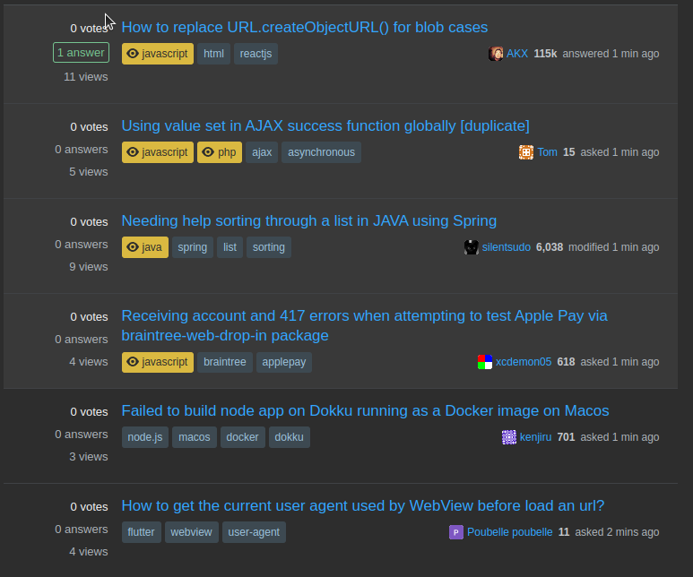
  • Removed "watched" state label, restored the yellow background and adding highlighting/icon to the individual tags that are causing the watched status
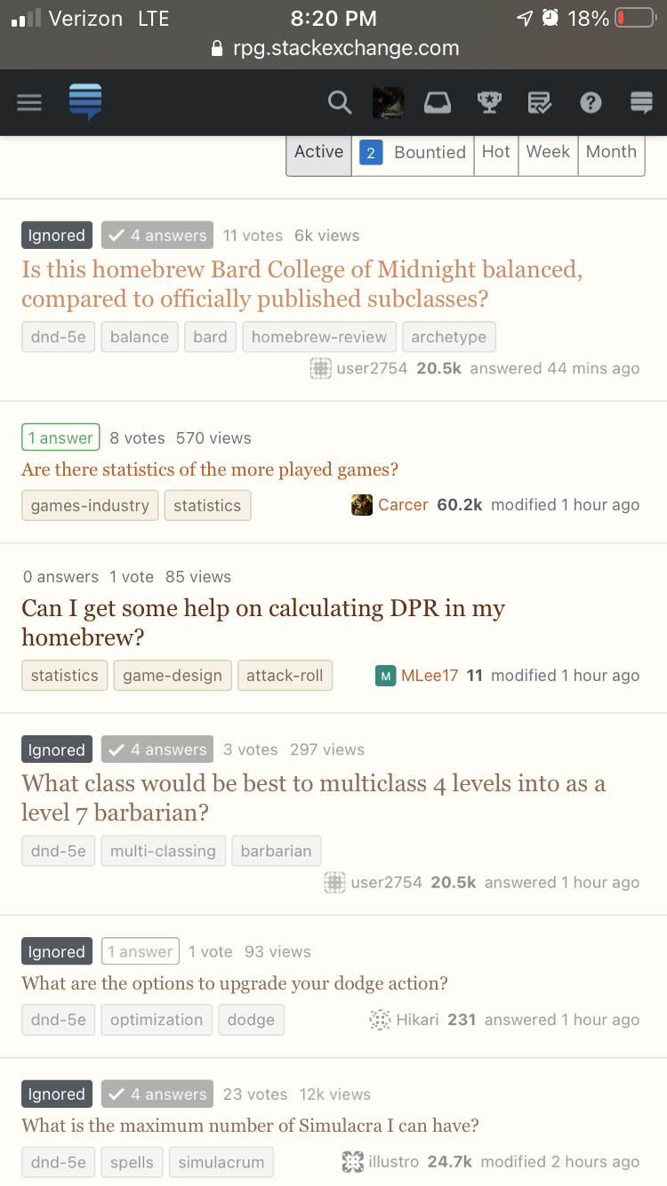
  • Removed "ignored" state label, added icon to the individual tags that are causing the ignored state

This latest set of changes also includes a number of bug fixes. We're still discussing how to better improve this component. There is still some extra whitespace at the end when there is no body excerpt and a bounty exists on the post (though, this is generally still less trailing whitespace than the current design on /questions, which has a body excerpt). Thank you for your continued feedback.

enter image description here enter image description here enter image description here

Update 1 - 2022-01-25

Most of the reported bugs have been squashed. We're currently gathering together all the and feedback items to decide how we want to alter the design. Thank you everyone for your feedback.


Original Post

tl;dr

We’re starting a rollout of the new post summary design to many existing screens, starting with greatest hits. This will be a slow rollout, with only one set of related screens changing at a time.

What we’re shipping now

We’ve built a new component to replace the existing post summary implementation. We aimed for ~100% data compatibility with this implementation so that users are not losing any statistics or features. That being said, our desire to leave the existing data intact as much as possible has led to sub-optimal layouts in a few uncommon scenarios, particularly for the display of community wiki posts. Work on these experiences is ongoing and will improve over time.

For the initial announcement, we’ve migrated /questions/greatest-hits to use the new implementation. This way, users can have a tangible example they can use today, before we roll out the design to more and more screens. Why did we choose greatest hits to start with? It was an ideal screen for many reasons:

  • Entirely standalone - no dependencies on other screens/processes and not depended on
  • Low user impact - low traffic, infrequently referenced and not terribly well known (even among employees!)
  • Uses the exact same component code and layout as /questions - users can see this as a very close preview for what will be shipping there later on
  • In disrepair - the screen was already showing some signs of neglect and really needed some love <3

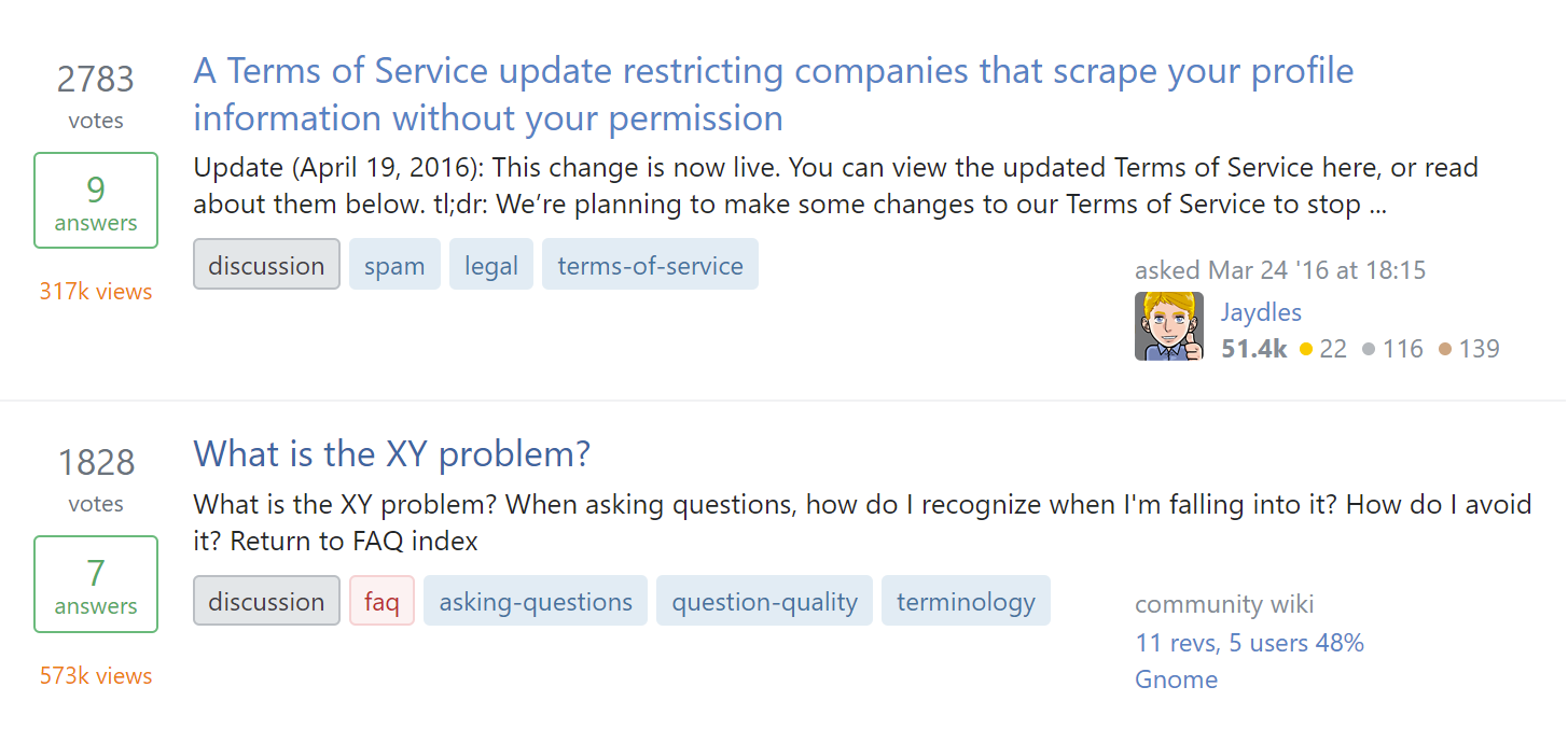
Before

post summary before

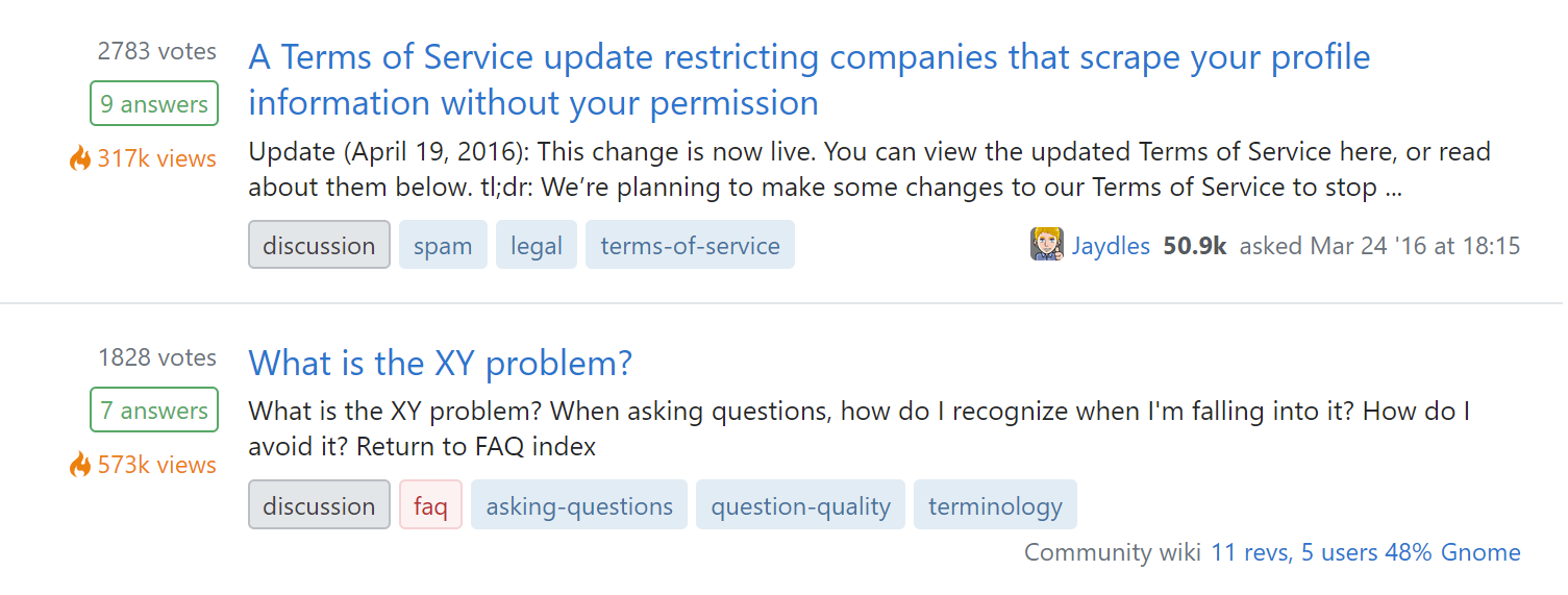
After

post summary after

What we’re shipping later

In addition to greatest hits, we’re aiming to roll this new design out site-wide. The areas we’re concentrating on first are the main areas of the site that still have mobile-only layouts. As we remove our final mobile views, we need to ensure that the remaining responsive views actually look good on smaller screens. More specifically, the following high traffic views are next on our list:

  • / (home / recent questions) - our “QuestionMini” layout questionmini layout
  • /questions/* (question list, list by tag, search, etc) - our “QuestionSummary” layout
    questionsummary layout

Work on these screens has progressed fairly far already due to most of the necessary work being in the creation and implementation of the underlying component. However, we’ve decided to hold off on the rollout until after the community has had an opportunity for processing the design changes and to offer us feedback.

Eventually, everything will be the new post-summary design, but it may be some time before the changes reach the long tail of our many different views.

Where we are currently using this design

Despite my claims above that this is a “new” design, we’ve been using it in a number of places across the site for quite some time. A (non-inclusive) list of places that are already using the post-summary design:

Why we’re making these changes

Our current designs have withstood the test of time, but they fall short in many areas:

  1. We generally assume 3 items of metadata: score, answers, and views. If we want to add new entries for e.g. bookmarks or revisions, it can be difficult to create a consistent layout in a list of questions.
  2. Inconsistencies in implementation have led to several different layouts across the site. When gathering requirements for a unified post summary component, we found at least 5 (five!) different layouts.
  3. Scaling the design is tricky, both in window size and adding features and functionality. We need to support all sorts of metadata on all sorts of devices.
  4. Our post summaries were only designed to support questions (and answers, kinda). We need to be able to display various content types in single lists. For example, in a list of notifications, we may want to present an article next to a question.
  5. We have no unified place to put an action menu.

Our new post-summary design solves these problems while supporting future features we’re exploring. Some features we’re looking forward to are:

  1. An arbitrary, scalable number of stats
  2. Multiple different content types
  3. A consistent location for post actions
  4. Scalable excerpts
  5. Responsive layouts
  6. A single consistent layout regardless of what data is included

How this component was designed

An early version of this component first appeared in Stack Overflow for Teams in a feature called For You. For You is a rich list of notifications that include questions, answers, and articles.

The existing designs were desirable for familiarity, but just weren’t well suited for the task. After the initial proposal and some iterations with our team of designers, the new post summary design was ready for user testing.

User testing was run with ~170 recently active users against 5 different versions of the post summary design (two of those being existing designs). The chosen design performed better than the existing designs in some metrics (including readability) and never worse on the remaining metrics (including familiarity, data absorption).

After this new design tested well, the design systems team gathered further requirements from across the organization and built it out as an official Stacks component. If you’re technically inclined, you can see some of the iterations in various open source pull requests.

If you’re familiar with the design tool Figma, feel free to check out some explorations prior to us moving into code.

FAQ

Q: What if I find a bug/regression?
A: Report it as an answer to this post - one bug per answer please. If you’re feeling charitable, add a [tag:bug] tag to the top of your post so we can more easily find it.

Q: What if I have constructive feedback, but it isn’t a bug?
A: We’d like to hear it! Add it as an answer on this post. As above, you can add a [tag:discussion] tag to the top of the post as well.

Q: When will FAVORITE_SCREEN be migrated to use this new design?
A: 6-8 weeks

162
  • 204
    I wish more work went into improving the UX instead of the UI.
    – Travis J
    Commented Jan 12, 2022 at 22:34
  • 194
    I sure don't like it; much harder to see the metadata on the home page. Commented Jan 24, 2022 at 21:58
  • 210
    This layout makes the desktop experience on the homepage worse, due to a lower information density displayed at once on the screen (# questions per screen), more difficult to parse and smaller statistics, too much padding between list items, misaligned tag and user bars with the bottom of the question block
    – illustro
    Commented Jan 24, 2022 at 22:12
  • 163
    Is it just me or does anyone hates these changes to the feed and profile? I say "hate", because they're ruining the desktop experience. Commented Jan 24, 2022 at 23:12
  • 61
    @BernardoDuarte the rapidly declining score on this post says "yes". As we've seen before though, score on announcements means nothing
    – Phil
    Commented Jan 24, 2022 at 23:14
  • 139
    I honestly don't see how this can be considered an improvement. It's harder to find information from a glance and it looks incredibly unbalanced.
    – Ambo100
    Commented Jan 24, 2022 at 23:42
  • 132
    It's horrible in nearly every way. Not a single improvement to my experience and several things which are worse.
    – takendarkk
    Commented Jan 24, 2022 at 23:52
  • 85
    Why do UX changes always make things harder to read and digest sigh
    – deep64blue
    Commented Jan 24, 2022 at 23:59
  • 78
    The change to add ignored tags with a black background, just to make questions you want to ignore stand out even more is ridiculous and bad UX design
    – illustro
    Commented Jan 25, 2022 at 1:26
  • 73
    While it was great that you released this on the Greatest Hits page first for us to poke around with, there's a fundamental problem with that, and it's why so many people are upset now: no one uses the Greatest Hits page. It's not part of anyone's regular workflow, so it's harder for us to see how the new design will break our workflows. People aren't used to using it, so if information is a little awkward to acquire, or certain use-cases aren't served, it's difficult for us to see it. I don't have a solution, just wanted to point out why the pre-release didn't end up being that useful.
    – bobble
    Commented Jan 25, 2022 at 1:37
  • 139
    While I appreciate the effort that's gone into this, it's really disappointing how consistently any UI changes to the site actually make the experience worse. It seems like every change is a net regression. Do the staff just think our consistent complaining is because people hate change? Because it's much more than that. Almost every change is a significant step backwards in some respects. This change seems to have a number of objective flaws. I feel like all the effort that's spent twiddling with a layout that's always been fine could be put to better use.
    – Michael
    Commented Jan 25, 2022 at 2:03
  • 64
    I've created a userscript that brings back the old design.
    – Spectric
    Commented Jan 25, 2022 at 3:50
  • 118
    In the name of everything that you hold sacred, please revert this!. My brain hurts trying to process this layout. There's way too much empty space and a tiny vote count is purely awful!
    – jojeck
    Commented Jan 25, 2022 at 9:27
  • 108
    As a Stack Overflow old-time developer. Don't come to the community with solutions. Come to the community with a problem statement and an idea and iterate. This way you'll get a better solution than this and you won't get massive downvotes. Remember: most people here are (a) better stack overflow experts than you or me and (b) better developers too. Give them a chance.
    – Sklivvz Mod
    Commented Jan 25, 2022 at 10:34
  • 77
    "While it was great that you released this on the Greatest Hits page first for us to poke around with, there's a fundamental problem with that, and it's why so many people are upset now: no one uses the Greatest Hits page." I have been around for over 11 years, and this meta.SE question is literally the first time I have ever heard about a "greatest hits" page. Staring at the current Stack Overflow interface, I have absolutely no clue how one is intended to navigate there, other than by manually entering the URL. So... no wonder nobody uses it. Commented Jan 25, 2022 at 10:41

95 Answers 95

-185

After exploring a number of alternatives and discussing with multiple members of the CM team, we’ve decided that it would not be in the long-term interests of the network to roll these changes back. This includes both rolling back the code entirely and a "visual rollback" where we keep the new code, but shoehorn the old layout onto it.

Why?

One of Stacks's goals is to burn down technical debt in the complex Stack Overflow Codebase because the way it constructs pages for viewers can be excessively difficult to manage and change. Over the years, many highly-desired feature requests have gone unanswered specifically because the work burden associated with UI and UX changes is high, and it is difficult to budget in even apparently small changes.

Our evaluation alongside the CM team is that the changes Stacks introduces into the inner workings of the network are necessary at some point or another for the sake of the longevity of the community. We recognize the community is a bit burnt out from the feeling that this feedback isn’t going heard or addressed, and may consider the Stacks team's approach a step backwards in UI/UX. Keep these feature requests coming - they will soon be much more actionable.

Here are a few of the things we gain by keeping the new layout that aren't possible to cleanly do if we rolled back the design:

  • Responsiveness - this was the primary catalyst for the change. The old layout was unusable on mobile and could not be feasibly scaled to work.
  • Unified feature set - we had 5+ different layout implementations (plus the "QuestionMini" layout replaced here). That number has grown since writing the original post. Only some screens support some features1, but not others and other screens exhibit bugs that have been fixed in visually related areas2.
  • Multiple types - we need a way to showcase multiple types of content in one list. The home page shows questions and apps (but not articles3). The question list shows questions and articles (but not apps4). Search results return questions, answers5 and articles. For You in Teams (an in box of rich notifications) shows questions, answers, articles, collections and a few other types of content. The existing design does not scale all of these scenarios. The Stacks post summary does.
  • Extensibility - we want to be able to add new features to post summaries. In fact, many of these "new" features already exist in specific areas and can be (visually) supported everywhere if we are able to implement the backend processes. Existing features include: Collective post/user endorsements, Article types and read time in Teams / Collectives, Bookmark support in Activity, answers nested under questions in Activity (and Enterprise search results).

What have we done to address the community's concerns?

I've gone through nearly 100% of the feedback in the answers (as of 2022-01-27) and distilled it down to the major themes. Here are the top 5 themes, with the list roughly ordered by number of times the individual theme was mentioned6. The amount of trailing whitespace was the most mentioned issue, while the layout of the "stats" area was the largest combined category of related issues.

LEGEND

  • ✅ Resolved
  • ⚠️ Partially resolved
  • ❌ Unresolved

  • ⚠️ Too much trailing whitespace
    • Category: Whitespace
    • Improvements made: Removed watched/ignored labels7
    • Further work: Fix the bounty indicator increasing space on the left side, explore adding body excerpt to home page8, explore improving wrapping of title/tags/user card
  • ⚠️ Increase votes visibility / emphasize votes
    • Category: Stats
    • Improvements made: Moved votes to the topmost (leftmost on mobile) stat, increased visual contrast of votes stat, increased size of stats as a whole, removed visually distracting "supernova" icon from views
    • Further work: Needs discovery / additional user research to identify further specific pain points
  • ✅ Don’t like the watched/ignored labels (adds height, too visually distracting)
    • Category: Whitespace, Stats
    • Improvements made: Removed labels entirely, reverted back to highlighting summary background, added icon to watched/ignored tags
    • Further work: Improve UX to better explain why the summary is highlighted/dimmed9, improve visuals in dark/high contrast mode10
  • ❌ Quickly scan by votes (stats horizontally lined up)
    • Category: Stats
    • Improvements made: See above regarding votes visibility
    • Further work: Explore setting home layout to "minimal" always11, Do discovery / additional user research on other layouts that provide similar benefits, but still allow for forward progress
  • ✅ Stats text too small
    • Category: Stats
    • Improvements made: Stat sizes bumped across the board12
    • Further work: Needs discovery / further user research to identify further specific pain points

So, where do we go from here and what are our next steps?

We're committed to continual improvements on the design. This includes all of the explorations and commitments I've outlined in the previous section.

We're going to continue to roll out this design to the screens it already most resembles. This includes /questions, tagged questions and search results. The largest unresolved issue (see above) does not apply to these screens, as they have always had their stats laid out vertically like in the new design.

Additionally, we're going to continue to roll this specific implementation out to the different areas that already use the new design, so they can benefit from the bug fixes and added features.

We will continue monitoring this post for incoming, future bug reports / feature requests.

I know this message will not be well received by a number of users, but we sincerely thank you for your continued feedback.

Footnotes

1 Here's a recent comment from a prolific user about the long standing search results page not implementing functionality seen everywhere else across the site

2 This user edited their post to reflect that a bug fixed in this set of layout changes isn't working everywhere you'd expect, despite the layout being 100% visually the same

3 This is due to these items not being able to be made to fit the existing layout, which requires exactly three statistics, no more and no less.

4 These are shown, but using the question layout with the rest of the posts. Because of this, apps can not be quickly identified in any appreciable way.

5 The existing search results literally only differentiate answers by showing an A: in front of the title. Articles are implemented as an entirely different partial on questions.

6 I didn't order my list based on upvotes, as many highly upvoted posts included 2 or more different themes. I did notice that there is a pretty strong correlation between "combined number of upvotes" and "number of times mentioned".

7 Watched/ignored labels along with bounty indicators are the cause for additional trailing whitespace 95% of the time.

8 The home/recent question pages have never had a body excerpt, while almost every other post summary does (see "QuestionSummary" screenshot in the original question taken from /questions). Adding a body excerpt will further unify the implementations visually, potentially at the expense of list "scannability".

9 This was the primary reason for the inclusion of the labels. User research showed that non-power users often weren't sure why posts were suddenly bright yellow / dimmed.

10 Using color only to indicate state ranges from "not useful" to "actively harmful" for accessibility reasons (e.g. high contrast, color blind).

11 Basically, force the mobile layout for desktop. Stats are horizontally aligned like before, but are placed above the title. This improves "scannability" at the expense of vertical height.

12 Stat sizes are not quite as large as they were previously (~25% size reduction). Further increasing the size is at the expense of vertical whitespace, which was the largest single criticism.


This update has been carefully written by Ben Kelly and reviewed by the CM Team. I'm posting it so we can pin the accepted answer.

58
  • 54
    For those who want to see votes in big, easy to see font - use this userscript created by Spectric, because it looks like SE is not interested in making vote count bigger. Commented Feb 1, 2022 at 19:52
  • 98
    "I know this message will not be well received by a number of users" My answer is at +501/-3. Your message will be ill-received by all but three users. At least be honest here. "A number of users" should actually read "essentially everyone". Commented Feb 1, 2022 at 20:47
  • 118
    I'm burnt to a crisp. It's not like we don't understand that you're trying to pay down technical debt, but this pattern of making a change and telling us that it'll be better for us down the road is a tune I've heard from Stack Overflow so many times over the years that the sentiment no longer holds any value. Don't be surprised that we're dissatisfied with how you're doing this - again, it's not that most of us don't get what tech debt is, but you don't just make changes and tell the customer to accept it. That's not how a healthy relationship with your customers work.
    – Makoto
    Commented Feb 1, 2022 at 21:48
  • 64
    SE is breaking the most important pages on all sites here, just to support features for Teams and Collectives. All other goals could be achieved by rewrites that keep most of the old designs. I had some reservations about the new focus for SE, but this is far, far worse than I ever imagined. Commented Feb 1, 2022 at 23:06
  • 87
    It is quite shameful how you are ignoring your user base and creating a false narrative around the way you are responding to the feedback. Pretending you are addressing feedback when you are just fixing egregious design flaws in the new UI/UX which you sold as solving a problem no one had, along with "may consider the Stacks team's approach a step backwards in UI/UX" and "this message will not be well received by a number of users" is dangerously close to plainly gaslighting your user base. I have used the SE forums for 10 years, and this seems like what may make me want to stop. Sad.
    – Pedro
    Commented Feb 1, 2022 at 23:16
  • 65
    "Responsiveness - This was the primary catalyst for the change. The old layout was unusable on mobile and could not be feasibly scaled to work." Perhaps, but I suspect quite a lot of the critique is from people using this site on the desktop. And SE is the second (or first!) screen for a lot of people.
    – Journeyman Geek Mod
    Commented Feb 1, 2022 at 23:28
  • 102
    As far as "mobile first" strategies. I deal with that myself, and it makes sense for a lot of web sites. But consider who the primary users of the main SE sites are: programmers. I think everyone understands that the other stuff (DIY, History, Physics, etc.) is secondary in usage and in $ value to investors. How many programmers are looking up answers to serious coding questions on their phones? Commented Feb 2, 2022 at 4:01
  • 33
    @manassehkatz-Moving2Codidact nothing specifically wrong with "mobile first", it just doesn't have to be "mobile everywhere". There's absolutely no reason that they can't have different layouts per device. I've written a userstyle that uses the current markup and provides the old column layout that could just as easily be applied via media queries.
    – Phil
    Commented Feb 2, 2022 at 4:04
  • 44
    Votes visibility is marked as resolved and you have a second unresolved point for "lining up" vote scores... what? Vote visibility will be resolved once the score is the most prominent thing about the listing (maybe after the title), and then you can drop the lining-up part. You write you need "discovery / additional user research" - how about simply using what worked for a decade and add the votes as a big number in its own column? Feel free to drop the view count if you need more horizontal space. Given that you've cleaned up the tech debt, such a change should be simple, right?
    – l4mpi
    Commented Feb 2, 2022 at 10:27
  • 40
    Excuses...excuses...excuses. This whole process has been completely broken from start to finish. It started with the profile activity lists and instead of cleaning issues up there it snowballed instead
    – charlietfl
    Commented Feb 2, 2022 at 12:09
  • 40
    The way this new design has been forced upon everyone, while refusing to accept that the community doesn't want this, is quite frankly disgusting and disrespectful towards SE's users. For the first time in years this made be wish that there was an alternative to SE.
    – MMM
    Commented Feb 2, 2022 at 13:58
  • 35
    @LShaver the fact that the new design heavily de-emphasizes question score has nothing to do with technical debt or "building scaffolding", but is a deliberate (and awful) design decision. They could very easily change the style and/or layout to make the score as prominent as it was previously, as is evident by the various user-styles that do just that in about 50 lines of css. The issue is that SO either does not want to do so, or thinks it's not important enough, against the wishes of many expert users.
    – l4mpi
    Commented Feb 2, 2022 at 17:09
  • 41
    1. Some of your V marks should actually be X'es. Don't try to rewrite reality. 2. I can relate to not wanting to keep older code for technical debt and uniformity reason. however if that is a key consideration, you should simply have had the new mechanism support the old layout (in the visual sense) as one of the visual styling options. That way you could have achieved all of the goals you mentioned. Regardless - you should have first rolled back the changes, and then gone through a proper process of discussing them with the community of users.
    – einpoklum
    Commented Feb 2, 2022 at 21:59
  • 50
    "✅ Increase votes visibility / emphasize votes" - no, it's not resolved so far. It's still very small and uncomfortable to use at all.
    – NStorm
    Commented Feb 4, 2022 at 10:43
  • 36
    "✅ Increase votes visibility / emphasize votes", "✅ Stats text too small" - you guys are joking, right? Because this sure is what all of this feels like... a joke. Either that or you are just in denial. Does this look visible or adequately sized to you? At this rate you will have to decrease downvote penalties from -2 to -1 if you want staff members who post on MSE to keep their rep > 1. Commented Feb 5, 2022 at 23:46
581
+100

I cared about question scores, but now my head hurts.

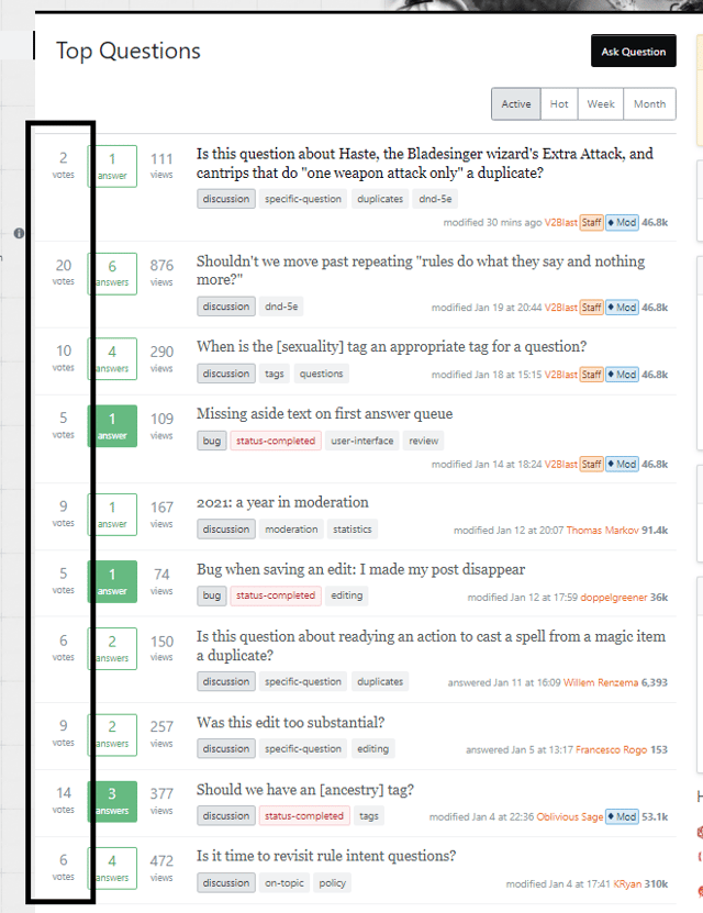
On the previous layout, I could quickly survey the question scores by reading down the votes column:

enter image description here

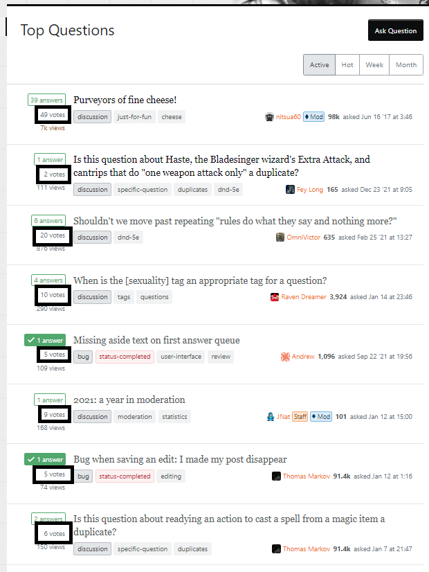
Now, I simply cannot quickly survey the front page for question scores, as those scores are quite small and buried between other information:

enter image description here

To me, this is a complete loss of functionality of scores on the front page. Trying to read the scores on the page, quite literally, makes my eyes and head hurt.

So I guess I can word this as a : please change it back.

35
  • 25
    If "don't fix what isn't broken" fits your theme it would be a nice BLUF. Up to you... Commented Jan 24, 2022 at 21:54
  • 140
    Also: view count now more prominent than score. I fear this is by design, and popularity is deemed more important than quality…
    – Bergi
    Commented Jan 24, 2022 at 21:55
  • 9
    Given views and answers, on top and bottom, both change colors based on status, and score doesn't, by default deemphasizes the score (also... it's score... not votes... feel like we've had this discussion)
    – Kevin B
    Commented Jan 24, 2022 at 21:57
  • 47
    So who is going to be the first to create a greasemonkey script to fix this atrocious redesign? Commented Jan 24, 2022 at 22:01
  • 144
    Agreed completely, previous layout made much more sense. If there's a problem with mobile, then change it on mobile. Leave us desktop folks alone.
    – Brad
    Commented Jan 24, 2022 at 22:07
  • 6
    However this is not how these numerical data are used. They have been playing a much more primary role in a user's decision to view a question or not, and have an importance closer to the title than the tags or the most recent activity. Thus they deserve the more prominent position in the older design.
    – Elliot Yu
    Commented Jan 24, 2022 at 22:25
  • 93
    What is the point of SE at all if you can't actually see the votes? Might as well be quora. Commented Jan 24, 2022 at 22:47
  • 33
    I'm personally fine with making votes small and unobtrusive; I don't think a post's score is anywhere near as important as a question's title, or even tags. But I'm with @Elliot as to the core problem: by losing the ability to "read down" within a single type of data (score / answers / views) the work involved in extracting information is greatly increased - for each line, I have to read vs. scan to determine the meaning of the number my eyes land on. Could probably relegate the text (answers / votes / views) to column headers and achieve a similar savings in real estate...
    – Shog9
    Commented Jan 25, 2022 at 0:43
  • 10
    (Also probably worth noting that this only really matters for the home page; question pages haven't been great in this regard for a long time, although the smaller text makes it hurt more; profiles were apparently already trashed when it came to tabular scanning a few months ago. We ... can at least be thankful that the question pages won't be as bad as question/answer lists in the new profile. I hadn't seen that until now; having done so, I suddenly like this design better. Good lord, what a flaming trainwreck.)
    – Shog9
    Commented Jan 25, 2022 at 0:53
  • 12
    The scores are also incorrectly labelled as "votes" in the summary. ”Purveyors of fine cheese!” doesn't have 49 votes; it has 56 (+52/-3). Its score is 49. Commented Jan 25, 2022 at 2:41
  • 18
    @Shog9 I think the score is pretty important... if there's a negative score in an area I know about, I like to go in and try to fix it, or at least leave constructive comments for the person who asked the question. (Because, few else seem to care to do this, and I'd rather help people than just obliterate their posts outright.) If there's a zero-score or low-score, it's probably a new question or a question that hasn't received any attention, and I like to look at it to see if I can answer, or close as duplicate as necessary.
    – Brad
    Commented Jan 25, 2022 at 7:08
  • 23
    The order of the information changed, too, not just the orientation. It went from votes, answers, views to answers, votes, views. Of course votes are the most important of these for a community web site; they're the community driven sorting mechanism. Commented Jan 25, 2022 at 12:11
  • 14
    In a way, I am grateful for this change. It may actually improve my productivity! It's so hideous I'll probably quit procrastinating by scrolling through SE so often! >:D (jk) Commented Jan 26, 2022 at 13:07
  • 45
    I'm sure SE is mostly just dismissing feedback because "nobody likes change" but this is a great example of how it actually makes it way harder to parse the data. Reading down a single column vs. having to find text that's sandwiched in between other text Commented Jan 26, 2022 at 19:39
  • 9
    I'm not versed enough to offer specific criticism, but I generally check SE on my phone, and I hate the new UI with a passion! Almost impossible to read, compared to previous layout! Please stop it!
    – TheHonRose
    Commented Jan 28, 2022 at 22:36
564
+1050

Revert this

As critical feedback goes this is probably the sharpest I've delivered, but this change is neither needed nor warranted. It doesn't make me enjoy using the site on desktop, which is what I do during the course of my day.

It strains my eyes a bit to have to read the smaller text of the title, compared with the even smaller text of the other information I'm not sure I need to know in the moment.

Revert this, and revisit this. This UX is not good.


In response to the third update - they're not going to revert this. So I'm burnt to a whole crisp on this. This is yet another case in which the company has decided to introduce an intrusive change that they insist is for the benefit of the community, but those benefits won't be realized for a long while. Like, I get it - it's innocent in and of itself, and paying tech debt is something I make a living out of these days - but this whole sentiment of "we'll fix it later, promise" is so played out that I can't take the company seriously anymore.

I should just stop giving feedback. You're going to do whatever you please and we're powerless to do anything about it. Just make the changes and post them to your blog and that'd be a better experience than having the modicum of hope that is you posting something on Meta about this.

Don't give me the "incremental changes" as something to indicate that you're listening to our feedback. We use this site every day. We liked the way it looked. You thrust this change on the entire damn network after talking with a handful of people about some obscure page that I think I've seen maybe twice in the ten years I've used the site, and decided to pick that as the standard for all posts.

Why did I even bother...

28
  • 74
    It doesn't look good on mobile either. I really don't see what the improvement was.
    – Dharman
    Commented Jan 24, 2022 at 22:43
  • 58
    @Makoto Congratulations, after a few days of this question being bountied, I plan to award my bounty to you, as I want this change GONE and the previous design back. I completely agree that it should be reverted, so you will probably get the bounty.
    – cocomac
    Commented Jan 25, 2022 at 3:38
  • 62
    I only entered to meta to verify that I was not the only one who found the new design absolutely terrible, now I am calmer
    – Borja
    Commented Jan 25, 2022 at 6:51
  • 14
    I miss the summaries or excerpts that were added beneath the title, the front page now just looks ... cheap. Commented Jan 25, 2022 at 9:14
  • 3
    @LasseV.Karlsen There never was summary text on the home page. This has been mentioned before. Commented Jan 25, 2022 at 9:22
  • 6
    @SebastianSimon But I have seen summaries on Stack Overflow, and now they're gone. I can't see them anywhere. I guess my bookmark was not to the main home page. Commented Jan 25, 2022 at 9:28
  • 25
    This is all that needs to be said. And while you're at it, SE, bring back the old profile view. Stop making this website worse and worse with every change.
    – Foo
    Commented Jan 25, 2022 at 9:33
  • 14
    Old design was functional and easier on eyes. Both homepage and profile page seem less informative to me now.
    – B200011011
    Commented Jan 25, 2022 at 10:28
  • 3
    I was surprised to see the original post having a high score when I initially saw it. For a second, I almost thought I was just being difficult to changes. Thanks, you made me feel like my distaste of the new design wasn't just me being a hard head.
    – Clockwork
    Commented Jan 25, 2022 at 15:14
  • 5
    @Zombo in fairness to Ben, I know for a fact that plenty of SE employees maintain multiple accounts--we don't know that the human behind "Ben" doesn't use SE, we just know this account doesn't use SE. That said, I do not dispute the notion that SE, generally, needs to understand its own product better. I've said as much here: meta.stackexchange.com/a/346437/311001.
    – nitsua60
    Commented Jan 25, 2022 at 22:49
  • 16
    This change still hasn't been reverted. A bigger bounty coming your way @Makoto (I'll award it within the next week, just to get some more attention on this post)
    – cocomac
    Commented Jan 26, 2022 at 2:43
  • 8
    This is the only reasonable thing to do. To revert and to forget about this
    – demonplus
    Commented Jan 26, 2022 at 6:22
  • 5
    @Dharman for the user there was no improvement - this makes the lives of SE staff easier (and harder for users) as part of their retiring the mobile views, and somewhat standardising the layouts. Less for them to maintain, but less useful to users with different priorities who made use of those different options.
    – Andrew
    Commented Jan 27, 2022 at 4:57
  • 5
    @Clockwork I think what happened is the original post only had any attention from their test users, those who approved of the design, and thus suffered from a selection bias from being users recruited from on specific subgroup (SOfT users) which aren't representative of most of the site's userbase, and it shows by most of us disagreeing strongly with their rushed and undertested change.
    – Andrew
    Commented Jan 27, 2022 at 5:00
  • 4
    "Why did I even bother" - yeah, that's something I asked myself quite a few times in the past, until I stopped bothering entirely and accepted that SO is going down the drain unless some drastic organizational change happens. On the plus side, remember two weeks ago when you complained on meta.SO about the bad log4j blog post - doesn't seem very important anymore now does it? You might re-read my answer to that question from your newfound perspective of not taking the company seriously anymore.
    – l4mpi
    Commented Feb 2, 2022 at 13:04
289

Ridiculous amounts of vertical white space on watched and/or bountied questions.

red boxes showing all the extra white space

The old design had no problem fitting all of that information in the same vertical space as the title and tags, so this feels like a huge step backwards in that regard.

This could at least be partly mitigated by simply reverting to how questions with watched tags used to work (i.e. the colored background).

20
  • 29
    Totally agree the amount of unnecessary padding and vertical white space reduces the amount of questions I can see at once and diminishes my site experience
    – illustro
    Commented Jan 25, 2022 at 0:46
  • 9
    ugh, I agree. One of the justifications for deploying this design was to support an increasing number of stats for each question. But this answer is the reason why we should not have more than 3 at most. Commented Jan 25, 2022 at 1:09
  • 5
    The first one (Bounty + watched) would look even worse if the question was a single line, which it easily could be. It would be like 2/3rds wasted.
    – Michael
    Commented Jan 25, 2022 at 1:48
  • 3
    This empty space could be filled by the summary text that they removed but apparently that's not coming back!
    – phuzi
    Commented Jan 25, 2022 at 8:52
  • 3
    The watched tag background not being highlighted anymore is really annoying
    – J_rite
    Commented Jan 25, 2022 at 9:07
  • 4
    @phuzi There never was summary text on the home page. This has been mentioned before. Commented Jan 25, 2022 at 9:13
  • 10
    "Hey, you probably haven't noticed the list of watched tags to your right, so LOOK AT ME I AM YELLOW!" All this makes me want to do is remove my entire list of watched tags.
    – Jeff Holt
    Commented Jan 25, 2022 at 13:48
  • 2
    @Michael Here's an example of how that looks like.
    – 41686d6564
    Commented Jan 25, 2022 at 15:25
  • 17
    @ChrisRogers The idea of the change was "support an indefinite number of labels". I guess no one stopped to think "what if an indefinite number of labels looks completely stupid?"
    – Michael
    Commented Jan 25, 2022 at 16:26
  • 1
    Agree, amount of blank space is huge. Why should we look at blank space?
    – demonplus
    Commented Jan 26, 2022 at 6:24
  • 1
    The number of stats themselves is not the problem. They could just be placed horizontally over the title and we would still save space.
    – idmean
    Commented Jan 26, 2022 at 8:06
  • 3
    The bounty indicator could be perhaps inlined into the title. (The “Watched” and “Ignored” labels are gone, good riddance.) Commented Jan 26, 2022 at 13:37
  • 6
    Update 2 makes this even worse. At least, it looks worse. Wish I could upvote this again to gain more attention to useless vertical white space.
    – 0stone0
    Commented Jan 27, 2022 at 16:25
  • 1
    @demonplus: When you hit 100,000 reputation you unlock the feature of collapsing the useless white space to see more questions.
    – einpoklum
    Commented Feb 3, 2022 at 22:41
  • 1
    @einpoklum from a 100k+ user... "You raised my hopes and dashed them quite expertly, sir. Bravo!"
    – Phil
    Commented Feb 3, 2022 at 23:40
232

tl;dr: Please don't do this to question lists; the motivation is invalid.

We’re starting a rollout of the new post summary design

Please stop the rollout - on question list pages anyway; the new design for question lists is worse than the existing one.

Our current designs ... fall short ... :

  • We generally assume 3 items of metadata: score, answers, and views. If we want to add new entries for e.g. bookmarks or revisions, it can be difficult to create a consistent layout in a list of questions.

And difficult it should be. It is tempting to "stuff" more meta-data into the question list, but there are diminishing returns. It would make more sense to have an alternative question list view with more meta-data, used when someone indicates that they want that meta-data.

  • Inconsistencies in implementation have led to several different layouts across the SE network. When gathering requirements for a unified post summary component, we found at least 5 (five!) different layouts.

That's orthogonal to changing the basic design of question lists, which is mostly (or fully?) uniform across the site. If that design needs to be changed, explain why, then change it; if it doesn't - address whatever inconsistencies you find.

  • Scaling the design is tricky, both in window size and adding features and functionality. We need to support all sorts of metadata on all sorts of devices.

I don't see what's tricky; and that challenge has already been met for many years. Also, you should not aim for a question list packed with a bunch more data and features.

  • Our post summaries were only designed to support questions (and answers, kinda).

I don't know what post summaries are, I'm referring to the question list design. If you mean question titles, then - yes, StackExchange is a network of Q&A sites. Are you saying you intend to change this? For existing sites even? I hope not...

  • We need to be able to display various content types in single lists.

No you don't. Or rather, not in the question list. The question list needs to display questions and a bit of meta-data about them, and it has done so reasonably well.

  • For example, in a list of notifications, we may want to present an article next to a question.

Please don't force the design of a list of notifications on the list of questions.

  • Our new post-summary design solves these problems while supporting future features we’re exploring.

As I've explained above, you have not presented problems with the question list design. So, the new design solves problems which may exist for other lists/pages, not the question list. That's a poor reason for changing the question list design.

Some features we’re looking forward to are:

It's nice that you're working on some generic item-summary-list design, but don't work on it at the expense of the acceptable/good design for question lists we have had so far.

3
  • 20
    Every single point in this is spot on.
    – illustro
    Commented Jan 25, 2022 at 9:17
  • 19
    The weirdest part about this to me is that they talk about the changes as if they were intended to improve visual consistency ("We need different kinds of lists to have the same underlying design! For some reason!"), but that aspect of things just got noticeably worse. Commented Jan 25, 2022 at 12:54
  • 11
    And, incremental changes are apparently a lost art. There's no reason this needs to be some giant sweeping redesign. Want to get rid of the "modified" notation? Then do just that and see what people think. Likewise for any of the number of other changes. Heck, maybe in isolation one of them is actually good...
    – GManNickG
    Commented Jan 27, 2022 at 5:56
191

It is very hard to ignore my ignored questions.

Could you come up with something more subtle than an ostentatious black box leading the way, such as the post highlighting/greying we used before that worked perfectly fine?

enter image description here

If I have my ignored tags set up to still be visible on the page, ignoring should make the post less imposing (like the old greying out did), not more imposing by adding an eyesore of a black box.

That said, after some experimentation I prefer the black ignored tag to the gross yellow watched tag for watching tags, so I’ve ignored my watched tags for now.

6
  • 58
    It's also worth pointing out that on desktop, the new ignored/watched tags make the questions take up more vertical space. So if you ignore a tag, questions with that tags now take up more screen space, with a coloured tag highlighting the now larger question...making it extra visible.
    – illustro
    Commented Jan 25, 2022 at 2:19
  • 13
    I came here to post this exact same thing. The "ignored" bar is the single most attention-grabbing thing on the page. In fact I'm missing the posts I actually want to see between the ignored posts. It's successfully made all the other questions subdued by comparison. I didn't have this trouble with the previous layout—ignored posts were just faded out and that was that! Commented Jan 25, 2022 at 2:43
  • 3
    If you click on the “edit” button in the “Ignored Tags” sidebar section on the home page, there’s a radio button setting of “Hide questions in your ignored tags” vs. “Gray out questions in your ignored tags”. Isn’t it an option for you to simply hide these posts? Commented Jan 25, 2022 at 3:06
  • 22
    @SebastianSimon That's somewhat missing the point - if the option to "gray out" is still there, its effect should not be to make the questions more prominent.
    – IMSoP
    Commented Jan 25, 2022 at 9:16
  • 6
    @SebastianSimon Also, while I might want to ignore the tags most of the time, occasionally there might be a title I find interesting enough to look into, or a situation where a new user might need some help with their question (new user plus downvoted score can indicate this)
    – illustro
    Commented Jan 25, 2022 at 10:22
  • 6
    We have partially reverted the label approach, but kept all of the other changes for ignored entries. Additionally, the titles themselves were intended to be muted as well, but weren't. We've addressed this in the latest round of changes.
    – Ben Kelly StaffMod
    Commented Jan 25, 2022 at 20:10
148

It's an old bug, but might be worth revisiting: the wording votes is wrong, it should be score.

The number that is displayed is not the number of votes on a post, but rather the score derived from number of upvotes and number of downvotes. Controversial posts can have a huge number of votes but still a score around 0.

If some countable noun is desired, maybe "net votes"?

10
  • 5
    Also recently mentioned in New responsive Activity page.
    – bad_coder
    Commented Jan 15, 2022 at 19:20
  • 18
    I agree that it should probably be called score. However, I'm currently considering that beyond the scope of this change since the new layout is maintaining the status quo in regards to data shown / wording. My recommendation for passers by would be to support the linked meta post. In the meanwhile, I'll raise this suggestion internally to talk about our options. This may seem like a super easy change, but that's deceptive. We have to ensure the wording is consistent everywhere cross-site, which will in turn invalidate a lot of translations for our non-English Stack Overflows.
    – Ben Kelly StaffMod
    Commented Jan 19, 2022 at 15:22
  • 10
    This is already on our backlog and I think it's being looked at right now.
    – Catija Staff
    Commented Jan 24, 2022 at 22:16
  • 9
    The problem with this, is that when you read a number and after that a word, you take in your mind that is a whole.. if you read a number, and under it a word, you take the word as a title for the number... this is in fact, everywhere.. so is not a wording problem... is a showing problem....
    – gbianchi
    Commented Jan 24, 2022 at 23:18
  • If we would remove downvotes instead, we could also leave the wording as it is... Otherwise we should really change the wording rather sooner than later. Did really nobody realize the mistake internally before the change going public? Commented Jan 26, 2022 at 11:53
  • @Trilarion: The use of the wording "votes" isn't a change - that wording was already used throughout much of the site. Bergi's just proposing that this wording be changed to "score".
    – V2Blast Staff
    Commented Jan 27, 2022 at 15:14
  • @V2Blast You're right. It seems to be an old mistake, which kind of makes it even more strange that nobody really thought about how meaningful "-X votes" is and did something about it. I now stumble over it more because before votes was written very small and the score really big, my brain was able to filter votes away. Now it cannot do it anymore and it somehow looks wrong. Let's see what the solution will be. Commented Jan 27, 2022 at 17:40
  • There is another MSE post about it with the [status-review] tag already on it, so it's already something we're looking at: Use "score" instead of "votes" in the list of questions
    – V2Blast Staff
    Commented Jan 27, 2022 at 17:59
  • 4
    @V2Blast "it's already something we're looking at" Almost 10 years old issue. I really need to adjust my expectations. I'm far too impatient for this world. Commented Jan 27, 2022 at 22:29
  • 1
    @Trilarion Don't get into local town planning. I asked about making a street safer for pedestrians, and they told me they "had a plan for that." This plan was made 40 years ago. Still no sidewalk. Commented Feb 5, 2022 at 18:52
128

Wow, no text summaries for the questions anymore?

Frankly, this is the most awful change I've ever seen on Stack Overflow. There's no other way to put it. It makes it very difficult to browse now.

This has to be a bug, right?

Update: See comments below from Ben and Catija. You can get the old view by using the "Questions" link on the left nav.

Bad Question Display

28
  • 20
    I hope its a bug. it really is hard to read since everything is almost the same size. Commented Jan 24, 2022 at 21:47
  • 3
    If it's not an outright bug, it feels like some dark pattern stuff. "Let's increase the number of click-throughs to questions. How do we hit some [arbitrary metric] before [arbitrary time]? I know..."
    – Brad
    Commented Jan 24, 2022 at 21:47
  • 28
    So, the home/recent questions page this post is referring to has never had text summaries. See the screenshots in the original post, specifically QuestionMini. We did actually considering adding body excerpts on that page, but decided to punt on it to maintain the status quo. See the questions/greatest-hits page for an example of what it looks like with excerpts.
    – Ben Kelly StaffMod
    Commented Jan 24, 2022 at 22:09
  • 25
    Nah, the home page doesn't have descriptions - that's one of the reasons I like it so much - it's compact, focused on titles only. The /questions view is the one that's always had summaries.
    – Catija Staff
    Commented Jan 24, 2022 at 22:20
  • 5
    @Catija Weird... I don't think I've ever used the "questions" page or left nav... so whatever link I was following before (which I thought was the logo) must not go to it anymore. Anyway, that solves it for me, thanks.
    – Brad
    Commented Jan 24, 2022 at 22:29
  • 28
    @BenKelly I have to say that I could not believe this page never had snippets in the first place, so I went to check the web archive, and indeed, it never had snippets, which I still cannot believe. The old design just looked... I don't know, complete? And the new design just looks... as if it has been stripped of something important, which I guess translates to the feeling that the snippets are missing even though they aren't. It must be a massive blunder in design if the same amount of information used to look complete, and now doesn't.
    – GSerg
    Commented Jan 24, 2022 at 23:14
  • 5
    @GSerg I made the exact same mistake and probably for the same reason. It just looks like something must be missing. Commented Jan 25, 2022 at 0:15
  • 9
    @BryanKrause And something is indeed missing - the yellowish background for the watched tags and the grayed out ignored tags. It looks as a continuous white sheet without that, with nothing for the eye to catch on. Hopefully it is indeed status-planned and will be brought back, the current Watched label is absolutely hideous and does not serve the purpose of visually splitting the page into areas of interest.
    – GSerg
    Commented Jan 25, 2022 at 7:37
  • 5
    I don't understand why / and /questions even have a separate existence in the first place. As far as I can tell, right now they are the same content, presented two different ways. Commented Jan 25, 2022 at 10:48
  • 6
    @KarlKnechtel they're not the same and haven't been for a long time. The homepage has filters that remove some content from visibility, such as low-scoring questions and some locked questions. This is subtle and most people aren't aware of these filters but they do exist.
    – Catija Staff
    Commented Jan 25, 2022 at 13:29
  • 4
    Why can't I instead, like, configure it so that / shows me my preferred filter? Why aren't those features you describe, that "remove some content from visibility", explicit options offered to me when I create my own filter? Why shouldn't I be able to specify or update filters on every page that shows me a question list? What good are "subtle" features attached to a page presenting the same sort of data with totally separate layout rules and interface? I thought consistency was an expressly stated goal here? Commented Jan 25, 2022 at 13:33
  • 3
    @BenKelly Your comments about excerpts don't square with my experience. I have always used / as a path. I changed nothing. But excerpts are gone now. Either you are wrong about /, or there was some additional state (cookies?) that modified the view of /. This matters, because the page loses almost all of its utility without excerpts. (Why any view would eliminate excerpts and attempt to rely on the VLQ titles typical of SO baffles me, but that's a different issue.)
    – erickson
    Commented Jan 25, 2022 at 16:17
  • 8
    There were excerpts on my home page. I feel like I'm being gaslit with everyone insisting there weren't. There were, there absolutely were. It must be some user setting. I know I had excerpts at https://stackoverflow.com, not any sub-page, because my SOP for 10 years has been to click on any post starting with "Hi", "Hello", or "So..." and edit that stuff out. Commented Jan 25, 2022 at 18:32
  • 3
    @Ben and others doubting their own sanity as to question excerpts on the homepage: they did exist - until sometime in early march 2017. Just not in the way that other views have them! For years, the homepage showed the excerpt as hovertext / "title text" - hover over a question on this archive link and see for yourself...
    – Shog9
    Commented Jan 25, 2022 at 19:40
  • 4
    @JohnKugelman Totally agree, not sure what's going on. All I know is, when I went to "stackoverflow.com" the resulting page was beautiful and useful and had excerpts. That is no longer the case, hard stop. I don't want arguments about how other people didn't notice or literally didn't have them. I did and now it's broken.
    – GManNickG
    Commented Jan 27, 2022 at 5:59
125

This design just hit live for the main page of Meta SE (this page, for clarity) and I've noticed that we've lost a pretty useful bit - The most recent activity notation next to the question listing.

When a post receives a modification (an edit, reopening, etc.) it "bumps" that post on the front page, and will display a "modified" notation along with the user (or Community if it was a deleted user/bumped by Community) who modified the post. That "modified" notation is clickable, and will take you to the post (answer or question) within that entry that was modified.

Here's what that looked like:

Image of old design with a modified link

That link was profoundly useful when navigating to an answer that was modified on a question with many answers (multiple pages of answers), and it feels like an oversight that it's no longer available. It allowed a user to at-a-glance see who changed the post, and be able to quickly click the link to see what was changed.

For an example, I've just bumped this question with this answer, and the home page only indicates the date that this question was asked:

Current design, with the "asked on (date)" notation only

Which leaves the question of why this post was bumped unclear.

Could we restore that functionality?

8
  • 5
    That was added in 2014 in response to this feature request. Commented Jan 24, 2022 at 21:26
  • 18
    Nice catch, I'd definitely consider this a regression. We do have support for this functionality written into the new component, it just isn't getting triggered for this instance. I took another look at the old view and found where the logic differs. I'll get a fix out for this today.
    – Ben Kelly StaffMod
    Commented Jan 24, 2022 at 21:29
  • 11
    Note that this isn't JUST "bumped" posts on the home page - the normal question views also support this, including tag views (although irritatingly, search results do not).
    – Shog9
    Commented Jan 24, 2022 at 21:40
  • 5
    @Shog9 Yup, I'm aware of all those and they'll have this enabled when their migration goes live. I'm using the same feature here - it's literally a boolean to turn on. The migrated logic for this particular implementation was incorrect, so it wasn't triggering. Regarding search results, I'm working on the migration for those now - I'll check to see if it makes sense to turn on support there as well ;).
    – Ben Kelly StaffMod
    Commented Jan 24, 2022 at 21:50
  • 12
    This has been fixed and rolled out cross network
    – Ben Kelly StaffMod
    Commented Jan 24, 2022 at 22:24
  • 4
    @BenKelly this is still broken when loading newly active questions on-the-spot (clicking on "X questions with recent activity")
    – bobble
    Commented Jan 24, 2022 at 23:12
  • 5
    "Which leaves the question of why this post was bumped unclear." I want to see both. I hate when I am browsing by newest, see something with recent activity, start reading the question, want to ask OP for a clarification... and then notice that the question is years old and OP is presumably not coming back. Commented Jan 25, 2022 at 10:46
  • 1
    Never mind the link, just showing the "modified" time enabled me to see what had new activity since my last visit. Thank God that got fixed quick!
    – Matthew
    Commented Jan 25, 2022 at 21:17
123

It appears that the view count is now more important than the vote count. Previously, score and answer count were larger numbers, with a font size equivalent to that of the question title.

Maybe this impression is just caused from greatest hits being, well, greatest hits by view count and thereby all questions in that list having the 🔥 "supernova" icon, but the orange highlight makes it stand out too much. Should a similar emphasis be put on questions with >10, >100 or >1000 votes?

7
  • 10
    Yes please to increasing the font sizes on score and answer values to be more like current. Especially in search result lists. Context of the list matters.
    – charlietfl
    Commented Jan 15, 2022 at 18:36
  • 5
    This is a good point. In most of the preexisting post summary layouts, view count was deemphasized. The greatest hits page does somewhat exacerbate the problem, but (imo) it looks much better in normal circumstances. I'll bring this up internally, but for now I'm going to mark this as "by design".
    – Ben Kelly StaffMod
    Commented Jan 19, 2022 at 15:30
  • 22
    @BenKelly I would respectfully disagree that it looks better in "normal" circumstances, particularly on the main Questions page.
    – illustro
    Commented Jan 24, 2022 at 22:25
  • 43
    Why does view count need to be highlighted at all? I want high quality content which is indicated by the post score, not how many times it has been viewed.
    – takendarkk
    Commented Jan 24, 2022 at 23:55
  • 3
    Bergi, assuming you like many of us don’t like it any better on non-“greatest hits” pages, you should either remove status-bydesign or ask Ben to do so, because I, for one, definitely feel this needs revisiting.
    – KRyan
    Commented Jan 25, 2022 at 4:25
  • 6
    @BenKelly any results from bringing it up internally? If this really is "by design", then the design is garbage and should be redone. It has been discussed time and time again that popularity is a very bad indicator of quality, and that the post score is by far the most important metric we have on the SE network.
    – l4mpi
    Commented Jan 25, 2022 at 12:56
  • 4
    @BenKelly there's been a lot of "Defect by design" changes rolling out, particularly in this case where the test platform was something I didn't even know existed, and most users probably never used - there was some pretty heavy selection bias in designing for the rare user who knows about, and prefers, that greatest hit page.
    – Andrew
    Commented Jan 25, 2022 at 17:27
98

Why we’re making these changes

Our current designs have withstood the test of time, but they fall short in many areas:

May I humbly propose that the reasons for these changes are not actually good reasons in the first place?

  1. We generally assume 3 items of metadata: score, answers, and views. If we want to add new entries for e.g. bookmarks or revisions, it can be difficult to create a consistent layout in a list of questions.

I've highlighted this part to point out that the difficulty you're talking about is a difficulty for you, the UI designer. The goal of UI design is surely to make things easier for the user; making things easier for the designer is important insofar as it makes it easier to make things easier for the user, it normally should not come at the cost of making things harder for the user.

  1. Inconsistencies in implementation have led to several different layouts across the site. When gathering requirements for a unified post summary component, we found at least 5 (five!) different layouts.

Lists of questions can appear differently on different pages because those pages have different purposes. You found 5 different layouts because they were designed for 5 different use-cases. It is a deoptimisation to attempt to unify them.

If I'm browsing a list of recent questions then the most important information to me is the question score (particularly whether it's positive or negative) and the tags; if I'm browsing search results for a problem I have, the most important information to me is an excerpt of the post's content. But in the list of recent questions, an excerpt is not information I am going to use to decide whether to click on a post, and in a list of search results, the tags are secondary because they don't tell me whether a post is specifically about exactly the same problem as I have.

  1. Scaling the design is tricky, both in window size and adding features and functionality. We need to support all sorts of metadata on all sorts of devices.

It doesn't really matter to me as an end-user if the page I'm looking at would look nice in a different sized window or on a different sized screen than the one I'm reading it on. Different layouts might be optimal for different devices, so again it is a deoptimisation to attempt to completely unify the design across devices.

  1. Our post summaries were only designed to support questions (and answers, kinda). We need to be able to display various content types in single lists. For example, in a list of notifications, we may want to present an article next to a question.

See #2. If you're showing a list of questions on the home page then it is irrelevant whether an article could be shown uniformly alongside those questions, because articles don't appear on that page anyway.

  1. We have no unified place to put an action menu.

See #2. What's missing from this list of five reasons is any real problem users had with the old UI, or any use case that a user might have such that a redesign would serve that user better. These five reasons are all focused on things which matter to the designer, not to the user.

As a user, I do respect the fact that making things easier for the people who develop and design the products I use is ultimately something which serves me, and asking a designer to choose a design which is better for me but harder for them to maintain means I am asking them to put effort in on my behalf.

But I still think it is worth highlighting that the interests of actual users apparently didn't form part of the rationale for the change, because I doubt you wanted to ignore the interests of actual users, I think it's more likely that you didn't realise you were doing so.

2
  • 16
    Well formulated. Commented Jan 25, 2022 at 8:49
  • 1
    In my ponion, this type of changes is better to introduce them slowly and consensually , there are many changes for something that is used daily
    – Borja
    Commented Jan 25, 2022 at 15:43
95

The questions on the main page are missing the highlight if they have a watched tag on them. Previously this allowed me to quickly scan whether the question comes from one of my favourite tags, now they're all just bland white.

16
  • 9
    Thank you for the report. I'll take a look into this
    – Ben Kelly StaffMod
    Commented Jan 24, 2022 at 22:23
  • This is exactly what I came to report as well. I scan for highlighted questions on the main page based on my highlighted tags. Without those highlighted, I'm bouncing from the home page because I don't want to spend time scanning for tags I care about.
    – Ross Allen
    Commented Jan 24, 2022 at 23:05
  • 2
    @RossAllen I wonder whether the front page update has measurable effects on the answering behaviour :-)
    – Bergi
    Commented Jan 24, 2022 at 23:13
  • 45
    @BenKelly This has been fixed quickly! I have to say that I preferred the inconspicuous yellowish background over the bold "Watched" badge though
    – Bergi
    Commented Jan 25, 2022 at 0:00
  • 2
    @Bergi I'm guessing the highlight made styling sites and dark mode complicated, but I agree there should be a better way to implement this, like a tag, a bounding box, something on the right-hand side, etc.
    – LShaver
    Commented Jan 25, 2022 at 0:30
  • 37
    I also much preferred the background as opposed to a new marker on the left. The former is ingested simultaneously, the latter must be ingested linearly. The former is instant... the latter is not.
    – Scott
    Commented Jan 25, 2022 at 0:41
  • 47
    @BenKelly that "watched" badge is hideous. Did that actually get approved by a designer? On dark mode it's absolutely glaring. I'd rather nothing at all in place of that
    – Phil
    Commented Jan 25, 2022 at 1:00
  • 40
    Not only is the watched tag way too prominent, especially with the dark theme, but when you add the number of answers, votes, views, AND bounty, the wasted space is just unwelcoming. IMO it looks bad, feels bad, reads bad. It's just making the user experience worse in every ways.
    – Seblor
    Commented Jan 25, 2022 at 1:59
  • 2
    I thought I had accidentally turned on a colour-blind accessibility option. I can see why a subtle background colour is not enough for people with vision issues. But I can no longer scan questions by anything but reading every title. I am flabbergasted at how horrible this is. Was this not user-tested?
    – marts
    Commented Jan 25, 2022 at 6:56
  • 2
    To get a quick fix with custom styles .s-post-summary--stats-item.is-watched {display:none !important;} .s-post-summary__watched {background-color: var(--yellow-100);} Commented Jan 25, 2022 at 8:45
  • 6
    The new "watched" marker has proven itself both garish and unclear in meaning. I greatly prefer the old style of subtly shading the background for that question div. However, I think I would like it even better to have the individual tags which the user is watching highlighted, perhaps in addition to the cell. Commented Jan 25, 2022 at 10:37
  • 1
    Assuming that the tag-style box is here to stay - I think it would be nicer if the watched tag was grouped with the tag buttons, and had the different styling for emphasis. It makes it harder to see the other metrics on the LHS when it shows up, and it definitely breaks up my flow when skimming the page. Or even just style the tag buttons differently if they're one of my watched tags. Commented Jan 25, 2022 at 14:42
  • 3
    The watched tag makes the location of the other metadata unpredictable and makes it even harder to quickly glance at votes because you don’t know where to look. The watched tag is bad, but at a minimum it should go last rather than first. Commented Jan 25, 2022 at 18:05
  • 9
    @BenKelly Thanks for fixing this! Looks much warmer and familiar again :-)
    – Bergi
    Commented Jan 25, 2022 at 19:57
  • 3
    I concur, the highlight looks neat and is immediately familiar to those who are used to the old design - thanks!
    – 0Valt
    Commented Jan 25, 2022 at 19:59
93

Please restore background highlight on watched questions

The questions with your watched tags used to have a yellow background.

Now they instead have a yellow plaque on the left:

pic

Which, at least for me, makes it much harder to visually scan for watched questions. Please consider restoring the background highlight we had before (with or without this new plaque).

7
  • Also mentioned by John Montgomery. Commented Jan 25, 2022 at 7:30
  • 25
    I would argue that the absence of the backgrounds for questions with watched or ignored tags is the main reason why the new home page leaves distinct feeling that it has been stripped of important information. The "Watched" sticker do not serve the purpose of visually splitting the page into the areas of interest like it was before. It is important to fix that.
    – GSerg
    Commented Jan 25, 2022 at 7:42
  • 16
    This tag might be useful if you have one or two watched tags; it's pure and utter visual clutter when you have enough watched tags that Every. Single. Question. has it.
    – deceze
    Commented Jan 25, 2022 at 8:00
  • 2
    Add custom css .s-post-summary--stats-item.is-watched {display:none !important;} .s-post-summary__watched {background-color: var(--yellow-100);} Commented Jan 25, 2022 at 8:42
  • 7
    We have partially reverted the label approach back to using a colored background. We lose info that way, but it gives us an opportunity to revisit how the watched styles are being added to the page.
    – Ben Kelly StaffMod
    Commented Jan 25, 2022 at 19:36
  • 11
    @BenKelly Thank you. Negatively received design changes were very rarely reverted before, if at all, so it feels like a step in the right direction. I'm not a fan of the rest of the changes too (sorry), but at least it's a bit better now. Commented Jan 25, 2022 at 19:45
  • 5
    @BenKelly "we lose info that way" - not really. It's one bit of information (watched / not watched), either way the information is there, it's about how to present it. I think you mean you lose explanatory power, because a yellow background doesn't explain itself; but users don't actually need to know this. The goal is to draw attention to content that is more relevant; that's done better by literally highlighting the content, not a bright rectangle which draws attention to itself. It matters less whether users know why their attention is drawn there, if it's drawn to the wrong place.
    – kaya3
    Commented Jan 26, 2022 at 21:45
78

This Watched label.

  1. The color is like it belongs somewhere else, not to this page

  2. It takes too much space.

  3. There is no explanation of what it is for. I can only guess.

If it's for watching tags, I do not understand why it's so big. I guess people know which tags they are watching without showing them this huge icon. For usability, tags filters would be a better option. On my page almost all questions have this tag, I don't think that people who follow tags with big amount of questions need to see this label. enter image description here

10
  • 2
    Isn’t this basically the same as this other report? Commented Jan 25, 2022 at 4:41
  • 1
    Similar, but my thoughts on this label are different.
    – vitaliis
    Commented Jan 25, 2022 at 5:04
  • 32
    Suggestion: why not highlight the tags themselves instead of adding an additional tag?
    – deceze
    Commented Jan 25, 2022 at 8:07
  • 3
    Yea, why aren't the watched tags yellow. I saw this on mobile view this morning and it was horrid. it takes up so much space and is shouty without giving any useful message. I liked the yellow highlight on the entire row better than this useless in your face label. I'm just hiding it for now .s-post-summary--stats-item.is-watched {display:none !important;} Commented Jan 25, 2022 at 8:32
  • 7
    Highlighting just the individual tag would also quickly remind you which tag you're watching for this question Commented Jan 25, 2022 at 9:26
  • 3
    I assumed it meant I either bookmarked or followed a question. It doesn’t seem clear at all.
    – Ambo100
    Commented Jan 25, 2022 at 14:25
  • 2
    Marking as duplicate of this resolved post.
    – Ben Kelly StaffMod
    Commented Jan 25, 2022 at 19:42
  • 3
    @BenKelly How about deceze’s idea to highlight the individual tags that are being watched? Commented Jan 26, 2022 at 7:00
  • 1
    You've made a big improvement after fixing issues related to Watched label. How it's color should still be revised. It's too distinctive.
    – vitaliis
    Commented Jan 27, 2022 at 16:41
  • 1
    @BenKelly I agree with vitaliis. The thing that’s supposed to stand out to catch the eye of the reader is still the background colour of the question, not the tag label. The latter only provides an explanation and additional information. Please, (1) get rid of the distracting eye icons, and (2) make the colour of the watched tags less obnoxious; it should have a similar level of saturation as the light blue of non-watched tags. Commented Jan 27, 2022 at 19:33
74

This change is bad, you need to step back and examine the purpose of the pages and elements you changed here. There are fundamental problems here, the new frontpage is much less usable than the old one.

The new layout for the votes/answers/views is inherently problematic. This is information that must be easily scannable when quickly looking through a list of questions, and not all numbers here are equally important. The old homepage view is really optimized for fast scanning of this table, with the three separate columns for the numbers.

The old questions view has a somewhat similar layout in that the numbers are also vertically stacked, but the huge difference is that the numbers are larger than the text and that the view count is much smaller. This makes an enormous difference, the different shapes provides a lot of help when scanning for these numbers. It's not an ideal design, the score and answers are a bit too similar when there are zero answers as there is no difference in color, but it still works pretty well.

Another huge difference is that in both old designs, I can see the score in my peripheral vision even while reading the title. I suspect this might even be the biggest factor that makes the new design so terrible for me in actual use. I don't need to stop reading the title to read the score. In the new design the score is too small and too similar to the other numbers for this, I need to stop reading the title and focus on the score to read it.

4
  • 13
    To add to this answer, when a question has more than 1k views, the text colour of the view count changes. That makes it look like the most important to look at. It's not. It makes it harder to see the vote and answer counts.
    – Dan
    Commented Jan 25, 2022 at 9:15
  • 13
    There's a definite trend here - users keep saying "votes are important, views are not important" while the design is based on the opposite assumption. The design is produced by people whose primary incentive is to drive traffic to the site; the users have a primary incentive of sorting content by quality. The disconnect is completely to be expected and not coincidental. Commented Jan 25, 2022 at 12:30
  • 3
    @Dan The view count color changed in the old design too. The difficulty in seeing answer count and score now is because the font-size is much smaller (and the same size for value and label). Previously the font-size for the value of score and answer count were like 28px and the label was like 12px.
    – TylerH
    Commented Jan 25, 2022 at 13:57
  • 2
    @KarlKnechtel When people like me genuinely can't find good content with the new UI, then quality will be driven way down and traffic will suffer. It's not even a boycott on principle; I just honestly cannot pick out good questions to answer like I could a few weeks ago. I'm not here to answer "null pointer exception means you have a null pointer in a place you shouldn't" a hundred times a day. Maybe they're hoping the site UI will force me to look at those questions rather than filtering them out, but it really just makes me not come to the site as much (excepting this Meta post, of course) Commented Jan 25, 2022 at 20:56
71

The new layout allows users on desktops to see fewer questions per screen on the hompage (due to the two sidebars on the page), which is undesirable.

While the new design may be more performant when switching smoothly to a mobile layout (which I support), it breaks what was a good layout in terms of information density on the desktop.

The lower information density (questions per screen in particular), makes my primary way of interacting with the network a much worse experience.

I should point out, that "screen" in this answer refers to what is visible and displayed on on my computer monitor, without having to scroll, as opposed to the word used in the question, which refers to different site views as screens.

As you can see from the below screenshots:

  • In the new view, without those tags, I can see 10 questions at once
  • In the old view I can see 12 questions at once

Compared to the original new view, without those tags, the old view enabled me to see 20% more questions.

Furthermore, not only is it easier to line up who posted, but also compare statistics between questions in the old view than the current view. If I try to scan down the list of recent posters, my eyes have to move all over the screen to find the information per question.

New view (original presentation): new view

Old view (captured using the waybackmachine): old view (captured using the way back machine)


Post 2022-01-27 update

I've moved the comments around the watched/ignored tags down here, so as not to conflate them with the actual issue that this post of raising, which is far too much whitespace in the design as a whole.

As you can see from the below screenshot:

  • In the new view, with the watched and ignored tags, I can see 9 questions

So, compared to the current new view, with the watched & ignored tags, the old view enabled me to see 33% more questions per computer monitor screen.

New View (post- addition of watched & ignored tags): New view post watched/ignored tags

11
  • 1
    I haven't noticed any significant change to the number of questions per screen. Can you provide a screenshot of the old view for comparison? Commented Jan 24, 2022 at 23:02
  • 1
    @NicolBolas I've captured an equivalent screenshot using the wayback machine on the same monitor. The only difference is I'm not logged in in the "old" screenshot (obviously), but I took pains to ensure that they are in fact the same size. I see 20% more questions per screen on the old view.
    – illustro
    Commented Jan 24, 2022 at 23:13
  • 2
    Ah, I see what it is now: question titles. In the old layout, question titles that fit in one line take up less space, while the new layout is tall enough that they take up the same space whether the title fits in one line or two. The new layout could do that too; it just doesn't, for some reason. Commented Jan 24, 2022 at 23:15
  • 7
    @NicolBolas also the new layout has additional unnecessary padding at the bottom of questions for no particular reason
    – illustro
    Commented Jan 24, 2022 at 23:16
  • 10 questions ? I got 7 to 8 on my home page. Look at all that wasted space! And I have the zoom level at 90% on StackExchange websites!
    – Seblor
    Commented Jan 25, 2022 at 1:48
  • 3
    @Seblor I took that screenshot before the delightful watched and ignored tags were added to the question list to "fix" the highlighting removal. I get less questions per screen now, but I'm not on my computer until tomorrow to get a new screenshot.
    – illustro
    Commented Jan 25, 2022 at 1:52
  • 2
    No worries, it's gonna get worse once they start embedding random articles in the questions list, pushing another 1-2 questions out of view...
    – grek40
    Commented Jan 25, 2022 at 16:08
  • 3
    (Note for future readers: the "Watched" and "Ignored" text labels have been removed for now, as noted in Ben's comments below other answers bringing those up.)
    – V2Blast Staff
    Commented Jan 27, 2022 at 16:09
  • @V2Blast I've edited the answer to allow for the changes since the post was originally written
    – illustro
    Commented Jan 27, 2022 at 16:31
  • @illustro: Thanks... Though now it looks like a new visual marker for watched (and ignored?) questions has been implemented that I quite like. At least for watched questions, I see that watched tags are highlighted with a gold-color fill, and an eye icon next to it. Sorry to make you edit so much :P
    – V2Blast Staff
    Commented Jan 27, 2022 at 16:52
  • @V2Blast That's not a problem. The new individual tag highlighting for watched and ignored is better certainly, but slightly orthogonal to this (as they no longer detract from the information density points I'm making with the answer). I'll maybe look to update the screenshot with them in it, so it remains relevant, later, but it's not as pressing for the moment I think :)
    – illustro
    Commented Jan 27, 2022 at 16:57
59

Why was such a major change to the interface of the main page of both Stack Overflow and the Stack Exchange network rolled out so quickly and with so little feedback gathered?

There is a reason why sites on the internet contemplating sweeping changes to their primary view offer users:

  • Several months (or years in some cases) to transition between the two and gather feedback
  • They do this by using a modal box on the page informing users that a change is going to happen, and would they like to preview it.

This sweeping change was buried in a post, that doesn't have an especially informative title, nor is it clear that it was referring to such a sweeping change (I missed it and I'm active on the SE network daily).

What's more it was only tested by ~170 users, on a page no-one uses (in comparative terms given the userbase of the site) over a very short period of time. I would have expected such a large change to the user experience to need much more data to be gathered from as wide a range of users as possible, with users beng able to compare both the new and old interfaces side-by-side (by changing a cookie setting set by the aformentioned model popup method that most sites use).

For a site with the userbase of Stack Overflow, let alone the Stack Exchange network as a whole, this approach to rolling out primary user interface design changes seems ill-conceived and irresponsible at best.

4
  • 8
    As an example of a site handling primary UI changes well, I’ve been getting periodic messages to try “new Reddit” for years now, and they still let me use old Reddit. Commented Jan 25, 2022 at 12:50
  • 6
    @ThomasMarkov they compensate for that by new Reddit being outright terrible and broken. And there are plenty of dark patterns there to try and get people to use new Reddit. Commented Jan 25, 2022 at 12:56
  • 5
    Testing with such a small fraction of the user base and on a page many people don't even know exists, let alone use, introduces massive selection bias into the results - only people who first know that page exits and second find it serves a use case they value will be giving feedback, and such limited feedback is likely to break the use cases other, far more numerous, users find value in.
    – Andrew
    Commented Jan 25, 2022 at 17:46
  • 1
    Maybe they rolled it out with so little feedback because the intention wasn't to ask for feedback in the first place, and just roll these terrible changes out, regardless of what everybody thinks. But they asked feedback so they can say "we took your feedback" while actually ignoring everything. Commented Feb 6, 2022 at 11:24
50

For questions without accepted answers, the "[X] answers" text is too hard to read, as the contrast ratio is too low

The text as to how many answers there are on a question is too light and difficult for me to read:

"13 answers"

A quick check with a contrast ratio checker shows that it's only 2.97:1. It should be at least 4.5:1 to comply with the Level AA standards for normal text, and preferably higher as the text is now smaller than normal.

This prior answer only talks about text size and not text colors.

9
  • 2
    The darker we make this text, the more difficult it become to distinguish it from black, so we'll need to consider a trade off between the information conveyed from color saturation vs. color contrast. I think we should tend towards higher contrast in this case. I can't guarantee that we'll achieve 4.5:1 here, but I think we can do better.
    – Dan Cormier Staff
    Commented Jan 24, 2022 at 22:42
  • 3
    @DanCormier Yeah, black would be great. Can you make it pure black #000000? The green hue isn't that useful there.
    – Dharman
    Commented Jan 24, 2022 at 22:44
  • 5
    @Dharman the color provides information by making different stats quickly differentiable, so I wouldn't want remove the color altogether.
    – Dan Cormier Staff
    Commented Jan 24, 2022 at 22:50
  • 2
    @DanCormier Why is there less visual contrast between views and score (views is mostly high for old posts; score tells you what the community thinks of a question) than for whether one of the answers was accepted or not (which tells almost nothing about the content except that the original poster decided to accept an answer; they may have accepted a terrible answer, or a question with an excellent answer may have nothing accepted)? There's definitely a mismatch in contrast in usefulness of the information and visual contrast. Commented Jan 24, 2022 at 22:53
  • 1
    I'm not sure I follow @BryanKrause. Are you referring to the relative contrast between distinct stats?
    – Dan Cormier Staff
    Commented Jan 24, 2022 at 23:12
  • 7
    @DanCormier Yes. There is no contrast between votes and views unless there are lots of views. Outside of SO, those thresholds are only occasionally reached, and never on new questions. I'm responding to "the color provides information by making different stats quickly differentiable" and arguing that no, the color choices made right now do not make different stats quickly differentiable. The color choices right now only emphasizes the number of answers and whether there is an accepted answer. I argue this is the least interesting/important thing to have stand out. Commented Jan 24, 2022 at 23:16
  • 2
    @DanCormier You have problem with green color ever since this new shade was introduced (about 2years ago). It is too light. There are posts on the Meta asking for more contrast even then. But it was just ignored, and the problem didn't go away. It is bad color and using it in more places will not make it better. Commented Jan 25, 2022 at 7:25
  • 1
    Note that WCAG advises that color should not be the sole method for conveying information. Perhaps also add a text shadow or a different border type to backup/supplant the color? I expect that people with certain types of color blindness do not get the information conveyed by that color choice. Commented Jan 25, 2022 at 14:00
  • @DanCormier Why not make the text black (or white on dark mode) and leave the green box border to keep your color as a distinguishing feature? That would give you the middle ground between keeping your colors and following accessibility standards. (Votes should ALSO have some distinguishing method, since answers and votes are the two most important stats for a question)
    – Andrew
    Commented Jan 26, 2022 at 16:26
48

When going over the main pages, I find the amounts of votes, answers and views very important to quickly glean a lot of information about traffic, what questions might need more attention, &c. These amounts used to be very visible because these numbers were rendered in much larger font sizes.
Currently, the words as well as the numbers are even smaller than the text on both of the sidebars:

enter image description here

This is a strange change in the visual hierarchy and visually less appealing (to me).

Can the font-size of the 'post summary stats', i.e. Answers/Score/Views block (div class "s-post-summary--stats", currently at 12px) be changed to at least the default font size (of 13px)?

45

I'm seeing a strange Mathjax layout problem on Stats.SE:

enter image description here

This display weirdness is not caused by the user's Mathjax input, as you can see from the post itself: PDF of $x_1^2+x_2^2-x_3^2-x_4^2$ with $x_i \sim N(\mu_i,1)$

I'm using Chrome 97.0.4692.71 for ARM on MacOS 12.1 (Monterey).


It appears that this issue is more frequent on Math.SE. Some examples:


Update 2021-01-28: SE CMs have added the "status completed" tag, but there are some pages where this bug still persists. Here's an example from the "All actions" tab of a user profile. For this reason, I've removed the "status completed" tag.

enter image description here

I've created a separate question to report the bug in other pages. MathJax layout problems persist in "All actions" tab and review queues

11
  • 11
    WOW, that's an odd one. I'll see if I can't reproduce this in my local environment and get a fix out for it. Thanks for the report!
    – Ben Kelly StaffMod
    Commented Jan 24, 2022 at 21:54
  • 12
    @BenKelly FYI, this is very similar, and may be related, to what was reported on Dec. 7, 2021 in the answer MathJax wraps awkwardly on the activity page (with this being marked status-review) to New responsive Activity page. For what it's worth, I have seen this "strange Mathjax layout problem" many times over the past few months on Math SE. Commented Jan 24, 2022 at 22:08
  • 7
    Thank you for bringing this to their attention, its been around for some time on maths.se Commented Jan 25, 2022 at 2:59
  • 5
    This is probably due to a container that "shrink-wraps" the content, so MathJax gets the wrong width for the container, and tries to line break to that incorrect (and too small) width. Commented Jan 25, 2022 at 15:25
  • 1
    @BenKelly In case it needs saying: Davide is a dev on the Mathjax team. He also left some detail in this comment on math.meta Commented Jan 26, 2022 at 1:53
  • 2
    Here are some more screen caps of recents posts. It's simply horrible. :/
    – Pedro
    Commented Jan 26, 2022 at 12:08
  • 4
    Thanks for all the extra info folks, it's a big help. I'm looking to address this one today. Thank you for your patience. There is a lot of feedback coming in and it is a lot of work to assess and address it all.
    – Ben Kelly StaffMod
    Commented Jan 26, 2022 at 14:42
  • 7
    Its a tad hard to test this live, but I believe this has now been fixed. Thanks to @DavideCervone for the assist. We've set the display property of the title link to block as suggested.
    – Ben Kelly StaffMod
    Commented Jan 27, 2022 at 16:06
  • @BenKelly Thank's, fFor my problem titles this is fixed now.
    – miracle173
    Commented Jan 27, 2022 at 16:12
  • 6
    @BenKelly While it appears that the bug is fixed on each site's front page (thanks!), the same bug persists in other view. I've edited to document one example in the All Actions tab of the user page, but I've also seen it in the reopen queues and other pages.
    – Sycorax
    Commented Jan 28, 2022 at 19:58
  • 6
    @BenKelly, it looks like adding width:100% in addition to display:block may be necessary for the uses that appear in flex-box settings, like the "Comments" tab on a user's "Activity" page. Commented Jan 30, 2022 at 13:55
42

(New answer, following the 2022-01-25 update)

We're currently gathering together all the discussion and feature-request feedback items to decide how we want to alter the design.

Sure, but in the meantime, please revert the question list to the old design.

40

Date and time shown on homepage is the date the question was originally asked, not the time of the last activity as before

Previously, the date and time shown on the homepage for each question was the time of the last activity (originally being asked, a new answer posted, an edit made, Community user bump, question getting reopened, etc.).

Now, however, the date and time shown is always the one when it was originally asked, and not that of the last activity:

enter image description here

The "Active" sort order still works, though.

Can this please be changed back to what it originally showed?

7
  • 3
    Related to: Restore "Modified" link
    – zcoop98
    Commented Jan 24, 2022 at 21:25
  • @zcoop98 Nope, that's a different issue: that has to do with the "asked", "answered", and "modified" texts that were removed. Commented Jan 24, 2022 at 21:27
  • Kind of... The way I see this, if the modified text lines return, then so will what you request; unless I'm misunderstanding something.
    – zcoop98
    Commented Jan 24, 2022 at 21:32
  • 5
    This has been fixed cross-network. The underlying mechanism that triggers this is the same as the one as the bug reported here (and linked by @zcoop98)
    – Ben Kelly StaffMod
    Commented Jan 24, 2022 at 22:27
  • As I mentioned on another answer, I want to see both pieces of information if at all possible. Commented Jan 25, 2022 at 10:53
  • 1
    @BenKelly This is still broken on the Bookmarks page when sorting by activity: i.sstatic.net/dHaJd.png (the page still shows question's posted date, not its last activity date, and the link still goes to the page unqualified, not to the post on the page w/ most recent activity).
    – TylerH
    Commented Jan 25, 2022 at 13:55
  • @BenKelly this is also broken for the user page. In a user (me, for example) page, see questions and order by "activity" --> stackoverflow.com/users/1983854/… What it shows is only the "asked <time>", instead of the last time there was some activity there. Commented Apr 28, 2022 at 13:47
39

Update 2 - Watched tags color

After update 2, the watched tags got a new color + icon.

Since the shade of orange is very bright, and not used anywhere else, the tag's instantly draws my attention.

The yellow background is, in my opinion, more than enough. I've pressed the 'watch tag' button myself, no need to remind me about that causing annoying side effects such as:

  • Content jumping
  • Disturbing bright colours

enter image description here

5
  • 27
    The icon alone, minus the color, would have probably been fine
    – Kevin B
    Commented Jan 27, 2022 at 16:35
  • 1
    Totally agree @KevinB.
    – 0stone0
    Commented Jan 27, 2022 at 16:35
  • 9
    +100 watched tag color is beyond horrible. Icon is more than enough. Actually, even icon is redundant. Reading tags was never the problem. It is something I selected, I don't need additional reminder in that place. Commented Jan 27, 2022 at 18:23
  • 1
    I've said this elsewhere but: I love the color!
    – bad_coder
    Commented Jan 27, 2022 at 21:42
  • 2
    The bright yellow watched button on 90% of all questions still is an eyesore and needs changing. If you keep the light background, then there's no need to color the tags, just add the eye icon, if you have to. If you want to drop the light background, that's the color intensenty that would be acceptable for the tag button.
    – 576i
    Commented Jan 28, 2022 at 8:31
38

Not a new bug, but let me mention it here anyway for the record: the question summaries may get truncated at random places, including in the middle of MathJax expressions, resulting in broken markup:

screenshot

4
37

As of Update 2, watched tags are now by far the most eye catching thing on the homepage feed when in dark mode:

Dark mode watched tags example

Could we have a less vivid colour for these watched tags when using the dark theme?

5
  • 13
    How about simply adding the "eye" icon while keeping the existing colours maybe? See i.sstatic.net/j2oVX.png
    – sp00m
    Commented Jan 27, 2022 at 16:35
  • 8
    I'm impartial about whether it needs a custom colour, I'd just like for any colour it does have to not be more eye catching than the title.
    – DBS
    Commented Jan 27, 2022 at 16:39
  • 1
    @sp00m that should be an answer. Also maybe consider a few different ways to highlight the eye? A different color, tag text bolded, an outline perhaps?
    – LShaver
    Commented Jan 27, 2022 at 20:35
  • There seems to be a handful of colors they don't change between light and dark mode. I'd be all for just having the watched icon and keeping the color, but at the very least they should mute the colors on dark mode.
    – Andrew
    Commented Jan 28, 2022 at 15:19
  • This seems to be completed and they went with your design, @sp00m. Congrats! I like it. Commented Jan 29, 2022 at 3:54
37

It is unnecessary to know if people watch the questions - it should just be shown within the question, not on the homepage of the site's screen.

Why is it not helpful?

  • This is unhelpful because most users are interested in the question itself - not whether someone watched it or not.

  • It makes each question take up a lot of space, which makes it harder for visitors of the site to access more questions they may have missed.

    (See here:)

    Watched

  • Most of the time, the quality of the question can be discerned based on the vote count -- not if someone watches it, and most people will only click on the questions that interest them anyway.

What purpose does stating the presence of watchers have?

I really have no idea, other than to take up space and add a yellow icon to the regular interface.

Can Stack Exchange please take out the watch icon -- or at least give an option to not see it? (As a whole, I am not a fan of the new update and format, but the watchers haven't been brought up yet (at least I didn't see an answer about them) and feel like they should be recognized for what they are: an icon that symbolizes next to nothing.)

Update 12/2022: Thank you for fixing this. The design looks much cleaner without the coloured backgrounds in my opinion.

11
  • 22
    The "watched" badge is for your watched tags, not if somebody is watching / following / bookmarked the question
    – Phil
    Commented Jan 25, 2022 at 1:31
  • 13
    I agree that the design is pure horror, especially on dark mode. It seems to be in response to this answer
    – Phil
    Commented Jan 25, 2022 at 1:36
  • 5
    @Phil Thank you, I was confused as to what 'watcher' meant. However, it is still a terrible format and a waste of space -- I much prefer the old version.
    – Joe Kerr
    Commented Jan 25, 2022 at 2:00
  • Related: this other report. Commented Jan 25, 2022 at 4:41
  • 15
    Thanks for this post. It shows exactly my initial problem: I didn't understand that the "watched" icon was about my watched tags instead of some other random information. If users misunderstand the icon at first sight it might not be the best UI/UX decision. I really preferred the design where my watched tags questions where highlighted as a whole instead of having some icon.
    – grek40
    Commented Jan 25, 2022 at 7:15
  • 1
    The "watched" label is awful. I generally don't mind the new layout, but I think I would prefer it with highlighting the background rather than a badge-style thing. Plus, it often forces a lot of extra whitespace that is unnecessary. I think a small change to replace the badge with highlighting the background would go a long way here. Commented Jan 25, 2022 at 15:46
  • 4
    We have partially reverted the label approach back to using a colored background. We lose info that way, but it gives us an opportunity to revisit how the watched styles are being added to the page. I agree that the label may be a little confusing due to lack of context, but imo "yellow + watched" is much less confusing than just "yellow". We're revisiting this design to see if we can improve the context even further.
    – Ben Kelly StaffMod
    Commented Jan 25, 2022 at 19:40
  • 8
    @BenKelly did you see the suggestion to highlight the actual tag(s) in some way? I thought that was pretty neat
    – Phil
    Commented Jan 25, 2022 at 20:56
  • 1
    @BenKelly No info is lost that way, and it seems the consensus on what is more clear runs opposite to your opinion (this may be because existing users are more familiar with the current format). Though stuffing information that I believe is best presented in other ways (here highlighting) into a list of tags is counterproductive UI design, it just takes up more and more vertical space and expands the item too much.
    – Andrew
    Commented Jan 26, 2022 at 16:17
  • 3
    @Phil: Looks like that's what they went with. I quite like the new design, with the tag filled in with a gold color and an eye icon next to the tag name. :)
    – V2Blast Staff
    Commented Jan 27, 2022 at 19:19
  • @V2Blast The colors are still an issue. Is it the same color on light and dark mode, because the contrast is too high on dark mode, the watched tag too bright. I think that's kind of true of a lot of the colors, they don't get muted at all for dark mode.
    – Andrew
    Commented Jan 28, 2022 at 15:09
35

I would like to make and argument for presenting the score, view count, and answer count as in the previous layout.

Previously these three numbers are tabulated and treated as primary information side by side with "content data" such as the title and tags. Now they are presented in a nested list, which groups them and subsumes this list to the stuff about the content of the post, creating a two-level structure of information, and thus forcing users to retrieve the information in two steps.

However this is not how these numerical data are used. They have been playing a much more primary role in a user's decision to view a question or not, allowing users to skim the question list as a table and make quick judgments, which seems to be precisely the use case that this answer remarks upon. Thus I believe the score and answer count have an importance closer to the title than the tags or the most recent activity, and consequently deserve the more prominent position they had in the older design.

5
  • 9
    This information should be in a column. We visually scroll our eyes top to bottom and when we have to read whether the number corresponds to a score or views or answers, it makes reading that list much more cumbersome.
    – Dharman
    Commented Jan 24, 2022 at 22:38
  • 4
    While you are at it, I would also make the post score larger so that it stands out more. You can make the title smaller instead
    – Dharman
    Commented Jan 24, 2022 at 22:39
  • 12
    Looking at this from the perspective of two kinds of users, i can understand prioritizing the title answers and views over score from a i'm a user looking for answers perspective, but aren't these views mostly used by users looking for questions? Don't most users looking for solutions come from the outside?
    – Kevin B
    Commented Jan 24, 2022 at 22:41
  • 2
    @KevinB Yup. When I look for answers, I never see the question list. I see Google.
    – Passer By
    Commented Jan 25, 2022 at 11:21
  • The weird thing is that they are still arranged in columns on mobile, it's just on desktop where they've been moved out of columns. Commented Jan 25, 2022 at 21:48
34

My ignored tags are showing up now

I ignore the [dnd-5e] tag on Role-playing Games Stack Exchange. D&D 5th Edition is probably most of the site now. I want to be able to focus on questions that aren't about it, which the old view let me do. What's the point of ignored tags, otherwise?

Only one of the questions below would be plainly visible, and the rest faded out, in the previous view, the question tagged [pathfinder-1e].

RPG questions feed with full view of ignored tags box

8
  • 4
    Companion bug to Watched tag highlight is broken
    – zcoop98
    Commented Jan 24, 2022 at 23:06
  • 2
    Thanks for the report! This bug is caused by the same issue as the one @zcoop98 linked. I have a fix going out for this soon.
    – Ben Kelly StaffMod
    Commented Jan 24, 2022 at 23:29
  • 6
    Looks like this was now fixed by adding an extremely visible dark "Ignored" tag on questions you've ignored and reduces the contrast difference: i.imgur.com/JMivtpJ.jpg Should make it easy to find the things you want to ignore. Commented Jan 25, 2022 at 0:11
  • 19
    "Fixed" - isn't the point of ignoring a tag to not see it?
    – mkrieger1
    Commented Jan 25, 2022 at 0:45
  • 17
    @BryanKrause Jesus. That is just unbelievably daft. Not only does ignoring a tag not hide them, that extra badge makes the post take up more vertical space than it would have if you didn't ignore it!
    – Michael
    Commented Jan 25, 2022 at 1:51
  • If you click on the “edit” button in the “Ignored Tags” sidebar section on the home page, there’s a radio button setting of “Hide questions in your ignored tags” vs. “Gray out questions in your ignored tags”. Isn’t it an option for you to simply hide these posts? Commented Jan 25, 2022 at 3:10
  • 2
    @SebastianSimon I do see interesting questions in the wastes once in a blue moon, so I would prefer them to exist, but faded out, like before.
    – Firebreak
    Commented Jan 25, 2022 at 6:38
  • @SebastianSimon While I might want to ignore the tags most of the time, occasionally there might be a title I find interesting enough to look into, or a situation where a new user might need some help with their question (new user plus downvoted score can indicate this)
    – illustro
    Commented Jan 25, 2022 at 10:32
32

What's the difference between the "Watched" badge without an eye and the one with an eye?

Also (not shown in screenshots below), "Ignored" without an eye, and with an eye with a line through it.

"Watched" badge

":eye: Watched" badge

Both screenshots were taken in the same page load at the same time, so scrolling down I could see both (indeed, I can see all four mentioned on the same page), which implies they're different.

For reference here is a screenshot of all four on the page at once (screenshot from phone, set to show desktop version so I could fit them all).

11
  • 1
    I noticed that the eye showed up for me on all badges when I added a new tag to the watch list. Did you perhaps do the same thing right before you noticed the eye symbol? I think it's a bug. Commented Jan 25, 2022 at 2:12
  • I also just noticed the same thing happens when you remove a tag from the watch list. Also, when you add or remove a new tag from the Ignore list, a different eye symbol shows with a line going through the eye. Commented Jan 25, 2022 at 2:14
  • 3
    @CaveJohnson haven't touched my watch list in months, I'm fairly specific in the posts I watch. (In fact, I had to go and see how to even modify my watch list on mobile, apparently you have to spend 30s scrolling to the very bottom of the page, TIL) Commented Jan 25, 2022 at 2:14
  • 3
    looks like anything that causes a re-render on the question list causes the eye to show up. A link popped up saying "X new questions" and after I clicked it, the new question showed on top of the page and then the eye showed up on all the "watched" and "ignored" badges. Commented Jan 25, 2022 at 2:19
  • @CaveJohnson Even if I reload the page, I'm still in the same situation, eye on some, not on others. Whatever the cause is it certainly doesn't appear to be consistent. I also have posts with ignored without an eye, and with an eye and line through it (again, both are visible on the page at the same time). Commented Jan 25, 2022 at 2:22
  • 11
    This appears to be a bug. The eye icon is supposed to be shown everywhere; the SVG icon just fails to load for all of them except the last one of the same type. There’s an empty <svg class="svg-skeleton-element-during-loading mr4"></svg> in the labels where the eye icon isn’t shown. Commented Jan 25, 2022 at 3:16
  • 3
    This was a race condition bug. We have "fixed" this by partially reverting the label approach back to using a colored background. We lose info that way, but it gives us an opportunity to revisit how the watched styles are being added to the page.
    – Ben Kelly StaffMod
    Commented Jan 25, 2022 at 19:37
  • Yes, thanks @BenKelly losing the label is the best option, and no info is lost that way!
    – Luuklag
    Commented Jan 25, 2022 at 19:51
  • Thanks for the update @BenKelly, could you throw into your discussion the contrast of the background colour? At least in "high contrast" dark mode, the difference (1 in screenshot) is barely perceptible without using the right hand margin (2 in screenshot) (where there isn't the line separators between posts): i.sstatic.net/B87qP.png Commented Jan 25, 2022 at 19:55
  • @BenKelly What info is lost? The bulk of the comments here about the watched tag was it takes up too much space and is ambiguous/unclear information. The highlight provides exactly the same information as far as I can tell, marking a question differently if it contains watched tags, so what info is lost by the changes?
    – Andrew
    Commented Jan 26, 2022 at 14:47
  • @BenKelly is it possible to get any other color than Yellow for the dark theme... it's extremely jarring and draws focus from question to yellow thing.
    – Mgetz
    Commented Jan 27, 2022 at 16:35
32

Yellow tag buttons clutter my view with information with non important screams of attention.

I'd rather prefer the font being bold with the same background as other tags, with a slight color background on the row, to know which tag is affected.

There is already so much information, don't draw my eyes unnecessarily hard towards relevant but unimportant info.

Current styling

current

Better styling

.tags .post-tag.s-tag__watched {
    font-weight: 600;
    padding-left: 0.5em;
    color: var(--theme-tag-color);
    background-color: var(--theme-tag-background-color);
}
.tags .post-tag.s-tag__watched:before {
    content:revert;
    display:none;
}

Better

.subcommunity-avatar.s-avatar {
   filter: grayscale(1);
}
.subcommunity-google-cloud.s-avatar,
.subcommunity-go.s-avatar {
    filter: invert(1) grayscale(1);
}
body {
    --theme-link-color: #ddd !important;
    --theme-link-color-hover: #ccc !important;
    --theme-link-color-visited: #bbb !important;
}
.s-post-summary--stats-item.is-watched {
    display:none !important;
}
.s-post-summary__watched {
    background-color: var(--black-025);
}
.s-post-summary--stats {
  display: grid !important;
  width: unset !important;
  grid-template-areas:
    "score answers views"
    ". bounty ."
    !important;
  grid-template-columns: repeat(2, 1fr)!important; /* change to 3 for views */
  column-gap: var(--s-post-summary-stats-gap)!important;
  row-gap: var(--s-post-summary-stats-gap)!important;
  align-content: start!important;
  align-items: center!important;
}

.s-post-summary--stats .s-post-summary--stats-item,
.s-post-summary--stats .s-post-summary--stats-item.has-answers {
  white-space: normal!important;
  text-align: center!important;
  margin: 0!important;
  padding: 4px!important;
  width: 60px!important;
  word-spacing: 60px!important;
}

.s-post-summary--stats-item[title$="views"] {
  grid-area: views!important;
}

.s-post-summary--stats-item.has-bounty {
  grid-area: bounty!important;
}

/** Hide unwanted elements **/
.s-post-summary--stats .s-post-summary--stats-item[title$="views"],
.s-post-summary--stats .s-post-summary--stats-item.is-watched,
.s-post-summary--stats .s-post-summary--stats-item.is-ignored,
.s-post-summary--stats .s-post-summary--stats-item.has-accepted-answer .iconCheckmarkSm {
  display: none!important;
}

.tags .post-tag.s-tag__watched {
    font-weight:600;
    padding-left: 0.5em;
    color: var(--theme-tag-color);
    background-color: var(--theme-tag-background-color);
}
.tags .post-tag.s-tag__watched:before {
    content:revert;
    display:none;
}

Ideal styling(in my opinion)

ideal styling

3
  • 1
    I prefer the eye-icon-only version from sp00m’s comment (here’s the mockup again). Commented Jan 27, 2022 at 16:57
  • 1
    Styling is easy to change - (would be even easier if SE team decided to end with mixing semantic (--theme-link-color) and shade-based (--blue-600) variables. I also prefer my screen to be a bit dimmed, here is my current style: i.sstatic.net/JFbRC.png For me, the biggest pain point is the layout.
    – Lesiak
    Commented Jan 27, 2022 at 16:57
  • From what I understand bold reduces legibility so reading the text inside the tag would actually be made more difficult. Putting away with color and reducing legibility seems like an inferior choice.
    – bad_coder
    Commented Jan 29, 2022 at 4:16

You must log in to answer this question.

Not the answer you're looking for? Browse other questions tagged .