UPDATE: TeamDAG has reviewed all of the feedback below and updated with status. We are actively working on fixes as time allows. Thanks to everyone who contributed constructive feedback.
We released the new top bar for all users across all communities. The only exceptions are Area 51 and chat. They will be coming a little later.
I wanted to take this opportunity to respond to some of the key pieces of feedback we received after the initial post about the top bar coming to the network. I'll try to summarize these feedback points below, say whether we are/aren't addressing each, and give you a short explanation why or why not.
Consistency between SO and SE network sites
Concern: Navigation links (questions, tags, users, etc.) are not folded into the top bar on SE network sites. The color of the top bar is different.
Status: status-bydesign
Explanation:
Navigation - In order to integrate navigation (as it is on SO) we would need to revisit each of the site themes and we don't have the resources for that now. We may revisit this in the future. But this would likely require reducing the level of theming that we support. The team believes that the current compromise results in a coherent design that users can understand, even if it isn't completely consistent.
Color - The top bar needs to be black on network sites, since that works best with the many themes. The SO top bar color was a branding decision and won't be changed to black.
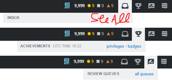
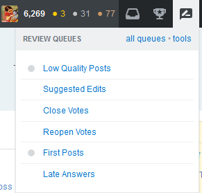
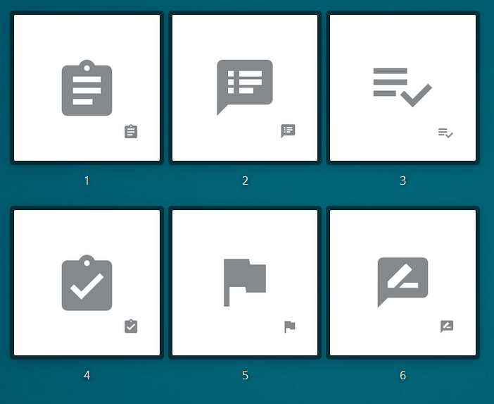
Review queue icon sucks
Concern: The review queue icon doesn't look anything like what I'd expect. It isn't recognizable. (note: this is actually a holdover from SO feedback).
Status: status-completed
Explanation: We are happy to change this icon to one that works better for everyone. We ran a survey for people to pick their top two favorite icons. Over 600 people participated. We are doing some additional design review on the top two candidates and will announce the results soon.
Review queue false positives
Concern: The review queue shouldn't "light up" or have the red dot when there are no items to review.
Status: status-planned
Explanation: We've squashed some bugs with the new design, but probably have a few more to deal with. We will continue on our bug stomping journey.
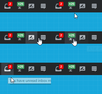
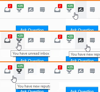
Add labels to icons
Concern: Still, the icons aren't as recognizable as they should be. But if you add labels below them they would be. Please add labels.
Status: status-declined
Explanation: There is no room for legible labels in the current design. The font would have to be so small that it is arguable if it would help many people. (The example posted to meta cheated a bit by changing "achievements" to the much shorter "awards".)
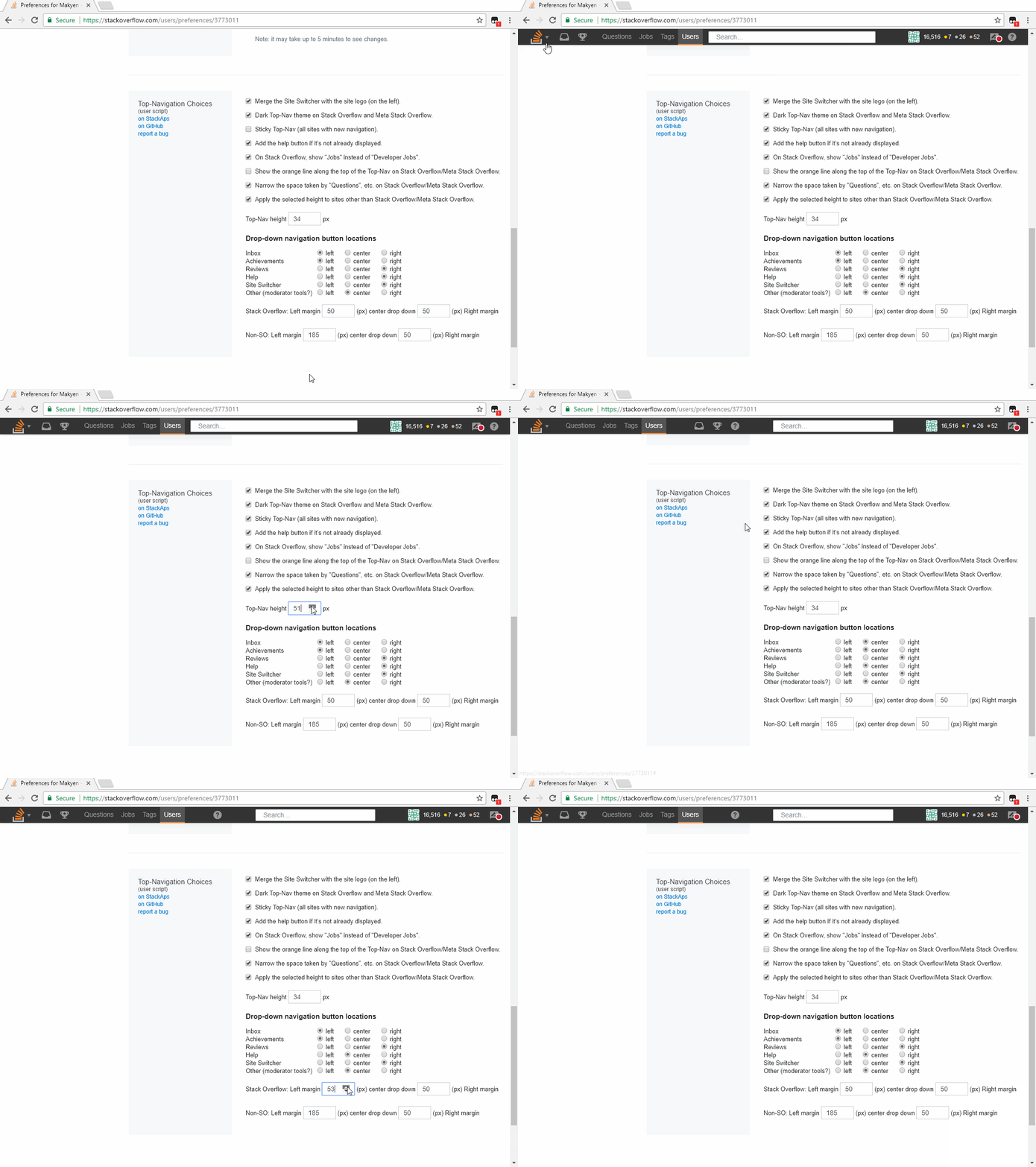
Stickiness global preference
Concern: SO top bar is sticky by default with a preference to unstick it. Network site top bar is not sticky by default and there is no way to make it so. Can we get a global preference for setting stickiness across all sites?
Status: status-review
Explanation: We think this is a good thing to have, now we just need to figure out how to make it so. This could be a somewhat expensive setting since we currently don't have any global settings. That said, we are actively investigating it.
Moderator tools are difficult to see/access
Concern: Inserting the mod tools to the far right (after the site switcher) creates confusion and make them difficult to see/interact with. Move them.
Status: status-completed
Explanation: We have moved these items to the left of the profile. This has the benefit of keeping the site switcher in the same location at all times. The new location for these tools has higher visibility. Also, we are going to continue investigating additional improvements for moderators.
Search transition is confusing
Concern: When a user clicks into the search box it animates to expand. Stop it! It's annoying.
Status: status-completed
Explanation: This was needed on Stack Overflow where the search box can get very small due to space constraints. It isn't necessary on other sites and has been turned off.
Clickable Stack Exchange logo
Concern: The Stack Exchange logo is useless. Clicking on it should trigger the site switcher (see below) or it should lead to stackexchange.com.
Status: status-completed
Explanation: This has been fixed. Clicking on the Stack Exchange logo will display a brief popup about the Stack Exchange network, and a link to stackexchange.com.
Site switcher
Concern: Moving the site switcher from the left to the right is confusing. Move it back.
Status: status-bydesign
Explanation: We know that this will take some getting use to, but based on previous experience with changes like this we are confident that everyone can make this adjustment.
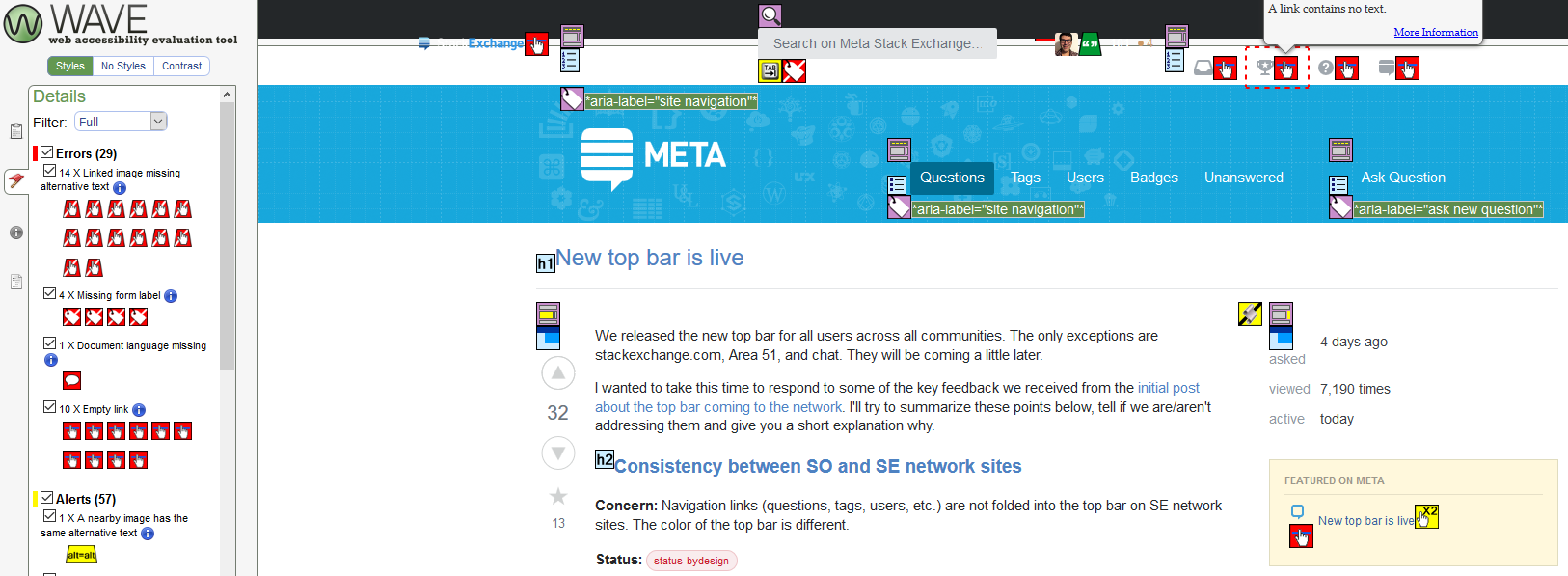
Inaccessible color choices
Concern: Some designs choices are inaccessible for people with low vision or color blindness (specifically the green achievements icon for people with deuteranopia).
Status: status-planned
Explanation: We are undergoing a general evaluation of our accessibility and will fix issues as a part of that process.
Where do we go from here
There are a number of other fixes that we made to address more minor issues or bugs in the top bar. So this list isn't exhaustive, but covers the biggest issues. Obviously there are some items that are still under work. We will continue working on them and listening for additional feedback on the new top bar.


